Friday, October 30, 2009

A look at Myki: currently under test in Melbourne

This video shows a station ticket machine being used to add value to a card, check the remaining balance and examine trip history. Also shown is validation on board a tram and the differences between touching on, touching off and an attempt to use an expired ticket.

Already installed on regional city buses, Myki will undego pilot testing before it becomes available to Melbourne train, tram and bus commuters. Until then Myki tickets are not valid for use in Melbourne and passengers require a valid Metcard to travel.

Also note that what you see here is a system under test and changes may be made by the time Myki is released for public use in Melbourne (expected to be later this year).

Further information: www.myki.com.au & Victorian Public Transport Ticketing

Sunday, October 25, 2009

The search for Melbourne's best railway line

Supposing you were moving to Melbourne and planned to commute to the CBD area by train. You had no pre-conceived suburb preferences and based your location choice soley on train service quality. Which train-served suburb or area would you pick?

The following are some key measures of service quality:

* Service frequency, both peak and off-peak. Can you 'turn up and go'?
* Service delivery. How common is it for trains to be cancelled?
* Service reliability. Do trains usually run on time?
* Comfort of travel. Are trains free of overcrowding?

Statistics on all the above are available from the following sources:

Timetables reveal service frequency. Delivery and reliability statistics are reported each month. The twelve month average is most useful here. Train loading figures are collected by the Department of Transport.

A look through these indicate significant variations between lines for frequency, reliability and comfort/crowding. Variations were fewer for service delivery, with almost all lines having around 99 percent of trains running. For this reason only frequency, reliability and comfort are needed for this survey.

An A to E scale is used to allow easier comparison. These are as follows:

Frequency

A = 3 to 10 minutes
B = 11 to 15 minutes
C = 16 to 20 minutes
D = 21 to 30 minutes
E = >31 minutes

Reliability

A = 96 - 100%*
B = 92 - 96 %*
C = 88 - 92%
D = 84 - 88%
E = less than 84%

(*) Exceeds compensation threshold.

Comfort

A = not indicated in DoT load chart
C = feature moderately in DoT load chart
E = feature prominently in DoT load chart

Line by line comparisons are tabulated below. Peak frequency figures are for am services from the terminus unless otherwise indicated. This is based on maximum intervals and service is usually higher at stations identified (+). Ratings are given in order of peak frequency/ offpeak frequency/ punctuality/ comfort.

Werribee (Werribee): C+/B+/C/C
Werribee (Altona): C/C/C/C
Williamstown (Williamstown): C/C/B/B
Sydenham (Watergardens): B+/C/B/E
Craigieburn (Craigieburn): C+/C/C/C
Upfield (Upfield): C/C/B/A

Epping (Epping): B+/C/B/C
Hurstbridge (Hurstbridge): E+/E/C/C
Hurstbridge (Greensborough): B+/C/C/C

Belgrave (Belgrave): C+/D/C/B
Lilydale (Lilydale): C+/D/B/B
Belgrave/Lilydale (Ringwood): A+/B/B/B
Belgrave/Lilydale (Auburn): A+/B/B/B
Alamein (Alamein): D+/B/A/A
Glen Waverley (Glen Waverley): B+/B/B/A

Pakenham (Pakenham): D+/D/E/E
Cranbourne (Cranbourne): C+/D/D/C
Pakenham/Cranbourne (Clayton): A+/B/C/D
Frankston (Frankston): B+/B/E/C
Frankston (Glenhuntly): C+/B/E/C
Sandringham (Sandringham): B+/B/B/A

The winner is:

The Glen Waverley line has good peak and interpeak service frequencies and high reliability without the crowding of some other lines. Parts of other lines score higher on some individual items but Glen Waverley presents the best overall package for the commuter.

Thursday, October 22, 2009

Customer service counters at city stations

In two months or less Victoria will have an (almost) statewide ticketing system based on durable Myki smartcards and short-term cardboard tickets. Ticket machines will dispense tickets for both metropolitan and country trips and staff will be able to sell tickets to any destination. Smartcard users on non-reserved services will not need to visit a booking office at all.

This stands to change the way customer service is delivered, especially at the larger stations with multiple ticket offices. We may end up with fewer locations that do more as the distinction between V/Line and metropolitan blurs.

For posterity, I though it would be worthwhile to document counter service at the CBD's second and third busiest stations immediately before Myki commences. Approximate usage is given, but this is a rough guide only and some (like luggage for long distance services) may be very 'peaky'.

Melbourne Central

A CBD station served by suburban trains that operate via the City Loop (ie most of them). A significant mid-city hub underneath a shopping centre.

Main entrance to platforms (well-used)

Here you see a full-service metropolitan train counter and a limited-service counter for V/Line (ie country services). The latter's opening hours are limited (closing during the pm peak) and not all payment methods are accepted.

Access from Swanston Street and the City Loop's midday reversal both work against the V/Line booth at this location. For most of its opening hours there are no direct trains to Southern Cross and passengers must join their train at North Melbourne. This makes either Flinders Street or Southern Cross more suitable locations than Melbourne Central for starting a V/Line journey.

Southern Cross

The city's newest station building served by nearly all of Victoria's suburban, country and interstate trains. Located next to the growing Docklands precinct and sees heavy use during sporting events.

Collins Street end

Metropolitan Tickets (well-used)

Regional Tickets (currently busy with long queues at popular times)

Information (well-used)

Myki (currently quiet but likely to become much busier)

Bourke Street end

Metropolitan Tickets (well-used)

Regional Tickets (quieter and well worth the walk from Collins St)

Luggage (generally quiet)

I will not speculate on what will happen when Myki is introduced and more of the routine purchases are done by machine or automatically. At a large multi-level site like Southern Cross there is a trade-off between the number of service locations, efficiency (expressed in customer waiting time and staffing) and fast, convenient access to a service desk.

A smaller number of service locations may increase average walking times but reduce waiting times and their variability. For instance two differently located booths might each have a window open but one might be quiet and the other busy. In contrast one booth with two windows open is more efficient as it reduces variability in waiting times. Walking time may be longer but the waiting time saved may exceed that during busy periods. Rostering is also easier for a single location and more staff can be more readily be put on (in busy times three people may be justified). However care nees to be taken that the number of windows open is as near as possible to staff present to speed service.

Wednesday, October 21, 2009

Two loops: Feedback and the City

In teaching creative thinking, Edward De Bono often discusses humorous or whimsical concepts that when refined can become practical ideas.

A example is building a factory downstream of itself. The practical idea here is that since it needs clean water the factory would have a vested interest in not polluting if its outlet was required to be upstream of its inlet.

Expressed as a more general principle, this is the idea of building short and direct feedback loops so that consequences of poor behaviour or decisions are more swiftly felt by those responsible. Or, more diplomatically, corrective action can more quickly be taken if circumstances change.

While the City Loop's noon reversals and weekend variations do not make it the most passenger-friendly system, its vagarities do make it a very efficient feedback loop.

It wasn't always like this, though.

Ten or so years ago, if like most Melburnians you lived in the south or east and commuted to the city, working near Parliament Station was an advantage. You had the shortest trip in and the shortest trip out. Train patronage was higher than its nadir c1980, but not that much more. And reliability was generally pretty good in the early 2000s.

Then numbers started growing above trend. Not just 1 to 2 per cent a year (roughly in line with population growth) but double digits for successive years. The growth forecasts promised by the franchise bidders came true, but not all survived to see it. Extra services were added but the growth in passenger numbers outstripped the increase in service provided by five to one if not more. So trains got more crowded and the network became more fragile and prone to delays.

Which group of passengers were most affected by this trend? The answer is, for those who live in the south and east, those boarding at Parliament in the afternoon. For Parliament is their last city station. Even a short suspension of the regular train throughput can leave people behind on the platform during peak times. Boarding at Parliament is like drawing the short straw and some even walk to Flinders Street, despite the extra time in the loop.

Who works near Parliament? Politicians first spring to mind. But equally important are departmental officers and ministerial staff. They experience the joys and pitfalls of suburban train travel first-hand. And, despite recent press, transit's modal share amongst CBD-based bureaucrats is still rather high and exceeds that for the population as a whole, many of whom work in suburbs with free parking and less public transport access.

And so orders for 38 new trains, and, more recently, new trams, have been placed. Subject to available line capacity and power, their commissioning will allow substantial service improvements. While unfair to accord it full credit, the City Loop and its mostly clockwise pm peak pattern appear to have played a role in forming a rather effective feedback loop.

Tuesday, October 20, 2009

Introducing 'The Connected Transit Network'

Presented is a 2-minute video that illustrates the main differences between a transit system that forms genuine network and one that is just a set of random routes that discourage interchange.

This video is different to others presented here. It has been heavily edited and there are more pictures than talk. Picture quality (though still not great) has also been improved and there is some use of visual effects.

Sunday, October 18, 2009

Does system complexity lessen reliability?

It's been a rough week on parts of Melbourne's train network. Power failures, equipment faults, errant prams and unruly passengers all contributed to delays and line suspensions. And during peak periods replacement buses aren't necessarily available either.

This leads one to ask whether there is a relationship between a transit system's complexity and its reliability, as measured by cancellation statistics.

First let's look at the relative complexity of buses, trams and trains.

Buses are the simplest. The driver must be rostered and present, the bus must be available and serviceable and there must be a road with flowing traffic. True, buses do get delayed when roads are blocked due to an accident. But replacement buses can be sent out from the depot (during off-peak periods, subject to driver availability) are can overtake defective buses. Also buses are self-powered, and being trackless, do not rely on points and signals to run.

Trams are a bit more complex. Rather than being self-powered they require power from an overhead. They can also derail and a stuck tram can block the line. However they do not have the sorts of complex centralised signalling systems we have with rail.

Trains are the most complex of the lot. A train is useless by itself. Not only does it need overhead power, but it also needs a track and a signal. The route a train takes is determined by the way the points are set, and this is interlocked with the signals to provide seperation between trains through a safeworking system. Signals can be manual (controlled by the city-based Metrol or suburban signal boxes) or automatic, controlled by the presence of trains, as detected by track circuitry.

Unlike trams, trains can be a mixture of stopping and express, with some lines shared with country freight and passenger trains. Similar to trams, delays can cause knock-on delays to later trains, but with magnified effects.

For a train to proceed so many more things need to be 'just right' than with trams or buses. And because any spare trains/drivers are often not where needed, one train taken out of service can result in two services not running.

What do the reliability statistics from Track Record say?

These indeed confirm that trains are cancelled more often than trams which in turn are cancelled more often than buses.

For the 2008-2009 year, 0.1 percent of buses did not run. The figure for trams is 0.3 percent. 1.3 percent metropolitan trains did not run. Regional trains were cancelled 1.7 percent of the time, though replacement coaches are more commonly run for country services. Note that these are overall system-wide figures; performance varies by time of day and line group.

Longer-term, trams always ran more of their timetabled services than trains, with the difference widening from small to large as train performance declined since its 2000-2003 peak.

Trains however come into their own when it comes to on-time running. Once a train runs you are more likely to arrive on time than if you took a tram. This is because they have their own right of way, unlike trams and buses, which mostly operate in mixed traffic.

The cancellation (but not punctuality) figures do seem to confirm that the more complex systems have signifantly more difficulties than the simpler modes. Metro trams versus buses is a 3:1 difference, while metro trains verus buses is a 13:1 difference.

However the above by itself does not constitute evidence that there is a causal relationship between complexity and (un)reliability.

It is possible to conceive of a situation where a more complex system comprising of three reliable processes produces better outcomes than a simpler one with one less reliable process.

As an example, supposing the simple process required only one thing to work properly, and this happened 90 percent of the time. A more complex system might require three sequential processes to happen. However the probability of each working was 99 percent.

In this case despite its greater complexity the second system was more reliable; its failure rate was near enough to 3% versus 10% for the simpler one-stage system. Its higher reliability appears to be because each process was more reliable and this contributed to overall better system performance. But add a lot of extra steps (each at 99 percent reliability) to the second system and the overall result could deteriorate to be worse than 90 percent. The solution is to either to simplify the process (fewer steps to go wrong) or improve the reliability of each process to say 99.9 percent (ie reducing failure rates to one-tenth the previous level).

Nevertheless research in other fields eg Alexandrov's paper do find such increasing system complexity does risk reliability. While he writes about computer systems, his conclusion could well hold true for transit systems (noting that computer systems are involved here too).

This seems to support the idea that instead of a massive interconnected system, high-reliabity railways should operate as several independent lines or sectors, each with their own tracks and points. Problems are thus isolated rather than risk bringing down the whole network. Crucially, connectedness must still be provided in the eyes of the passenger, and this requires very careful station and interchange design due to the possible increased need to transfer.

Saturday, October 17, 2009

Melbourne's new bus zones and network connectivity

Integrated fares that provide free transfers between all modes is a requirement for transit to operate as a genuine nework. Introduced in Melbourne when patronage hit record lows and lines were under threat of closure, integrated fares contributed greatly towards transit's turnaround.

Subsequent advances gave metropolitan travel to holders of V/Line tickets and, announced this week, tidied up Melbourne's bus zone boundaries.

How do these latest bus changes improve network connectivity (from a fares standpoint)?

Probably the best demonstration is to map all the bus routes that cross a zone boundary onto a large sheet of paper. Use colours according to current zone. Then add the train lines, again identifying stations by zone.

You will find cases of different zones applying to different bus routes, even if they serve the same stops. This is hard to explain and discourages passengers from using multi-route frequent service corridors if the fare varies depending on the route number.

At other times railway stations may be in Zones 1 and 2 but the buses outside may be in Zone 2 only. This requires transferring passengers to pay an extra fare if travelling from the city, and so discourages feeder bus use. Instead many drive to the station, placing pressure on scarce parking space and sapping local bus patronage. And even if you usually walk to the station, having a bus in the same zone is a good back-up during train service disruptions.

Compare this map with the proposed zones and note the changes. Some of the stations whose passengers will benefit include:

* North Brighton
* Middle Brighton
* Bentleigh
* Oakleigh
* Reservoir
* Merlynston
* Oak Park
* Glenroy

Some major trip generators to get cheaper fares on more routes in more directions include Monash University (Clayton), Monash Medical Centre (Moorabbin), Northland Shopping Centre (Preston), LaTrobe University (Bundoora) and Sunshine Hospital (St Albans). With public transport already dominant for CBD travel, these are the sorts of major suburban trip generators that patronage will need to grow for transit to further increase its modal share.

Some of the well-served service corridors to benefit include Chadstone - Oakleigh - Monash University (Clayton), Oriel Rd (West Heidelberg), Bulleen Rd - Doncaster, Reservoir - LaTrobe University and Reservoir - Northland.

No fare system is perfect and there may still be real or perceived 'anomalies' that these latest revisions do not change. People just outside a zone boundary often want their location included in another zone or maybe put in an overlap. Having everything in a single zone is sometimes suggested but even this implies a judgement of some sort and large flat-fare networks do not necessarily offer the best compromise between 'value for passengers', 'revenue', 'simplicity' and 'perceived fairness'.

Transfer-friendly fares policy is less to do with whether (say) Box Hill is in Zone 1 or 2 than it is in ensuring that all trains and buses at a given station have the same zones to remove transfer penalties. Expressed differently, transfer penalties impose a marginal cost on the passenger, and their existence harms network connectivity. In contrast the location of zone boundaries affects the absolute levels of fares but need not impose transfer penalties if the network is zoned as one.

If I could only ask one question for each proposed public transport infrastructure, route, timetable, physical access or fares change, it would be 'Does this change strengthen network connectivity?'. In relation to these revised bus zone changes, the answer is an unqualified 'yes'.

Wednesday, October 14, 2009

Why housing's 'Zone 1' price premium is no longer justified

Estate agents and property investment spruikers will tell you that one of the benefits of buying an inner suburban home is its cheaper fares (for city commuters) than a place beyond about 15km from the city. Anecdotally many buyers and renters seem to value this criteria as well. 'Located in Zone 1' is perhaps not quite as coveted as being in the catchment of a so-called 'good school' but it's not far off, especially for childless couples.

Three years ago I demonstrated out that the higher mortgage payments of a dearer inner suburban home generally outstripped the savings in fares. Unless the Zone 1 suburb 14km from the CBD had amenity benefits that the Zone 2 suburb 16km out didn't have, the fare difference is not worth paying much of a premium for if buying a home.

To put it in dollar terms, the difference in monthly fares for a full fare passenger is about $60 per month or $15 per week. Double that for a two income household (both taking public transport to a city job) and half that for a concession passenger. $15 per week is just under $700 per year, or the same as 7% interest on $10 000 owing. And $10 000 is trivial where average house prices are over $100 000 different between adjoining suburbs on opposite sides of the zone divide.

Has anything changed in 2009? Average house prices are generally higher than in 2006 but interest rates are lower, so the difference in mortgage payments between then and now even out.

While we have a metropolitan fare system that generally works well, don't let anyone tell you it is immune from change. For example, in the last 30 years we have seen section-based fares with fine increments, one type of zone system, its abolition in favour of a neighbourhood system, another type of zone system and lately its significant modification with new flat fare tickets.

The two major fare changes in the last five years or so are:

The first is a gradual flattening of the fare system. Longer trips are now a lower fare multiple of the shortest trips. Each recent trend has been in this direction. Examples include the abolition of both the cheapest fares (Rail+2, Short-Trip, National Bus section tickets) and the dearest fares (Zone 3, V/Line fare reductions). In 2006 only Seniors could get flat fare tickets (the Seniors Daily).

Since then new ticket types, starting with the Sunday Saver, school student periodicals and then the Weekend Saver, extended flat fares to new groups of passengers. Free travel at certain times has been extended, with the Early Bird and Sunday Pass being examples. While trips that involve zonal tickets still remain in the majority, zones are becoming irrelevant for an increasing amount of travel.

The second change is what is likely to happen with Myki ticketing. Nominally this involves no change to fares or zones. However people who select the 'Myki Money' option won't need to think about zones if they don't want to; instead they will just top up when their balance gets low. Fare zones become less of a 'barrier', which can happen with otherwise flexible tickets such as the 10 x 2 hour. Finkestein argues that users of roads with electronic toll collection are less mindful of the amount they pay than where toll collection was manual. There is no reason to suggest that passenger behaviour will be different with public transport smartcards.

To summarise, both flatter fares and less awareness of exact payment amounts will make fare zones less important in real life. Unless flat fares completely take over, distance (or its modern proxy of zones) will remain one of the main bases of calculating fares along with travel time, time of travel, and method of ticket purchase or payment.

While there is a great deal of appeal in buying in a Zone 1 suburb, it is desirable to know the real factors that attract people to the area. These are things like general amenity, facilities, walkability and quality of transport which do affect quality of life. While Zone 1 status doesn't hurt, the lower fare won't save much money compared to the likely higher price paid to buy into the area. Contrary to what the property agents and promoters claim, Zone 1 isn't worth paying much of a premium for if the area otherwise satisfies 'high amenity' or 'value for money' tests.

Sunday, October 11, 2009

Route 903 article in this month's Transit Australia

Those who read the post about Route 903, Melbourne's first orbital bus route, but want to know more are referred to this month's Transit Australia for a detailed article.

This month's issue contains Part 1, while Part 2 should appear in November. Transit Australia is available at a few of the better newsagents (try the one near Box Hill Station) or can be obtained by direct subscription. It is also received by the Department of Transport's library and possibly also the State Library.

Saturday, October 10, 2009

800 minutes extra per year

A suburban bus stop whose relocation will save regular passengers up to 800 minutes per year commenced full service this morning. The stop, pictured below, cuts the number of road crossings required from the highway and shopping strip from four to one. Access time has been reduced from about four minutes to two minutes. Transfers from station platforms are also easier and are achieveable in just a few seconds from Platform 2.

Before

The videos below show access to the 888/889 bus stop at Chelsea in 2008:

Part 1

Part 2

(Two parts were needed for this video as access took such a long time).

After

The video below shows how it is as of October 10, 2009 when the stop was relocated nearer the station:

(Quicker access meant it could be filmed on one short video only.)

Saving access time...

The travel time saving quoted in the title is worth a further look. 800 minutes is over 13 hours per year. In other words well over one working day.

It applies for a walk-on passenger using the bus twice daily for 200 days of the year and holds for people going to or from destinations on Nepean Highway.

It's a bit different when transferring between train and bus. This is because a faster access time does not save end to end time if it means is waiting 3 minutes instead of 5 minutes for a connection. However there would be times when the faster access time means a bus or train that would previously have been missed can be boarded.

The potential time lost due to a missed connection is a function of service frequency. For the 888/889 intervals between departures vary between 10 and 40 minutes. The train runs more frequently, but intervals can still be 30 minutes during early mornings, evenings and Sundays.

Hence any time the improved access allows an otherwise missed connection to be made can save the passenger up to 40 minutes waiting. That is the 'best/worst' scenario and savings would usually be less. If considered along with these cases where faster access does not speed end to end time the average is likely to tend towards an 800 minute yearly average, especially given more or less random waiting times.

...and better reliability

Does the relocated bus stop also help overall service reliability, as measured by variability in end-to-end travel times? Yes it does.

Train-only passengers complain if their train is 10 minutes late and thus their arrival is delayed by that much. While this does affect many, they get off lightly compared to those who need to change to a bus. A late train may result in a missed bus and a wait of 30 or even 60 minutes until the next one.

A missed bus connection can increase end-to-end travel time by up to 50%. Anyone would agree that such variability, even if it happens once or twice a week, would be a disincentive to use public transport, or at least local buses. Afternoon peak trips to outer suburbs are most affected due to the snowballing of train delays and infrequent buses home.

A 2 minute access saving helps by making some previously dicey transfers more reliable. Instead of a 5 minute late train being enough to cause a lost connection, the train can now be up to 7 minutes late and the connection can still be made. For people making this particular connection the gain from relocating the stop is not so much reduced travel time but increased reliability.

Sensible stop location is one piece of the puzzle that makes or breaks an integrated transport network. The relocation described here will strengthen the network by reducing travel times and improving overall reliability.

Thursday, October 08, 2009

Station Park & Rides - is there a higher and better use?

A term popular in property valuation and development circles is 'highest and best' use. In commercial real estate the value of land depends on the use to which it can be put. If it has high rental, development or subdivision potential it is worth more than land that does not possess these attributes.

Failure to develop land for its 'highest and best use' represents an 'opportunity cost' for the owner. The owner may still profit from its existing use, but the return will be lower. But if the return the owner is getting is at a lower risk, or if it is taken in a non-financial form such as a better standard of living derived from living on a large block, then they may be quite content not to develop further.

But where publicly owned land is used for marginal, low-return uses, it is only prudent that one asks if it has a higher and better use. In this case the utility may be measured in financial terms, social terms or a mixture.

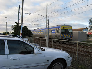
Parking space at stations is a case in point. Its provision may attract passengers who find driving to the station preferable to walking, cycling or taking a bus. The land may be useful to keep in reserve for future infrastructure, such as extra tracks, stabling, passing loops or bus interchanges.

On the other hand, because parking is uncharged, it returns no direct income to the railways and so may incur opportunity costs such as foregone rental income (if the land was developed), lower bus patronage or reduced walkability.

To try to quantify opportunity costs, one needs to assess both capital and income gains possible from a 'higher and better use' for park and ride land. This needs to be compared to the maintenance costs of park and ride, and if a park and ride is being built or expanded, capital costs as well.

These factors vary by area; a park and ride in a high-land value inner or bayside suburb imposes a much higher opportunity costs than using a scrap of otherwise unusable land near an outer or ex-urban station. It's also worth mentioning that even with different types of parking there are differences; substituting high-turnover short-term shopper parking for low-turnover long-term commuter parking benefits local retailers so probably represents a higher and better use, at least for the local area.

While coarse, the following back of the envelope calculations may assist in estimating opportunity costs.

The first thing is to look at the cost of park & ride. The Victorian Transport Plan has a $60 million program. 1700 new spots are mentioned, but these are only part of the program, so to claim $35 000 per spot sounds excessive. However a figure less than half that is mentioned here. The cost in Perth appears to be a bit over $10 000 per bay. Passengers contribute up to a maximum of around $2000 in fares annually, which buys unlimited travel in Zones 1 and 2.

The other input is the land itself. Wikipedia reckons you should allow 30 square metres per average parking spot, including circulation areas and landscaping. In other words, 100 parking spots equates to about 3000 square metres, or 0.3 hectare.

How much is the land worth? This varies greatly depending on the locality, use and zoning. But going on residential values, $400-500k will buy a house on a 600 square metre block in a median suburb. If we take the land component as being $300k per block, then that's a value of $500 per square metre. Land near a station may be regarded as undesirable due to noise and traffic despite its convenience. So it could be worth less - maybe $300 - 400 per square metre. That is unless its development potential makes it more rather than less attractive. Anyway, let's say the 0.3 ha is worth $1 million, which is very conservative.

How does this relate to the 100 parkers and riders? They're getting exclusive use of a million dollar asset for 10 hours per day. Based on a land value of $10k per spot and an imputed commercial rental return of 10% pa, they are getting a 'free lunch'. 10% of $10k is $1000 per year, or over 50% of their fare (which ought to be going onto running the service). And this does not include the capital costs required to build the car park.

Having done the costs, let's get to the opportunities. What can you do with 0.3 hectare, or 3/4 acre in the old money? It's good for five houses on standard 600m2 blocks, fifteen townhouses or villas each with generous courtyards. Stack said units to make a 3-storey block and we're up to 40+ flats.

Assuming $400k per house, $300k per unit, or $250k per flat, that's a developed site value of $2 million with houses, $4.5 million with units or $10 million with flats.

With a 5% rental yield on the above prices, annual rental revenue would be about $100k for the houses, $225k for the units or $500k for the flats. While we have over 200 suburban stations, if just 20 could be developed, the potential rental income would be in the low millions, or the financial equivalent of hundreds if not thousands more commuters buying Zone 1+2 full fare yearly tickets.

Good design could incorporate improved amenity, for instance passive surveillance of the station precinct. Less NIMBY-minded councils may even provide a waiver on car space requirements in return for a portion of the development being for social housing or (say) a womens refuge.

While there would be a loss of parking spots, this would have to be balanced against the increased population with the station on their doorstep who'd likely on average use the train more, and not just for work trips and the gains possible with improved feeder buses and bicycle facilities.

All things considered, it appears that park and ride may represent close to the 'lowest and worst' land use at many station locations and incur opportunity costs that are not always recognised.