It's true that, as cited by the minister, there have been gains in absolute terms (particularly for buses) but the method of counting by trip can give an inflated impression of service increases where routes upgraded are short.
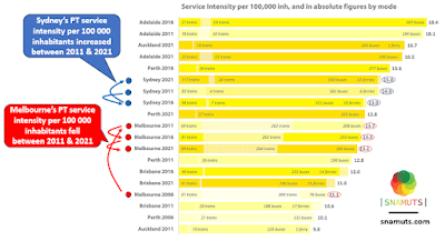
Let's cut to the chase. The fortunes of public transport service in Sydney and Melbourne are very different, with increasing divergence over time.
These service increases are why waits for trains, trams and major bus routes at night in Sydney are typically now about half Melbourne's. They added service while we stagnated.
See the numbers below, particularly the figure at the end of the bars, which encapsulate all modes (click for a better view).
What are some other messages in the data?
Melbourne did a lot with buses between 2006 and 2011. Bus service provision and patronage rose roughly 25% in that time. However the bus figure given above shows a much bigger increase as only bus routes with a 'useful service' were counted. The reason for this is that service that qualified increased greatly when the SmartBus routes were expanded. Melbourne has upgraded some bus routes in the years since 2011 but has not extended its SmartBus network.
Auckland has been the star performer, increasing public transport service greatly. This has been both on its rail and bus networks with major network reform on the latter. The same can be said for Perth, which opened its Mandurah line in 2007 and upgraded buses then and in subsequent years. However both cities (plus Melbourne and Brisbane) have had fast population growth, which is why their 2021 service intensity is lower than in 2016.
Adelaide features highly. Part of this can be attributed to 2014's Seaford rail electrification which improved services. However its attempt at bus reform failed and little has happened since. Its service per capita score is only high because its low population growth erodes per 100 000 service slower than in faster growing cities. And more of Adelaide has a more transit-friendly pre-car urban form compared to a Perth or Brisbane.
However Adelaide does demonstrate that a not particularly wealthy Australian city can afford a higher service intensity than we in Melbourne have. Their experience invalidates claims that Melbourne (for example) cannot afford substantially better public transport frequency, especially if done in a cost-effective manner, eg through bus network simplification and reform. Reflect on this the next time you've missed the last bus at 9pm or it's 30 minutes to the next evening train home.
There's two take-home messages from this data:
1. Melbourne is trailing Sydney on public transport service per 100 000 population, wtih the gap widening over time.
2. Melbourne can afford better public transport service, with big bus upgrades possible if we choose to lift service intensity to be comparable to Sydney, Auckland and even Adelaide.


No comments:
Post a Comment