Sunday, December 31, 2006
Friday, December 15, 2006
Back in August I wrote about reliability of the pre-privatisation Met train services.
The main pre-1999 trends were vastly reduced cancellations from the early 1990s. Reliability also improved and has been sustained at a higher level than during the strike-torn 1980s.
What has happened since?
To find out, I compiled a table, drawing on PTC annual reports for the pre-1999 figures. Afterwards I used statistics from Track Record 1, 5, 9, 13, 17, 21, 25, 28. Because results were listed by operator, these were averaged for the pre-reunification years (1999 - 2003).
Metropolitan Trains: reliability and cancellations 1983 - 2006
Period | % OT(i) | % Canc(ii)
1983 ------ 93 ----- ?
1984 n/a
1985-6 ----- 87.8 ----- 3.7
1987 -------- 92 ----- 2.8
1988 -------- 92.1 ----- 2.5
1989 -------- 92.1 ----- 2.4
1990 -------- 88.3 ----- 6.3
1991 n/a
1992 n/a
1993 n/a
1994 -------- 92.3 ----- 0.3
1995 -------- 92.3 ----- 0.5
1996 -------- 93.3 ----- 0.5
1997 -------- 94.8 ----- 0.9
1998 -------- 93.7 ----- 1.4
1999 Q1 ---- 93.5 ----- 1.1
1999 Q2 ---- 93.6 ----- 0.7
1999 Q3 ---- 96.0 ----- 0.4
1999 Q4 ---- 97.2 ----- 0.5
2000 Q1 ---- 95.2 ----- 0.5
2000 Q2 ---- 94.8 ----- 1.3
2000 Q3 ---- 96.5 ----- 0.6
2000 Q4 ---- 96.6 ----- 0.6
2001 Q1 ---- 96.5 ----- 0.6
2001 Q2 ---- 96.5 ----- 0.6
2001 Q3 ---- 97.0 ----- 0.3
2001 Q4 ---- 96.9 ----- 0.5
2002 Q1 ---- 96.6 ----- 0.5
2002 Q2 ---- 96.1 ----- 0.6
2002 Q3 ---- 96.5 ----- 0.4
2002 Q4 ---- 96.9 ----- 0.4
2003 Q1 ---- 96.9 ----- 0.5
2003 Q2 ---- 96.9 ----- 0.4
2003 Q3 ---- 96.2 ----- 0.7
2003 Q4 ---- 96.2 ----- 1.2
2004 Q1 ---- 95.8 ----- 1.0
2004 Q2 ---- 95.0 ----- 1.9
2004 Q3 ---- 94.2 ----- 1.4
2004 Q4 ---- 94.0 ----- 1.3
2005 Q1 ---- 93.9 ----- 1.4
2005 Q2 ---- 93.1 ----- 1.2
2005 Q3 ---- 93.1 ----- 0.8
2005 Q4 ---- 93.2 ----- 1.0
2006 Q1 ---- 92.6 ----- 1.3
2006 Q2 ---- 93.2 ----- 0.6
2006 Q3 ---- 93.9 ----- 0.5
(i) Percent of trains on time to 5:59 min (all day)
(ii) Percent of trains cancelled (all day)
Analysis
The post-1998 figures can be divided into four stages. The first occurred during 1998 and 2000 when the network was split (Bayside and Hillside) and then franchised. Apart from a poor Q2 of 2000, the rise in service cancellations experienced in 1997 and 1998 was arrested and then reversed.
The third quarter of 2000 ushered in a 'golden age' for trains in Melbourne, and not just for those who were taking advantage of the new increased Sunday services either. Reliability was consistently high (96-97%) and cancellations were few (0.5% approx). Good performance continued for nearly three years.
The (time?)tables turned sometime in 2003. The organisation of the system was falling apart with National Express pulling out and half the network reverting to government operation until new contracts could be negotiated with the remaining operator. Chronic driver shortages (due to a previous lack of recruitment and training) increased cancellations on the 'Bayside' part of the network. Major rail projects reduced operational flexibility while the consequences of delays increased due to patronage pressures (thought to be due to rising fuel prices and urban growth). These factors (plus the odd Metrol breakdown and storm) combined to double lateness and cancellations between 2002 and 2005. This put on-time running back to 1995 levels and wiped out the improvements of the early 2000s. However, cancellation performance, though poorer than in the recent past, was still at approximately half the level experienced during the Met days.
It's too early to say much about the last year. However there are some encouraging signs of a turn-around, notably sharply fewer cancellations (similar to those experienced during the 'golden age'). On-time running has also improved, with comparable figures to late 2004/early 2005 and the last few (best) years of the Met.
These figures are of value in several ways. Firstly they help to dispel myths one hears said about the network. The first is that 'things were better during the Met years'. Such an assertion is not borne out in the figures, even during less reliable years such as 2004 and 2005. Secondly they demonstrate what our network can achieve, ie a reliability exceeding 96% and cancellations around 0.5%. Thirdly, under a short-term management style, though current performance may be good, the seeds of later problems may be sown (eg not training drivers during the 2000-2003 period).
Monday, December 04, 2006
You might have noticed the new tramTRACKER stickers on tram stops around Melbourne. Started on two routes last month, the real-time information system became effective across the whole tram network today.
Unless a tram is within sight, my common 1.2km afternoon peak-hour trip is often faster walking than tramming. However in the cause of science, I waited around to give the new service a go.
There are two services available - voice or SMS reply.
In both cases you dial a number (1300 698 726 voice, 1999 2772 sms) and enter a four digit tram stop ID number. Then it will tell you the time of the next three trams by voice or reply SMS message.
I tried the voice option first. This gave times as per the printed timetable, so it doesn't seem to have a real time function yet.
Then I decided to send an SMS. The reply came quickly; the next three trams were 14, 13 and 24 minutes away respectively. After about 10 minutes a second SMS was sent; now the answer was 4, 4 and 18 minutes.
And sure enough, in 4 or 5 minutes two (bunched) trams arrived. Based on this quick trial, TramTRACKER is accurate and it works. However at least for now, SMS beats voice.
To make it more useful one could save the number in your phone and memorise the four digit tram stop number. Then you can get information from home, bus or train, before you reach the stop.
Is this an exercise in transport geekery? No doubt! But for critical trips it's a useful service. And since tram on-time data is already collected for operational purposes, it may as well be made available to the public for minimal cost.
Saturday, December 02, 2006
When the Melbourne Underground Railway Loop was designed, its major intended purpose was to serve a distributor function for CBD commuters. Before the Loop, commuters to the north and east of the CBD had to transfer to (possibly) an overcrowded and gridlocked tram from either Flinders or Spencer Street Station.
For such commuters it did not matter very much which direction loop services went, or indeed whether they reversed in the middle of the day.
However demographics and travel patterns have changed since the loop opened in the 1980s and it is appropriate to review its current function, potential, service patterns and passenger information. Such a review may find that while the loop benefits some trips, it poorly serves others. Furthermore, it is possible that demand for trips it serves poorly is growing faster than those it serves well.
The following have changed since the Loop fully opened in 1985:
* The rise of city living. The resident population has virtually doubled in the last 10 years and there has been an associated retail boom. The CBD is no longer just a place to commute to from the suburbs. The CBD population is growing by between 3000 and 5000 people per year, or at a rate twice the state average. Transport systems increasingly must serve within-CBD movement as well as suburb - CBD trips.
* The enlargement of the Melbourne CBD. The City Loop is no longer the natural boundary of the CBD, with growth bursting over the river to Southbank and westwards into the Docklands precinct. Within-CBD trips are becoming longer and trains will become faster than trams for more of them. Significantly, the closest railway stations to the new developments (Flinders Street and Southern Cross/Spencer Street) are also the oldest and those sometimes disadvantaged by the Loop.
* The revitalisation of regional rail and expected increased patronage. Services to fast-growing commuter-belt areas are based around Southern Cross Station, which currently lacks direct loop services at certain times of the day.
* The growth of air travel and specialist airport bus services. Current services (particularly to Melbourne Airport) are of high quality, but are let down by the limited accessibility of Southern Cross Station from some CBD locations at certain times.
* More diverse travel patterns, including more weekend and evening travel. Whether due to de-regulated shopping hours, labour market changes, CBD living, tourism or the influx of international students, this has increased the amount of movement, especially around the inner-city. Much of this demand could be met by a revised City Loop in conjunction with surface tram and bus systems.
The above points require a new way of thinking about the City Loop's function.
Its original rationale, that of a high-capacity distributor for CBD/M-F/9-5 workers commuting in from the suburbs, though still important, is declining in relative terms. In contrast, the Loop's current usefulness is limited for all five travel growth markets identified above.
To make the Loop relevant again, it needs to be seen and used as an inner-city metro system, offering faster CBD-area travel than is possible by tram. Of course the Loop still retains its traditional distributor and collector role for suburb-CBD trips, but the new emphasis could appeal to whole markets that are currently poorly served.
What would a modernised metro-style City Loop look like?
Generally, very similar to today. The tracks and stations are already there, and the services already run.
Just two things would be different; one substantive and the other cosmetic.
The substantive difference would be service patterns. The following three points are most important:
* Scrapping the 12:45pm weekday reversal so that loop services would run in the same direction all day long. Tourists and lunch-time travellers will no longer need to shun the loop as they do today.
* Standard loop directions seven days per week.
* A loop operating pattern that provides for direct no-transfer services between all CBD stations.
The cosmetic change is passenger information. As well as traditional line-based information (again only really suitable for beyond-CBD passengers), extra passenger information for CBD-area passengers would be established. Examples are shown below:
Note that the above platform numbers assume a weekend loop service pattern, with services stopping at Flagstaff.
Conclusion
Years of planning exclusively based on suburb to CBD commuter travel needs has left the City Loop poorly equipped to serve emerging passenger growth markets in and around the Melboune CBD. The midday reversal and differing service patterns have made full use of the City Loop impractical for many casual travellers.
A new-look Loop, based around existing services but easier to use and responsive to modern travel needs, has been proposed. It is hoped that train service revisions planned for next year will represent a step towards this aim.
Sunday, October 29, 2006
5:05pm: Werribee train departs departs Flinders St stopping all stations between Newport and Werribee
5:11pm: Werribee train departs Flinders St Station express between Newport and Laverton, then express to Hoppers Crossing. I board this train.
5:37pm: Look south from the express and see 5:05pm stopper just leave Westona.
5:38pm: Pull in to Laverton. Passengers for Aircraft Station alight.
5:39pm: Express through Aircraft to Hoppers Crossing.
5:41pm: 5:05pm stopper arrives at Laverton, picking up passengers for Aircraft.
5:42pm: Arrive and alight at Hoppers Crossing.
5:43pm: Walk to bus interchange. No buses to be seen.
5:48pm: 5:11pm stopper train arrives at Hoppers Crossing.
5:50pm: Buses start pulling into interchange.
5:54pm: Bus route 440 leaves.
5:55pm: Bus route 436 leaves, then route 442.
5:56pm: Bus route 437 leaves. About 20-25 on board.
5:57pm: All quiet at Hoppers Station interchange until the next train.
Monday, October 23, 2006
The Herald Sun has an article about a plan to create an enlarged inner Melbourne council to allow a more co-ordinated transport policy.
Such a council area could include not just the CBD and immediate surrounds, but also inner-Melbourne areas, such as St Kilda, Brunswick, Richmond, Footscray or even further out.
These sorts of things come up every now and then. Amalgamated councils apparently 'co-ordinate better' and 'have more resources', whereas divided up councils can be 'more responsive to local concerns' and are better at 'local solutions'.
But people should stand back and consider the implications before supporting it, rather than taking the 'grass is greener on the other side' approach and thinking it must be good.
Brisbane has been cited as an example of a powerful local government. The City of Brisbane has approximately 700 000 residents and has some tasks that would be state government functions elsewhere (eg running buses).
But I'm not sure if transport planning in Brisbane can be regarded as a success. Admittedly they've done very well lately with Translink fares and bus patronage, but for years Brisbane was less innovative than cities such as Perth, which has had genuine multimodal service planning for years.
A Brisbane-like structure just sets things up for big power plays between a big state government and a big local government. And especially if one controls trains and the other controls buses then you're going to get some pretty stupid decisions being made if an integrated approach is not taken (eg busways paralleling railways, or in other cases light rail where a bus would have been better etc).
After a few years of waste and politicking, people will be calling for an integrated body to be formed, and so the wheel will have turned full circle.
Fragmentation can also hinder or spoil big projects. Would Allanah McTiernan have got the direct (Narrows Br) Mandurah railway option up if PCC and the NIMBYs of South Perth were more powerful? The answer is no she wouldn't. The 'second-best' option of the train via Cannington would have been built, and trip times would be scarcely faster than the current freeway buses.
The other problem with public transport being controlled by inner suburban interests is that it will be divided into inner versus outer systems, with inner parts thriving at the expense of the outer parts of the network. This is effectively conceding that PT will not work in outer areas. However it is essential that it does since the liveability of the inner areas is a major beneficiary of it.
Is this pie in the sky stuff? No.
Go back to the Lonie Report, which recommended mass rail closures. Or the early proposals from the Kennett era.
If you wanted to travel after 8pm from the city to beyond Caulfield or Moorabbin, you will have to get off the train and onto a bus. This was predicated on seperate inner vs outer networks. Such a network would be particulary unsuitable for a city such as Melbourne where population density differences between inner and outer suburbs are quite small.
In summary, I have yet to see anything that convinces me that changes of this ilk are progress, as opposed to mere activity.
Sunday, October 22, 2006
Bus waiting for passengers at Stud Road, Rowville. Note the timetable totems going up across the SmartBus network.

Two totems are pictured, but only use the front one for departure times. The rear totem is only useful if you're meeting someone and wish to know arrival times!
Tuesday, October 17, 2006
(Daniel probably didn't think he was starting a meme when he wrote this, but this is too good to let go)
1. Board 6:23pm train to Flinders St at Werribee
2. Shortly afterwards AOs (aka ticket inspectors) walk through, checking tickets
3. Two graffiti dudes board at Aircraft or Laverton, lying on the bench seats at the rear of the carriage (Comeng train)
4. They got out felt pens and started tagging (and were dumb enough to date it!)
5. Emergency button pressed and the driver asked to call AOs
6. Driver does so over the PA so all the passengers knew what was happening
7. The whole carriage looks at them 8. At Newport AOs quietly bundle said yoof out of carriage for questioning
9. The train so relieved, continues towards Flinders Street
Yes, sometimes the system works, and occasionally the baddies even get caught!
Monday, October 16, 2006
Even though this area has an urban form conducive to walking, many homes without cars, a well-used tram service and and the highest journey-to-work train modal shares in Melbourne, almost no one takes the bus.
During the middle of the day you'll get a few elderly shoppers on board. Plus students before and after school. But that's about it. During the afternoon peak, while packed trains are spewing out passengers, it's common to see buses just metres away with 1 or 2 on board. And sometimes even 0 - in the middle of peak-hour.
I have often asked myself 'why was it so?'. I decided that it would be easy to treble patronage. So instead of 1 or 2 people on the bus, there could be 3 or 6. All you'd need is 5% of alighting train passengers to transfer, and this is simple as the bus route goes in the same direction as the main pedestrian flow.
But before we get onto that, I'll present a map to make it easier to explain.
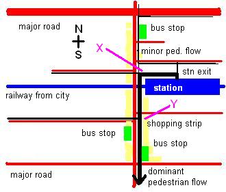
The red lines are the roads, the blue line is the station and the yellow denotes a shopping strip, the most active part of which is south of the railway. The green boxes are bus stops.
Most important are the black lines, which indicate pedestrian flows during the afternoon peak. The thicker the black line, the more popular is the route. As can be seen by the thickness, most people alighting the train walk south, through the most active part of the shopping strip.
That tallys with what one would expect; the area north of the major road is mainly low-density residential with a railway station on another line about 15 minutes walk away. In addition, the road's width and lack of crossing points presents somewhat of a barrier to pedestrians.
The area south of the line has no such constraints. Indeed it has some features conducive to high use of the local station, including a busy shopping strip, high-density housing, high student and rental populations and no other railway lines nearby. So it's no mystery why most users of the station live south rather than north of it.
The streets with the densest housing are up to 15 - 20 minutes walk due south of the station. It would seem logical that some of these people would take a 5 minute bus ride on the way home from the station, wouldn't it? But as noted before, almost no one does.
The map above provides the critical clue why this is so. Note the locations of the two south-bound bus stops. The one nearest the station is to the north. Despite the new route sign, the timetable case remains empty. But since this is away from the dominant southwards pedestrian flow, it would be seen by relatively few people who might wish to use it, so the timetable's omission may be less a sin than originally thought.
The other southbound stop is quite a distance from the railway station, five (maybe ten) minutes walk, near the southern end of the shopping strip. By that time people might have thought that since they're one half to one third the way home, they might as well keep walking and not catch the bus. Since the basic service frequency is 30 minutes, and assuming a random arrival, probability theory is on the side of the walker getting home quicker. And the passenger numbers on the bus are enough to indicate that most people instinctively know that anyway unless they can see a bus coming.
What about my trebling patronage claim - doesn't that sound a bit outlandish? It might, but first I'll tell you about the kind bus driver who did even better, getting a 700% patronage boost.
It was about 6:20pm. A down train had just stopped and dozens of passengers were squeezing their way out of a narrow station exit. As per the map above, most started heading south. A bus with one passenger on board happened to be stopped at the level crossing at point 'X' (see pink line). This was right near where alighting passengers were about to turn, and the driver opened the doors and let them board.
A bus that otherwise would have carried one now carried eight. And before the bus could go, the boomgates lowered again, and most likely more people were able to board. This 700% patronage increase was the product of no planning; all it needed were passengers in the right place, a bus in the right place and, most importantly of all, a nice driver.
Now the particular spot that the bus stopped was ideal for alighting passengers, but due to a side-street, there isn't enough room for a regular stop. However there is room at point 'Y'. This is still quite close to the station, central to the shopping strip and also convenient for city-bound trains. Most importantly it is in the main pedestrian traffic flow, so it will be visible to most people.
The chances are that some passers-by would check the timetable before deciding whether to continue walking or take the bus. This is particularly the case with properly-designed (composite) timetables, so that tired passengers can consult one list, not three. Even if it's fifteen minutes to the next bus, some might elect to do some shopping in the interim. Since they won't be half way home before they get to a bus stop, psychologically they would be more inclined to opt for the bus.
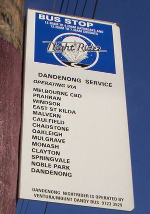
It so happens that point 'Y' is outside a Metcard outlet and already has a seat. As mentioned in a previous post, it would be a fine place for a bus stop. The stop north of the station can then be moved north-east around the corner to the main road, where it could also be used by other services including a SmartBus and a NightRider (which already stops there).
What are the lessons from all this?
* Alighting passengers will not risk walking time to back-track to a bus stop (especially when the walking distance home is less than 2 kilometres and bus times are unknown)
* Alighting passengers will board a bus going their way if it's waiting and outside the station exit
* Alighting passengers are likely to consider boarding a bus (ie checking the timetable) if it is (i) near the station and (ii) on the way home
* Even if the wait for the bus is longer than walking, some passengers may still choose the bus if they can use waiting time to shop
Conclusion: Putting bus stops on major pedestrian desire lines is likely to generate significant increased patronage. At certain times when buses are lightly used (eg peak hour for local trips) increases of several hundred percent are not unreasonable when backed by appropriate service planning and passenger information.
Tuesday, October 10, 2006
The fourth SmartBus service starts next week and timetables are now out.
Route 900 operates from Caulfield to Rowville. It runs roughly parallel to the rail line until Huntingdale, parallels Route 630 to Monash Uni and terminates at Stud Park Shopping Centre via Wellington Road. As well as providing quite frequent 7-day service to a swathe of suburbs east of Springvale that have never before had it, it will reduce the need to go into the city for local trips within Melbourne's east.
Monday to Saturday service spans are similar to trains: 5am to 11:30pm. Sunday service starts about 2 hours later and finishes about 2 hours earlier.
Weekday services are roughly every 15 minutes from approximately 7am to 9pm. However the effects of peak hour traffic can be seen, with longer trips and service intervals creeping up to 20 minutes. At other times, services are a clockface 30 minutes. However, it cannot be said to be a common timetable; Saturday buses depart Rowville at :28 and :58, while Sunday buses depart at :10 and :40. Coincidentally these exact times are also departures from Caulfield, but reversed by day.
Run lengths ranges from 41 minutes late at night, to 50 minutes on weekends to over an hour during peak times. These times are short for any route that goes by Chadstone, and the reason is apparent from the route map; unlike other services, Route 900 serves stops on Princes Hwy and does not pull in. The Chadstone interchanges must cost millions in wasted bus operating hours per year, but given its importance as a trip generator (and annointed 2030 activity centre) it will be interesting to see how long 900 can keep avoiding it.
There is one final question. Is 900 a limited stop service or not? The timtable makes no reference to it, but the 'Leader' newspaper ads do. It will be interesting to find out next week, as there's pros and cons in both approaches.
Monday, October 09, 2006
Sunday, October 08, 2006
See Saturday's Age magazine for the full article and pictures. Or read an excerpt on Vicsig.
The article is a pretty standard example for the journo looking for an easy human interest story.
The recipe is something like this:
* Find an obscure interest that is poorly known outside its adherants. It helps if there's been a movie on it (though I'm surprised 'Malcolm' wasn't brought up).
* Gather a few adherants willing to talk.
* Visit them and get some pictures.
* Write your stuff. Recycle old cliches (again books or movies help). If there's something odd (like a higher propensity for some mental condition amongst enthusiasts), put that in as well.
Having said that, I didn't mind the article. I saw no glaring factual errors. Some gunzels said that parts conveyed a poor impression, and that might be correct. However a dispassionate reporting style can easily be viewed as hostile by those with the special interest. So it's very hard to write any article about a minority group without making participants appear a bit strange.
Whether you're a gunzel, amateur radio operator, timetable analyst or real estate investor (which are all minority pursuits) and someone from the popular media writes about it, they often don't quite 'get it' in the eyes of those involved.
This is probably inevitable given the generalist scope of journalists. Another thing is that many journalists have arts or humanities backgrounds. So anything that smacks of being technical is considered obscure, eccentric or 'abnormal'.
Social change shapes how topics are treated in the media. Australia is now largely a de-industrialised consumer society with most jobs in the service sector. Anything vaguely related to science, mathematics, heavy industry or 'making things' is now considered passe. Whereas 30 to 40 years ago it would have been mainstream and lauded as contributing to a high-technology future. Where are Telstra's Research Labs now?
Despite the percentage of people with higher education qualifications being the highest it has ever been, in some ways society is still quite philistine. Knowledge and intellectual rigour is held in low esteem (possibly by the jealous who lack it) and even linked to mental defects in some circles.
In the current environment, someone who can recite details for every bus route in Melbourne is more likely to be regarded as 'slightly odd' than valued for their interest and knowledge in modern Australia. This malaise could possibly explain why organisations such as Metlink have such difficulties with quality control.
Though the rant above has strayed off topic, I hope it has provided a few reasons why gunzels are, like other minority groups, portrayed as 'eccentrics' or 'misfits', and that social and economic change has made this more rather than less so.
Thursday, September 28, 2006
Recent frequent trips through Parliament station (which also explains the lack of posts) have had me compare the speeds of the various escalators. In particular, the ones between platforms 1 & 2 up to the barriers.
To do the experiment, you stand on the escalator (left hand side please!) level with another standee on the next escalator. Hoping that the other person has remained on the same step you compare whether they're in front or behind when you're near the top.
Having done this during the am peak for three consecutive days this week, I can confirm that the up escalator nearest Platform 2 is the fastest. It has consistently beaten the two escalators towards Platform 1 (the fourth nearest Platform 1 was going down).
What was interesting was the variability in the speed difference. On Monday and Wednesday the difference was greatest, with the escalator nearest platform 2 about 3 metres in front by the time it reached the top. In contrast, Tuesday was more even, with the difference being about 1 metre.
Research is continuing. But in the meantime, if you want a fast ride to the top, then it's the escalator nearest platform 2 that will do the job.
UPDATE 29 September: The last two days have seen escalators operate in different directions. My favourite was going down, so people going out had to use the three on the right. Of these the one nearest platform 1 was much faster than inner (platform 2 side). Inner escalator, platform 1 side was the slowest.
UPDATE 3 October: Escalators switched back to old pattern. Up nearest Platform 2 is once again the fastest.
Wednesday, September 20, 2006
I think I like it. But to be sure, I'll need to upgrade from a 15" screen and/or adjust some settings, as the bottom scrollbar is getting too much work for my liking.
It's good to see they've simplified the previously cluttered left-hand directory. Though everything has a trade-off, and in this case it's that we'll be clicking through more levels to find stuff. For instance where do you go if you're daunted by the whole thing and just want a basic overview of the system?
I didn't find it at first, but eventually found something under timetables. Whereas on my site it's easy - just see the heading at the bottom of the screen and scroll down.
However there are also commonalities as well as differences. For instance both sites now have glossaries, and the similarities between them appear more than mere coincidence.
Integrating fares & ticketing into the mainstream site is good. This reverses the previous approach of having a seperate Metcard site. This was a hangover from the Metcard ideology, which emphasised, seperation, outsourcing, and the avoidance of responsibility to the detriment of everyone.
The 'My Way' feature is the major technological advance of the new site. Rather than 'one size fits all' users can select and filter information they receive for the services they use. Could this be a start towards other user-specific information, eg service disruption information, preferably provided in as close to real time as possible?
Parts are still rough or missing but the new site only came online today, so no doubt these will be fixed. But, as remarked at the beginning, the end result should be an improvement.
Monday, September 04, 2006
New metropolitan train timetables start today
Connex adds 6 weekday services on the Broadmeadows, Sydenham and Werribee lines.
Note: Item written retrospectively for posterity.
Tuesday, August 29, 2006
I briefly mentioned that the draft was available for comment a few days ago. Any doubt as to their importance was scotched yesterday afternoon when I rode bus Route 840. This route goes from Berwick to Berwick via half the known universe and takes an hour to do so.
On leaving Berwick Station I passed underdeveloped land near the station, brand new new housing estates, a few large shopping centres, some slightly older housing estates and vacant land.
There were a few swings and bumps (due to roundabouts) and circuitous running due to poor street layouts. Many school children were dropped off but few passengers were picked up. Even if the buses were more frequent (current off-peak service is hourly) travel would still have been indirect and excruciatingly slow.
Suburbs like Berwick and Narre Warren are why the guidelines are needed. They are full of neat houses, nice parks, views and even the odd lake. However traffic on surrounding roads is terrible and public transport even worse. With the way these subdivisions have been planned, with circuitous internal streets unsuited to direct bus routes, fences backing onto main roads creating poor passive surveillance for cyclists, and pedestrians considered second class it is hard to see how non-car transport modes can be effective and efficient, either now or in the future.
I hope these Guidelines will help the planning of future suburbs. Note that they're still in draft form and submissions close next Monday, so read it and put one in. I thought that there is more to it than just bus stops and roundabouts, and give a list of pointers in my submission (pdf 120k).
Russ over on Civil Pandemonium also has a few words to say.
To conclude, it's one thing for there to be a bus in a street near you. It's quite another for it to provide efficient and effective transport that people other than schoolkids and oldies will want to use. Planning suburbs for a choice of effective transport modes is the first step to attracting people to public transport. It's not the be all and all (factors such as service planning and integration are also crucial) but if done properly it would give new suburbs a good start that places such as Narre Warren and Berwick have been denied.
Sunday, August 27, 2006
The Public Transport Procurement Legislation Review Consultation prepared for Auckland (pdf 1.8MB) has some interesting comparisons between bus service levels, their change over time and patronage growth across major Australian and New Zealand cities.
The statistics (verifiable by consulting their timetables) show that Christchurch now has higher average bus service levels than just any other city in Australia or New Zealand. A concerted effort to redesign the nework and boost services was rewarded by higher patronage, with a growth of about 43% since 1990 (all of which occurred since 1999).
Of the Australian cities, Brisbane and Perth did best with increases of 35% and 14% respectively. The newly-integrated Translink fare system, high-quality BUZ services and better service co-ordination all contributed to Brisbane's performance.
Melbourne buses scored at or near the bottom on many measures, with a patronage growth of just 0.3% since 1990. Admittedly these stats exclude our large and popular tram system, which most of the other cities lack. However this also means that our buses disproportionately serve outer suburban growth areas, which should attract greater use through faster population growth. However you look at it, the statistics present solid evidence that there is room for Melbourne buses to do much better.
Thursday, August 24, 2006
Carlo Carli MP on community transport.
Audit Victoria on regional fast rail.
DOI wants submissions on public transport guidelines for land use development.
Wednesday, August 23, 2006
In Victoria it's raining new timetables. It will only get heavier, with many of the new services coming into effect in the next month or two.
First off we had the proposed regional rail timetables, incorporating substantial service increases on most lines.
Next to be released were details of revised train timetables, with changes in either September and October. These changes will see extra peak services on some of the faster growing lines plus late-night Friday and Sturday services.
Buses within and between regional cities will also see service increases. The area around Geelong is a particular (and much-deserved) winner.
Finally there are the metro bus timetables. Changes to these will mainly include extended weekday and new weekend services especially for Sundays. There will also be the Wellington Rd SmartBus.
Timetable enthusiasts are having a field day as details emerge. It is hoped that the travelling public will also benefit and that the quality of the additions (as regards connections, routes, etc) is equal to their quantity.
Saturday, August 12, 2006


Friday, August 11, 2006
Source: MTA/PTC Annual Reports
Rpt Yr | % OT(i) | % OT(ii) | % Canc(iii) | % Canc (iv)
1983 ------ 93 ---------- ? ----------- ? ------------ ?
1984
1985-6 --- 87.8 ------ 84.1 -------- 3.7 -------- 6.0
1987 ------ 92 -------- 86 ---------- 2.8 -------- 3.8
1988 ----- 92.1 ------ 90.2 --------- 2.5 -------- 4.1
1989 ----- 92.1 ------ 86.4 --------- 2.4 -------- 5.2
1990 ----- 88.3 ------ 85.2 --------- 6.3 -------- 7.6
1991
1992
1993
1994 ----- 92.3 -------- ? ---------- 0.3 --------- ?
1995 ----- 92.3 ------ 86.7 --------- 0.5 --------- ?
1996 ----- 93.3 ------ 89.5 --------- 0.5 --------- ?
1997 ----- 94.8 ------ 92.4 --------- 0.9 --------- ?
1998 ----- 93.7 ------ 90.8 --------- 1.4 --------- ?
(i) Percent of trains on time to five minutes (all day)
(ii)Percent of trains on time to five minutes (peak periods)
(iii) Percent of trains cancelled (all day)
(iv) Percent of trains cancelled (peak periods)
General trends
- The long-term average for on-time running is around 93% with few variations.
- Cancellations and service disruptions declined during the late 1980s
but increased greatly around 1990.
- There were unusually low cancellation rates in the 1994 - 1996 period. Subsequent years showed increases, but they remained below their late 1980s levels.
- Current stats are here. These indicate on-time is running at the long-term average and retention of the early 1990s gains in service reliability.
Wednesday, August 09, 2006
1. Is this bus service for dwarves, drunks or gutter dwellers?
2. The correct answer is no-one; the route was discontinued several months before the photo was taken.

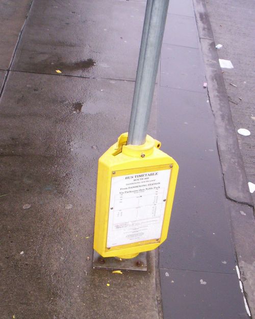
3. A fine example of initiative.
Since replaced by a shiny new (but empty) Metlink timetable case.
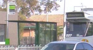
4. What do you do if you need a bus to somewhere other than Chadstone?...

... You look around for some daggy but informative Met signs!
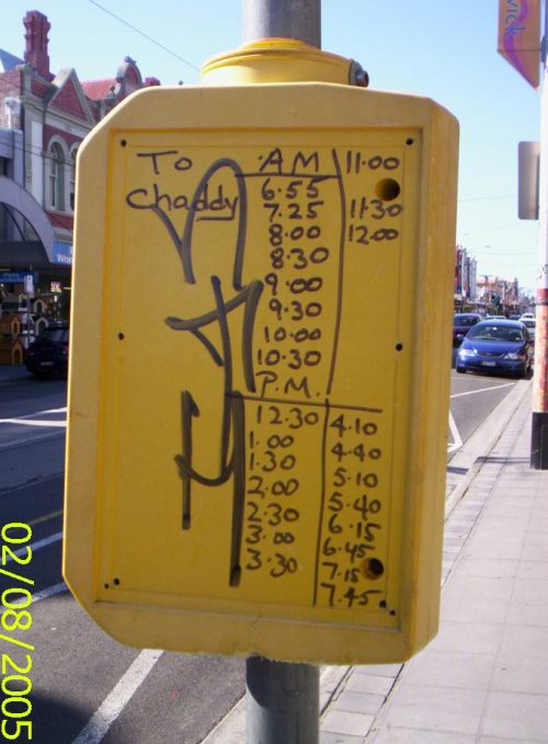
5. Improvements on the way. A new SmartBus passenger information module.

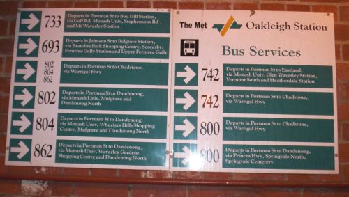
6. How it was done in the old days. An outstanding example of MMTB tram passenger information.
7. The way of the future? 'Best practice' passenger information is network or destination-specific. This compares to current Metlink practice, which is still too operator or route specific. This keeps passengers unaware of high-quality service combinations and results in lower patronage for a given service level.
 example only
Tuesday, August 08, 2006
Real estate ads sometimes boast that properties are 'walking distance to Zone One station'. Even though houses as far out as Laverton (22km from CBD) qualify, the implication is that this is desirable due to short travel times, low commuting costs and (perhaps) better service levels.
Balanced against this is the higher property prices in Zone One. If anything the price disparity between inner and outer suburban properties has increased over the last 30 years, with the former generally exhibiting the highest capital growth.
The costs of yearly full fare tickets are as follows:
Zone 1 $1058 ($88 per month)
Zone 1+2 $1633 ($136 per month)
Zone 1+2+3 $1999 ($167 per month)
Zone 2 or 3 $709 ($59 per month)
Zone 2+3 $1434 ($120 per month)
Source: Metlink Fares & Travel Guide 2006
The difference between Zones 1 and 1+2 is just under $600 per person per annum. For most concession fare passengers it's a little over $300. The difference when moving from Zone 2 to Zone 3 is less, especially for concession passengers.
There are a couple of instances where fares are lower in the outer zones. The most important is for local travel, since Zone 2 or Zone 3 only tickets are cheaper than Zone 1 only travel. Fares are similarly reduced for school children living in Zone 2 or 3 rather than Zone 1.
However because public transport's modal share is highest for CBD and near CBD jobs, I will assume that people are commuting to work in Zone 1 and, as a result, will need to pay more if they live in Zones 2 or 3.
The next part of this exercise will try to convert fare differences into capital.
For a working couple the annual difference between Zone 1 and 2 will be $1200. $1200 extra will pay 8% interest on $15 000 of borrowed capital. If the couple have sufficient deposit this means that they can afford a home that's $18 750 dearer, assuming a conservative 80% loan to valuation ratio.
There are cases where houses in Zone 1 sell for less than what most people pay for a house in Zone 3. However this is generally confined to a handful of western suburbs. It is more common for homes in Zone 1 to be $100 000 to $200 000 dearer than homes in zones 2 or 3 and the published statistics reflect this.
This means that differences in transport fares across the zones are too small to offer little benefit to the inner-suburban home buyer because of high home prices. However this small difference also means that the public transport component of the extra transport costs involved in outer suburban living is small compared to the vastly lower house prices.
The only way that reducing transport costs can have a bigger impact are if households can reduce the number of cars owned and (especially) financed. This is more practical in Zone 1 suburbs which generally enjoy better public transport services and more closely spaced amenities within walking distance. Conversely if people moving to outer suburbs are forced to buy more cars and drive more then the increase in the 'private motoring' component of transport costs far outstrips the increase in the 'public transport fares' component.
Another way to make Zone 1 suburbs more financially attractive is to substitute unrealised future capital gains on real estate for higher mortgage payments being made today. Any number of property 'gurus' will tell you that suburbs within 10-15 kilometres of the CBD have superior capital growth histories than areas further out. A bit of guessing and fiddling can make the projected equity growth look impressive, but many would prefer extra money in the hand today!
For renters the fare difference works out to be $12 per week. This doesn't sound much, but I still maintain it is relatively more important for renters rather than buyers. This is for the following reasons:
One is that rental yields tend to be low in prime Zone 1 suburbs and highest in low socio-economic outer suburbs. Thus compared to home prices, there is less variation between rents across the metropolitan area.
Related to the above is that when property yields are lower than interest rates (as is the case currently) renting is far cheaper than buying. Also renters tend to have a lower income profile and a smaller average household size than owners. Hence a $1200 annual saving is more significant relative to both incomes and housing costs.
Another factor is housing diversity; the inner suburbs have low-rent studio and one bedroom apartments rare in outer areas. Many renters are willing to sacrifice space for convenience and low transport costs.
Considering all these factors, the situation is less clear for renters than home buyers. Especially for renters in smaller households, zones make a difference and influence location decisions. For buyers differences in fares are small compared to mortgage payments so they cannot be that significant except for those near zone edges.
Private transport costs, such as needing to buy, finance and run additional vehicles are likely to have a far greater impact on households. Car financing is a particular wealth hazard, especially given high interest rates, running costs and a depreciating asset. If this can be avoided by buying a more expensive but better located home then paying the difference could be worthwhile even for buyers (especially if buying a unit).
However once the high financial opportunity costs of additional cars are accepted (and there may be little choice in areas with limited public transport), then the marginal costs of driving aren't so bad, especially for families. Where useful services exist, the pricing of fares versus the marginal cost of driving is an important marketing point and a discussion for another day.
Saturday, August 05, 2006
It's a decision nearly every passenger who doesn't live next to a railway station has to face; is it quicker to walk home or wait for the bus?
The calculation is particularly important for Melbourne because though a minority of people live within 1km of a railway station, most of the rest live within 5km of one. To a large extent patronage growth depends on the abilty to attract new passengers from this 1 to 5 km belt.
There will be a distance below which walking is always quicker and is the preferred access mode. Planners call this the primary pedshed. This will be within about 400 metres of stops or station entrances. Walking is usually also fastest within a secondary pedshed, or up to about 800 metres from entrances.
At very long distances (eg 10km) the bus will always be quicker, even if the passenger has just missed one and needs to wait for the next one.
As explained before, it is the in between distances that are most crucial to patronage growth. The answers here are not clear cut, as it is not possible to determine which is faster without consulting timetables and making some estimates.
I will call the distance above which the bus is faster than walking the critical distance. This will vary according to factors like travel speed, distance, and for the bus, waiting times. The latter is set by service frequency or co-ordination and any late running caused by other traffic.
Let us assume a walking speed of 5km/h. For simplicity, we'll assume that the bus' speed is infinite. This will skew the numbers towards the bus, but only reinforces the main point that on local routes speed is worthless without frequency.
The following table shows how the critical distance is inversely proportional to service frequency, but can be made a small and constant amount with timed transfers.
Wm | Wavg | Dcrit (Wm) | Dcrit (Wavg) | Dcrit (Wco)
120 min ----- 60 min ----- 10 km ----- 5 km ----- 0.83 km
60 min ----- 30 min ----- 5 km ----- 2.5 km ----- 0.83 km
40 min ----- 20 min ----- 3.3 km ----- 1.66 km ----- 0.83 km
30 min ----- 15 min ----- 2.5 km ----- 1.25 km ----- 0.83 km
20 min ----- 10 min ----- 1.66 km ----- 0.83 km ----- 0.83 km
15 min ----- 7.5 min ----- 1.25 km ----- 0.62 km ----- 0.83 km
10 min ----- 5 min ----- 0.83 km ----- 0.42 km ----- n/a
Wm = max wait (service frequency)
Wavg = average wait (assuming random arrival)
Dcrit (Wm) = maximum critical distance
Dcrit (Wavg) = average critical distance
Dcrit (Wco) = critical distance co-ordinated services (10 min wait)
What does the table mean? If the bus runs every hour and one has just been missed, then walking is faster than waiting in all areas up to 5km from the station. This is the 'worst case' example; a critical distance of 2.5 kilometres (assuming a random arrival at the bus stop) is more representative where services are unco-ordinated (as in Melbourne).
This gap between the station's pedshed (800 metres) and the critical distance (in this case 2500 metres) represents those areas that could potentially benefit from the train, but cannot since feeder buses are ineffective and the station is beyond walking distance*. The bigger the gap, the more people miss out, and the smaller the gap the greater the station's catchment area and thus potential patronage.
Ideally the critical distance should equal the pedshed so that there is no gap at all. With an 800 metre pedshed, this situation is reached when service frequency is every 10 minutes. Assuming the worst case (bus just misses the train) the maximum wait is the same as the pedshed distance and the average is much less.
Where a 10 minute frequency cannot be achieved, the critical distance can still be lowered greatly by harmonising headways and carefully co-ordinating timetables. In this way every second train will have a good connection with the bus so people can plan a shorter journey time if they so wish. Even with a generous 10 minute connection time the difference between the pedshed and the critical distance reduces to insignificant proportions.
Hence a transfer time of 10 minutes is probably acceptable though not seamless. With improved pedestrian access to bus stops and stricter timed transfer arrangements (eg 4-5 minute connections) the critical distance could be lowered to 400 or even 300 metres. Such a reduction would most benefit activity centres that are slightly away from the railway station but becomes less important for low-density residential areas.
What conclusions can be drawn? The first is that there are currently large gaps between station pedsheds and critical distances. This creates large 'donuts' immediately outside station pedsheds where both walking and bus access to the station can be considered poor (especially when compared to driving).
Secondly, these poorly served donuts contain huge populations. If 20% of people live within station pedsheds, assuming 20 to 30% more (ie 600,000 to 900,000 people) just outside is not unreasonable.
As a result a strategy to fix transport beyond the pedshed by introducing Perth-style bus-train route and service co-ordination is likely to boost patronage, achieve modal share goals and improve utilisation of a largely empty bus fleet.
(*) It should not be overlooked that there is also such thing as a 'bikeshed', with a distance of around 2000 metres. Bike + train is almost certainly faster than bus + train without service co-ordination. However due to crowding, it is unwise to encourage bicycles on 'normal flow' peak hour trains. The alternative of using bicycle lockers at stations helps some, but if the destination is beyond the station's pedshed then the lack of a bike reduces ease of access. This gets back to improving bus access as described above.
Wednesday, August 02, 2006
Substantial service increases on RFR lines plus Seymour:
Sure the express trains aren't quite as fast as originally promised, but this is more than outweighed by the greater number of services. To misquote Paul Keating, 'These are the timetables that bring home the bacon'.
Sunday, July 23, 2006
A set of guidelines (pdf 114k) for intending commercial sponsors provides an interesting insight into how Metlink, Melbourne's public transport marketing body, sees the world.
In brief, Metlink divides society into those who are 'car only' and those receptive to using public transport. This second group is divided into those who choose to use public transport and those who use it for lack of other choices.
This is pretty standard stuff. It identifies extremes of people who (i) will always drive no matter how good public transport is and, (ii) captive riders who will always take public transport no matter how bad it is. The critical middle are the 'pragmatists' or 'choice passengers' who can be wooed either way.
However the guidelines also contain some assertions that I think are shaky. There is also no mention of other factors at least as important as the coarse age/sex demographic groups used.
For example, 'pragmatists' (which must be a key target group for any marketing) are described as being in the lower income range. Unlike 'car worlders' they are not described as having higher than average educational attainment.
No one disagrees that 'captive passengers' are likely to be low income. For these people public transport's social role is critical.
However I do not think that the explicit income or implicit education generalisations about 'pragmatists' hold much water. Disturbingly this positions public transport as a a residual service for low income earners with limited appeal for others.
I would encourage anyone interested in the topic to get an ABS Social Atlas and look at the following three maps: (i) Percentage of people with degrees, (ii) Higher income households, and (iii) proportion of people who commute by public transport. Train and tram network maps will also be helpful.
What do these maps show? Most striking is that there is a fair degree of overlap between education, income, transport services and patronage. People with high formal education live in much the same suburbs as the high income people, ie within 15km of the CBD.
Given high (and increasing) average incomes of inner-suburbia residents can't all be 'hostages'. Given their public transport usage habits they can't be 'car worlders' either. Therefore, they must be 'pragmatists', willing to use it when it suits their needs. And because there are more services in inner suburbs than outer suburbs, this is the case for a greater percentage of trips. Which is reflected in the modal share statistics. Thus there are heaps of 'pragmatists' that are likely to be neither lowly educated or low income.
Now onto other important factors.
One has got to be family structure. The economics of car ownership are worst for single people and best for families. A family can be driven for the same cost as one person, whereas public transport fares are largely 'per capita'. Then there's the practicalities, including strict time deadlines or carrying equipment. In contrast the single person for whom car costs are a larger proportion of income may find public transport more attractive. The concentration of single people in inner suburbs and families in outer suburbs only reinforces this due to better transport nearer the city.
Another is geography. I have already discussed the inner suburbs. Outer suburbs in Melbourne comprise a mixture of the following (i) old rail-based hubs with large populations of low socio-economic 'transport hostages' in suburbs up to 3-4 km away (eg Werribee, St Albans, Broadmeadows, Noble Park, Dandenong and Frankston), and (ii) Newer car-based suburbs with no rail and only a limited bus service. These areas have low rates of transit usage, have many people with trades qualifications and higher average incomes than the first group. Examples include Knox and newer parts of Frankston. Though not strictly outer, the City of Manningham is also car-dominated. Manningham excepted, these suburbs are neither highly degreed or earn the top incomes. If all these areas comprise a large number of 'car-worlders' then factors other than income or education must be more significant.
What are my conclusions?
The first is that Australians tend to be pragmatic by nature. Where public transport is good (inner suburbs) they will use it. Where public transport is poor (outer suburbs) they won't. Our pragmatism is good news since it reveals potential for patronage growth if choices are broadened.
Secondly, 'pragmatism' is distributed across all income and education groups and there are no grounds for it to be regarded as a lower income trait. Doing so is selling public transport short. However I would link pragmatism with intelligence!
Thirdly, classifying people by age, sex and income, though old staples of market research, may give inadequate results compared to geographic and household living patterns which may have a greater bearing on transport use.
Friday, July 21, 2006
Since the Kennett Liberal and Bracks Labor governments have been of roughly equal durations, enough time has elapsed to compare the different philosophies between them when it comes to public transport service increases.
Although people often claim that 'both parties are the same', this is not correct when it comes to public transport services, at least in Melbourne. As will be explained below, the differing emphases between the parties is stark.
Liberal
The previous post cited the Liberals' strengthening of the core train and tram network through off-peak service increases. In true Kennett style it was big and bold. It also changed minds and behaviour.
The mindset change was the way people viewed public transport; from being merely a weekday commuter service into something that could be used seven days a week and around the clock (with Nightrider buses).
The economics of off-peak service improvements are especially good with rail modes given their huge fixed costs. Why have a good service just 4 hours of the day (peak periods only) when for very little more you can have it for 18 hours a day? And there wasn't any doubt that patronage wouldn't increase since train and tram routes were already established corridors with known demand.
In contrsat, buses were largely neglected during the Kennett era except as things to be privatised or as substitutes for closed down country rail lines. However credit should be given for hatching the 'Smartbus' idea, ie frequent direct buses between major trip generators and transport interchanges.
Labor
Messrs Bracks and Batchelor have taken quite different approaches to service increases.
Part of this is regional versus city; the current government is very keen to avoid being seen as 'Melbourne-centric' and is upgrading country rail and regional city bus networks.
Leaving this aside, what is most interesting is the approach to planning Melbourne services. In the last seven years we saw none of the uniform network-wide train and tram upgrades obtained under Kennett. Instead most service upgrades have been confined to the odd extra peak train, or buses; either Smartbus or minor local routes. The latter have generally seen an extra service or two added. Hence their average finishing time is now a little after 7pm weekdays instead of a little before. Also the proportion of routes with Sunday service is now nearer to 30 percent than 20 percent, although their frequencies typically remain in the 60 to 90 minute range.
The recent 'Meeting Our Transport Challenges' document proposes more of the same but bigger. Sunday service will become the norm rather than the exception. The 7pm average finish could extend to 9pm or later. However services will be stretched thinly; as discussed in an earlier post about service capabilities, the capability of hourly services is low. Hence buses will remain chiefly a 'charity' service for those without other transport.
Overall
Jeff Kennett's extra services only helped the minority of the population within walking distance of the train and tram networks. However they strengthened the role of the dominant two PT modes in Melbourne. The increased service frequency made PT practical for many more trips and improved its position relative to the private car; an important consideration in gentrifying inner suburbs.
The economics are good as well, and it is not only due to high fixed costs of rail. Attracting choice passengers should cause average revenue per passenger to rise even more than patronage, with an increased percentage of full fare payers. This is because upgraded service levels (20 and particularly 15 minutes) have the potential to be considered by car drivers as an alternative. Lower service frequencies do not have this same patronage, revenue or modal share potential, and relegate public transport as a 'mode of last resort' for those with no alternative.
Assuming it meets its MOTC promises, Labor has concentrated on providing everyone (especially the 60% beyond train and tram networks) some sort of service seven days a week. However the hourly service levels are unlikely to be frequent enough to entice 'choice travellers' to switch. Patronage on these extra services will thus be confined to 'captive passengers' paying concession fares. As such they will play a useful social role, though local routes running every 30 to 60 minutes until 9pm still isn't the stuff that that 20% modal shares are made of (as Adelaide demonstrates).
I agree with Melbourne 2030 in that achieving mode share increase is critical. The current approach of adding many routes with infrequent service, though socially necessary, won't get us there by itself. Instead it is a recipe for an incomplete network, poor revenue, limited patronage growth and stagnant modal share.
Both Liberal and Labor have tried approaches that we can learn from. A mix of the two is probably optimum. Additional train and tram service improvements plus a network of connecting primary bus routes operating at train service frequencies have better modal share, patronage and financial prospects, while having the additional advantage of extending high-capability service to disadvantaged suburbs.
Friday, July 14, 2006
July 4, 2006 marked the seventh anniversary of large Sunday service increases across Melbourne's train and tram networks. The boost removed the need for passengers to meticulously plan their trips and slashed waiting times across the network.
Though timetable and service improvements such as this are often overshadowed by other things their importance cannot be over-stressed. The Sunday increase occurred a few years after off-peak weekday train services in the eastern and southern suburbs went from 20 to 15 minute headways. Both increases, which occurred under the Kennett government, did more than anything else to make public transport more practical for the complex travel needs of a seven-day city.
Friday, July 07, 2006
the three Cs of successful public transport
Capability
Key is an ability to go anywhere anytime.
'Anywhere' requires good network coverage, a sensible route structure and easy interchange between services.
'Network coverage' comes down to service being available within reasonable walking distance of home, work, shops and recreation.
A sensible route structure involves direct and easy to understand routes that link major trip generators and transport interchanges with each other and surrounding residential areas.
Easy interchange between services require the following:
- No financial penalties: integrated and multimodal fares
- Co-ordinated timetables: for reliable transfers and minimal waiting
- Easy physical access: a short, safe and direct walk from station to bus stop, preferably unimpeded by car traffic
'Anytime' implies consistently wide operating hours combined with adequate service frequencies. The travel capability required should be reflected in the service frequency provided (as per the previous post). Where services are less frequent than ten or fifteen minutes, a network-wide headway hierachy should be adopted to assure consistent connections.
Choice
Choice is obtained by satisfying capability. This is because a high-capability public transport system satisfies a large number of travel requirements. This enhanced flexibility expands choice; many will no longer reflexively reach for the car keys as if this was the only option.
To further increase the number of choice passengers, the service needs to be grown to make it even more convenient and thus car-competitive (two more Cs!). Since total travel time is a major influence of choice, methods such as smart scheduling, frequency upgrades, interchange redesign, bus/tram priority, and express running are all important.
Capacity
Having provided a high-capability network that many people use by choice, the final problem is meeting this demand through providing sufficient capacity.
In some ways this is a nice problem to have, since it is the opposite of the spiral of declining patronage/declining revenue/declining service/declining patronage that many transit systems saw during 1950/60s.
Depending on infrastructure utilisation, substantial capacity upgrades are not always cheap. However the public transport planner can take some comfort that they are cheaper than freeway projects with equivalent or smaller people throughputs.
Enhancing capability and thus broadening choice should be key themes for public transport advocates. For their part, planning agencies should evaluate the merits of proposed projects on the basis of the capability benefits that they bring.
Thursday, June 29, 2006
Along with routes and operating hours, service frequency is a major determinant of its attractiveness to passengers and its suitability for various trips. The following is an attempt to assign capability to specific service frequencies that may be found on a network.
5 min: turn up and go providing instant service just like turning on a tap. Go anywhere any time with no timetables needed. It's stress free (not worth running if you see a service arriving) and connections are always fast. Shelters, seats and other facilities become less important. Operationally, maintaining even headways is more important than time adherance. Very high potential to attract people out of their cars.
10 min: Turn up and go, go anywhere any time, timetables less important. Main passenger information item is a network map. Extremely suitable for peak period travel. Car-competitive and good potential for modal shift.
15 min: Sort of turn up & go. Clockface. Requires no prior planning and allows spontaneous changes of plan. Transfers are timed but no big deal if connections are missed. Little need to live life around timetables. Suitable for work trips, leisure trips and short errands. An acceptable minimum standard for complex capital-intensive urban rail systems with many lines and transfer combinations. People cannot plausibly claim a 'lack of service' as a reason for non-use. Semi-car competitive - car travel is no more than twice as fast and can be slower.
30 min: Clockface. Requires some prior planning. Transfers are timed. Missed connections a worry when transferring. Waiting becomes a large component of trip time and car travel is 2-3 times quicker. 'Lack of service time wishes to travel' may be valid. However, provided connections aren't required or are seamless, suitable for leisure trips with flexible finish times. Can also work for medium-long length shopping trips (>30 min). Limited potential for mode shift from car owners.
60 min: Clockface. Transfers must be timed. Inflexible. Does not allow spontaneous changes of plan. Timetables far more important than network maps. Can work with long shopping trips or if impeccably planned. If not planned, waiting forms majority of trip time and car travel is 3-10 times quicker. Use on an electrified suburban system may represent poor utilisation of sunk capital and infrastructure. 'Lack of service at time one wishes to travel' a valid argument. Negligible potential for mode shift from car owners.
120 min: Require extensive planning of forward and return trips before trip is started, and thus reference to paper or online timetables. Transfers must be timed. Extremely inflexible - must plan life around timetables and can do little else during day. Lack of service excuse almost always valid. Not used by car owners except in emergencies.
2-3 services per day: May be adequate for low-density rural areas, but represents a 'charity' service inappropriate for suburban areas. Fulfills a welfare role for people without cars. Transfers are limited and often fortuitous. Extremely inflexible.
I should add that the above times apply for routine trips within an urban area. I'd expect similar principles to apply for other types of travel. However in all cases the proportional travel time advantages of increasing frequency fall once in-vehicle journey time exceeds several times the service frequency.
Monday, June 26, 2006
Thursday, June 22, 2006
A quick summary - for more see MOTC document.
Held last night. About 70 present. Transport described 'in good shape'. MOTC described as 'Not exhaustive but comprehensive'. 20%/2020 target not mentioned in speech or MOTC but minister verbally confirmed aim. Rail capacity issues urgent: new tracks, signalling, Metrol, communication, etc. Debate in 15 years time (2021) will be about new lines and service frequency. But some extra services sooner (peak, shoulder peak and late night). More local & SmartBuses. Continue 'Think Tram'. Money for accessibility. Fund for better use of transport infrastructure in rural areas (eg school buses). 90% modal share is roads so must support these too. Some new cycleways. Little mention of improved pedestrian access.
Sunday, June 18, 2006
Dear XXXXX,This letter raises several issues that demonstrate that Melbourne is a first-world city with third-world buses. The main difference is that in third world countries people have no alternative to use the bus so they're packed, whereas in Melbourne most people have alternatives so buses run empty. Especially if drivers don't stop!On Saturday 17/6 I attempted to catch Route 479 from Flinders St/Olivers Lane at 1:15pm. This is an unmarked stop, but I had previously been made aware of its location. I arrived at the stop at 1:00pm, so made ample allowance for any early running.
The bus arrived on time but sped past the stop, picking no one up. This is despite being hailed by myself and others waiting. When the bus turned the corner into Exhibition St and was waiting at lights he was again alerted, but refused to open the doors.
Since both Metlink and your own website confirm that these are revenue services, I am puzzled that this lapse could have happened.
This delayed me by over an hour, but eventually I got there via train and a change at Moonee Ponds. Thus I could only spend 30 minutes at Sunbury instead of the planned 1 1/2 hours.
I count myself lucky compared to others. The City to Airport section of Route 479 features in Metlink's online journey planner and in Monash University's MSA Airport Travel pamphlet. I shudder to think of the number of people who have naively relied on your 'service' and been left stranded in a strange city as a result.
Therefore I seek your assurance that (i) the driver concerned has been appropriately disciplined and (ii) all other drivers have been reminded that they must operate their full route as per the published timetable and pick up passengers accordingly.
I look forward to hearing from you soon.
Kind regards, etc
Issues with the 479 are as follows:
1. That there are unmarked bus stops with not even a bus stop sign (479 stop in the city on Flinders St between Russell St & Olivers Lane).
2. Where there are stops timetables are missing (479 stop in the city)
3. Where there are timetables route signs are missing (479 bay at Sunbury interchange)
4. Timetables are old and covered in graffiti (479 at Sunbury Interchange)
5. Numerous variations to routes (on some 479 runs passengers must request certain deviations, but only at certain times)
6. Very poor service frequency (479 departs the city just twice a week)
7. Wasteful duplication with other services (there is little justification for 479 to serve the city at all given trains and trams to locations such as Essendon and Moonee Ponds). (But if it does, then stops should be marked and drivers stop.)
8. Picking up passengers requires stopping the bus and delivering timetabled services in full and you can't have that!
Note that even if the driver did stop and the letter above wasn't written, 7 of the 8 points above would still be valid. Admittedly the 479 is an extreme example of a route badly planned, run and signposted, but many of the above points apply to other routes, only to a lesser extent. In such cases waste and intertia combine to deliver an inferior service to the public and poor value to taxpayers.
UPDATE 22/6/06: Nice reply received today. Amongst other things it mentioned that the driver concerned was new and this was his first run (though I'd have though other drivers would have taken him on 'route familiarisation' runs first).
Friday, June 16, 2006
Noted economist Fred Argy is advocating the need for social investment to foster social mobility. His excellent paper, called Equality of Opportunity in Australia has listed public transport as one of the areas that needs investment for a more mobile society free of entrenched poverty.
Thursday, June 15, 2006
Hear Victorian Transport Minister Peter Batchelor speak about government public transport policies at the Fabian Society. Date is Wednesday 21 June, 2006. 6pm @ Trades Hall (Lygon & Victoria St, City). $8 admission.
Be there!
Tuesday, June 13, 2006
You build a new one, conveniently located in the middle of town! It hardly cost anything either since it was built with volunteer labour. Having visited it, I can vouch that the new station does the job better than the town-edge brick 'toilet block' it replaced.
Is it better for a city's rail network to have 300km of track and services every 30 minutes, or only 100km of track but trains every few minutes?
Adelaide and Brisbane are examples of the former, whereas Toronto exemplifies the latter. It is desirable to have an extensive rail network. However it is also helpful to have an intensive service so that people can turn up and know that there'll be a train in a few minutes. The latter often gets lost, since timetables and service planning are seen to be less exciting than hardware such as new stations, new trains and new lines.
An interesting discussion that touches on these matters as they relate to Melbourne recently appeared on the Railpage. Particularly relevant are the posts from 'penov' (on the suburban network) and 'DMU Dave' who cites a 'Railway Digest' article by Albert Isaacs on the country network.
Melbourne's population has grown and spread over time but there has been relatively little change to the extent of the suburban rail network since the 1930s, something that was pointed out in a recent 'Age' opinion piece.
As the article states, some lines have closed, eg Healesville, Mornington, East Kew, etc. However while it covers network extent, it neglects mention of service intensity across the network. It is this service level that is the main determinant of whether a rail service should be regarded as rural or urban in character.
Hence it would be interesting to repeat the exercise, but this time defining the urban rail network as the area having an off-peak service headway of 20 minutes or better. If this is followed, it turns out that Mornington and Healesville never had a suburban level service, so should not be included, even when they ran. Ditto for Dandenong, which according to penov's post, only ran every hour. In contrast established inner areas such as Williamstown, Brighton and Essendon had a more intensive service in the 1930s than they do now. The only reason why this wasn't also true for Glenhuntly also was the off-peak service increase on the Caulfield group in the 1990s.
Though I haven't done the calculations, I suspect that if you looked at the track kilometres of line that enjoyed a 20 minute or better service in the 1930s, compared to now, you will find a more extensive network today. Inner areas lost service, while suburbanising outer areas like Dandenong gained service.
What about country lines? The 'Railway Digest' article says that there are more trains now than in the 1930s. However the difference is that many smaller lines that only saw one train a day have closed. But on the major lines services have increased. In other words, a more intensive service over a smaller network is offered. This is comparable to the situation for outer suburbs but opposite to the case for the inner suburbs, whose service intensity decreased.
So in summary:
- Service intensity over the inner parts of the suburban network has declined (now there are less frequent trains on the same tracks)
- Service intensity over the outer parts of the outer part of the suburban network has increased (more trains on fewer lines)
- Service intensity over the rural network has increased (more trains on fewer lines)
Saturday, June 10, 2006
On Sundays do more people go to jail than work/shop at Chadstone?
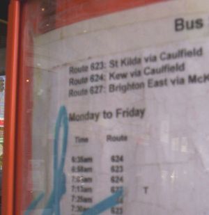
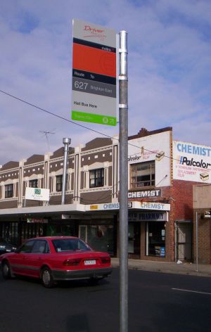
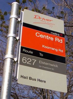
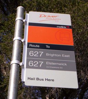
Are there huge numbers itching to go on an hour-long tour from Elsternwick to Brighton East via Chadstone?
On Saturdays do more people need to get from Brunwick West to Brunswick or Frankston North to Frankston?
Does a greater need for frequent buses exist between Footscray and the back streets of Yarraville, Mentone and Mordialloc or Elsternwick and Brighton (which all have direct trains) on the one hand, versus Cranbourne to Narre Warren/Fountain Gate, Chirnside Park to Ringwood, Knox City to Glen Waverley or Caulfield to Belgrave/Lilydale line, which don't?
Click the above links to get my drift before reading further
These examples demonstrate mismatches between service levels offered and both route importance and likely patronage. Important routes serving major trip generators that could attract thousands of extra passengers are frequently underserved. In contrast, local routes with alternative nearby trains or buses receive a premium service.
This is a very topsy-turvy way of operating (I refuse to use the word 'planning') services. These mismatches, along with timetable co-ordination with trains, should be redressed in area-wide route and timetable reviews. Such reviews are the single most cost-effective thing could be done to improve Melbourne public transport in the next 6 to 12 months.
Saturday, June 03, 2006
The previous post described the progression from providing transport only for niche markets to highly developed integrated systems that cater for a wide variety of city and cross-regional trips.
One measure of a network's progress is the number of transfers that passengers make. Whether we like it or not, modern cross-suburban travel patterns increasingly require transfers. Since it's impossible to have an efficient network that eliminates transfers while maintaining good service frequency throughout, timetable co-ordination with easy interchange is extremely important.
Particularly in car-owning cities, a good measure of success is the extent to which people transfer, and whether such trips represent an increasing proportion of the total. If this is the case, we know that public transport is meeting emerging as well as traditional travel patterns.
The article 'Renaissance of an Urban Railway' in Transit Australia January 2006 by Alan Mortimer has some Transperth patronage figures (page 10). These cover the 1980-2005 period and show patronage rises following upgrades to the Perth network. The most significant of these are (i) the restoration of Fremantle line trains, (ii) suburban rail electrification and service increases, (iii) the northern suburbs railway, and (iv) bus service improvements elsewhere on the network.
Statistics provided in the article include 'Total system boardings' and 'Total journeys'. System boardings include transfers, whereas total journeys do not. Hence the number of transfers is the difference between these.
The relevant Transperth patronage statistics are as follows: (numbers in '000 pa)
Year - Total Boardings - Transfers - Percent transfers
1980-81 - 63660 - 11628 - 18.2%
1981-82 - 61206 - 11163 - 18.2%
1982-83 - 58482 - 10739 - 18.4%
1983-84 - 60273 - 14924 - 24.7%
1984-85 - 58762 - 14459 - 24.6%
1985-86 - 61666 - 15120 - 24.5%
1986-87 - 63944 - 12865 - 20.1%
1987-88 - 63524 - 12774 - 20.1%
1988-89 - 66275 - 13507 - 20.4%
1989-90 - 64045 - 12767 - 19.9%
1990-91 - 62278 - 12379 - 19.9%
1991-92 - 61466 - 12322 - 20.0%
1992-93 - 64500 - 13030 - 20.2%
1993-94 - 70409 - 17556 - 24.9%
1994-95 - 71878 - 17964 - 25.0%
1995-96 - 74013 - 21526 - 29.0%
1996-97 - 76438 - 22289 - 29.2%
1997-98 - 75566 - 21310 - 28.2%
1998-99 - 74273 - 20744 - 27.9%
1999-00 - 78250 - 22439 - 28.7%
2000-01 - 83696 - 24178 - 28.9%
2001-02 - 86069 - 24449 - 28.4%
2002-03 - 88121 - 24914 - 28.3%
2003-04 - 90578 - 25370 - 28.0%
2004-05 - 94985 - 26165 - 27.5%
Over this period the number of transfers shows an increase that is second only to the trebling of rail patronage since electrification.
The main growth in transfers came about during 1983-4 (when the Fremantle rail service was restored) and during 1993-4 when the northern suburbs line opened. The former may be because a higher service on one leg of the journey (in this case the train) can stimulate use of its feeders. In the second case, the reconfiguration of buses to feed railway stations rather than continue down the freeway forced some transfers. However since rail ridership growth (8 million) far outstripped the bus ridership decline (2 million), this change attracted new custom to public transport above and beyond a simple substitution of bus journeys by rail trips.
The cause of the decline in tranfers in the late 1980s is not known. However the period coincided with difficulties with the (then antiquated) suburban rail network. This is reflected in a 20% decline in rail patronage between 1986-7 and 1990-1. Since trips that involve tranfers are much more affected by service unreliabilty than those that don't, it is likely that this was a prime contributor.
The period since 1999 has seen a slight decrease in the proportion of transfers, though their absolute number continues to grow. This is largely because of accelerated growth in the total number of trips. Thanks to service improvements (eg Circle Route, regional route reviews, clockface scheduling and increased frequencies) the fastest increase has been in bus patronage (from 45 million in 1998-9 to 62 million in 2004-5). Though some extra people are tranferring to other services, an even higher proportion must be using the bus for local trips, which better services also encourage.
Looking at the bigger picture, it can be seen that the absolute number of transfers has doubled in the previous twelve years after a period of stagnation. Discounting the northern suburbs rail line impact the increase lessens to 50 percent. Nevertheless this can still be considered an achievement and a sign that Transperth is catering to a wider variety of destinations than its former CBD-focus.
As towns and cities increase in size, the type and role of their public transport networks change.
Moving from rural to major urban areas, and from least sophisticated to most sophisticated, the progression is normally as follows:
1. School bus routes only.
2. Seniors door to door shopper or community bus operating a few days a week.
3. Fixed route/fixed timetable town buses operating a few services in the middle of the day, again mainly for shoppers going into town.
4. Fixed route/fixed timetable town buses offering the above plus am and pm peak hour service for shoppers and town centre commuters.
5. Fixed route/fixed timetable town buses offering the above plus weekend and evening services suitable for shoppers, commuters and leisure trips into town.
6. A web-like network of scheduled services with cross-suburban as well as CBD routes and easy transfers between services.
7. A web-like network of services, with trunk services to the CBD using heavy and/or light rail and local cross-suburban feeder routes using buses.
8. A web-like network, with both trunk services to the CBD and the more important cross-suburban circumfrential routes using light and/or heavy rail.
The types of centres served by these services are as follows:
1. Settlements up to several hundred have only school buses and, if they are lucky, the odd coach to a large regional city. 2. Larger towns up to a few thousand might also have a community bus for the seniors. If on a passenger railway, regional trains may stop there. 3. Towns around 10000 (eg Sale) tend to have a rudimentary fixed route bus system but with operating span and frequency only suitable for day shoppers (not work commuters). 4. Bigger centres of 30 000 or more may have services before 10am and after 4pm, allowing some use for town centre commuters. 5. Even larger cities (such as Geelong) have much the above, but with weekend and some evening services. However as with examples 3 & 4 all routes converge on the CBD. 6 and 7 are more characteristic of Australian capital cities such as Sydney, Melbourne and Perth. However due to limited services the network may still be CBD-centric, so may retreat to being closer to 5 during these times. 8. is only found in the big transit cities such as Paris and Moscow, and there are no examples in Australia.
The least sophisticated networks (1 & 2) cater for special-need groups only, so can't legitimately be called 'public transport'. Those who aren't in the nominated groups cannot use these services. They they will drive, cycle or walk, so the public transport modal share in these centres is small.
Networks 3 to 5 represent conventional small city public transport systems, and can cater for varying types of town-centre trips. Network coverge, operating span and service frequency tend to governing the range of trips it can cater for and represent the main differences between 3, 4 and 5. Inter-suburban trips may require backtracking to a town-centre terminus, so are less attractive.
Networks 6, 7 and 8 represent the most developed systems and are the most versatile. They can cater for a wide range of CBD and cross-suburban trips throughout the day and night. Cities with 7 and (especially) 8 offer car-competitive travel times and have the highest modal share for public transport.