Tuesday, August 29, 2006

Public Transport Guidelines for Development: why they're needed

I briefly mentioned that the draft was available for comment a few days ago. Any doubt as to their importance was scotched yesterday afternoon when I rode bus Route 840. This route goes from Berwick to Berwick via half the known universe and takes an hour to do so.

On leaving Berwick Station I passed underdeveloped land near the station, brand new new housing estates, a few large shopping centres, some slightly older housing estates and vacant land.

There were a few swings and bumps (due to roundabouts) and circuitous running due to poor street layouts. Many school children were dropped off but few passengers were picked up. Even if the buses were more frequent (current off-peak service is hourly) travel would still have been indirect and excruciatingly slow.

Suburbs like Berwick and Narre Warren are why the guidelines are needed. They are full of neat houses, nice parks, views and even the odd lake. However traffic on surrounding roads is terrible and public transport even worse. With the way these subdivisions have been planned, with circuitous internal streets unsuited to direct bus routes, fences backing onto main roads creating poor passive surveillance for cyclists, and pedestrians considered second class it is hard to see how non-car transport modes can be effective and efficient, either now or in the future.

I hope these Guidelines will help the planning of future suburbs. Note that they're still in draft form and submissions close next Monday, so read it and put one in. I thought that there is more to it than just bus stops and roundabouts, and give a list of pointers in my submission (pdf 120k).

Russ over on Civil Pandemonium also has a few words to say.

To conclude, it's one thing for there to be a bus in a street near you. It's quite another for it to provide efficient and effective transport that people other than schoolkids and oldies will want to use. Planning suburbs for a choice of effective transport modes is the first step to attracting people to public transport. It's not the be all and all (factors such as service planning and integration are also crucial) but if done properly it would give new suburbs a good start that places such as Narre Warren and Berwick have been denied.

Sunday, August 27, 2006

Melbourne lagging on buses

The Public Transport Procurement Legislation Review Consultation prepared for Auckland (pdf 1.8MB) has some interesting comparisons between bus service levels, their change over time and patronage growth across major Australian and New Zealand cities.

The statistics (verifiable by consulting their timetables) show that Christchurch now has higher average bus service levels than just any other city in Australia or New Zealand. A concerted effort to redesign the nework and boost services was rewarded by higher patronage, with a growth of about 43% since 1990 (all of which occurred since 1999).

Of the Australian cities, Brisbane and Perth did best with increases of 35% and 14% respectively. The newly-integrated Translink fare system, high-quality BUZ services and better service co-ordination all contributed to Brisbane's performance.

Melbourne buses scored at or near the bottom on many measures, with a patronage growth of just 0.3% since 1990. Admittedly these stats exclude our large and popular tram system, which most of the other cities lack. However this also means that our buses disproportionately serve outer suburban growth areas, which should attract greater use through faster population growth. However you look at it, the statistics present solid evidence that there is room for Melbourne buses to do much better.

Wednesday, August 23, 2006

Raining timetables!

In Victoria it's raining new timetables. It will only get heavier, with many of the new services coming into effect in the next month or two.

First off we had the proposed regional rail timetables, incorporating substantial service increases on most lines.

Next to be released were details of revised train timetables, with changes in either September and October. These changes will see extra peak services on some of the faster growing lines plus late-night Friday and Sturday services.

Buses within and between regional cities will also see service increases. The area around Geelong is a particular (and much-deserved) winner.

Finally there are the metro bus timetables. Changes to these will mainly include extended weekday and new weekend services especially for Sundays. There will also be the Wellington Rd SmartBus.

Timetable enthusiasts are having a field day as details emerge. It is hoped that the travelling public will also benefit and that the quality of the additions (as regards connections, routes, etc) is equal to their quantity.

Saturday, August 12, 2006

The Metlinking of a street: Koornang Rd, Carnegie

Place mouse over picture to view comments

Earthworks around NightRider stop.  I wouldn't be surprised if this stop will also be used by the proposed Wellington Rd SmartBus. (Dandenong Rd near Koornang Rd) NightRider stop.  If you thought you waited here for the service to Dandenong, you'd be wrong.  (Dandenong Rd near Koornang Rd)

A piece of history.  Route 620 ceased over 20 years ago.  (Koornang Rd near Dandenong Rd) A bus-length from the 620 sign, here is the new Metlink southbound stop for Carnegie Station. No timetables yet. A fine place for a bus stop.  Near the station, central to local shops, outside a Metcard outlet, across from the stop in the other direction and even comes with a seat. However it seems that car parking must take precedence. (Koornang Rd outside Newsagency) A space-efficient multi-route timetable showing times of Routes 623, 624 & 627 in a single timetable case. In contrast the stop opposite omits times for Route 624, even though it, like the other two routes, serves the same major trip generator.  The problem is caused by Metlink's fixation on individual route rather than network-level passenger information, even where services overlap. (Koornang Rd southbound near Neerim Rd) In theory this is a potential transfer point to Route 627 bus from the 67 tram terminus across the road.  In practice there is no timetable so few will use it for this purpose.  The destination is shown as East Brighton, even though only one in three weekday services extend this far. (Koornang Rd southbound opposite 67 tram terminus) Another possible transfer point to/from Route 67 tram. In this case the sign doesn't even have the green tram logo.  The stop's most prominently displayed destination is Elsternwick (better reached by the nearby tram) as opposed to more popular local destinations of Carnegie Station and Chadstone. (Koornang Rd northbound, south of 67 tram terminus) Sign in overlapping section of the infamous 'noodle route' 627. The lack of timetables or maps means it makes no sense at all, especially given that it shows distant or infrequently served termini rather than popular local destinations such as Carnegie and Oakleigh. (Koornang Rd) Met Rules OK! (Koornang Rd southbound near Lyons St) Route 67 tram terminus.  One wouldn't know this intersected with buses to Carnegie Station and Chadstone Shopping Centre. (Koornang Rd)

Photographs taken Saturday 12 August, 2006.

Friday, August 11, 2006

How reliable was the Met?

Train Reliability Statistics 1983 - 1998

Source: MTA/PTC Annual Reports

Rpt Yr | % OT(i) | % OT(ii) | % Canc(iii) | % Canc (iv)
1983 ------ 93 ---------- ? ----------- ? ------------ ?
1984
1985-6 --- 87.8 ------ 84.1 -------- 3.7 -------- 6.0
1987 ------ 92 -------- 86 ---------- 2.8 -------- 3.8
1988 ----- 92.1 ------ 90.2 --------- 2.5 -------- 4.1
1989 ----- 92.1 ------ 86.4 --------- 2.4 -------- 5.2
1990 ----- 88.3 ------ 85.2 --------- 6.3 -------- 7.6
1991
1992
1993
1994 ----- 92.3 -------- ? ---------- 0.3 --------- ?
1995 ----- 92.3 ------ 86.7 --------- 0.5 --------- ?
1996 ----- 93.3 ------ 89.5 --------- 0.5 --------- ?
1997 ----- 94.8 ------ 92.4 --------- 0.9 --------- ?
1998 ----- 93.7 ------ 90.8 --------- 1.4 --------- ?

(i) Percent of trains on time to five minutes (all day)
(ii)Percent of trains on time to five minutes (peak periods)
(iii) Percent of trains cancelled (all day)
(iv) Percent of trains cancelled (peak periods)

General trends

- The long-term average for on-time running is around 93% with few variations.
- Cancellations and service disruptions declined during the late 1980s but increased greatly around 1990.
- There were unusually low cancellation rates in the 1994 - 1996 period. Subsequent years showed increases, but they remained below their late 1980s levels.
- Current stats are here. These indicate on-time is running at the long-term average and retention of the early 1990s gains in service reliability.

Wednesday, August 09, 2006

Passenger information around the network

1. Is this bus service for dwarves, drunks or gutter dwellers?

2. The correct answer is no-one; the route was discontinued several months before the photo was taken.

3. A fine example of initiative.

Since replaced by a shiny new (but empty) Metlink timetable case.

4. What do you do if you need a bus to somewhere other than Chadstone?...

... You look around for some daggy but informative Met signs!

5. Improvements on the way. A new SmartBus passenger information module.

6. How it was done in the old days. An outstanding example of MMTB tram passenger information.

7. The way of the future? 'Best practice' passenger information is network or destination-specific. This compares to current Metlink practice, which is still too operator or route specific. This keeps passengers unaware of high-quality service combinations and results in lower patronage for a given service level.

example only

Tuesday, August 08, 2006

How much is Zone One worth?

Real estate ads sometimes boast that properties are 'walking distance to Zone One station'. Even though houses as far out as Laverton (22km from CBD) qualify, the implication is that this is desirable due to short travel times, low commuting costs and (perhaps) better service levels.

Balanced against this is the higher property prices in Zone One. If anything the price disparity between inner and outer suburban properties has increased over the last 30 years, with the former generally exhibiting the highest capital growth.

The costs of yearly full fare tickets are as follows:

Zone 1 $1058 ($88 per month)
Zone 1+2 $1633 ($136 per month)
Zone 1+2+3 $1999 ($167 per month)
Zone 2 or 3 $709 ($59 per month)
Zone 2+3 $1434 ($120 per month)
Source: Metlink Fares & Travel Guide 2006

The difference between Zones 1 and 1+2 is just under $600 per person per annum. For most concession fare passengers it's a little over $300. The difference when moving from Zone 2 to Zone 3 is less, especially for concession passengers.

There are a couple of instances where fares are lower in the outer zones. The most important is for local travel, since Zone 2 or Zone 3 only tickets are cheaper than Zone 1 only travel. Fares are similarly reduced for school children living in Zone 2 or 3 rather than Zone 1.

However because public transport's modal share is highest for CBD and near CBD jobs, I will assume that people are commuting to work in Zone 1 and, as a result, will need to pay more if they live in Zones 2 or 3.

The next part of this exercise will try to convert fare differences into capital.

For a working couple the annual difference between Zone 1 and 2 will be $1200. $1200 extra will pay 8% interest on $15 000 of borrowed capital. If the couple have sufficient deposit this means that they can afford a home that's $18 750 dearer, assuming a conservative 80% loan to valuation ratio.

There are cases where houses in Zone 1 sell for less than what most people pay for a house in Zone 3. However this is generally confined to a handful of western suburbs. It is more common for homes in Zone 1 to be $100 000 to $200 000 dearer than homes in zones 2 or 3 and the published statistics reflect this.

This means that differences in transport fares across the zones are too small to offer little benefit to the inner-suburban home buyer because of high home prices. However this small difference also means that the public transport component of the extra transport costs involved in outer suburban living is small compared to the vastly lower house prices.

The only way that reducing transport costs can have a bigger impact are if households can reduce the number of cars owned and (especially) financed. This is more practical in Zone 1 suburbs which generally enjoy better public transport services and more closely spaced amenities within walking distance. Conversely if people moving to outer suburbs are forced to buy more cars and drive more then the increase in the 'private motoring' component of transport costs far outstrips the increase in the 'public transport fares' component.

Another way to make Zone 1 suburbs more financially attractive is to substitute unrealised future capital gains on real estate for higher mortgage payments being made today. Any number of property 'gurus' will tell you that suburbs within 10-15 kilometres of the CBD have superior capital growth histories than areas further out. A bit of guessing and fiddling can make the projected equity growth look impressive, but many would prefer extra money in the hand today!

For renters the fare difference works out to be $12 per week. This doesn't sound much, but I still maintain it is relatively more important for renters rather than buyers. This is for the following reasons:

One is that rental yields tend to be low in prime Zone 1 suburbs and highest in low socio-economic outer suburbs. Thus compared to home prices, there is less variation between rents across the metropolitan area.

Related to the above is that when property yields are lower than interest rates (as is the case currently) renting is far cheaper than buying. Also renters tend to have a lower income profile and a smaller average household size than owners. Hence a $1200 annual saving is more significant relative to both incomes and housing costs.

Another factor is housing diversity; the inner suburbs have low-rent studio and one bedroom apartments rare in outer areas. Many renters are willing to sacrifice space for convenience and low transport costs.

Considering all these factors, the situation is less clear for renters than home buyers. Especially for renters in smaller households, zones make a difference and influence location decisions. For buyers differences in fares are small compared to mortgage payments so they cannot be that significant except for those near zone edges.

Private transport costs, such as needing to buy, finance and run additional vehicles are likely to have a far greater impact on households. Car financing is a particular wealth hazard, especially given high interest rates, running costs and a depreciating asset. If this can be avoided by buying a more expensive but better located home then paying the difference could be worthwhile even for buyers (especially if buying a unit).

However once the high financial opportunity costs of additional cars are accepted (and there may be little choice in areas with limited public transport), then the marginal costs of driving aren't so bad, especially for families. Where useful services exist, the pricing of fares versus the marginal cost of driving is an important marketing point and a discussion for another day.

Saturday, August 05, 2006

When does walking beat buses?

It's a decision nearly every passenger who doesn't live next to a railway station has to face; is it quicker to walk home or wait for the bus?

The calculation is particularly important for Melbourne because though a minority of people live within 1km of a railway station, most of the rest live within 5km of one. To a large extent patronage growth depends on the abilty to attract new passengers from this 1 to 5 km belt.

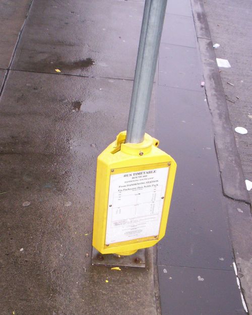
There will be a distance below which walking is always quicker and is the preferred access mode. Planners call this the primary pedshed. This will be within about 400 metres of stops or station entrances. Walking is usually also fastest within a secondary pedshed, or up to about 800 metres from entrances.

At very long distances (eg 10km) the bus will always be quicker, even if the passenger has just missed one and needs to wait for the next one.

As explained before, it is the in between distances that are most crucial to patronage growth. The answers here are not clear cut, as it is not possible to determine which is faster without consulting timetables and making some estimates.

I will call the distance above which the bus is faster than walking the critical distance. This will vary according to factors like travel speed, distance, and for the bus, waiting times. The latter is set by service frequency or co-ordination and any late running caused by other traffic.

Let us assume a walking speed of 5km/h. For simplicity, we'll assume that the bus' speed is infinite. This will skew the numbers towards the bus, but only reinforces the main point that on local routes speed is worthless without frequency.

The following table shows how the critical distance is inversely proportional to service frequency, but can be made a small and constant amount with timed transfers.

Wm | Wavg | Dcrit (Wm) | Dcrit (Wavg) | Dcrit (Wco)
120 min ----- 60 min ----- 10 km ----- 5 km ----- 0.83 km
60 min ----- 30 min ----- 5 km ----- 2.5 km ----- 0.83 km
40 min ----- 20 min ----- 3.3 km ----- 1.66 km ----- 0.83 km
30 min ----- 15 min ----- 2.5 km ----- 1.25 km ----- 0.83 km
20 min ----- 10 min ----- 1.66 km ----- 0.83 km ----- 0.83 km
15 min ----- 7.5 min ----- 1.25 km ----- 0.62 km ----- 0.83 km
10 min ----- 5 min ----- 0.83 km ----- 0.42 km ----- n/a

Wm = max wait (service frequency)
Wavg = average wait (assuming random arrival)
Dcrit (Wm) = maximum critical distance
Dcrit (Wavg) = average critical distance
Dcrit (Wco) = critical distance co-ordinated services (10 min wait)

What does the table mean? If the bus runs every hour and one has just been missed, then walking is faster than waiting in all areas up to 5km from the station. This is the 'worst case' example; a critical distance of 2.5 kilometres (assuming a random arrival at the bus stop) is more representative where services are unco-ordinated (as in Melbourne).

This gap between the station's pedshed (800 metres) and the critical distance (in this case 2500 metres) represents those areas that could potentially benefit from the train, but cannot since feeder buses are ineffective and the station is beyond walking distance*. The bigger the gap, the more people miss out, and the smaller the gap the greater the station's catchment area and thus potential patronage.

Ideally the critical distance should equal the pedshed so that there is no gap at all. With an 800 metre pedshed, this situation is reached when service frequency is every 10 minutes. Assuming the worst case (bus just misses the train) the maximum wait is the same as the pedshed distance and the average is much less.

Where a 10 minute frequency cannot be achieved, the critical distance can still be lowered greatly by harmonising headways and carefully co-ordinating timetables. In this way every second train will have a good connection with the bus so people can plan a shorter journey time if they so wish. Even with a generous 10 minute connection time the difference between the pedshed and the critical distance reduces to insignificant proportions.

Hence a transfer time of 10 minutes is probably acceptable though not seamless. With improved pedestrian access to bus stops and stricter timed transfer arrangements (eg 4-5 minute connections) the critical distance could be lowered to 400 or even 300 metres. Such a reduction would most benefit activity centres that are slightly away from the railway station but becomes less important for low-density residential areas.

What conclusions can be drawn? The first is that there are currently large gaps between station pedsheds and critical distances. This creates large 'donuts' immediately outside station pedsheds where both walking and bus access to the station can be considered poor (especially when compared to driving).

Secondly, these poorly served donuts contain huge populations. If 20% of people live within station pedsheds, assuming 20 to 30% more (ie 600,000 to 900,000 people) just outside is not unreasonable.

As a result a strategy to fix transport beyond the pedshed by introducing Perth-style bus-train route and service co-ordination is likely to boost patronage, achieve modal share goals and improve utilisation of a largely empty bus fleet.

(*) It should not be overlooked that there is also such thing as a 'bikeshed', with a distance of around 2000 metres. Bike + train is almost certainly faster than bus + train without service co-ordination. However due to crowding, it is unwise to encourage bicycles on 'normal flow' peak hour trains. The alternative of using bicycle lockers at stations helps some, but if the destination is beyond the station's pedshed then the lack of a bike reduces ease of access. This gets back to improving bus access as described above.

Wednesday, August 02, 2006

Proposed V/Line timetables

Substantial service increases on RFR lines plus Seymour:

New timetables

Sure the express trains aren't quite as fast as originally promised, but this is more than outweighed by the greater number of services. To misquote Paul Keating, 'These are the timetables that bring home the bacon'.