It’s been a wet winter, the flowers are out and plants have grown fast. Gardeners are out with the shears, trimming undergrowth and unwanted branches.

Our bus network has had a similar windfall. A 15-year drought ended with many new routes being added in the last five years, a growth rate without recent historical precedent. Operating hours broadened, coverage spread and patronage surged.
Students of public administration will be aware that being required to spend large sums in a short time does not guarantee top value for money or high accountability. Careful planning and effective targeting of expenditure can be a casualty of blanket 'one size fits all' funding increases.
In public transport this could occur by boosting services on a route without regard to its network importance, relationship with other services or opportunity cost. Hence some corridors got more buses per hour but ‘lumpy’ timetables with long waits. Roads with overlapping routes were sometimes overserviced while adjacent high employment areas missed out. And buses are not all headway harmonised with trains like they are in Perth, despite our sometimes lower train frequencies making connectivity even more crucial.
The plant analogy can go further. If the bus network was a tree, parts would have strengthened greatly but others would still be weak, bushy and hardly alive. There would be many twigs, some well-placed and others with odd kinks formed years ago for reasons long forgotten. Not all supporting branches would robustly connect with trains or directly link suburbs.
Too much undergrowth can retard the funding, marketing and visibility of direct high-service routes most likely to attract patronage. Tangled scrub can also appear impenetrable, especially for commuters who drive past it on the way to the station.
If the political and economic climate favours service cuts, there can be coverage gaps. If it favours service increases there can be duplication. Our current network has both, reflecting past feast and famine. The latest feast has vastly improved buses and driven patronage to forty year highs. Nevertheless there remains great opportunity to carry even more through an efficient network that neither over or under services.
The patronage potential of buses is clearest when comparing their ridership with trams. Buses ‘should’ carry more than trams as their catchment population is higher, they exclusively serve the largest suburban shopping centres and run in the suburbs where most people live. But the actual figures are very different; 170 million for trams and barely 100 million for buses, indicating much higher service and patronage intensity on the smaller tram network.
This large disparity can’t all be due to trams’ CBD running, population density or a passenger preference for rails in tar. For there exist bus corridors that already have timetables and patronage that approach those of trams. The fact that buses don’t run on rails and overhead wires is no reason for low average patronage. However trams’ directness, legibility and frequency show aspects of successful service planning that can effectively apply to buses (as confirmed by usage of high-service ex-Met and SmartBus routes).
Both directness and legibility are a result of good planning, which is relatively cheap. Frequency costs scarce recurrent expenditure. But some can be raised internally from restructuring less efficient routes. However a growing city with a service backlog will also require increased external funding to develop the network. Such funding requests are more likely to succeed if there is evidence that the existing network is already planned efficiently and additional resources would boost rather than duplicate services.
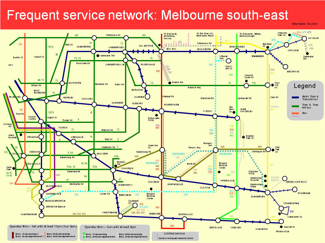
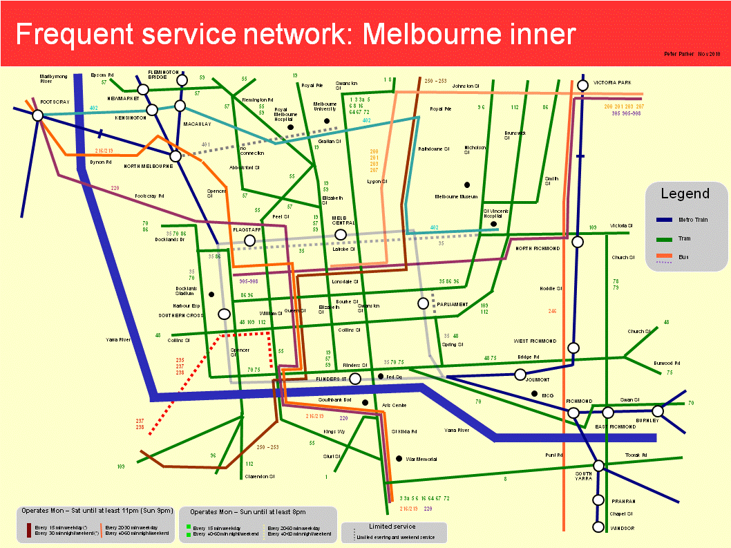
Reviewing, untangling and making legible the bus network is key to making it more useful and boosting patronage. A good first step is to examine the current network for corridors that could be simplified. The multimode frequent service maps as presented above are useful tools for this purpose.
My examination of these maps has produced the following ‘dead wood’ portions of routes that may warrant pruning if 'greater good' gains can be obtained elsewhere:
219 (portion): Part west of Sunshine duplicates 903. A weekend variation serves areas covered by Route 471.
280/282 (portion): A local route that duplicates the 901 SmartBus along a low-density residential area (Foote St/Reynolds Rd Templestowe).
246 (Latrobe Uni extension): Overlaps with other routes between Clifton Hill and Latrobe Uni.
286 (entire route): Largely duplicated by two SmartBus routes (901 and 906) along Blackburn Rd
293 (part): Duplicated by new SmartBus Route between Doncaster Shoppingtown and Eltham (Main Rd roundabout).
295: Duplicates 903 along Station St between Box Hill and Doncaster Shoppingtown.
340/350: Overlaps with 250 between Ivanhoe and Latrobe Uni.
445 (part route): Duplicates other routes between Werribee Plaza and Hoppers Crossing Station. Truncation could allow removal of stopping restrictions (including to a local shopping centre) which lessen legibility.
478/479 (part route): Duplicates Route 477 and tram between Moonee Ponds and Airport West.
479 (City – Moonee Ponds portion): A weekend extension that duplicated by a frequent tram service.
483 (entire route): Freeway service for Sunbury. Will become less necessary after rail electrification.
500 (entire route): Duplicates 901 between Broadmeadows and Melbourne Airport. Duplicates 479 between Melbourne Airport and Sunbury.
544 (part route): Duplicates 901 between Roxburgh Park and Broadmeadows
563 (part route): Duplicates tram along a large section of Plenty Rd and 901 between Greensborough & Plenty Valley SC
623 (part route): Duplicates 626 and 900 between Chadstone SC and Carnegie. Scope for rerouting along Neerim Rd to replace portion of 624.
673 (entire route): An hourly service entirely duplicated by parallel longer routes
691 (part route): Monash Uni extension – replaced by direct high-service 900 SmartBus
694 (entire route): Largely parallels 663 & the extended 688 for all but a few stops.
745 (entire route): Four occasional routes with very low patronage
777 (entire route): A short route with few services and trip generators
Apart from removing redundant routes (relatively easy since no coverage is sacrificed), there are other things that could further simplify the network and increase effective service frequencies, preferably using resources saved from route rationalisation. The most obvious is more evenly scheduling overlapping routes that share a corridor. Other gains could come from rerouting that lessens duplication and improves coverage. Such changes won't please everyone, but not considering them may result in higher gains foregone. Some examples of this type will appear in a future post.