A pet personal project (obsession?) has been the compilation of schematic maps showing Melbourne’s frequent transport corridors, offering service every 15 minutes or better.
Melbourne’s inner suburbs have many such corridors thanks to its extensive tram network. Further out, fifteen minute weekday frequencies are available on some train lines and bus routes. Around half of our frequent bus corridors bear SmartBus branding, while the other half receive no special marketing.
While trams and trains are visible and legible, buses remain a mystery to the average traveller. Public transport is widely considered effective to get to the city but not so useful for cross-suburban trips, which dominate most people’s travel.
Simplifying the network through multi-modal frequent service maps is one way to make the network more legible and counter a major objection to buses; namely that they do not run frequently or late enough. The resultant network becomes more web or grid like, making it suitable for many more trips than the largely radial train and tram systems on their own.
I started with scribbles on taped scraps of paper. Plain shower curtains from discount shops were then tried. Windows Paint worked but smeared badly with each alteration. Finally Power Point was found workable.
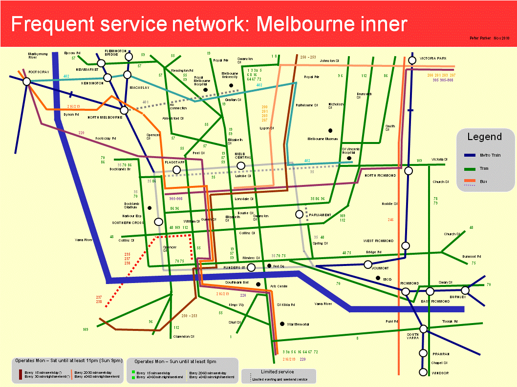
Two maps for Melbourne’s eastern suburbs have previously appeared here. These have been updated and are presented with new maps for Melbourne’s north, west and inner, as below:
Melbourne west

Melbourne north

Melbourne north-east

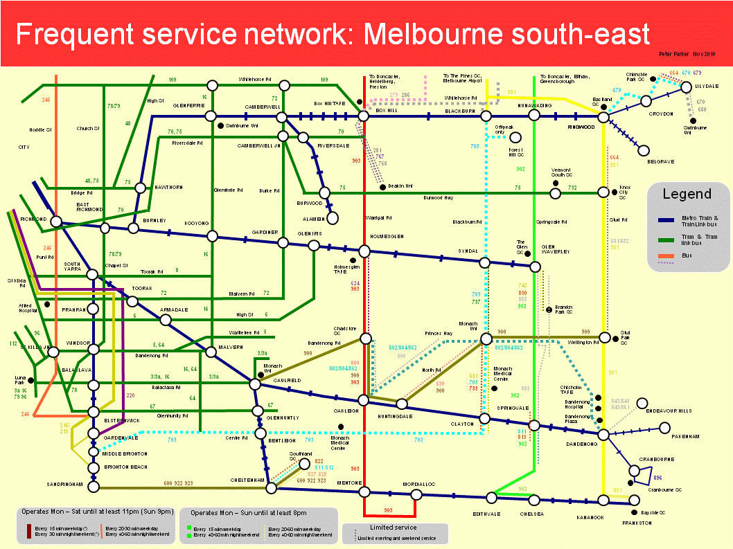
Melbourne south-east
Melbourne inner
I will be the first to admit that these maps are not perfect.
Some maps, particularly the south-east, are way too cluttered. Deleting parallel lower service routes (so the key can be removed) and/or making each map cover a smaller area may help. The orientation of some streets (particularly the CBD) is not always ideal. And a few areas, such as around Port Melbourne and Prahran, fall within two maps but are well documented by neither.
Trying to reconcile geographic accuracy with simplicity was a challenge. So was illustrating both frequency and span. For the latter I made thickness represent frequency and line continuity represent span. Although it made the layout less clean, I wanted to show lower frequency routes that share the same corridor with high-service routes, and so boost combined frequency further.
Some of the complexity reflects the different service levels across the network. Bus routes especially don’t always fit neat categories such as (i) high service SmartBus, (ii) minimum standard local route or (iii) limited service special route. This shows that mapping can only simplify the network so much; planners need to do their bit to straighten routes and harmonise spans and frequencies as well.
In some cases I broke my own rules as the maps would have looked silly otherwise (eg half the rail network missing). For instance northern suburbs trains and western suburbs trains and trams operate every 20 minutes, and I have shown them even though the cut-off generally used was 15 minutes. If there was a rationale, it could be that people are willing to sacrifice frequency for trains’ average higher speed and comfort.
What these maps do demonstrate, however, is that frequency maps can provide a fresh way of seeing (and using) the public transport network that should be helpful for planners, providers and passengers alike.
3 comments:
Have a look at Visio for making maps - it's pretty much designed for it (among other graphical tasks).
Peter, some nice stuff. What Evan said, except I use OpenOffice Draw for this type of work.
I think your scale is too broad, very few people operate across Melbourne's North, and that make the maps less useful for actual travel (as does completely removing non-frequent services). My advice would be to split the maps into districts at around 5km spacing, then draw them at two scales: as localised service maps with the adjacent nodes along the edge, and a nodal map that shows fast (less than 10 minutes travel) frequent services that directly connect nodes (within 1km).
Apart from the CBD, Richmond and North Melbourne, I'd say, Clifton Hill, Fairlfield, Heidelberg, Macleod, Greensborough, Eltham, Preston, Reservoir, Epping, South Morang, Doncaster, Hawthorn, Camberwell, Box Hill, Nunawading, Ringwood, Croydon, Lilydale, Bayswater, Ferntree Gully, Knox, Rowville, Glen Waverley, Mount Waverley, Chadstone, Riversdale, Caulfield, Clayton, Springvale, Dandenong, Narre Warren, Berwick, Pakenham, Keysborough, Bentleigh, Cheltenham, Mordialloc, Chelsea, Frankston, Mornington, Sandringham, Brighton, St Kilda, South Yarra, Port Melbourne, Footscray, Newport, Williamstown, Altona, Point Cook, Hoppers Crossing, Werribee, Tarneit, Tottenham, Sunshine, St Albans, Sydenham, Melbourne Airport, Maribyrnong, Moonee Ponds, Pascoe Vale, Broadmeadows, Roxburgh Park, Craigieburn, Coburg and Brunswick.
That's a lot of maps, but quite a few are also blank I suspect, which might make them easy to draw (and a useful tool for highlighting the paucity of localised frequent services).
I agree with Evan that Visio is a good choice. For making maps, it's a lot like PowerPoint (being another MS Office tool), more powerful, and not much harder to use.
Any vector image tool will work well though. If you would like to spend some time learning a really powerful tool, try Adobe Illustrator.
Post a Comment