Showing posts with label marketing. Show all posts

Tuesday, November 16, 2010

Frequent service maps – now Melbourne wide

A pet personal project (obsession?) has been the compilation of schematic maps showing Melbourne’s frequent transport corridors, offering service every 15 minutes or better.

Melbourne’s inner suburbs have many such corridors thanks to its extensive tram network. Further out, fifteen minute weekday frequencies are available on some train lines and bus routes. Around half of our frequent bus corridors bear SmartBus branding, while the other half receive no special marketing.

While trams and trains are visible and legible, buses remain a mystery to the average traveller. Public transport is widely considered effective to get to the city but not so useful for cross-suburban trips, which dominate most people’s travel.

Simplifying the network through multi-modal frequent service maps is one way to make the network more legible and counter a major objection to buses; namely that they do not run frequently or late enough. The resultant network becomes more web or grid like, making it suitable for many more trips than the largely radial train and tram systems on their own.

I started with scribbles on taped scraps of paper. Plain shower curtains from discount shops were then tried. Windows Paint worked but smeared badly with each alteration. Finally Power Point was found workable.

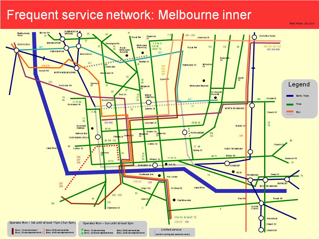
Two maps for Melbourne’s eastern suburbs have previously appeared here. These have been updated and are presented with new maps for Melbourne’s north, west and inner, as below:

Melbourne west

Melbourne north

Melbourne north-east

Melbourne south-east

Melbourne inner

I will be the first to admit that these maps are not perfect.

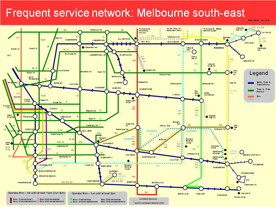
Some maps, particularly the south-east, are way too cluttered. Deleting parallel lower service routes (so the key can be removed) and/or making each map cover a smaller area may help. The orientation of some streets (particularly the CBD) is not always ideal. And a few areas, such as around Port Melbourne and Prahran, fall within two maps but are well documented by neither.

Trying to reconcile geographic accuracy with simplicity was a challenge. So was illustrating both frequency and span. For the latter I made thickness represent frequency and line continuity represent span. Although it made the layout less clean, I wanted to show lower frequency routes that share the same corridor with high-service routes, and so boost combined frequency further.

Some of the complexity reflects the different service levels across the network. Bus routes especially don’t always fit neat categories such as (i) high service SmartBus, (ii) minimum standard local route or (iii) limited service special route. This shows that mapping can only simplify the network so much; planners need to do their bit to straighten routes and harmonise spans and frequencies as well.

In some cases I broke my own rules as the maps would have looked silly otherwise (eg half the rail network missing). For instance northern suburbs trains and western suburbs trains and trams operate every 20 minutes, and I have shown them even though the cut-off generally used was 15 minutes. If there was a rationale, it could be that people are willing to sacrifice frequency for trains’ average higher speed and comfort.

What these maps do demonstrate, however, is that frequency maps can provide a fresh way of seeing (and using) the public transport network that should be helpful for planners, providers and passengers alike.

Selling frequency

Brochures intended for tram hand-holds selling the frequent lunchtime service now available on a city tram corridor.

Wednesday, September 22, 2010

How many bus marketing messages can you spot?

(Brighton Buses August 2009 - Dave Spencer and John Bishop)

Tuesday, September 14, 2010

Should train network maps show buses?

Since franchising, on-vehicle public transport information has been mode (and for a while) operator-specific. The old Met-era multimodal inner-city transport maps on trams are now just a distant memory.

Passenger wishing to make connections have to be prepared beforehand, especially if alighting at an unstaffed station. There is often now wayfinding signage at station exits, but rarely bus timetables or current pedestrian-scale maps.

Having to cross a busy road only to find out that the next bus is 30 minutes away discourages interchange and spontaneous bus patronage. Whereas a bus timetable at the station exit would be visible to alighting passengers and encourages bus usage, even if it's only on days where the bus is only a few minutes away. It's also better for families as there's fewer phone calls home and fewer requests for lifts from the station.

Such details are especially important in cities where train arrivals are unpredictable and buses are infrequent; statistics demonstrate that the train-bus transfer rates for transit systems with mode-based planning such as Melbourne's is much lower than for a master-planned network like Perth’s.

One way to encourage passengers to think of the system as a versatile network (suitable for many trips) rather than a collection of routes (each capable of only a few) is to introduce multimodal elements onto mode-specific maps.

Melbourne has started doing this by indicating points where other modes can be caught with a small square, circle or triangle. However these do not indicate where the intersecting service goes, its route number, frequency, nor even if it is running on the day of travel.

Further advances could be to show intersecting routes, ending up with either a comprehensive local area map or schematic frequent service map. While such maps are useful they can introduce clutter for train or tram-only passengers, especially if applied at the metropolitan-wide scale. Possibly the best compromise are several maps at interchanges for different purposes. Examples could include a schematic metropolitan-wide railway map, a schematic frequent service map (covering about a 10-15km radius), a local pedestrian and bus map and an interchange map for large stations.

There could also be scope to introduce further multimode features on conventional single-network maps. An example is presented below.

This is the familiar Metlink/Metro Melbourne train network map with the three orbital SmartBus routes linking outer suburban stations (effective later this month). Its purpose is to convey a more versatile web-like network suitable for trips other than CBD-direction travel, especially for middle and outer suburban residents.

Detail has been kept low to avoid clutter (the main problem with adding buses). Only the orbital SmartBus routes that link most lines have been included. Hence it could reasonably replace the train-only network map (saving costs and space) without overwhelming the passenger. Additional details of local routes could be given through frequent service maps at the regional level and all-route maps for those making shorter trips. Such more specific maps are more suited to stations and interchanges than on trains, which may travel over much of the network.

Friday, September 10, 2010

Frequent Service Map 2: Melbourne’s north-east

A few posts ago I posted a frequent service map for Melbourne’s south-eastern suburbs to show the area’s high-service train, tram and bus corridors.

You might choose to live along these corridors if you value the choice of not having to drive everywhere. Businesses can establish in these areas and have quality public transport for their employees and customers in at least some directions. Or, if a tourist, you can travel to these locations with the confidence that service will still be running when you want to get home and that you won’t be waiting an hour if a service was missed.

Today’s map covers the north-eastern suburbs – roughly the City of Manningham with a bit either side. It was done in time for the introduction of five SmartBus routes to the area (mostly as part of Doncaster Area Rapid Transit) within the next month.

The map below shows Manningham’s frequent service network from October 4, 2010. The main routes form a grid of roughly 1 to 3 kilometre intervals. These put most of Manningham within 20 minutes walk of at least one SmartBus service. Service levels include a 15 minute weekday frequency until 9pm. At other times buses operate every 30 minutes until midnight, except Sundays where a 9pm finish applies (do people near trains and trams have later bedtimes?).

Click here for higher resolution pdf (recommended for printing or study)

As with the earlier map, continuous lines indicate long service spans and thick lines indicate the highest service frequencies. Low-frequency and peak-only routes are omitted except where they overlap much of a higher service route and boost frequencies along a corridor.

Friday, August 20, 2010

Frequent service Map 1: Melbourne's south-east

Via Jarrett Walker is advice that Vancouver’s TransLink is seeking ideas from the public for a frequent network map, to highlight high service routes and corridors.

We have never had such a map for the Melboune network. More than any other Australian city frequency here has been a function of mode. Trams are most frequent, offering ‘turn up and go’ service every 5 to 15 minutes, at least during the day. Trains are next, on 15 to 30 minute frequencies. Buses were last, typically operating every 20 to 60 minutes, with varying spans and operating days.

Although there were exceptions, if you wanted frequent travel and an assurance of being able to travel on Sunday or get home at night you would almost never catch a bus. Hence train and tram system maps (normally mode rather than area-based) were our de-facto frequent network maps.

In the last five years we have seen the extension of many bus services to 7 days and the commencement of SmartBus services, which, at least on weekdays, operate at or better than train frequencies. The generalisation that buses run less often than trains remains valid but decreasingly so. However because our network maps treat all bus routes as being equal (just like if a street directory showed local streets as thick as freeways and distributors) the higher service on the better routes and corridors is uncommunicated to passengers.

The solution is a multimode frequent service map to highlight the high-service parts of the network that can reasonably be navigated without a timetable (at least on weekdays). It would be in a simple schematic form, showing only the high-service corridors, interchange points and major trip generators. At major interchanges it would supplement but not replace metro-wide single mode network schematic maps and local multimode geographically-based street-level maps.

A possible frequent service map for the south-east suburbs of Melbourne is shown below. Interstate or international readers should note it's approximately one-third of the metropolitan area and excludes the CBD (beyond the top left of the map). The areas covered are approximately 4 to 40 kilometres from the city centre.

This map is an attempt to simplify a fairly complex network that has diverse service levels and operating spans. I have set a cut-off related to SmartBus service levels, ie a 15 minute frequency on weekdays and 30 minutes on nights and weekends. Less frequent individual routes are not shown unless they parallel other routes to form a high combined frequency along a corridor.

Line thickness is related to service frequencies for individual routes or route families, with two levels used; thick for 15 minutes or better, and thin for inferior to this. Routes or corridors with 'full-time' operating hours, ie daily service until 11pm (9pm Sunday) got solid lines. Routes offering lesser spans got dashed lines. Hence a thick dashed line would be a frequent weekday service with limited or no service at other times. Conversely a thin solid line would indicate lower frequency but wide span (like outer suburban trains). A thin dashed coloured line would typically be a 'minimum standards' route, with 7-day hourly service until 9pm. Routes offering less than this (only drawn if they added frequency to a corridor) are shown with a grey line.

Melbourne typically colours its train information blue, tram information green and bus information orange. The map above adopts these colours for train and tram lines. However because there are more bus routes legibility requires the use of several colours. The orbital SmartBus routes were identified by colour in the planning stage (eg red orbital, green orbital, yellow orbital) so I have used these colours on these routes.

Some frequent service maps concentrate on daytime frequency and offer little assistance to passengers travelling at other times. However to provide assurance that night travellers won’t get stranded, it's desirable for maps to show approximate operating spans as well (especially finish times), in an unobtrusive form. I believe this map succeeds at both, without introducing too much clutter.

Thursday, August 19, 2010

The Three Ms of high modal share

A previous post covered capability, choice and capacity, the three Cs of successful public transport.

Since that was written public transport patronage and mode share has grown. However data from the last year indicates that the pace of growth has slowed.

There are three passenger demographic groups, all beginning with M, that must be won over to increase transit’s modal share. These are as follows:

Middle Suburban

These are the suburbs, approximately 8 to 30 km from the Melbourne CBD, that house the majority of the population. They are typically beyond the tram network but are usually within 5 kilometres of a railway station and may be served by a SmartBus or orbital route.

Planned (and often established) by the 1920s, they often have a grid network of roads intersecting railway lines, particularly in the south and east. Detached housing dominates, though the closer in areas also have flats, townhouses and villas. Retail areas comprise strip centres around stations, factory outlets in light industrial areas and Melbourne’s largest drive-in shopping centres. These middle suburbs are also home to a more diverse range of universities, hospitals and business parks than is found in outer areas.

In Melbourne public transport’s mode share is highest in the inner suburbs and falls away with distance from the CBD. Those residents of middle ring suburbs who work in the CBD often commute by train but driving is dominant for non-CBD work and other trips, which are generally less well served by transit. However the success of SmartBus has shown that patronage growth is possible in these areas, even for non-city trips. The density of activty around the large universities and shopping centres along with grid streets, which are efficient for tangential rail feeder buses, also indicate potential for patronage growth.

That is not to say that patronage cannot also be grown on the fringes, but these areas are handicapped by bad street layouts, less walkable neighbourhoods and a lower base from which to expand service levels compared to middle suburbs that also tend to have more trip generators.

Middle Age

Public transport in cities with low modal share disproportionately carry non-drivers; typically the young and the old. They are often referred to as ‘captive passengers’ since they have few other choices. These groups will be described in turn.

The closure or amalgamation of government schools and the shift to private schooling has increased the average distance school students travel. Parental concerns about ‘stranger danger’ and mounting road traffic has also contributed to the sharp decline in walking and cycling. Hence ‘Mum’s Taxi’ and public transport (where available) are dominant modes for primary and secondary student travel. And the growth of universities (due to both local and international students) has increased the number of older students travelling. Unlike the USA, Australia has less of a tradition of suburban students moving away to study so local students will often remain at and commute from home.

Senior passengers include those who never learned to drive (often housewives in then-dominant single-car households after WWII) and those too blind or frail to drive. In addition, local shopping strips, cheap seniors fares and frequent service (especially during weekday interpeak times when many seniors travel) make car ownership unnecessary for many seniors.

There is however change within the senior passenger population. Population ageing is increasing the number of those who have had to give up driving but is reducing the number of seniors who have never driven. The majority of seniors remain mobile, especially with the spread of low-floor buses. However a growing proportion (often over 80) have difficulty accessing conventional route services and use community buses operated by a local seniors group or council.

Public transport usage is weakest amongst middle aged working people (especially for the majority who work outside the CBD). Due to their number public transport will need to attract a growing proportion of them for it to increase modal share. To some extent this has happened in recent years, largely due to the employment strength of the CBD. However because market share is now high amongst CBD workers, continued increases in modal share will need to come from those who work elsewhere.

Middle Class

Public transport has strong usage by those on low incomes, particularly if it is their only motorised transport option. Those on moderate to high incomes who work in the CBD dominate peak-period public transport. Inner-suburban gentrification has made the average incomes and house values of suburbs served by tram higher than many outer areas served by bus or train only. Nevertheless the middle class appear to be under-represented on much non-CBD off-peak and weekend public transport services.

Nevertheless when designing services and facilities to attract modal share, one must have middle class tastes (including their fears and prejudices) in mind when designing and marketing services. This might include developing frequent networks serving places where the middle class go (for instance large shopping centres on the weekends), addressing concerns about travelling at night and spreading the message it is used by ‘people like us’.

Legibility is another concern; the suburban middle class are unlikely to give up driving, but could be attracted to public transport for some trips if routes are more direct and understandable. Even not being able to see through windows due to all-over advertising on trams and buses would discourage some passengers due to safety and navigability concerns.

Summary

Middle Suburban, Middle Aged and Middle Class. These are the groups that abandoned public transport for the car during the 1950-1980 period of falling patronage. Conversely it is these people who need to be attracted back to deliver further modal share increases. Public transport service design and marketing could do worse than target these potential passengers in its work, particularly in areas where services can be cheaply improved, made legible and promoted.

Saturday, August 07, 2010

They mean well, but...

Today's Herald Sun has an article about a personal safety campaign targeted at international students travelling at night on public transport. Possibly a response to student safety concerns, it is supported by major universities (and other bodies) in Sydney and Melbourne. Transport departments, industry bodies or operators appear not to be involved.

Campaigns such as Think before you travel must be designed very carefully or they can do more harm than good. It's a fine line between encouraging modified behaviour (which may lower an individual's risk) and fuelling the perception that 'public transport is unsafe'.

If too many take the latter to heart, it becomes a self-fulfilling spiral - even fewer travel, the perception of safety declines further, causing even fewer to travel until a point is reached that only trouble-makers and the desperate are travelling.

Unfortunately I believe that elements of 'Think before you travel' do risk being counter-productive.

My first worry is the name of the campaign - 'Think before you travel'. Though milder than 'Think whether to travel', there is still a message that people should voluntarily restrict their liberty and not travel (as it's a big bad world out there). Or if they do travel, drive instead of take public transport (given ads and tips focus on or near public transport, as if that's the only place where bad things happen).

In contrast, a 'Think when you travel' message, although it's a change of just one word, would be more positive, not discourage transit use and support freedom to travel as a right in a civilised society. Any such campaign should also cover driving as well as public transport to fairly reflect risk.

The point about liberty is important, especially for people from societies less free than ours. Travelling alone is not a crime. People should not be chided as being somehow reckless or irresponsible for doing so. And accounts of assaults should not blame the victim for exercising this right.

The idea that people should restrict their freedom, though apparently desirable for safety, is an acquiescence to tyranny, or the fear of it (albeit committed by criminals rather than governments). We should not accept this as satisfactory; it diminishes us all if the exercise of a significant freedom is discouraged as part of a (well-meaning) taxpayer-funded campaign.

This is particularly if campaigns discourage the exercise of liberty that is socially beneficial, which I will explain below.

There are some liberties that we accept even if (inappropriately exercised) the consequences to others range from discomfort (eg clipping nails in public) to mild harm (eg passive smoking out of doors). People are legally free to do these sorts of things but there is reliance on civil society concepts of consideration to minimise detriment to others. A polity that seeks to prohibit everything runs out of police and prisons to enforce all infractions.

However there is also a virtuous group of liberties which if exercised by one person improve things for everyone else. Walking and travelling on public transport at night is one such example due to 'safety in numbers'. Campaigns that even only slightly lessen the propensity for people to exercise such 'virtuous liberties' are counter-productive and ought not run.

A couple of the safety tips are doubtful or don't apply in all areas. One display a wariness about public transport interchanges. For example: "Avoid long waits on platforms and around Public Transport hubs. If you do have a long wait stay in well lit areas or near open shops." In Melbourne a railway station large enough to be called 'a public transport hub' will be a premium stations, with a staff presence and often enclosed waiting areas. Some car parks aren't the most savoury of places either, and I'm not sure that hanging around an open liquor store or hotel car park is necessarily safer than a station platform.

The suggestion about the guards compartment does not apply nation-wide. And that such warnings apply 'outside of peak times' as well as at night seem over-cautious. Besides being impractical if everyone did it given the good patronage of many off-peak trains in Melbourne. These points underlie the hazards of trying to apply a Sydney campaign to other cities without making changes for local conditions.

The clip ends with a message 'Are you feeling lucky - think before you travel'. Which again conveys the perception of risk or travel being a safety lottery.

The best way to increase safety on public transport is to encourage more people to use it. This means making it more attractive for people to use. For example reduced waits through frequency and co-ordination, better urban design, staffing and so forth. Carriages should be numbered inside for easier identification by people dialling 000. While a role exists in passenger education, it is extremely important that it encourages rather than discourages patronage, as may be the risk with aspects of this campaign.

Friday, April 02, 2010

Ad-hoc versus system design: the cases of railway station posters

Has anyone looked at poster cases at railway stations lately? If so one will see several different designs erected at various times. Careful inspection will reveal that different tools are required to open and update the contents.

This apparently minor detail can give hints about how passenger information is delivered to the platform and the extent to which this represents conscious design or a 'grafting on'. And what is regarded as standard practice for the architect or design engineer might not be favoured by administrators, and vice versa.

Different styles of poster case at stations

An engineer required to design passenger information at stations would likely specify just one design of poster case. All would be a common size so that savings can be made with bulk purchase of materials. And the same basic design would be reproducable in the future if needed for new or upgraded station. Standardisation implies inflexibililty in one area (unimportant to passengers) but permits flexibility elsewhere (to optimise the sequence of information presented to passengers) as posters can be swapped between cases if needed.

As an example, a government-funded station car park extension may have been finished long ago so promotion is no longer needed (the blank case pictured previously advertised this). Or the Myki ticketing system will eventually be as established as Metcard is today, so promotion space for it is no longer necessary. Meanwhile a rail occupation may require numerous additional posters. This is especially if it coincides with public holidays and special events. In such instances, all poster cases at a station are needed to fully inform passengers, and there is a risk that (say) a ticketing poster may occupy space needed for (more important) service information. Having standard poster cases should also cheapen maintenance as the range of replacement parts needed would be less.

The engineer would likely also specify one standard opening tool for all cases at the station. He would know that this assists the railway staff member whose job it is to replace posters as they would only need to carry one tool and not three. Needing only one tool reduces the chance of a tool being forgotten or lost and thus the chance of a poster or timetable not being able to be updated. Hence a simpler system based on one type of poster case accessible with one key should also be reliable than where there is a variety.

Other professionals would also agree, though for different reasons. The architect would want some unity of design, rather than the tacked-on look of many additions to stations. And the chance that non-standardisation causes some cases to be empty would worry the merchant or marketer who sees blank shelves or cases as selling opportunities lost. The passengers, most of whom are not in the above professions, would likely prefer whatever provides the most reliable information when they want it.

A differing perspective may be offered by the manager or bureaucrat. Managers might favour speed and short-run budgets compared to the engineer's standardisation or the architect's design coherence. Well defined goals such as an individual project's delivery may trump broader issues such as the passenger experience or sequence of information received. Those ordering new poster cases may work outside the railways (eg in ticketing) and could even want 'their' posters to have a different style and key. Manufacturing a short run just to continue an existing design may prove expensive, given there are no railway workshops anymore. Thus it could be more rational for managers to order poster cases off the shelf, even if they are a different size or uses different opening methods to cases already on the platform (photos below).

Standard type (used by train operator)

Promotional (used by Department of Transport)

Myki (used to promote new ticketing system)

The photos show that the manager or bureaucrat perspective has generally prevailed over that of the design engineer's. It also indicates that information may be delivered in seperate 'channels' or 'silos' (marked 'railways/existing ticketing', 'transport projects' and 'new ticketing') through different styles of poster cases for each.

This is mostly not too much of a problem. However instances can arise where one area (eg new transport projects today, rail occupations tomorrow) requires more information than poster cases reserved for it. In addition poster placement may not perfectly align with passenger information needs at different locations around the station, and the use of different poster cases may limit flexibility. Also as noted before, having a variety of poster cases and opening tools may have implications for overall system simplicity and thus information reliability.

Tuesday, March 30, 2010

The promotion of a SmartBus: 902 in six days

A look at how the new Route 902 SmartBus is being promoted.

Route 902 is the second of Melbourne's orbital routes, linking railway stations, tram lines and shopping centres. This 76km long route will operate every 15 minutes on weekdays and 30 minutes on evenings and weekends.

Advertising at stations

(Note the mention of service frequency, as recommended in Human Transit).

Announcement on Metlink website

In the papers

Direct mail

Friday, December 25, 2009

Merry Christmas

Public transport operators around the world conveyed the Christmas message through decorated trains and buses or writing their own carols.

Below are some of the best.

Chicago:

Sydney:

West Midlands (UK):

Vienna:

Brisbane:

Sweden:

Local operators such as Ventura got into the spirit, with a decorated bus operating Route 903 around Melbourne suburbs. No holidays for the drivers though; thanks to recent bus service improvements, there will be free Christmas Day service operating on over 200 of the city's 350 train, tram and bus routes.

In almost all cases a standard Sunday timetable will operate, with special reduced Christmas-only timetables having being made extinct. With few exceptions in metropolitan Melbourne, routes that run on Sundays will almost always be running on Christmas Day.

Merry Christmas to all readers, commenters and their families, and best wishes for a safe and happy 2010.

Sunday, November 22, 2009

A frequent service map for Melbourne's south-east

As a fan of Adelaide's Go Zone concept, I've been following its application in other cities, eg Jarrett Walker's frequent network discussions on Human Transit.

Here is my attempt at a similar map for Melbourne's south-eastern suburbs. This area was chosen due to its concentration of major trip generators (often off the rail network) and the number of high-service bus routes (including SmartBus routes).

Unlike other maps, I vary the lines to reflect the service level on each route (or related group). A continuous line indicates a wide span, whereas a broken line operates for less of the day (and/or fewer days of the week). Line thickness reflects service frequency; thick lines reflect a service that meets my criteria for a frequent service.

Shown on the map are some routes that by themselves do not meet the criteria of being a frequent service. However where these overlap other routes to provide a high combined service I decided to show them along the common sections only. I believe this is useful for passengers unsure of whether to board that bus or not.

This map is is intended to supplement rather than replace existing information, particularly at interchanges. There will still need to be maps for individual routes, preferably showing major trip generators along them. Equally critically, alighting passengers still need high-quality geographically-based maps to guide them to their destinations (something often missed). Nevertheless, I think this schematic style successfully simplifies what is a complex network dominated by a large numbers of less frequent routes.

Comments would be appreciated.

Sunday, August 09, 2009

Walking a fine line: A look at Victoria Walks

You may have noticed a new link added to the sidebar - Victoria Walks.

While I've previously posted on pedestrian issues, the emphasis has been on walking to access public transport and transfer between services.

However walking also needs to be regarded as a transport mode in its own right, and not just as a means of recreation or physical exercise. Walking even beats public transport for some trips. The distance where walking is faster ranges from about 1 to 5 kilometres, with higher figures in pedestrian-hostile locations, or where where transit has limited frequency, connectivity, directness and coverage.

How significant is walking as transport? The census question about transport asks about the journey to work. This is the very journey that people are least likely to walk and walking's modal share is low. Counting all trips would probably give a higher share for walking but it is still often dismissed as a 'minor access mode'.

What are the main threats to walking's attractiveness as transport? Key is bad urban and traffic system design, with examples being missing footpaths, absence of crossing facilities, buildings that don't address the street or have easy footpath access, long traffic light cycles or excessive use of roundabouts, blank walls facing footpaths and poor passive surveillance. The design of our suburbs, covering matters such as a permeable street grid, location of transit stops, and co-siting of activity centres around transport nodes are also important. The costs of designing new suburbs along these lines is negligible, and even retrofitting existing suburbs need not be expensive given the benefits. There are also social attitudes, for instance a perception of being unsafe when walking. Just as with public transport safety more people walking tends to create a virtuous spiral of 'safety in numbers'.

What is walking's political representation like? Drivers have the RACV. Cyclists have Bicycle Victoria. Public transport passengers have the PTUA. Even though there are more pedestrians than either drivers and public transport passengers, Victorian pedestrians have no organised lobby to advance their interests (whereas NSW has the Pedestrian Council).

As walking costs the user nothing, there is almost no 'walking industry' or 'vested interests'. For example, it requires no ailing car industry for governments to protect with tariffs, subsidies or loan guarantees. It involves no new trains, trams or buses. Plus there are no multimillion dollar franchises, operator contracts or powerful unions at stake. The upgrade of suburban streets to become walkable grids would generate jobs for road construction companies, but these firms could just as easily be building new roads, so these companies don't have a particular vested interest in pedestrian improvement projects either.

Does the lack of political representation for a particular transport mode automatically mean that nothing in that field gets done? Not necessarily. Though Perth's 'Friends of the Railways' were successful in getting the Fremantle line restored, and this fostered the biggest suburban rail revival of any Australian capital, it appears to have been academics and sympathetic governments who maintained the momemtum to complete a series of major projects including electrification, Joondalup, Thornlie and Mandurah. WA appears not to have a passenger lobby group as prominent as the PTUA in Melbourne (and those that are there appear to have been offshoots from a reasonaly strong environment movement, eg STCWA) who would have been expected to advocate such extensions.

The situation as regards walking in Melbourne is a little different. As mentioned above there is no prominent pedestrian lobby. University transport academics occupy high profiles in public debate but public transport and urban planning tend to be their favourite topics. Other matters such as walking and freight transport appears to be less advocated, or at least are less reported in the papers.

Is suburban walkability a significant part of state transport plans and budgets? When considering this allowance needs to be given for the involvement of both local and state governments. The various state transport plans have typically involved road and public transport infrastructure projects, with a swing towards the latter in the Victorian Transport Plan. Pedestrian access was not a major part of this plan, or of the debate that preceded it (about the Eddington report, tunnels and surging rail patronage). While there exists a Local Area Access Program that supports pedestrian access projects, its budget appears to reflect the extent to which walking is regarded as a serious transport mode.

The lack of a lobby and academics to lead debate, the relative absence of media on pedestrian access topics (outside the occasional article in the local paper) and the absence of a significant program to make existing suburbs walkable all indicate unmet needs. These only intensify when the social and fitness benefits of walking are added.

Stepping into this gap is the Victoria Walks website. This turns out to be a registered charity sponsored by VicHealth. VicHealth is a health promotion foundation established by parliament as part of the Tobacco Control Act (1987). Although funded by cigarette taxes, its health promotion goes well beyond the Quit Campaign to includes areas such as physical activity, which is where Walking School Buses and Victoria Walks come in.

To reflect its sponsor's aims, the motivation behind Victoria Walks appears to be the health benefits of walking. This is much like how cycling and cycle tracks is seen as a recreation as much as a transport mode. And some might see buses in some areas mainly as social welfare, since their ridership is predominantly 'captive passengers'. Which leaves cars, trucks and trains as the 'serious' transport modes deserving of 'real dollars' through various transport plans and administered by a dedicated department.

What is the content of Victoria Walks? There is one thing it isn't; it's not a simple exhortation for everyone to walk at least 30 minutes a day.

Instead it emphasises a 'bigger picture' or 'community engagement' model. If psychology can be said to emphasise the individual's mind and sociology society's values, Victoria Walks is clearly favours the social, the community and the 'active' (politically as much as physically).

Hence site readers are encouraged to do 'walking audits' of their neighbourhood and form 'walking action groups' to 'engage government'. There are many case studies from parts of Melbourne and around the world to open minds as to what can be done. And the achievements of Walking Action Groups, such as questions in parliament and replies from councils, are highlighted for further encouragement.

Although its excellent website contains much useful background information, Victoria Walks is not a lobby group in itself. After all its funding source effectively makes it an arm of government, and one area trying to lobby another part would look odd. Nevertheless it does engage in what I would term 'advocacy support'. They won't directly lobby or give specific advice but the website acts as an enabler, encourager and mouthpiece for others to do so.

Victoria Walks is an example of initiative on an aspect of transport coming from outside the department ostensibly responsible for it. The progress of it, and particularly any activity it spawns, will be well worth watching.

Sunday, July 05, 2009

Our Top 50 Bus Routes - Part 3

The third and final part of this series is to show a frequency guide for major Melbourne bus routes and route corridors. Similar to the information in Part 2, it removes the graphs for a more concise format in route number order.

If the guide is too small to read, click for a larger version.

When accompanied by a multimode network map, information presented in this format can more easily communicate the areas easily reached by public transport. For combined routes it successfully condenses information that would otherwise require recourse to a number of timetables or a website journey planner. Hence the absence of combined service information can severely undersell the level of service actually provided.

Until very recently, what bus service planning there has been in Melbourne has been route or operator based (as opposed to suburb or network based). Where a single operator has been in charge of a corridor or area the distinction is not great. Examples where routes have been co-scheduled to provide an even headway include some 200-series National and MBL routes and some 700 and 800-series Grenda routes.

However where different operators run parallel routes (eg 216 and 456) we see wasteful service duplication, poor connectivity and low overall service (two buses arrive in a few minutes and then a long gap until the next bus). Frequency guides and maps like the above can identify these service deficits (and operational inefficiencies) and be a useful tool to optimise service.

Frequency comparison charts can also allow one to examine the allocation of resources between routes. In some cases these may be rational and meet demand or connectivity requirements. However in others they may identify an unmet need. As an example, one 15-minute weekday route runs every 120 minutes on Sundays while others run every 20 or 30 minutes. Are users of the lower service route really 4 or 6 times less likely to travel on a Sunday, or do the differences relate to historical accident and have no good reason today?

Then there are the routes that offer consistenty high service, sometimes exceeding SmartBus (particuarly on weekends and Sunday evenings). These are mainly ex-Met routes, though they include some newer train and tram link services as well. From a marketing and passenger information standpoint, should they be treated the same as a standard 'hourly to 9pm' local service, or do they deserve to have their superior service levels emphasised and promoted through maps and the like?

Friday, June 19, 2009

What should we do about the 703?

Human Transit has done it again. Written a post that sparks one here. Jarrett Walker's post discusses transport service projects that expand yet dilute, potentially undermining their rationale and key selling point.

Here in Melbourne the opposite has happened with SmartBus. As its network spread the basic service level offered improved. All of the recently introduced SmartBus routes have better services than the initial pilot routes (703 and 888/889).

Route 902, the Green Orbital, will take care of the 888/889 when it starts next year. However nothing has been said about the future of Route 703, the other SmartBus pilot.

Route 703's key trip generator is Monash University Clayton, which it links to numerous Zone 2 trains and buses. It also has other transport interchanges and trip generators at Brighton, Bentleigh, Clayton, Sydndal, Forest Hill Chase and Blackburn.

A 15-minute service provides a SmartBus frequency on weekdays. Saturday buses run a 30 minute headway. The Sunday frequency is 45 minutes, with the Brighton end of the route receiving no service. Evening service mostly ends before the 9pm 'minimum standards' finish for local routes. The main exception is the eastern portion of the route, which sees hourly buses until about 11pm on weeknights.

A Sunday schedule runs on all public holidays. This is different to the new local route and SmartBus standard, which prescribes a Saturday holiday timetable except for Good Friday and Christmas Day. Partially balancing this are some extra services run on those public holidays that are university teaching days.

Hence Route 703's service level is best described as a hybrid between a regular bus and a full SmartBus route. Its weekday frequency equals or beats all metropolitan local routes bar two. The 11pm service on part of the route is almost as rare. On the debit side its weekend span and holiday arrangements do not meet local bus service standards, let alone SmartBus standards. Having said that, its 30 or 45 minute weekend frequency is roughly similar to the better local routes and the other pilot SmartBus (888/889).

How does one explain 703's 'limbo' status to the general public?

The answer is 'with great difficulty', especially when trying to market other SmartBus routes.

I can see three options for Route 703, as follows:

(a) Upgrade service to full SmartBus standards, though it doesn't fit in with any proposed orbital
(b) Keep its current timetable (or a slightly improved one meeting 'minimum standards'). Remove reference to SmartBus, instead treating it as a strong local route with a good weekday service
(c) Do nothing

(a) is obviously ideal. It would require additional funding, but is probably justified by its patronage. Maybe the university could chip in, given its revenue from international students (a key passenger group) and the opportunity cost of providing parking?

(b) is cheaper, incurring modest additional running costs for slightly improved spans (2 hours extra per week, plus public holidays and full route running on Sundays). The SmartBus totems could remain, but the service might no longer be SmartBus branded.

(c) is perhaps the worst option, unless you think that keeping SmartBus branding would encourage (a) above to be implemented. But if this doesn't happen, letting 703 limp along as a 'quasi-SmartBus' with its sub local route weekend span devalues the standing, meaning and value of all other SmartBus routes, due to 703's lower service levels and the need to keep saying 'except 703' when selling SmartBus benefits.

If nothing is done 703 risks being left behind as SmartBuses' unloved parent; one of the routes that started it all and proved it worked, but upstaged by its 900, 901 and 903 offspring.

For the good of the SmartBus concept specifically, and the bus network generally, a decision of whether to nurture or end Route 703's SmartBus status would seem desirable, with the urgency increasing as the Green Orbital start approaches.

Monday, April 20, 2009

Route 903's first day

Route 903, Melbourne's first orbital SmartBus route, commenced operation today. The 86 kilometre route links a wide belt of Melbourne's middle suburbs, including Altona, Sunshine, Essendon, Coburg, Preston, Doncaster, Box Hill, Holmesglen, Oakleigh, Mentone and Mordialloc.

Services typically run every 15 minutes on weekdays and every 30 minutes on evenings and weekends. Route 903 incorporates routes 291 and 700 in the eastern suburbs and provides new coverage across the north and west.

It takes about 4 hours to do the route from end to end. No one except the curious would travel the entire route. However it serves numerous large suburban centres and it is already proving popular for many local and semi-local trips that would otherwise require a detour via the city.

The following pictures show aspects of 903 on its first day of operation.

Promotion at Mordialloc Station

Notice at Sunshine bus stop

Passenger information display at Mordialloc advising the first service

First full length service from Mordialloc stopping at Box Hill

Staff assisting passengers at Altona terminus

Features

903 is the first of three orbital bus routes for Melbourne. High-quality cross-suburban and circle routes address a common criticism of traditional public transport networks; that they cater well for travel towards the CBD but are less effective for cross-suburban trips.

Other functions for 903 include as a rail feeder (especially on those parts of the route where peak frequencies are as high as 7-8 minutes) and to serve shopping centres that previously had limited transport, particularly on weekends when they were busiest.

Route 903 offers passenger information displays at stops and on board the bus. Bus lanes near intersections, more detailed timetable displays and 100% low floor operation are other features available on this and other SmartBus routes. The paper timetable is a bound 70+ page book with different expanded/compressed timetables for each route section.

Because of the interruption of Port Phillip and the distance between Altona and Mordialloc, 903 is not a full circular route (where buses return to their origin). Also the same bus runs the entire trip from end to end; the route is not split into sections. These two characteristics pose challenges for efficient scheduling, rostering, timekeeping and connections compared to the shorter, simpler routes that 903 replaced.

Other cities

Other cities with circle routes include Perth, Adelaide, Brisbane and Christchurch.

Route 903's span span compares favourably with the other cities. Its frequency is superior to Adelaide and Brisbane and approximately comparable to Perth. Christchurch's 'Orbiter' is smaller than the Australian examples but is an intersting case of very high service levels in a small city.

Tuesday, February 17, 2009

Promoting the bus reviews

Local area bus service review meetings have been running this week and last. The companies doing them for the Department of Transport are Parsons Brinckerhoff and Booz and Co.

Below are some examples of how the reviews are being promoted to increase participation.

1. A billboard outside the meeting venue. This was erected about a week before and is directly visible from the area's main bus stop across the street.

2. A locally-prepared information leaflet and questionaire. Provided on a table in the nearby public library. Includes a network map and some simple questions to answer.

3. A poster on a bin advertising the meeting. With tear off phone numbers.

4. A similar notice but on a shopping centre notice board. Some are also posted inside buses.

Thursday, December 04, 2008

iHub transport information: a demonstration

Forewarned is forearmed. The passenger told about the cancelled train before entering the station underpass is happier than one who only found out after the train failed to arrive. And it's better for everyone if the passenger can use this knowledge to do something useful (like grab some food or a paper) and minimise 'any inconvenience caused'.

Conversely not displaying train information until the last possible moment (eg suburban train times at the Bourke Street end of Southern Cross Station) is bad. It's a bit like having a shop on a first floor up a one-way staircase since if the services or times aren't to your liking, you've passed the point of no return and must wait it out.

Hence attempts to bring public transport information off the system to where the people are, in the street, at work or in their homes, are very much to be welcomed. One such information source is the iHub booths around Melbourne CBD. They were installed just before the 2006 Commonwealth Games as part of making the city 'tourist-friendly'. With their touch-screens they're like an electronic visitor guide, with information on things to do, attractions, food and transport.

Today I tried one out, in this case to find out about city trams. You can watch how the trial went below.

To summarise, they're not much good, at least for transport information, and usability was poor. While they might make some advertising revenue for the operator their public benefit is limited. The average tourist would be better off if the space was used for large city maps with attraction guides and transport information instead.

Thursday, June 12, 2008

Doing the Bus Stop: how the class of '92 learned bus safety

Almost every child gets lessons in road safety at some point in their schooling. Students may learn through police visits, on-road demonstrations or educational videos.

One of the latter was recently bought in a Hobart junk shop for very little. Called 'Doing the Bus Stop', this 1992 VHS video features 'Hail the Bus Driver' set to catchy rap lyrics popular at the time.

It's cheesy, it's dated and some in it will groan when viewed now ('were we really like that?!'). However as well as the laughs it's got a serious side and is well-worth reviving on today's media. Total play time is about 15 minutes, with each part around three minutes.

Part 1

Part 2

Part 3

Part 4

Part 5

Part 6 (ending and credits)

(Apologies for the poor video reproduction - images photographed direct from TV screen with digital camera)

Note: Video (C) Vicroads 1992. Reproduced with permission.

Friday, April 25, 2008

Service standards for buses

When people front up to a bus stop, they don't know what to expect.

For a start (unlike a tram stop or railway station) it might not have a timetable.

But assuming it does, the timetable can show a big variations in services. For instance, it may run frequently on weekdays but not at all on Sundays. Some services operate weeknights but not on Sundays, while other go Sundays but not weeknights. Regular routes may provide a superior service to SmartBuses on some days but not others. Public holidays and reduced December/January timetables are other causes of confusion as there are no network-wide standards.

Since the service levels of some bus routes can be low, it is easy to tar all with the same poor brush. And this is understandable given that even a single route can be simultaneously good or poor depending on the day of the week and time of the year.

The SmartBus program provides a premium and visible level of service on five routes. Currently they are all in Melbourne's east but eventually they will extend around the northern and western suburbs via proposed orbital routes. Except possibly for peak times, SmartBus provides a consistent level of service on weekdays. However weekends and evening SmartBus services still have a way to go, with some regular non-SmartBus routes offering superior service.

At the local level there are the minimum standards improvements which will give local routes at least a basic hourly service until 9pm and standard public holiday service arrangements. Over 200 of Melbourne's 300 bus routes are to be upgraded, and we are currently just under half way through.

When minimum standard upgrades are finished, it will be possible to talk about a minimum service standard of a bus at least every hour until 9pm. And given the 90%/400 metre rule, we could add it would be within a 5 minute walk of most homes as well.

Left out of this is a big body of busyish routes that are neither SmartBuses nor quiet local routes. They may serve shopping centres, universities or a major corridor. They may be highly patronised routes, such as the 200-series out to Sunshine or 250/251 to Northland/Latrobe University. Or they might be the only direct link for some suburbs missed by trains or trams (eg various City-Doncaster routes). Many of these already operate to quite high service standards, and even, as noted before, run more frequently and later than SmartBuses.

It is these intermediate/'nonSmart' routes that are currently getting a bad deal. They don't get the promotion or infrastructure of SmartBus services. Neither have they had the public holiday standardisation of local routes. Where these services comprise two or three similar routes, timetables may not always be in composite form, so Joe Public can't readily see the higher service level offered. Unlike SmartBuses or local routes they don't have documented service standards. To the passenger it's just another route number, and study of a timetable is needed before knowing whether the route is hourly until 7pm or every 20 minutes until midnight. These good but 'non-smart' routes will never reach their potential until this is addressed and their superior service is highlighted.

The solution to all this is contained in a media release quoting Bob Cameron, the Member for Bendigo West, when announcing upgraded local bus services in Bendigo.

The salient sentence is this:

"There will be services at least every 30 minutes on prime routes and every hour on secondary routes,” Mr Cameron said.

Since the hourly 9pm 'minimum standards' are just that - minimums - we can label all those routes that conform as 'secondary', just as Mr Cameron did for Bendigo's quieter routes.

SmartBuses are usually better than that, so it's logical that they are 'primary'. Ditto for the 'nonSmart' routes if their service level is high enough. Document these primary standards, make some minor improvements to ensure adherence and standardise public holiday arrangements and we've effectively doubled the SmartBus network for very little cost. After all, who really cares if a bus is 'smart' or otherwise if it's like Route 220 and runs every 15 minutes until after 11pm?

The few routes that conform to neither primary or secondary status (perhaps because they are peak-hour only or serve semi-rural areas), can be labelled 'tertiary'.

Once we have a proper primary/secondary/tertiary standard, it can be explained easily to passengers; just as the MP did in his one-liner. We can say things like: Primary routes have a bus at least every 15 minutes during the day and every 30 minutes until midnight and secondary routes are at least hourly until 9pm. This exercise now is impossible since current timetables have dozens of variations and requires hundreds of words to explain.

Primary service can be promoted at stops, in timetables and on websites similar to what Adelaide does with its 'Go Zones'. Local public transport maps at all railway stations and bus interchanges would show the primary routes as thicker lines. The remaining secondary and tertiary routes would be thinner lines.

By differentiating primary and secondary routes, and heavily promoting the former, we've created a quite different, more versatile and more usable bus network. And this should translate into higher bus patronage overall, with the potential of upgrading popular secondary routes to primary status.

And we've met the challenge set at the beginning, which was to ensure that passengers know what service to expect, just as they do now with trains and trams.