Showing posts with label trams. Show all posts

Saturday, December 10, 2011

The user time element in public transport service planning (Pt 2)

Can it be done?

Still think that substantial travel time reductions are impossible without building high-speed railways under each suburb?

The following examples show how significant travel time savings could be possible, largely with existing infrastructure.

Example 1: Inter-suburban bus trip

Consider a short bus trip where the bus runs every 40 minutes. This service level is typical for middle and outer suburban routes and even some major inner suburban routes (eg 246 on Sunday evenings).

The trip takes ten minutes, with five minutes allowed to reach and leave the stop at either end. That adds up to a best case 20 minutes travel time, if you arrive at the stop just as the bus arrives. The worst case, if a bus has just been missed, is 60 minutes. While the average, assuming random arrival is 40 minutes.

This comparison shows high variability, or +/- 20 minutes from the average. The 3:1 difference between maximum and minimum trip times is entirely due to the attempt to make a short trip by randomly arriving to catch a low frequency service.

Increasing frequency to 20 minutes reduces the average time to 30 minutes, or a 33% reduction. Variability is reduced to +/- 10 minutes, or 20 to 40 minutes. For a ten minute frequency the average drops to 25 minutes, or an average 37% time saving. Variability drops to +/- 5, or a ratio of maximum to minimum of 1.4:1.

The above example shows that frequency has a dramatic effect on random arrival end-to-end travel times. Higher frequency also cuts variability, or effectively increasing travel reliability. The minority willing to plan around timetables can enjoy the benefits today, without any frequency increase. That’s unless they depend on connections, which are discussed next.

Example 2: Bus + train trip

Consider a suburb about 20km from the CBD. Its local buses run every 30 minutes and the trains every 20 minutes. The passenger is 5 minutes walk away from the bus stop. The bus trip (via a meandering route) takes 15 minutes to a stop near the station. When passengers alight the bus they need to cross a busy road to the station, which has only one entrance at the far end of the platform (assume 5 min). After that the train takes 40 minutes to the city.

The best case travel time is 5 min (walk) + 0 min (wait for bus) + 15 min (bus travel) + 3 min (station access) + 0 min (wait for train) + 40 min (train travel). Or a total of 65 minutes for the 20km trip.

The worst case travel time is 5 min (walk) + 30 min (wait for bus) + 15 min (bus travel) + 5 min (station access – assuming 2 min traffic light cycle at crossing) + 20 min (wait for train) + 40 min (train travel). That’s a total of 115 minutes for the 20km trip.

There’s three things to note. Firstly the worst case represents an overall speed of just over 10km/h or about double walking speed. Secondly the variability is high – the worst case taking twice as long as the best case. And, in the worst case example, the passenger is in motion for barely half the time.

Now consider the same trip above, with the following modest service improvements:

· Bus frequency upgraded from 30 to 20 minutes, to provide a harmonised connection to each train, with a consistent 6 minute connection · Bus route made more direct, to reduce travel time from 15 to 10 minutes and fund the higher frequency, but with 5 minutes added walking time · Additional station platform entrance and zebra crossing installed (to reduce station access time from 5 to 2 minutes)

The best case travel time following these improvements is as follows: 10 min (walk) + 0 min (wait for bus) + (10 min bus travel) + 2 min (station access) + 4 min (wait for train) + 40 min (train travel). Or a total of 66 minutes for the 20km trip. The worst case following these improvements is as follows: 10 min (walk) + 20 min (wait for bus) + 10 min (bus travel) + 2 min (station access) + 4 min (wait for train) + 40 min (train travel). Or a total of 86 minutes for the 20km trip.

The difference is dramatic. The average travel time has fallen from 90 to 76 minutes, while the ‘worst case’ is nearly 30 minutes quicker. Variability also fell; from +/- 25 minutes of the mean to +/- 10 minutes. Better connectivity and higher bus frequency contributed most to the gain. However more direct bus routing and better pedestrian access also added smaller but no less cost-effective benefits.

Example 3: Bus + Bus trip

Finally we’ll examine a cross-suburban trip involving a change between two bus routes. This is typical for journey types in which public transport has a low modal share.

I’ll use similar assumptions to the first example. Eg 5 minute walk to and from the bus and 10 minute travel time in each bus. The first route runs every 60 minutes while the one being changed to is every 40 minutes.

The first leg involves 5 min (walk time) + 30 min (average wait) + 10 min (travel time), or a total of 45 minutes. The best case is 15 minutes, while worst case is 75 minutes. Or a variability of +/- 30 minutes.

The wait to the second bus will be anywhere between 0 and 40 minutes. Because the frequencies are unharmonised the best connections will recur every two hours. We’ll assume an average of half its frequency, or 20 minutes.

The second leg involves 20 min (average wait) + 10 min (travel time) + 5 min walk time, or a total of 35 minutes average. But it could range from 15 to 55 minutes, or a variability of +/- 20 min from the average.

The very shortest time that the overall trip can be made is 30 minutes, with the longest 130 minutes. The average time is 80 minutes. Because time savings and delays average out, the traveller is unlikely to experience the extreme shortest and longest trip times. But if they do, that’s a ratio of over 4:1, or a variation of +/- 50 minutes.

While people may tolerate a higher variability for a short trip (Eg a 10 minute trip taking 20 minutes), it is probably true that tolerance declines for longer trips (especially if routine). Hence the letters in the paper complaining about suburban trips that take an hour by public transport but only 20 minutes driving.

There’s a couple of things that can be done to reduce variability.

Firstly the passenger could forego flexibility and use a timetable. Instead of waiting an average of 30 minutes for the first bus, they wait an average 5 minutes. This reduced variability of +/- 20 minutes is solely due to the connection between the first and second bus, which is beyond the passenger’s control. Average travel time is also reduced – by 25 minutes, which is the difference between the planned wait and the random arrival wait (ie half the frequency of the first service).

There’s also the contribution of service planning, which unlike the first response, assumes no accommodation on the part of the passenger.

Suppose the frequency of the first service was upgraded from 60 to 40 minutes. The first benefit of this is to reduce the average wait, from 30 to 20 minutes. Variability contributed by the wait for the first service is thus reduced.

The second benefit is that it matches the frequency of the second service. Such matching does not guarantee good connections but does dramatically slash variability. Let’s look at the numbers.

The first leg involves 5 min (walk time) + 20 min (average wait) + 10 min (travel time), or a total of 35 minutes. The best case is 15 minutes, while worst case is 55 minutes. Or a variability of +/- 20 minutes.

The wait to the second bus will be anywhere between 0 and 40 minutes. Because the frequencies are now harmonised the connections will recur every 40 minutes. We’ll assume there’s been no special planning and the wait for the second service is half its frequency, or 20 minutes.

The second leg therefore involves 20 min (average wait) + 10 min (travel time) + 5 min walk time, or a total of 35 minutes. Because the first leg has been harmonised to it the wait for it is now constant, variability has been reduced to zero.

Add the two legs and we have an average of 70 minutes. That’s 10 minutes down on the first case of 80 minutes. But the real gain has been in reduced variability. At best it’s 50 minutes and at worst it takes 90 minutes. This is a variability of +/- 20 minutes – well down on the earlier +/- 50 minutes. Also the ratio of maximum to minimum journey time has fallen from over 4:1 to under 2:1. Although average travel times are still slower than many would like, the improvement made from adjusting one route from a non-harmonised 60 minutes to a harmonised 40 minutes cannot be underestimated.

Again, with the earlier example one can do better. If one sacrifices flexibility and uses a timetable to catch the first service, the average travel time falls by 15 minutes (70 to 55 minutes) and variability virtually eliminated. Secondly, if planners consider that the connection between the two services is sufficiently important to be worth adjusting timetables, the connection time could be reduced from the 20 minutes average assumed here to 10 minutes. This contributes another 10 minutes, meaning a total average trip time of 60 minutes for those who don’t use a timetable and a reliable 45 minutes for those who do.

Summary and Conclusion

I have demonstrated the effect of frequency on cutting journey time. It is at first dramatic, with a point of diminishing returns being reached as frequency rises to around ten minutes. Beyond that point, unless it needed for capacity or for very short trips, its impact drops.

Also discussed has been travel time variability. Public debate on this normally concerns train reliability, and this is especially important for those connecting to less frequent buses. However the examples demonstrate indicate it can be very high for bus trips, especially those involving random arrival and connections between non-harmonised services. Harmonised bus frequencies can greatly reduce variability and make public transport more useful for trips where it’s currently weakest.

The planning approach presented here focuses most on service frequency and its harmonisation. There is less attention to infrastructure and capacity.

The former is cheap and quick, while the latter is expensive and long-term.

Both have their place in a growing city. But introducing the latter without the former means that use of the latter is poorly utilised and public transport’s potential to fully contribute to the overall transport effort is unrealised.

The user time element in public transport service planning (Pt 1)

There’s been heavy discussion about the financial user cost of public transport, following the announcement of an 8.6 per cent fare rise from next month. This post is about another user cost; the longer time it sometimes takes relative to driving.

Amongst those with a choice, public transport attracts its highest share where it is time competitive with driving, notably work trips to the city. Where it’s uncompetitive passengers tend to be those with more time than money, typically due to low incomes and/or an inability to pay. This is the familiar skewed pattern of old and young in the off-peaks and city commuters during the peaks.

This is a long post, so is split into two parts. Part 1 discusses user financial costs, funding sources, trip time and trip time variability. Part 2 uses examples to illustrate the large gains possible from service and other improvements.

Two dimensions: time and money

One insight that comes from counting time as a cost is that it invites comparison with that other type of cost most commonly associated with public transport – fares. Fares are known and fixed whereas time value is less tangible but no less important.

Although lacking hard numbers, we can guess time value’s magnitude or draw inferences from surveys and modal share statistics. We know it varies with trip length, location and timing. Acceptance of slow trips and high costs varies but depends on the value placed on time and money respectively. Some rough plots of user time versus financial costs for various transport modes in Melbourne are on the graph below.

The ‘best’ is cheap and fast (bottom left) while the worst is dear and slow (top right). The other corners are occupied by fast expensive (top left) and slow cheap (bottom right). Overall user costs for each comprises dollar plus time costs, with this increasing from bottom left to top right.

Consensus that a particular mode represents good value is highest for those near the bottom left. Whereas top right is poor value and only worthwhile for those willing to bear the high overall cost. If they are not, they’ll change homes, jobs or schools to avoid it. The action is crucial; mere grumbling implies acceptance since bad transport may still be better than other choices available.

I take the view that most people are transport pragmatists, ie whichever available mode suits their time / cost value profile for a particular trip will be used. Most of the time the mode chosen (driving) is faster but dearer than public transport. This invites the question as to whether the overall user value of public transport would increase if it were faster, even if somewhat dearer.

Public transport’s place

Public transport’s detractors treat slowness as inherent but this is not necessarily so. Where transit is slow, this is due to decisions made on station spacing, route and timetable planning, street design, signal priority and allocation of road space between modes.

Skybus (also on the graph) is an example of fast public transport. Its fares are high relative to government-subsidised routes. But because it’s both fast and frequent its time costs are low. Add the two and you see that Skybus occupies a distinctive (and successful) position in the market, set apart from regular buses (with low fares but high time costs).

Is regular public transport’s position on the graph optimum?

The answer depends on what you want it to achieve.

What would happen if you changed either its user financial or time costs?

Making an already low-priced but infrequent bus service cheaper would not greatly reduce the overall user cost to the ‘average person’. This is because unless they value their time lowly, the time cost component probably outweighs the fare cost and slashing the latter won’t cut the total much.

However this conclusion ignores certain market segments. Fare cuts are more significant for those who value money more than time, ie the ‘captive passsenger’ end of the market. This segment tolerates the limited service and values the saving more than average so will probably use the service more, possibly even increasing revenue.

It’s a bit like arguments in favour of Reaganomics tax cuts; individuals pay less but incentive stimulates economic activity which increases overall tax take. Fare / patronage elasticity will likely be highest off-peak and weekends as there’s more discretionary trips made by a different passenger profile.

The above limited bus service isn’t attractive to car owners unless driving conditions are very poor. People on all but the lowest incomes may find the waiting not worth the saving. Passengers that a lowered fare attracts may have previously walked rather than driven. Cheaper buses might make individual travel more energy intensive, although public transport fuel efficiency (as measured by fuel use per passenger) improves with patronage (ie more passengers per litre).

Speeding up buses (achieved through directness, frequency and connectivity) but charging a higher fare should have a different effect. The better service may attract some who previously drove or got lifts. Existing passengers may use the improved, more capable service more. But a fare increase could mean that even though the service is better, price-sensitive passengers abandon it for their lower value discretionary trips.

Funding better transport

There’s at least three things that can be done.

* The first is to maximise effective service levels from current budgets. For example delete routes that duplicate others and use saved resources where more worthwhile. This requires a strong service planning culture, and for co-ordinating agencies to take a network view; both factors in which Melbourne has been weak. Like tidying an over-grown garden before selling your house, good service planning has high payoffs, due to this legacy. And participatory public engagement, including illustrating the service gains possible, should help build acceptance.

* Secondly there’s the possibility of differential off-peak pricing. This gives the price-sensitive a discount while preserving revenue from the less price sensitive. This segments the market and probably optimises patronage, though at expense to legibility. A difficulty here is if peak fares must rise disproportionately to retain overall revenue, and here we merge into the next point.

* The third are other measures to generate revenue. Possibilities include development of rail air space, parking taxes, hypothecated property levies or above-CPI fare increases.

All are politically difficult, especially if the fare increase has not followed tangible reliability and service improvements. Rises skewed toward peak period commuters (without whom capacity building infrastructure would not be needed) may be economically most rational, but send the wrong signals with regards modal choice if not accompanied by similar increases for driving (whether through fuel, parking or road space pricing).

This combined approach may be better transport policy but probably harder than fare hikes alone due to the larger numbers affected. While not impossible, it may require a trust in government that is lacking, particularly in states that propose then cancel major transport projects, such as New South Wales with its various metro plans.

Whereas people are willing to individually pay more for quicker travel (as witnessed by the popularity of driving versus public transport), sourcing such funds for collectively funded network improvements raises hackles. How do we break this deadlock?

Seeing improvements differently

It may be worth reviewing how we regard transport improvements.

Large transport plans may be centred on infrastructure. Its purpose is typically to relieve ‘bottlenecks’ caused by extrapolating present commuting patterns forward. Time costs may be used to justify it; studies may cite rising congestion costs and ‘lost productivity’. Infrastructure’s tangible nature invites us to draw lines on maps and build models to imagine a faster future.

Another way of thinking is to set a public transport journey time reduction target and use the best combination of infrastructure and services to achieve it. The bigger the target the higher the cost, but the more likely that public transport would win the modal share shifts envisaged in Melbourne 2030 (an increase from 9 to 20% or a patronage trebling).

A 20 to 50% cut in average public transport travel times may seem far-fetched. But considering how it could happen would sharpen our thinking about which improvements are really worthwhile. Plus it familiarises planners with the real source of delays, which passengers know but they may not.

Overall travel time and its variability

Rules for such analysis need to match where and when people live and travel. For example they must acknowledge that people live where they do and not at railway stations. They want to leave when they want, without checking a timetable. And the selection of trips used must represent travel made by all motorised modes, and not skewed towards public transport’s current profile. These rules are observed by (i) counting waiting and transfer times, (ii) assuming random arrival at the stop or station, and (iii) including a representative spread of trips (including cross-suburban, night and weekend travel, which together form a majority of all trips).

Adding the first two produces a more useful average travel time (random arrival end to end travel time) than ‘headline’ minimum in-vehicle travel times. The latter is often a dubious selling point for ‘fast rail’ projects. It’s a bit like quoting air fares without all the extras and surcharges; meaningless at best and misleading at worst.

Travel time variability also needs to be known. Which transit system is better? One where a particular trip takes anywhere between 10 and 40 minutes. Or one that at best is slower (eg 15 minutes) but at worst is faster (25 minutes). It’s no contest really; the latter’s lower variability means better reliability, especially for time-critical trips.

Average random arrival end-to-end travel time and travel time variability (for a representative sample of trips in the area) are the to key numbers planners need to pick the best from a number of route and timetable options.

Train planners may have to juggle with express running versus frequency. Service delivery is also critical; when passengers start having to catch an earlier train due to the risk of the one they want being cancelled, effective travel speeds can easily halve, especially when a connection from a bus is involved.

Tram planners have little scope for express running and frequency is generally already high. Their main problems are externally caused, especially when in mixed traffic. Although there are trade-offs between whether all services are run to the terminus or some terminate early to provide greater frequency and capacity in the busier inner core.

Bus planners have more flexibility. They must balance walking time, coverage, number of routes, use of transfers, directness and frequency. However, like trams, priority on the roads can speed travel and reduce variability. This is especially where bus priority operates at all times and not just when the bus is running late.

Part 2 will follow with examples

Thursday, November 03, 2011

More frequent Sunday morning trams

One of the most enduring features of Melbourne's tram timetables has been their 30 minute Sunday morning frequency. Late morning and afternoon Sunday services were boosted to Saturday frequencies just over 10 years ago but earlier headways were left intact. Hence Sunday mornings and evenings were about the only times with a half-hourly service; at other times the rule has been 15 min or better during the day, and 20 minutes at night.

Recent morning service upgrades on St Kilda Rd routes have banished the 30 minute frequency to the first few services only; now frequencies are nearer to 20 minutes between about 8 and 10am. This is a significant improvement that recognises that people are often out and about at these times.

While it's still possible, check and compare old and new timetables for routes like the 67.

Friday, September 30, 2011

Good, Bad and Interesting things about Adelaide Transport

Presenting a paper at this year's Australian Transport Research Forum in Adelaide has provide a chance to sample that city's public transport. Here's four good, four bad and four interesting points based on observation.

The good

Go Zones. Frequent service corridors covering most inner suburbs out to about 10km from the CBD. They are extensively advertised at stops, on timetables and at the Metro Shop.

Airport accesss on regular services. J1 and J2 provide a 15 minute service 7 days a week. Service spans are very wide, with service starting before 5am even on a Sunday morning. The profile of the service is quite high - airport staff recognise the numbers and the information desk is well stocked with timetables.

Rail electrification. Project includes several new and rebuilt stations, sighted on the Noralunga line.

Glenelg tram. New extension is well patronised. It also serves major trip generators including a university, convention centre and hospital under construction.

Bad

Pedestrian crossings. Imagine a journey where after a couple of minutes travel you stopped, were paused 2 minutes, could lurch forward a few hundred metres and stopped again. This is walking in Adelaide. Long traffic light cycles at CBD intersections reduce overall walking speeds to a crawl. In the suburbs islands and seperate signals (for each direction) at divided roads further slow transfer between train and bus. The Melbourne equivalent would be if every intersection had traffic light cycles like King Street.

Infrequent trains. Unlike Melbourne or Perth, where trains form the most frequent 'spine' of the network, train frequencies are often 30 to 60 minutes, making recourse to a timetable essential.

Low bus network legibility. It is difficult for the visitor to see the logic of the bus network. If you board a bus in a CBD street you cannot be assured it will continue straight along it. There is a large number of route numbers, with various letter and number prefixes and suffixes. Buses are significantly less legible than trams in Melbourne, but there are no inherent reasons for this to be the case.

Few maps on the network. Compounding limited legibility is that while many bus stops have times, few have maps of either the route or network. The only place where there's a city-wide network map appears to be inside the Metro Shop. Go Zone network maps are similarly available on the web but not at the point of need on the system. Maps of individual routes don't seem to be nearly as common as (say) Melbourne.

Interesting

Ticket purchase on trains. Instead of at machines at stations.

Can see to the front on trains. Most systems' trains only allow passengers to see out the sides of a train. With at least some of Adelaides you can also see out the front. This gives a quite different view of the network.

Single zone tickets. The liability is a high minimum fare, though there is a cheaper short-distance ticket. The advantage is simplicity. The ratio between single and daily ticket is not dissimilar to Melbourne, making a daily tickets a good choice.

Stops are numbered. The acid test of a public transport system's legibility is whether people can find themselves to a destination at night. Large numbers on stops are viewable from the bus, so can help if trying to ascertain where you are (printed timetables refer to these numbers against timepoints). On the flip side timetables are not stop specific - they are instead full timetables where the passenger must estimate arrival times for themselves.

Wednesday, May 25, 2011

Monday, April 11, 2011

What should a good CBD periphery transport system look like? Both Chris Loader/Charting Transport and Alan Davies/Melbourne Urbanist have picked up on the fact that as soon as you get beyond a City Loop railway station the modal share for public transport halves.

This blog takes the view that while there exist ardent revheads, greenies, transit geeks and the lycra set, the majority of the population are pragmatists in their transport choices. Especially for habitual and often time-critical trips such as the journey to work.

So why isn't transit so attractive when you get much outside the Hoddle grid?

A play with the Metlink journey planner gives some answers.

Let's compare comparative travel times between similar distance middle-suburban stations and various CBD fringe workplaces. For arrival at a start time of 8:30am, the following results were had:

Laverton - Melbourne Town Hall: 33 min
Laverton - Melbourne University (Parkville): 40 min
Laverton - Epworth Hospital (Richmond): 49 min
Laverton - Alfred Hospital: 51 min
Laverton - South Melbourne Market: 45 min
Laverton - Citylink Business Park (Port Melbourne): 52 min
Laverton - Waterfront City (Docklands): 54 min

Greensborough - Melbourne Town Hall: 38 min
Greensborough - Melbourne University (Parkville): 60 min
Greensborough - Epworth Hospital (Richmond): 42 min
Greensborough - Alfred Hospital: 60 min
Greensborough - South Melbourne Market: 61 min
Greensborough - Citylink Business Park (Port Melbourne): 65 min
Greensborough - Waterfront City (Docklands): 67 min

Mitcham - Melbourne Town Hall: 40 min
Mitcham - Melbourne University (Parkville): 50 min
Mitcham - Epworth Hospital (Richmond): 43 min
Mitcham - Alfred Hospital: 47 min
Mitcham - South Melbourne Market: 52 min
Mitcham - Citylink Business Park (Port Melbourne): 50 min
Mitcham - Waterfront City (Docklands): 60 min

Cheltenham - Melbourne Town Hall: 32 min
Cheltenham - Melbourne University (Parkville): 50 min
Cheltenham - Epworth Hospital (Richmond): 43 min
Cheltenham - Alfred Hospital: 39 min
Cheltenham - South Melbourne Market: 53 min
Cheltenham - Citylink Business Park (Port Melbourne): 50 min
Cheltenham - Waterfront City (Docklands): 62 min

In every single case a trip to the CBD was faster than to a CBD fringe location.

This is even where the destination was on the same side of town as the origin (eg Cheltenham - Alfred Hospital). It could be for this type of trip that driving would be relatively more competitive than existing public transport services, and so command a higher modal share (people are pragmatic, remember). There may even be a self-reinforcing pattern; if people can't afford to buy a home in the inner suburbs near work they may choose an outer suburb on the same side of town as their work (if not always the same train line).

City fringe destinations vary in the amount of time they add compared to within Hoddle's grid.

Waterfront City is the least accessible by fast public transport - from any direction - despite its frequent trams. Compared to the CBD, travelling to it can add 20 to 30 minutes to travel time each way. For a commuter that's 40 to 60 minutes per day, or an extra week added to annual holidays. Not suprisingly its public transport modal share is just 22%, compared to double or triple that a little to the east.

Why are the variations in travel time so great?

We have an extensive suburban rail system that has metro-style operating hours but commuter-type frequencies on its fringes. We have trams, but unlike some compact European cities we don't have a dense metro in the job-dense 2-5km core (see maps by Neil Freeman) that allows for fast local travel. Instead for the 'last mile' we rely on slow surface modes, notably trams and buses, often without their own right of way.

Also the fixed rail we do have is planned and run as a suburban - CBD distributor rather than doubling as a (small) inner city metro that with its spare capacity could take pressure off trams for longer trips.

The City Loop's weekday noon reversal introduces unwelcome complexity, discourages casual travellers and prevents direct access between some city stations at certain times. Quite different from the consistency and legibility of a real metro.

For many years the possibility of getting a direct train from South Yarra to Footscray (for example) was scotched by the philosophy that everything should run via the Loop and the primacy of the CBD as a destination. The May 2011 timetable will introduce some welcome improvements for such cross-town trips, provided dwell times at CBD stations are kept down. Especially important as Flinders Street and Southern Cross are the nearest stations to Melbourne's fastest growing areas at Southbank and Docklands.

The May 2011 timetable will increase the number of trains that will run from Flinders Street through to Southern Cross. This ties in well with an important bus rerouting from last year, namely the restructuring of Port Melbourne routes (235/237/238) to operate via Southern Cross Station. This restored a rail-bus connection that vanished when the tram superstop in Flinders Street was built and buses were forced away from Flinders Street Station. Peak frequency of the Port Melbourne buses is high but further work would lift their legibility and profile.

Route 401, between North Melbourne and Mebourne University, is an example of a 'bridging the gap' frequent service that has become well accepted by those commuting from the western suburbs to Melbourne University. The trip plan above for Laverton include the 401 as its bus leg as it proved the fastest travel option. Other opportunities for 401-style service could include Melbourne University to Clifton Hill or South Yarra to Port Melbourne, although bus priority would assist in providing worthwhile savings in travel time and efficient vehicle utilisation.

It seems to me that the CBD fringe is an area ripe for future patronage growth. Unlike the CBD, where public transport modal share is near saturation, there is significant room here to grow. But this can only come about if it can get the pragmatists on board. To achieve it a fresh look at how the CBD fringe and the close job-rich inner suburbs can be better served may achieve some surprising patronage results, as demonstrated by the success of Route 401.

Wednesday, March 09, 2011

Aural Timetables: checking the network's pulse

The previous post introduced the concept of converting timetable data into sound. The technique was suggested as a means of gauging co-ordination between intersecting routes.

Now I've got some real times. I try to apply this stethoscope-like tool to check the pulse of connectivity at selected suburban railway stations in Melbourne.

Hear the difference between unharmonised and harmonised service frequencies at these interchange points. The tunefulness of the latter demonstrates that not only does good service planning produce good connectivity, but also good sounds as well!

Saturday, February 26, 2011

Aural Timetables: A new tool for connectivity analysis?

A key topic here is transport timetables, especially where there are opportunities for legibility, frequent service or service co-ordination.

Those needing to make a connection typically have to juggle two printed timetables, or, more recently, use an internet journey planner which does a similar thing after comparing alternatives.

In both cases arrival and departure times are presented in visual format.

The visual approach is good for planning specific trips. It could be numerical (eg calculating connections from two columns of times, often in different booklets) or graphical (as used in train graphs, and I think proposed by Tufte).

However I'm unaware of anyone converting timetables to sounds and analysing the result by listening.

Yet aural timetables could offer some fresh insights. For example it provides a way of comparing multiple timetables simultaneously for patterns; something the eye is poor at as it can only look at one time at a time and make a subtraction.

The possibility of aural timetables has evolved from earlier analogies made between some audio/musical concepts (eg resonance, harmonics, time, beat and pulse) and transport timetabling (at least for timed transfer systems). The term 'harmonised headway' hints at this relationship.

More recently I built a drone machine as used by electronic musicians. This is a bank of variable tone generators that can make many interesting sounds and beat notes. I then saw the possibility of audio frequencies being determined by bus and train times at a particular interchange, unwittingly turning service planners into composers.

Such an instrument would be more advanced than my simple drone machine, most likely having a master oscillator and dividers to accurately provide for specific service frequencies. You would also need to shift the start and finish times for each route to reflect actual timetables.

Another approach is to do without special electronics and simply use an audio editing program. I used Audacity which features an audio tone generator just right for this purpose.

The video below explains the concept.

Unlike future videos this one is based on a hypothetical location to introduce the concept of a multi-route aural timetable likely to be useful for connectivity analysis. It starts off with a train arriving every 15 minutes. To this is added a feeder bus every 30 minutes, then another every 60 minutes. At this point the local network is harmonised and the rhythm is distinctive. Then a non-harmonised 50 minute frequency route is introduced and the rhythm (and regularity of connections) is upset. The per second pulse is restored when this service is rescheduled to run every hour. For passengers this means predictable waiting times and an effective frequency for trips involving connections no worse than that of the least frequent route.

You may need to replay this several times. First listen to tones of the same frequency to discern their interval. Once these are identified, listen to the intervals between tones (easiest at lower frequencies, eg 50 or 60 minutes).

Most significantly, note is how the 50 and 60 minute headway services start as being far apart, then arrive at once in the middle, then space further apart near the end. These actually follow a long cycle based on the lowest common multiple (ie a cycle length of 300 seconds here or 300 minutes in the real world).

Such cycles are too long to discern aurally, but a further speeding up may be required to pick this up. Conversely slowing down might help with higher frequency services.

The speed of playback affects how the mind sees these noises; either as individual beeps or rhythms different for each combination of service frequencies. This is similar to Morse code. At slow speeds (eg 5wpm) one must count dots and dashes whereas at higher speeds (eg 20wpm) each letter has a distinctive sound. The advantage of this is increased by the mind's limited memory (or persistence) of sound and memorised rhythms require less effort to distinguish and decode than counting dots. It is painful for a person proficient in the faster speed to return to the lower speed method of decoding.

The same applies to timetables converted into sound. Particularly marked is that the harmonised timetable example (15/30/60/60 minute frequencies) is easier to listen to than the non-harmonised example (15/30/50/60 minute frequencies). I think this is because the harmonised pattern has a cycle recurring every 60 minutes (1 second) whereas the non-harmonised pattern's cycle only repeats every 300 minutes (5 seconds). A series that repeats every second is easy for the brain to sync to, whereas a 5 second long rhythm would be much harder.

What are the strengths and weaknesses of listening to (rather than looking at) timetables?

For precise connections between particular services I still think that either one of the visual approaches are better. However when it comes to examining headway compatibility at stations or interchanges, the aural approach has advantages. Here we are examining the state of connectivity by literally taking its pulse.

Tuesday, November 16, 2010

Frequent service maps – now Melbourne wide

A pet personal project (obsession?) has been the compilation of schematic maps showing Melbourne’s frequent transport corridors, offering service every 15 minutes or better.

Melbourne’s inner suburbs have many such corridors thanks to its extensive tram network. Further out, fifteen minute weekday frequencies are available on some train lines and bus routes. Around half of our frequent bus corridors bear SmartBus branding, while the other half receive no special marketing.

While trams and trains are visible and legible, buses remain a mystery to the average traveller. Public transport is widely considered effective to get to the city but not so useful for cross-suburban trips, which dominate most people’s travel.

Simplifying the network through multi-modal frequent service maps is one way to make the network more legible and counter a major objection to buses; namely that they do not run frequently or late enough. The resultant network becomes more web or grid like, making it suitable for many more trips than the largely radial train and tram systems on their own.

I started with scribbles on taped scraps of paper. Plain shower curtains from discount shops were then tried. Windows Paint worked but smeared badly with each alteration. Finally Power Point was found workable.

Two maps for Melbourne’s eastern suburbs have previously appeared here. These have been updated and are presented with new maps for Melbourne’s north, west and inner, as below:

Melbourne west

Melbourne north

Melbourne north-east

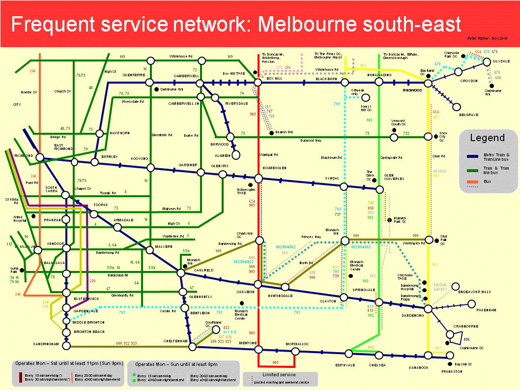
Melbourne south-east

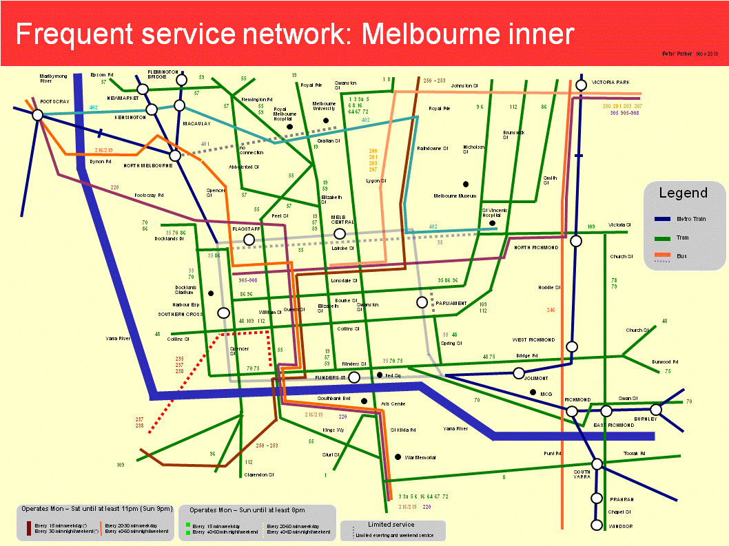
Melbourne inner

I will be the first to admit that these maps are not perfect.

Some maps, particularly the south-east, are way too cluttered. Deleting parallel lower service routes (so the key can be removed) and/or making each map cover a smaller area may help. The orientation of some streets (particularly the CBD) is not always ideal. And a few areas, such as around Port Melbourne and Prahran, fall within two maps but are well documented by neither.

Trying to reconcile geographic accuracy with simplicity was a challenge. So was illustrating both frequency and span. For the latter I made thickness represent frequency and line continuity represent span. Although it made the layout less clean, I wanted to show lower frequency routes that share the same corridor with high-service routes, and so boost combined frequency further.

Some of the complexity reflects the different service levels across the network. Bus routes especially don’t always fit neat categories such as (i) high service SmartBus, (ii) minimum standard local route or (iii) limited service special route. This shows that mapping can only simplify the network so much; planners need to do their bit to straighten routes and harmonise spans and frequencies as well.

In some cases I broke my own rules as the maps would have looked silly otherwise (eg half the rail network missing). For instance northern suburbs trains and western suburbs trains and trams operate every 20 minutes, and I have shown them even though the cut-off generally used was 15 minutes. If there was a rationale, it could be that people are willing to sacrifice frequency for trains’ average higher speed and comfort.

What these maps do demonstrate, however, is that frequency maps can provide a fresh way of seeing (and using) the public transport network that should be helpful for planners, providers and passengers alike.

Selling frequency

Brochures intended for tram hand-holds selling the frequent lunchtime service now available on a city tram corridor.

Tuesday, November 02, 2010

Transport safety videos over the years

A selection of sometimes hard-hitting, sometimes entertaining clips with a serious message.

2010

2009

2000s?

1992

1984

1970

1948

Wednesday, October 20, 2010

Employment concentration and public transport service quality

Just over six months ago Alan Davies of the Melbourne Urbanist reminded us that the majority of jobs in Melbourne are (1) outside the CBD and surrounds, and (2) outside what Melbourne 2030 calls 'Major Activity Centres'. Outside the top four areas where employment is highly concentrated, is a 'long tail' of smaller centres which employ between about 1 and 2 percent of suburban centre jobs.

In descending order of significance the top four centres were Clayton, Tullamarine, Kew/Hawthorn and Box Hill.

I thought it would be worth comparing the availability of high-service public transport routes to and within these areas. This could help answer questions such as whether the largest employment centres had the best public transport, or whether historical factors, such as the era of development and presence of tram routes were more important.

Criteria used to assess service quality to these employment areas were as follows:

a. Service levels. The number of directions from which high service routes to the area is provided (at least SmartBus spans and frequencies). Lower frequency routes and branches are not counted, even though some approach SmartBus standards.

b. Travel speeds. As measured by the number of directions with services that operate on their own rights of way (eg railways, busways and segregated light rail).

c. Connectivity. Number of intersections between high-service routes.

d. Coverage. Extent to which the highest service routes are within walking distance of the highest concentrations of employment in the area. Assessed as low, medium or high.

Only regular Metcard/Myki ticketed routes were counted in this survey.

The overall rating comprises a Service, Speed and Connectivity score ( a + b + c) plus a coverage estimate for high service routes (described as low, medium or high).

Assessments by centre, starting with the largest, are as follows:

Clayton (includes area around Clayton Station, Monash University and Blackburn Rd)

a. Service levels

High service routes are as follows: Bus 900 (2 directions) and Dandenong line train (2 directions).

Total number of directions with high service routes: 4 (increases to 8 if the lower service 703 and 802/804/862 routes are included)

b. Travel Speeds

Number of directions with ROW route: 2

c. Connectivity

Number of intersections between above high-service routes: 0

d. Coverage

Train serves areas near Clayton shopping strip and Monash Medical Centre. Route 900 serves area near Monash University. Business parks and light industrial in the area are not served by the above routes. The area is pedestrian-hostile.

Overall: SSC score 6 with medium coverage.

Tullamarine

a. Service levels

High-service routes are Routes 901 and Routes 902. Route 901 offers service in one direction and Route 902 operates in both directions.

Total number of directions with high service routes:3

b. Travel Speeds

Number of directions with ROW route: 0

c. Connectivity

Number of intersections between above high-service routes: 1 (Mickleham Rd)

d. Coverage

Route 901 offers medium coverage of airport (stop is away main passenger gates). Both routes serve Mickeham Rd. Melrose Dr, Sharps Rd and Keilor Park Dr not served by above routes. The area is extremely pedestrian hostile.

Overall: SSC score 4 with low-medium coverage.

Kew/Hawthorn (area east of Princess St and from Swinburne University and north)

a. Service levels

High service routes are as follows: Tram 16 (1 direction), Tram 48 (2 directions), Tram 109 (2 directions), Bus 200/201/207 (1 direction), Ringwood/Alamein trains (3 directions).

Total number of directions with high service routes: 9

b. Travel Speeds

Number of directions with ROW route: 3

c. Connectivity

Number of intersections between above high-service routes: 3 (Kew Junction, Cotham/Glenferrie Rd & Glenferrie Stn)

d. Coverage

Most major trip generators are served by trains and trams that quality as high-service routes. Coverage is therefore high.

Overall: SSC score 15 with high coverage.

Box Hill

a. Service levels

High service routes are as follows: Tram 109 (1 direction), Bus 903 (2 directions) and Ringwood line trains (2 directions).

Total number of directions with high service routes:5 (increases to 9 if the lower service 270/271, 286, 281/293 and 281/767/768 corridors are included)

b. Travel Speeds

Number of directions with ROW route: 2

c. Connectivity

Number of intersections between above high-service routes: 1 (Box Hill Station)

d. Coverage

Good coverage within Box Hill Shopping centre and surrounds. Hospitals and TAFE colleges are near at least one high-service route. Overall medium – high.

Overall: SSC score 8 with medium-high coverage.

Conclusion

This analysis has many limitations. For instance area boundaries and job densities could have been established and the proportion of jobs within pedsheds of high-service stops should have been examined to obtain a more accurage coverage statistic. And the different local network topologies, from parallel non-intersecting routes (eg Clayton), to a single interchange point (Box Hill) to a multi-centred network (Kew/Hawthorn) could have been explored.

However the information gathered should be robust enough to show that that public transport service levels are not necessarily matched to a suburban centre’s employment significance. In particular the two largest centres (Clayton and Tullamarine) have high-quality services from fewer directions and not as many interchange points as the two smaller (but still large) centres.

Nevertheless service levels have become more equal between centres over the last five years, as tram service levels remained largely unchanged, new SmartBus routes commenced and local routes gained 7-day service. Five years ago, for instance, Clayton, the largest employment centre, had only one high-service route (the train), which missed the suburb’s biggest employer (Monash University). And less than one year ago Tullamarine, our second largest, had only occasional services. Both now have at least one high-service bus route serving the largest employer in each area.

Friday, August 20, 2010

Frequent service Map 1: Melbourne's south-east

Via Jarrett Walker is advice that Vancouver’s TransLink is seeking ideas from the public for a frequent network map, to highlight high service routes and corridors.

We have never had such a map for the Melboune network. More than any other Australian city frequency here has been a function of mode. Trams are most frequent, offering ‘turn up and go’ service every 5 to 15 minutes, at least during the day. Trains are next, on 15 to 30 minute frequencies. Buses were last, typically operating every 20 to 60 minutes, with varying spans and operating days.

Although there were exceptions, if you wanted frequent travel and an assurance of being able to travel on Sunday or get home at night you would almost never catch a bus. Hence train and tram system maps (normally mode rather than area-based) were our de-facto frequent network maps.

In the last five years we have seen the extension of many bus services to 7 days and the commencement of SmartBus services, which, at least on weekdays, operate at or better than train frequencies. The generalisation that buses run less often than trains remains valid but decreasingly so. However because our network maps treat all bus routes as being equal (just like if a street directory showed local streets as thick as freeways and distributors) the higher service on the better routes and corridors is uncommunicated to passengers.

The solution is a multimode frequent service map to highlight the high-service parts of the network that can reasonably be navigated without a timetable (at least on weekdays). It would be in a simple schematic form, showing only the high-service corridors, interchange points and major trip generators. At major interchanges it would supplement but not replace metro-wide single mode network schematic maps and local multimode geographically-based street-level maps.

A possible frequent service map for the south-east suburbs of Melbourne is shown below. Interstate or international readers should note it's approximately one-third of the metropolitan area and excludes the CBD (beyond the top left of the map). The areas covered are approximately 4 to 40 kilometres from the city centre.

This map is an attempt to simplify a fairly complex network that has diverse service levels and operating spans. I have set a cut-off related to SmartBus service levels, ie a 15 minute frequency on weekdays and 30 minutes on nights and weekends. Less frequent individual routes are not shown unless they parallel other routes to form a high combined frequency along a corridor.

Line thickness is related to service frequencies for individual routes or route families, with two levels used; thick for 15 minutes or better, and thin for inferior to this. Routes or corridors with 'full-time' operating hours, ie daily service until 11pm (9pm Sunday) got solid lines. Routes offering lesser spans got dashed lines. Hence a thick dashed line would be a frequent weekday service with limited or no service at other times. Conversely a thin solid line would indicate lower frequency but wide span (like outer suburban trains). A thin dashed coloured line would typically be a 'minimum standards' route, with 7-day hourly service until 9pm. Routes offering less than this (only drawn if they added frequency to a corridor) are shown with a grey line.

Melbourne typically colours its train information blue, tram information green and bus information orange. The map above adopts these colours for train and tram lines. However because there are more bus routes legibility requires the use of several colours. The orbital SmartBus routes were identified by colour in the planning stage (eg red orbital, green orbital, yellow orbital) so I have used these colours on these routes.

Some frequent service maps concentrate on daytime frequency and offer little assistance to passengers travelling at other times. However to provide assurance that night travellers won’t get stranded, it's desirable for maps to show approximate operating spans as well (especially finish times), in an unobtrusive form. I believe this map succeeds at both, without introducing too much clutter.

Monday, August 16, 2010

Metro's Caulfield - Camberwell shuttle: the bigger picture

Today's Herald Sun carries an article about a proposal from Metro Trains for a north-south bus route between Caulfield and Camberwell.

Metro's motivation may well be to relieve loading on two of Melbourne's busiest rail corridors. Nevertheless from a total network perspective it has a lot going for it, but only if planned in conjunction with existing nearby routes, which have just been reviewed.

Maps


View Larger Map

Also see Metlink local area map for local network

Notes about the area and transport services

- Approximately 10km from Melbourne CBD.
- Major universities adjacent to Caulfield (Monash) and Glenferrie (Swinburne) stations.
- A high international student population (who are heavy users of public transport - day and night).
- A major activity centre at Camberwell. Caulfield has similar potential if its underutilised racecourse is redeveloped.
- Both Caulfield and Camberwell are major junctions on Melbourne's busiest railway lines. All passing trains stop at these stations. Trains run approximately every 3 minutes during weekday peak, 7.5 to 15 minutes during off-peak and 15 to 30 minutes evening.
- No strong north-south public transport links for the six kilometre stretch between Glenferrie Rd and Warrigal Rd in the area south of the Glen Waverley railway (trains and trams are all east-west). In contrast the suburbs to the east (around Warrigal, Blackburn and Springvale Roads) have partial or full north-south SmartBus routes that are amongst Melbourne's busiest.

Existing services

Current options for travel between Caulfield and Glenferrie/Camberwell include:

- Train via a transfer at Richmond. Involves some backtracking but may be faster than the direct options that involve tram or infrequent bus.
- Route 72 tram between Toorak, Gardiner and Camberwell. Also involves some backtracking if coming from Caulfield as the line turns west instead of continuing south. Only a minority of daytime trains on the Caulfield group stop at Toorak, forcing an extra transfer at Caulfield.
- Route 16 tram between Malvern, Kooyong and Glenferrie. Provides a direct link to Swinburne University but can be slow. Not all trains stop at Malvern.
- Route 624 bus between Caulfield, Tooronga and Auburn. Serves the quieter station in between Glenferrie and Camberwell which is not served by all trains. The route is direct but its 30 minute frequency is less attractive than train or tram.

Overall

A Caulfield - Camberwell bus route that is more attractive than existing options could make a lot of sense. It would fill a major gap and be at least as well used as portions of some SmartBus routes.

Strong circumfrencial bus links can ensure that those who don't need to enter the CBD are not forced to do so. This frees up space for those who must (eg instead of staying on until Richmond, passengers at Caulfield may opt to change to a bus to Swinburne or Camberwell instead). And it's good economics too; the marginal costs of carrying passengers increase in congested areas, so frequent cross-suburban buses could pay for themselves in rail infrastructure not needed, and attract patronage in their own right.

My only proviso is that if implemented the route would not become an example of grafted-on planning which is inefficient and detracts from the capacity to fund local bus review recommendations. A way to avoid this is not to evaluate the proposal in isolation, but to considering adjacent existing bus routes (eg 624), especially if these could be modified to more economically form the new service.

Saturday, August 07, 2010

They mean well, but...

Today's Herald Sun has an article about a personal safety campaign targeted at international students travelling at night on public transport. Possibly a response to student safety concerns, it is supported by major universities (and other bodies) in Sydney and Melbourne. Transport departments, industry bodies or operators appear not to be involved.

Campaigns such as Think before you travel must be designed very carefully or they can do more harm than good. It's a fine line between encouraging modified behaviour (which may lower an individual's risk) and fuelling the perception that 'public transport is unsafe'.

If too many take the latter to heart, it becomes a self-fulfilling spiral - even fewer travel, the perception of safety declines further, causing even fewer to travel until a point is reached that only trouble-makers and the desperate are travelling.

Unfortunately I believe that elements of 'Think before you travel' do risk being counter-productive.

My first worry is the name of the campaign - 'Think before you travel'. Though milder than 'Think whether to travel', there is still a message that people should voluntarily restrict their liberty and not travel (as it's a big bad world out there). Or if they do travel, drive instead of take public transport (given ads and tips focus on or near public transport, as if that's the only place where bad things happen).

In contrast, a 'Think when you travel' message, although it's a change of just one word, would be more positive, not discourage transit use and support freedom to travel as a right in a civilised society. Any such campaign should also cover driving as well as public transport to fairly reflect risk.

The point about liberty is important, especially for people from societies less free than ours. Travelling alone is not a crime. People should not be chided as being somehow reckless or irresponsible for doing so. And accounts of assaults should not blame the victim for exercising this right.

The idea that people should restrict their freedom, though apparently desirable for safety, is an acquiescence to tyranny, or the fear of it (albeit committed by criminals rather than governments). We should not accept this as satisfactory; it diminishes us all if the exercise of a significant freedom is discouraged as part of a (well-meaning) taxpayer-funded campaign.

This is particularly if campaigns discourage the exercise of liberty that is socially beneficial, which I will explain below.

There are some liberties that we accept even if (inappropriately exercised) the consequences to others range from discomfort (eg clipping nails in public) to mild harm (eg passive smoking out of doors). People are legally free to do these sorts of things but there is reliance on civil society concepts of consideration to minimise detriment to others. A polity that seeks to prohibit everything runs out of police and prisons to enforce all infractions.

However there is also a virtuous group of liberties which if exercised by one person improve things for everyone else. Walking and travelling on public transport at night is one such example due to 'safety in numbers'. Campaigns that even only slightly lessen the propensity for people to exercise such 'virtuous liberties' are counter-productive and ought not run.

A couple of the safety tips are doubtful or don't apply in all areas. One display a wariness about public transport interchanges. For example: "Avoid long waits on platforms and around Public Transport hubs. If you do have a long wait stay in well lit areas or near open shops." In Melbourne a railway station large enough to be called 'a public transport hub' will be a premium stations, with a staff presence and often enclosed waiting areas. Some car parks aren't the most savoury of places either, and I'm not sure that hanging around an open liquor store or hotel car park is necessarily safer than a station platform.

The suggestion about the guards compartment does not apply nation-wide. And that such warnings apply 'outside of peak times' as well as at night seem over-cautious. Besides being impractical if everyone did it given the good patronage of many off-peak trains in Melbourne. These points underlie the hazards of trying to apply a Sydney campaign to other cities without making changes for local conditions.

The clip ends with a message 'Are you feeling lucky - think before you travel'. Which again conveys the perception of risk or travel being a safety lottery.

The best way to increase safety on public transport is to encourage more people to use it. This means making it more attractive for people to use. For example reduced waits through frequency and co-ordination, better urban design, staffing and so forth. Carriages should be numbered inside for easier identification by people dialling 000. While a role exists in passenger education, it is extremely important that it encourages rather than discourages patronage, as may be the risk with aspects of this campaign.

Sunday, May 30, 2010

How much does it cost to get around in the city: bikes, public transport and taxis compared

Melbourne's public bike share scheme starts tomorrow.

Each mode has its own advantages and peculiarities. For instance public transport isn't always door to door, waiting times for taxis varies, and the bike hire scheme requires a $300 security deposit (daily and weekly members only) and BYO helmet.

The charging structures for each mode varies, and this will be the topic here.

Taxi: Fares are based on a $3.20 flagfall plus $1.617 per km or 56.6c / minute time charge (the time charge applies if the speed is under 21 km/h). A 20% surcharge applies late at night or on public holidays. Taxi fares are several times dearer than public transport fares or bike hire charges, to reflect the personal door to door service provided.

Public transport: Fares depend on ticket type, validity period and passenger. Discounts apply for bulk-purchase, periodical and weekend tickets. A single-trip City Saver costs $2.80. 2 hours unlimited travel in Zone 1 (which includes the CBD and inner suburbs) costs $3.70, while a day costs $6.80. Concession fares are a bit over half these amounts. Bulk purchase and periodical tickets can offer savings of 25% or more.

Bike Share: Charges are based on a $2.50 daily flagfall (or membership charge) plus a rising charge per 30 minute block. The first half-hour is included in the flagfall. The next half-hour costs $2.00. Above then per half-hour charges rise; to $5 for 61 - 90 minutes and then $10 for each subsequent half hour.

Comparisons: Imagine a graph with time along the x-axis and cost along the y-axis.

The taxi curve is very steep, shooting up to nearly $10.00 by around 10 minutes of travel.

Public transport and bike share are both cheaper than taxis, but they swap places depending on the amount of travel time required.

Up to 30 minutes bike share is almost always cheaper, at $2.50 (much less for weekly and annual members). However users of City Saver x 10 pay $2.18 per trip - this is the only case where full fares are lower than bike share charges for up to 30 minutes of use. While the City Saver x 10 is a bulk-purchase product, there are no restrictions on when it must be used up by, unlike periodical Metcards or weekly bike share memberships.

The costs of bike share and public transport cross over in the 30 to 60 minute region. 60 minutes of bike share costs $2.50 flag fall + $2.00 usage charge, or a $4.50 total. In contrast a 2 hour full fare Zone 1 ticket costs $3.70. Hence for the casual pay-as-you-go user, public transport is always cheaper for an hour's travel.

It is in the 60 minutes or under usage level that the benefits of long-term bike share memberships are greatest. A weekly member riding up to an hour 5 days per week pays $1.60/day flagfall + $2.00, or a total of $3.60 per day. This is comparable to casual Metcard ticket purchase (for a 2 hour ticket) but dearer than a 10 x 2 hour Metcard. Yearly bike share membership is only 20 times the daily rate, so yearly members who cycle weekly or more would pay just cents for flagfall each time. Yearly members could bike share for an hour a day and pay less than public transport users, even those using periodical tickets. Around the 30 - 60 minute region bike share and public transport costs are roughly the same, with public transport generally cheaper, especially when compared against costs for casual bike share users.

Beyond an hour the cost differences between bike share and public transport diverge markedly. Because public transport tickets are mostly time-based, and the shortest is 2 hours, it is no dearer to take transit for 2 hours than it is for 1 hour. There is also a relatively gentle rise from 2 hour to daily fares, with less than a doubling for an increase in travel time allowed by over five times.

Bike share charges behave in the opposite manner, rise steeply with time of use. Charges (excluding flagfall) increase from $0 (30 minutes), $2 (31 - 60 minutes), $7 (61 - 90 minutes) to $17 (91 - 120 minutes). At this 2 hour level casual bike hire is $19.50, ie approximately 5 times dearer than a 2-hour public transport ticket. This almost exponential rise is presumably to encourage use of the scheme for short trips in the CBD region only.

Conclusion: Of the three modes of travel compared, public transport is the most cost-effective for CBD travel. This is especially for visitors from the suburbs, who in many cases will have arrived on public transport with a daily or higher ticket, so would face a marginal cost of further CBD travel of zero. The bike share scheme occasionally works out cheaper, but only for those frequently making short trips.

Monday, March 08, 2010

Small usability improvements for public transport

A great deal of transport project funding is already committed through major transport plans whose projects are typically long-term and infrastructure-based. It will be a while until the major ones come to fruition. A lot of the rest is recurrent expenditure.

Our growing population still has unmet travel needs and public transport is being asked to take on a larger role.

Hence there is a real need for transport improvements that are not expensive but can increase the usability, capability and thus patronage of transit services. Such improvements can either be one-off small infrastructure projects or a few extra services inserted at times when existing timetables are lacking.

Below is a list of examples, grouped by benefit. Their benefits are typically both local (by improving access for a particular area) and network-wide (as traits such as coverage, legibility and frequency are improved).

ACCESS AND CATCHMENT ENLARGEMENT

Frankston is a case where the station entrances south of the station is remote from most surrounding houses and further than it needs to be from a shopping centre. Passengers coming from these areas often need to backtrack to board the train, increasing their walk by 300 - 400 metres.

This extra distance is a large percentage of a station's 800 metre pedshed. Adding a northern platform entrance at 'X' would speed access for thousands of users and increase the station's 800 metre pedestrian catchment to include more residential areas off Beach Street.

The map below shows how the northern part of Patterson Lakes is physically near but just outside a station's pedestrian catchment for want of direct roads or walking paths. A narrow pedestrian/cycle bridge across the channel plus upgraded bicycle storage at Bonbeach Station would cheaply extend the reach of the rail network and provide a faster journey time than changing to a bus.

CONNECTIVITY

A common problem faced by transit is how to serve major destinations (such as universities and shopping centres) that are just beyond a railway station's pedestrian catchment. Southland Shopping Centre has a very frequent bus service from Cheltenham Station. However buses may depart from any of three widely spaced stops, so getting the next bus to Southland has always been a case of pot luck. Modifying routes to serve the same stops could allow the full benefits of the high frequency service provided to be realised.

The timetable for Route 517 below is an instance where buses cannot reliably connect with trains due to their unharmonised service interval. The effect is widely varying end-to-end trip times (making the bus a last-resort transport option) and the need for passengers to carefully pick trip times to avoid excessive waiting.

Sometimes slightly less frequency can mean better service. In the example below, reducing 517's Saturday headway from 38 to 40 minutes and Sundays from 55 to 60 minutes would at least provide constant interval connections with every second or third train respectively.

SERVICE SPAN AND FREQUENCY

There are certain times where span and frequency do not represent desired or actual travel patterns.

An instance of the former is the period immediately after the pm peak. Spreading the peak increases both efficiency and patronage. A way to encourage this is to more attractive shoulder-peak train services, such as higher frequency and express services. Critical times could be 9-10 am inbound and 6 - 8pm in the outbound. As stations are already staffed and the trains already exist, the main resources needed would be drivers and maintenance staff.

One area of unserved patronage demand is Sunday morning, where many people attend suburban markets or (sometimes) early sporting events in the city. NightRider buses have finished and the first outbound arrivals in some outer suburbs are not much earlier than 9am. Melbourne is a particularly late starter compared to Sydney, whose trains start much earlier on Sunday morning.

Unlike a frequency increase, bringing the Sunday start of service forward by 60 - 90 minutes represents an increased span. This shortens the period available for track work on Saturday night. In addition the increased span increases staffing costs at premium stations, which are staffed from first to last train.

If the cost of funding the extra 1-2 hours station staffing per week is an issue, it may be possible to find some offsetting savings by closing staff service at non-safeworking stations earlier, for instance just after the last 'up' train rather than the last 'down' on (say) a Sunday night. This would reduce customer service as regards ticket purchase facilities, toilets and perceived safety through staffing on Sunday evening. However based on a greater good argument, it may be that that the new patronage attracted by the new early Sunday trains would exceed those dissuaded from riding the last couple of Sunday evening down trains.

LEGIBILITY

One of my hobbyhorses, familiar to regular readers, the route below would be better off split into two route numbers (even if services continue to through-route via Chadstone).

Legibility is improved if a standard arrangement across all routes applies for public holidays. There have been rapid recent improvements and a majority of bus routes now have similar patterns to trains. However those as yet unstandardised are some of the busiest services in Melbourne, such as the case below:

EFFICIENCY

Addressing access and usability issues such as the above are relatively cheap, although some would involve recurrent expenditure. Costs in all cases would likely be in the low millions as opposed to hundreds of millions to billions for major projects. Nevertheless inefficiencies should still be identified and removed, especially if there exist improvements that provide larger benefits for the same expenditure.

The following are examples of routes that were useful when they were commenced but appear to no longer serve a useful function as new or upgraded alternative routes now exist.

Sources: Timetables - Metlink Victoria Pty Ltd, Maps - Melway Publishing 2007 & Google Maps.

Tuesday, December 01, 2009

Snippets from the new train contract

Yesterday's media initially concentrated on 'soft' stories such as the transition to the new rail operators, statements from politicians and train rebranding. However today's service disruptions on some lines reminded us that the basics of running a railway are (and should never be) very far away.

How Melbourne's railways are to be run is prescribed in the Franchise Agreement, Projects Agreement and an Infrastructure Lease Agreement.

While their contents is often too specialised for the mainstream media, long-term these documents will prove more important than the name changes and media conferences in yesterday's news.

What are some of the notable points in the train franchise agreement?

Definitions

The first 48 pages are definitions, conditions and warranties. While there are some odd definitions like the meaning of weekdays (Labour Day on a Monday isn't) it's still worth a skim since tantalising terms like planned delayed services, Platform Assistant Withholding Amount and Maintenance Cost Saving Amount are all defined.

The most discussed definition would be 'on-time running'. This is now defined as within 4:59 minutes instead of 5:59 minutes under Connex. However the Metro website has dual standards; 92% within 5:59 minutes (same as the old Connex standard) and 88% within 4:59 minutes, which depending on the number of trains between 4 and 5 minutes late is pretty close to being the same thing.

'Must Dos'

Page 50 lists performance requirements against what are called 'Year 5 benchmarks'. The two fixed ones are for 'reliability' and 'customer experience'. Further details of reliability standards, their quarterly review and various levels of non-compliance appear from page 76. Information on the 'customer experience' benchmark appear in an appendix but their general aim is to capture some of the 'customer service' facets not in previous franchise agreements.

Page 53 requires the formation of a Network Development Partnership to discuss issues, monitor performance and agree on a Strategic Operations Plan. Both directors of public transport (ie the Department) and franchisees can propose changes to the Master Timetable (more detail starting page 70).

Page 59 discusses load breaches (ie overcrowding). The train operator may receive load breach notices from the department but 6.1(b) states that the department is not obliged to issue them. Generally the department needs to approve reductions in carriage seating capacity. This is topical due to the trial of a reduced seating Comeng train and announcements that new trains will have fewer seats to carry more passengers and improve flow (hopefully reducing station dwell times).

Major events

The use of short (3 car) trains on some lines, especially on weekends with special events, has proved insufficient for passenger numbers. Connex responded by increasing 6-car running on the longer busier lines. Page 63 requires the franchisee to use full consists (if reasonably practicable) on all but quiet shuttles on the ends of some lines.

New Years Eve trains will be provided and will be free, as in previous years (page 66). Shutting down the ticketing system that evening may be required to allow updates (fares normally rise on January 1). As happened in some previous years but not others, the agreement entrenches free trains on Christmas Day (page 67).

Trains and major events almost go together in Melbourne. Melbourne's ability to run big events without hitch is a major part of the city's self-image, at least amongst state and city leaders. Train network failures during major events is regarded very seriously (more so than disruptions to regular commuter travel). Hence significant space is devoted to transport for major events, with notification and planning starting 18 months prior (Page 67).

Timetables

Who determines what's in the timetable? Part 7 (Page 70) discusses this. The Director of Public Transport (ie the Department) can specify requirements in the form of numbers of added or deleted services by time band and even their approximate times. However timetablers are franchisee employees and it is these who shedule the service (noting the need to find train paths, trains and drivers and possibly juggling other services to form and accommodate them). The train operator can also initiate Master Timetable changes but must put proposals through the Network Partnership process and secure the Director's approval.

Provision is made for a Daily Timetable that is different to the Master Timetable to sometimes operate. These may be for planned occupations (required due to track maintenance), for safety reasons, special events or disruptions.

Planned and unplanned disruptions

Service disruptions have risen to prominence as patronage gains made the network more fragile. These are either planned or unplanned, with, as would be expected, tougher requirements for 'planned disruptions' eg buses replacing trains due to trackwork. Page 78 specifies requirements for replacement transport, with the standard being 'reasonable endeavours' and passengers being transported to the end of their 'intended journeys'.

What happens if running is persistently not to the timetable? Page 76 refers to three escalating thresholds: 'call in', 'breach' and 'termination' with judgement made every quarter. The standards have been set that the 'breach' or 'termination' levels require extremely poor performance to be triggered. As has been the case since 2004, these sorts of figures are averaged network-wide, so lines can suffer periods of severe underperformance (eg Stony Point) but this in itself is insufficient to trigger these sanctions if other lines are performing to standard.

Disruptions are sometimes not entirely within the operator's control. Page 79 lists circumstances that if the Director (DoT) agrees then the operator need not be called in, given a breach or terminated. Examples include disruptions due to 'force majeure', 'excluded rolling stock repair' (I'm thinking Comeng air conditioners here) or major projects.

Shuttles and connectivity

Some interesting comments on page 82, which deal with other operators' connecting services and shuttles. This explicitly mentions the Stony Point train and the ferry service to Cowes and French Island. Here there is duty ('reasonable endeavour') to consistently achieve connections.

That same page also requires consultation and co-operation with bus operators regarding facilities and information. However this section is both brief and scrappy; there is no similar requirement to co-ordinate with tram services and specific measures that would assist passengers, such as requiring the display and stocking of bus timetables at stations are omitted.

Clause 7.18 discusses shuttles, such as those that operate between Williamstown and Newport, or Alamein and Camberwell. I couldn't understand this paragraph. The first part requires both timetabled and actual co-ordination. However to my mind this is contradicted by the second part which does not even require the shuttle to be delayed.

Information

Timetables used to be hosted on both the Connex and Metlink websites, with different formats in use. Metro now links to its timetables on the Metlink site. However as real time information is only provided on the Metro site, Metlink cannot yet be regarded as a single source for service information (although it can be for timetables).

Page 83 of the agreement deals with this. While the operator can provide real-time information direct to passengers, it must also provide it to Metlink, apparently with the intention that Metlink will also carry live information.

A very unusual service improvement

Page 84 contains an obscure service improvement that as far as I know has gone unpublicised. On Good Friday and Christmas Day trains have always run a Sunday timetable, with a Saturday schedule applying on other public holidays. Since Sunday train services were upgraded about 10 years ago, their main difference compared to Saturday schedules was that first services were 2-3 hours later.

7.21a of the agreement says that Christmas Day and Good Friday services must run to the master timetable for Sunday except that services must be provided as per the weekday timetable until the Sunday timetable kicks in. If this is correct, we have the anomaly of early morning services as frequently as 10-20 minutes, then every 30-40 minutes around 8am and then back to 20 minutes after about 11am. Similar changes also apply if Australia Day and ANZAC Day fall on a Sunday, though at least in the latter case there may well be higher patronage, depending on the timing for early services.

Extra money will need to be found for drivers to run frequent trains in the early hours of Good Friday and Christmas Day that few passengers will use. I am not convinced that this necessarily represents the wisest use of resources given that other service improvements (eg daytime frequencies extended to 8-9pm, consistent Sunday evening train frequencies and/or earlier trains on Sunday mornings) would all deliver better patronage gains.

Passengers and staffing

Passengers get their own section (p85). This relates to the publication of a Customer Service Charter in specified languages and formats, a compensation code, refund policy, complaints process, DDA compliance, an ill passenger protocol and lost property.

Crowd Management is a major new area. The Franchisee must have a Crowd Management Plan and employ more platform assistants at inner-city stations. Also new are surveys and quarterly monitoring of customer satisfaction (note that quarterly is consistent with Track Record reports). Big drops must be explained.

Increased staffing has been promised. These include 22 staffed stations (these will be host). The Franchise agreement also specifies that there will be a minimum of 350 Authorised Officers (page 95).

Fares and ticketing

Fares are set by the Department (and approved by the State Government). Contrary to what some claim in the letters pages the operator does not set fares. Hence the fares and ticketing section of the contract is brief and requires working within the fares structure, current and new ticketing systems and an obligation to counter fare evasion.

Relationships

Section 11 deals with interoperator relationships. It is hard going. But there are some items of interest, such as safety, branding obligations, track access for heritage rail groups, operator accreditation and more. 12 to 14 are financial and administrative aspects.

Electricity procurement is the topic of Section 15. This came up in the Parliamentary Inquiry into train services. An important issue is security of supply, especially on hot days when loads are high.

Rulling stock and availability

This post is more than long enough and few will have read this far. But the contract gets no less important. Part III deals with rolling stock. Very topical since last summer's disruptions were exacerbated by inadequate air conditioning on Comeng trains. 'Faulty trains' are at least a partially preventable cause of service cancellations. Topics covered in this portion include repair, renewal and peak availability. Peak availability requires improved performance over time - 92% at contract commencement and 94% in 24 months (page 174). Low availability constitutes a 'call-in' event. The current Master Timetable requires 145 trains, with possible variations when new timetables are introduced.

Non-performance

What happens if the operator doesn't perform? Read Part IV for this. The first level is a 'call-in', ie a 'please explain' for which a remedial plan may be required. Next is a 'franchisee breach'. For this a 'cure plan' must be presented and the Director may impose a penalty. Finally there is termination. The department may use 'step in' powers for terminations or severe breaches. These appear to be 'reserve powers', only to be used sparingly and in exceptional circumstances.

Annexures including loading and frequency standards

The second part of the franchise document contains the annexures. These contain the more detailed standards, formulas and methods. Still it's worth a look for the passenger weightings (can compare relative patronage of lines) and frequency standards (termed 'maximum delay minutes' - Schedule 7). These are low 'minimum standards' that in some cases are both non-clockface (eg 25 or 40 minutes) and represent less service than currently runs.

Against this should be compared Victorian Transport Plan and other statements about moving to a 'metro-style service'. If the agreement fully reflected this it could have defined a core network across which a high minimum service frequency (say every 10 minutes) would apply after a program of upgraded services over several years. If we take the authorities at their word, we can only assume that any plans for service improvement will be contained in other (more easily revised?) documents and the low minimum standards have been inserted in the franchise agreement to give the franchisee and the Department significant 'wriggle room'.

Conclusion

Overall these contracts are a difficult but rewarding read that will inform the reader of the broader operating context for Melbourne's trains. Highly recommended.