Showing posts with label buses. Show all posts

Saturday, December 10, 2011

The user time element in public transport service planning (Pt 2)

Can it be done?

Still think that substantial travel time reductions are impossible without building high-speed railways under each suburb?

The following examples show how significant travel time savings could be possible, largely with existing infrastructure.

Example 1: Inter-suburban bus trip

Consider a short bus trip where the bus runs every 40 minutes. This service level is typical for middle and outer suburban routes and even some major inner suburban routes (eg 246 on Sunday evenings).

The trip takes ten minutes, with five minutes allowed to reach and leave the stop at either end. That adds up to a best case 20 minutes travel time, if you arrive at the stop just as the bus arrives. The worst case, if a bus has just been missed, is 60 minutes. While the average, assuming random arrival is 40 minutes.

This comparison shows high variability, or +/- 20 minutes from the average. The 3:1 difference between maximum and minimum trip times is entirely due to the attempt to make a short trip by randomly arriving to catch a low frequency service.

Increasing frequency to 20 minutes reduces the average time to 30 minutes, or a 33% reduction. Variability is reduced to +/- 10 minutes, or 20 to 40 minutes. For a ten minute frequency the average drops to 25 minutes, or an average 37% time saving. Variability drops to +/- 5, or a ratio of maximum to minimum of 1.4:1.

The above example shows that frequency has a dramatic effect on random arrival end-to-end travel times. Higher frequency also cuts variability, or effectively increasing travel reliability. The minority willing to plan around timetables can enjoy the benefits today, without any frequency increase. That’s unless they depend on connections, which are discussed next.

Example 2: Bus + train trip

Consider a suburb about 20km from the CBD. Its local buses run every 30 minutes and the trains every 20 minutes. The passenger is 5 minutes walk away from the bus stop. The bus trip (via a meandering route) takes 15 minutes to a stop near the station. When passengers alight the bus they need to cross a busy road to the station, which has only one entrance at the far end of the platform (assume 5 min). After that the train takes 40 minutes to the city.

The best case travel time is 5 min (walk) + 0 min (wait for bus) + 15 min (bus travel) + 3 min (station access) + 0 min (wait for train) + 40 min (train travel). Or a total of 65 minutes for the 20km trip.

The worst case travel time is 5 min (walk) + 30 min (wait for bus) + 15 min (bus travel) + 5 min (station access – assuming 2 min traffic light cycle at crossing) + 20 min (wait for train) + 40 min (train travel). That’s a total of 115 minutes for the 20km trip.

There’s three things to note. Firstly the worst case represents an overall speed of just over 10km/h or about double walking speed. Secondly the variability is high – the worst case taking twice as long as the best case. And, in the worst case example, the passenger is in motion for barely half the time.

Now consider the same trip above, with the following modest service improvements:

· Bus frequency upgraded from 30 to 20 minutes, to provide a harmonised connection to each train, with a consistent 6 minute connection · Bus route made more direct, to reduce travel time from 15 to 10 minutes and fund the higher frequency, but with 5 minutes added walking time · Additional station platform entrance and zebra crossing installed (to reduce station access time from 5 to 2 minutes)

The best case travel time following these improvements is as follows: 10 min (walk) + 0 min (wait for bus) + (10 min bus travel) + 2 min (station access) + 4 min (wait for train) + 40 min (train travel). Or a total of 66 minutes for the 20km trip. The worst case following these improvements is as follows: 10 min (walk) + 20 min (wait for bus) + 10 min (bus travel) + 2 min (station access) + 4 min (wait for train) + 40 min (train travel). Or a total of 86 minutes for the 20km trip.

The difference is dramatic. The average travel time has fallen from 90 to 76 minutes, while the ‘worst case’ is nearly 30 minutes quicker. Variability also fell; from +/- 25 minutes of the mean to +/- 10 minutes. Better connectivity and higher bus frequency contributed most to the gain. However more direct bus routing and better pedestrian access also added smaller but no less cost-effective benefits.

Example 3: Bus + Bus trip

Finally we’ll examine a cross-suburban trip involving a change between two bus routes. This is typical for journey types in which public transport has a low modal share.

I’ll use similar assumptions to the first example. Eg 5 minute walk to and from the bus and 10 minute travel time in each bus. The first route runs every 60 minutes while the one being changed to is every 40 minutes.

The first leg involves 5 min (walk time) + 30 min (average wait) + 10 min (travel time), or a total of 45 minutes. The best case is 15 minutes, while worst case is 75 minutes. Or a variability of +/- 30 minutes.

The wait to the second bus will be anywhere between 0 and 40 minutes. Because the frequencies are unharmonised the best connections will recur every two hours. We’ll assume an average of half its frequency, or 20 minutes.

The second leg involves 20 min (average wait) + 10 min (travel time) + 5 min walk time, or a total of 35 minutes average. But it could range from 15 to 55 minutes, or a variability of +/- 20 min from the average.

The very shortest time that the overall trip can be made is 30 minutes, with the longest 130 minutes. The average time is 80 minutes. Because time savings and delays average out, the traveller is unlikely to experience the extreme shortest and longest trip times. But if they do, that’s a ratio of over 4:1, or a variation of +/- 50 minutes.

While people may tolerate a higher variability for a short trip (Eg a 10 minute trip taking 20 minutes), it is probably true that tolerance declines for longer trips (especially if routine). Hence the letters in the paper complaining about suburban trips that take an hour by public transport but only 20 minutes driving.

There’s a couple of things that can be done to reduce variability.

Firstly the passenger could forego flexibility and use a timetable. Instead of waiting an average of 30 minutes for the first bus, they wait an average 5 minutes. This reduced variability of +/- 20 minutes is solely due to the connection between the first and second bus, which is beyond the passenger’s control. Average travel time is also reduced – by 25 minutes, which is the difference between the planned wait and the random arrival wait (ie half the frequency of the first service).

There’s also the contribution of service planning, which unlike the first response, assumes no accommodation on the part of the passenger.

Suppose the frequency of the first service was upgraded from 60 to 40 minutes. The first benefit of this is to reduce the average wait, from 30 to 20 minutes. Variability contributed by the wait for the first service is thus reduced.

The second benefit is that it matches the frequency of the second service. Such matching does not guarantee good connections but does dramatically slash variability. Let’s look at the numbers.

The first leg involves 5 min (walk time) + 20 min (average wait) + 10 min (travel time), or a total of 35 minutes. The best case is 15 minutes, while worst case is 55 minutes. Or a variability of +/- 20 minutes.

The wait to the second bus will be anywhere between 0 and 40 minutes. Because the frequencies are now harmonised the connections will recur every 40 minutes. We’ll assume there’s been no special planning and the wait for the second service is half its frequency, or 20 minutes.

The second leg therefore involves 20 min (average wait) + 10 min (travel time) + 5 min walk time, or a total of 35 minutes. Because the first leg has been harmonised to it the wait for it is now constant, variability has been reduced to zero.

Add the two legs and we have an average of 70 minutes. That’s 10 minutes down on the first case of 80 minutes. But the real gain has been in reduced variability. At best it’s 50 minutes and at worst it takes 90 minutes. This is a variability of +/- 20 minutes – well down on the earlier +/- 50 minutes. Also the ratio of maximum to minimum journey time has fallen from over 4:1 to under 2:1. Although average travel times are still slower than many would like, the improvement made from adjusting one route from a non-harmonised 60 minutes to a harmonised 40 minutes cannot be underestimated.

Again, with the earlier example one can do better. If one sacrifices flexibility and uses a timetable to catch the first service, the average travel time falls by 15 minutes (70 to 55 minutes) and variability virtually eliminated. Secondly, if planners consider that the connection between the two services is sufficiently important to be worth adjusting timetables, the connection time could be reduced from the 20 minutes average assumed here to 10 minutes. This contributes another 10 minutes, meaning a total average trip time of 60 minutes for those who don’t use a timetable and a reliable 45 minutes for those who do.

Summary and Conclusion

I have demonstrated the effect of frequency on cutting journey time. It is at first dramatic, with a point of diminishing returns being reached as frequency rises to around ten minutes. Beyond that point, unless it needed for capacity or for very short trips, its impact drops.

Also discussed has been travel time variability. Public debate on this normally concerns train reliability, and this is especially important for those connecting to less frequent buses. However the examples demonstrate indicate it can be very high for bus trips, especially those involving random arrival and connections between non-harmonised services. Harmonised bus frequencies can greatly reduce variability and make public transport more useful for trips where it’s currently weakest.

The planning approach presented here focuses most on service frequency and its harmonisation. There is less attention to infrastructure and capacity.

The former is cheap and quick, while the latter is expensive and long-term.

Both have their place in a growing city. But introducing the latter without the former means that use of the latter is poorly utilised and public transport’s potential to fully contribute to the overall transport effort is unrealised.

The user time element in public transport service planning (Pt 1)

There’s been heavy discussion about the financial user cost of public transport, following the announcement of an 8.6 per cent fare rise from next month. This post is about another user cost; the longer time it sometimes takes relative to driving.

Amongst those with a choice, public transport attracts its highest share where it is time competitive with driving, notably work trips to the city. Where it’s uncompetitive passengers tend to be those with more time than money, typically due to low incomes and/or an inability to pay. This is the familiar skewed pattern of old and young in the off-peaks and city commuters during the peaks.

This is a long post, so is split into two parts. Part 1 discusses user financial costs, funding sources, trip time and trip time variability. Part 2 uses examples to illustrate the large gains possible from service and other improvements.

Two dimensions: time and money

One insight that comes from counting time as a cost is that it invites comparison with that other type of cost most commonly associated with public transport – fares. Fares are known and fixed whereas time value is less tangible but no less important.

Although lacking hard numbers, we can guess time value’s magnitude or draw inferences from surveys and modal share statistics. We know it varies with trip length, location and timing. Acceptance of slow trips and high costs varies but depends on the value placed on time and money respectively. Some rough plots of user time versus financial costs for various transport modes in Melbourne are on the graph below.

The ‘best’ is cheap and fast (bottom left) while the worst is dear and slow (top right). The other corners are occupied by fast expensive (top left) and slow cheap (bottom right). Overall user costs for each comprises dollar plus time costs, with this increasing from bottom left to top right.

Consensus that a particular mode represents good value is highest for those near the bottom left. Whereas top right is poor value and only worthwhile for those willing to bear the high overall cost. If they are not, they’ll change homes, jobs or schools to avoid it. The action is crucial; mere grumbling implies acceptance since bad transport may still be better than other choices available.

I take the view that most people are transport pragmatists, ie whichever available mode suits their time / cost value profile for a particular trip will be used. Most of the time the mode chosen (driving) is faster but dearer than public transport. This invites the question as to whether the overall user value of public transport would increase if it were faster, even if somewhat dearer.

Public transport’s place

Public transport’s detractors treat slowness as inherent but this is not necessarily so. Where transit is slow, this is due to decisions made on station spacing, route and timetable planning, street design, signal priority and allocation of road space between modes.

Skybus (also on the graph) is an example of fast public transport. Its fares are high relative to government-subsidised routes. But because it’s both fast and frequent its time costs are low. Add the two and you see that Skybus occupies a distinctive (and successful) position in the market, set apart from regular buses (with low fares but high time costs).

Is regular public transport’s position on the graph optimum?

The answer depends on what you want it to achieve.

What would happen if you changed either its user financial or time costs?

Making an already low-priced but infrequent bus service cheaper would not greatly reduce the overall user cost to the ‘average person’. This is because unless they value their time lowly, the time cost component probably outweighs the fare cost and slashing the latter won’t cut the total much.

However this conclusion ignores certain market segments. Fare cuts are more significant for those who value money more than time, ie the ‘captive passsenger’ end of the market. This segment tolerates the limited service and values the saving more than average so will probably use the service more, possibly even increasing revenue.

It’s a bit like arguments in favour of Reaganomics tax cuts; individuals pay less but incentive stimulates economic activity which increases overall tax take. Fare / patronage elasticity will likely be highest off-peak and weekends as there’s more discretionary trips made by a different passenger profile.

The above limited bus service isn’t attractive to car owners unless driving conditions are very poor. People on all but the lowest incomes may find the waiting not worth the saving. Passengers that a lowered fare attracts may have previously walked rather than driven. Cheaper buses might make individual travel more energy intensive, although public transport fuel efficiency (as measured by fuel use per passenger) improves with patronage (ie more passengers per litre).

Speeding up buses (achieved through directness, frequency and connectivity) but charging a higher fare should have a different effect. The better service may attract some who previously drove or got lifts. Existing passengers may use the improved, more capable service more. But a fare increase could mean that even though the service is better, price-sensitive passengers abandon it for their lower value discretionary trips.

Funding better transport

There’s at least three things that can be done.

* The first is to maximise effective service levels from current budgets. For example delete routes that duplicate others and use saved resources where more worthwhile. This requires a strong service planning culture, and for co-ordinating agencies to take a network view; both factors in which Melbourne has been weak. Like tidying an over-grown garden before selling your house, good service planning has high payoffs, due to this legacy. And participatory public engagement, including illustrating the service gains possible, should help build acceptance.

* Secondly there’s the possibility of differential off-peak pricing. This gives the price-sensitive a discount while preserving revenue from the less price sensitive. This segments the market and probably optimises patronage, though at expense to legibility. A difficulty here is if peak fares must rise disproportionately to retain overall revenue, and here we merge into the next point.

* The third are other measures to generate revenue. Possibilities include development of rail air space, parking taxes, hypothecated property levies or above-CPI fare increases.

All are politically difficult, especially if the fare increase has not followed tangible reliability and service improvements. Rises skewed toward peak period commuters (without whom capacity building infrastructure would not be needed) may be economically most rational, but send the wrong signals with regards modal choice if not accompanied by similar increases for driving (whether through fuel, parking or road space pricing).

This combined approach may be better transport policy but probably harder than fare hikes alone due to the larger numbers affected. While not impossible, it may require a trust in government that is lacking, particularly in states that propose then cancel major transport projects, such as New South Wales with its various metro plans.

Whereas people are willing to individually pay more for quicker travel (as witnessed by the popularity of driving versus public transport), sourcing such funds for collectively funded network improvements raises hackles. How do we break this deadlock?

Seeing improvements differently

It may be worth reviewing how we regard transport improvements.

Large transport plans may be centred on infrastructure. Its purpose is typically to relieve ‘bottlenecks’ caused by extrapolating present commuting patterns forward. Time costs may be used to justify it; studies may cite rising congestion costs and ‘lost productivity’. Infrastructure’s tangible nature invites us to draw lines on maps and build models to imagine a faster future.

Another way of thinking is to set a public transport journey time reduction target and use the best combination of infrastructure and services to achieve it. The bigger the target the higher the cost, but the more likely that public transport would win the modal share shifts envisaged in Melbourne 2030 (an increase from 9 to 20% or a patronage trebling).

A 20 to 50% cut in average public transport travel times may seem far-fetched. But considering how it could happen would sharpen our thinking about which improvements are really worthwhile. Plus it familiarises planners with the real source of delays, which passengers know but they may not.

Overall travel time and its variability

Rules for such analysis need to match where and when people live and travel. For example they must acknowledge that people live where they do and not at railway stations. They want to leave when they want, without checking a timetable. And the selection of trips used must represent travel made by all motorised modes, and not skewed towards public transport’s current profile. These rules are observed by (i) counting waiting and transfer times, (ii) assuming random arrival at the stop or station, and (iii) including a representative spread of trips (including cross-suburban, night and weekend travel, which together form a majority of all trips).

Adding the first two produces a more useful average travel time (random arrival end to end travel time) than ‘headline’ minimum in-vehicle travel times. The latter is often a dubious selling point for ‘fast rail’ projects. It’s a bit like quoting air fares without all the extras and surcharges; meaningless at best and misleading at worst.

Travel time variability also needs to be known. Which transit system is better? One where a particular trip takes anywhere between 10 and 40 minutes. Or one that at best is slower (eg 15 minutes) but at worst is faster (25 minutes). It’s no contest really; the latter’s lower variability means better reliability, especially for time-critical trips.

Average random arrival end-to-end travel time and travel time variability (for a representative sample of trips in the area) are the to key numbers planners need to pick the best from a number of route and timetable options.

Train planners may have to juggle with express running versus frequency. Service delivery is also critical; when passengers start having to catch an earlier train due to the risk of the one they want being cancelled, effective travel speeds can easily halve, especially when a connection from a bus is involved.

Tram planners have little scope for express running and frequency is generally already high. Their main problems are externally caused, especially when in mixed traffic. Although there are trade-offs between whether all services are run to the terminus or some terminate early to provide greater frequency and capacity in the busier inner core.

Bus planners have more flexibility. They must balance walking time, coverage, number of routes, use of transfers, directness and frequency. However, like trams, priority on the roads can speed travel and reduce variability. This is especially where bus priority operates at all times and not just when the bus is running late.

Part 2 will follow with examples

Saturday, December 03, 2011

The end of Melbourne's least legible bus route

Melbourne bus passengers will get less lost after the cessation of Melbourne's least legible bus route after end of service today.

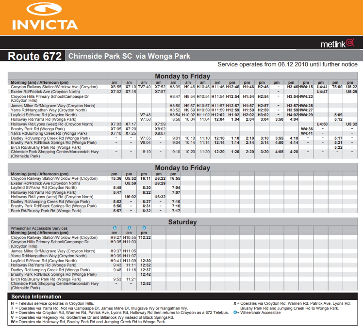
Route 672, in Melbourne's outer east, sometimes runs between Croydon Station, Wonga Park and Chirnside Park Shopping Centre. I say 'sometimes' because at certain times of the day almost each trip goes a different way.

672's proliferation of timetabled deviations meant that buses often missed stops, finished at unpredictable locations, went down other streets and even went on the opposite side of the road to what maps showed.

As attested by the number of footnotes, Route 672 had no standard pattern. Footnotes appear on timetables at stops. But if you're not up for a trip to Croydon, you'll be able to read them online for the next few days.

Current 672 timetable  (subsequent archived link)

The first thing to read is the route description. Note how the variations take up more space than the route route itself. If you're game, try to follow these on the map. Finally inspect the timetables themselves (either the pdfs under download route timetables or individual stop timetables). One direction has no less than nine footnotes and the other no less than six.


Compare it with Monday's timetable below.

672 timetable from 5 December 2011 (subsequent archived link

The description, map and timetable for the revised 672 are vastly simpler. Except for the Telebus deviate-on-demand service which remains, fine print footnotes have been almost eliminated. There are later finishes on weeknights and many more Saturday trips.

Other changes

The 672 isn't the only route that will be simplified on December 5. A good summary appears here.

Key cases where occasional deviations and extensions were removed include 691's Bayswater and Monash extensions (the latter now covered by other routes) and 664's Sunday deviation to Lilydale (a hangover from when 664 and 691 were about the only Sunday bus routes operating east of Stud Road). Other routes eg 671, 680 and 693 also lose occasional deviations or are straightened.

Span and frequency

As well as legibilty gains, there have also been span and frequency improvements.

The most common span improvements include one or two later weeknight trips and a fuller Saturday afternoon service. Frequencies have been made more regular on several routes. The largest changes include (i) a doubling of Route 693's off-peak service to 30 minutes, (ii) 664 becoming a 30 minute service along its full length (it was previously a split 20 / 40 minute service, unharmonised with trains every 30) and (iii) some weeknight frequency improvements between the pm peak period and last service around 9pm.

Overall the changes in the Invicta network reflect the biggest improvement since some routes in the area got minimum standards upgrades. They deliver substantial legibility gains without greatly changing the existing network. It's an example of a 'greater good' upgrade that should result in a net overall benefit.

Wednesday, November 30, 2011

The high cost of bad design: Glen Waverley Station and buses

A trip last night on the Springvale Road portion of the Route 902 orbital provided some lessons on good and bad transport interchange design.

The good example is Nunawading, in Melbourne’s east. The rail was sunk (to remove a level crossing) and a new station built a couple of years ago.

The bad example is Glen Waverley, which was last redeveloped in the 1960s. This was lauded as a good example of a shopping centre / railway station development in the Victorian Railways staff magazine of the time. However, looking back, it serves as an example of what not to do.

Nunawading

What’s good about Nunawading? The station has exits directly on Sprinvale Road. The bus stop for the station is just another stop. The bus does not leave Springvale Rd. Passengers on it are not delayed. Hence it efficiently serves both passengers transferring from train and those making short local through trips, such as from Forest Hill to Doncaster Rd. Bus operating times are also reduced, making it possible to provide a direct, fast and frequent service for a given number of buses.

The ability to efficiently serve multiple trip types increases patronage and contributes to the success of the SmartBus orbitals. It also makes for a more versatile public transport network, better able to cater for the majority of trips that don’t involve CBD travel.

The old Nunawading


View Larger Map

Glen Waverley

About 30 minutes south of Nunawading is Glen Waverley. Unlike Nunawading, this is a rail terminus (though some would like it extended to Rowville, possibly via a tunnel). Most important for this discussion is the distance of Glen Waverley station from Springvale Road.

The 1960s redevelopment placed a large car park between Springvale Road and the station, with the intention that this be used by commuters and shoppers. However in doing so it severed the station from its main potential north-south catchment for buses, bicycles and pedestrians – Springvale Road.

This short-sighted design meant that buses serving Glen Waverley Station must divert off Springvale Road, pull in to the bus interchange, and then rejoin Springvale Road. The requires passage through several sets of traffic lights, lengthening the journey.

Glen Waverley


View Larger Map

Comparison

How much is Glen Waverley’s delay compared to Nunawading? Comparing Route 902 travel times between stops immediately before and after each station provides an indication.

Southbound trips between the stop at Tunstall Av (before Nunawading Station) and West St (after Nunwading station) take about 3 minutes. This is about 1km distance and includes crossing the very busy Whitehorse Road.

Southbound trips between Landridge St (before Glen Waverley Station) and Ingram Av (after Glen Waverley Station) take about 8 minutes. Again this is about 1km with a busy road crossing, so is comparable to the Nunawading example.

For a 1km trip, the five minute time difference is quite stark. Having to leave and rejoin Springvale Rd slows the bus almost down to walking pace for the better part of ten minutes around Glen Waverley. This makes it unattractive for local trips not involving the station. Whereas Nunawading’s arrangement imposes no such delay.

Cost implications

As well as wasting passengers’ time, the operational cost imposed by inefficient off-road interchanges such as Glen Waverley’s is considerable.

Back-of-the-envelope calculations indicate substantial increases to bus running costs, which would be better spent on improving service. That’s even with a five minute delay, which would likely be higher during peak times. And the better the bus service, the higher the cost.

Route 902 has about 70 trips each weekday in each direction via Glen Waverley. A five minute penalty for each trip costs 700 bus minutes or over 11 bus hours per weekday. If a bus costs $100 per hour to run, the daily cost of the delay (not counting foregone ticket revenue from lost patronage) would be over $1000 per day, about $7000 per week or over $365 000 per year.

When multipled by the longevity of the project, the overall cost reaches into the millions. This does not include the effect on other bus routes. Nor the amount required to remedy, for instance to construct a redesigned railhead featuring a station fronting Springvale Rd along which buses would remain.

I think the main lesson from Glen Waverley is that some projects can seem a good idea at the time but impose high future costs and hobble future network development for generations.

Friday, September 30, 2011

Good, Bad and Interesting things about Adelaide Transport

Presenting a paper at this year's Australian Transport Research Forum in Adelaide has provide a chance to sample that city's public transport. Here's four good, four bad and four interesting points based on observation.

The good

Go Zones. Frequent service corridors covering most inner suburbs out to about 10km from the CBD. They are extensively advertised at stops, on timetables and at the Metro Shop.

Airport accesss on regular services. J1 and J2 provide a 15 minute service 7 days a week. Service spans are very wide, with service starting before 5am even on a Sunday morning. The profile of the service is quite high - airport staff recognise the numbers and the information desk is well stocked with timetables.

Rail electrification. Project includes several new and rebuilt stations, sighted on the Noralunga line.

Glenelg tram. New extension is well patronised. It also serves major trip generators including a university, convention centre and hospital under construction.

Bad

Pedestrian crossings. Imagine a journey where after a couple of minutes travel you stopped, were paused 2 minutes, could lurch forward a few hundred metres and stopped again. This is walking in Adelaide. Long traffic light cycles at CBD intersections reduce overall walking speeds to a crawl. In the suburbs islands and seperate signals (for each direction) at divided roads further slow transfer between train and bus. The Melbourne equivalent would be if every intersection had traffic light cycles like King Street.

Infrequent trains. Unlike Melbourne or Perth, where trains form the most frequent 'spine' of the network, train frequencies are often 30 to 60 minutes, making recourse to a timetable essential.

Low bus network legibility. It is difficult for the visitor to see the logic of the bus network. If you board a bus in a CBD street you cannot be assured it will continue straight along it. There is a large number of route numbers, with various letter and number prefixes and suffixes. Buses are significantly less legible than trams in Melbourne, but there are no inherent reasons for this to be the case.

Few maps on the network. Compounding limited legibility is that while many bus stops have times, few have maps of either the route or network. The only place where there's a city-wide network map appears to be inside the Metro Shop. Go Zone network maps are similarly available on the web but not at the point of need on the system. Maps of individual routes don't seem to be nearly as common as (say) Melbourne.

Interesting

Ticket purchase on trains. Instead of at machines at stations.

Can see to the front on trains. Most systems' trains only allow passengers to see out the sides of a train. With at least some of Adelaides you can also see out the front. This gives a quite different view of the network.

Single zone tickets. The liability is a high minimum fare, though there is a cheaper short-distance ticket. The advantage is simplicity. The ratio between single and daily ticket is not dissimilar to Melbourne, making a daily tickets a good choice.

Stops are numbered. The acid test of a public transport system's legibility is whether people can find themselves to a destination at night. Large numbers on stops are viewable from the bus, so can help if trying to ascertain where you are (printed timetables refer to these numbers against timepoints). On the flip side timetables are not stop specific - they are instead full timetables where the passenger must estimate arrival times for themselves.

Thursday, August 25, 2011

The armchair bus planner

He idly leafed through the Melway street directory as a sedentary diversion from gardening outside. Such an activity could have been done anytime since about 1980 when the directory started showing bus routes as well as streets.

The page turning stopped at Map 17. Straight streets, but bent bus routes. Almost as soon as the bus would have got up speed it was time to turn the corner, hand straps swinging from side to side.

This was Hadfield, built by the Housing Commission in the 1950s. Nine miles north of the Melbourne CBD and a mile from railways either side. Boundary Road betrays a former outgrown limit, while North, South, East and West Streets reassuringly prevent those in between from getting lost.

Less known than Pascoe Vale to the south or Glenroy to the west but still deserving capitals, Hadfield is a real suburb. As opposed to a mere locality like the nearby obscure lower-case Westbreen. The ‘50s were probably the golden age of the small lettered locality name. Like Bellfield, Pennydale, Coatesville or Coonans Hill. Built after the railway ceased being a necessity for a suburb but before children and housewives routinely motored beyond it.

Three of the area’s four bus routes (513, 527, 534) go to Coburg at the south-east of the map. Three (513, 534, 536) also run to Glenroy Station, back a page to Map 16. Glenroy roughly marks the limit of pre WWII development and forms the edge of the inner suburban fare zone. Two run to quiet Gowrie while none run to busy Broadmeadows, the area's main suburban centre just off the map.

The map showed that bent routes were typical – buses would typically head west, north and then west or east. A couple seemed unsure of themselves. 534 might as well join the communists. Once out of Coburg it sways wildly left, right, left, until deciding far left, to Glenroy, was its destiny. Route 536, slightly to the north, is so indecisive that, for good or evell, trips alternate between parallel streets.

536 veers off Map 17, with a small incursion into Map 6, to 17’s north-west. Map 6 is dominated by Broadmeadows. Shopping centre, library, town hall, schools, Centrelink, police and courts. One could almost live one’s entire life there, and some may have. Plus a major railway station and two orbital SmartBus routes, including the main route to the airport.

‘Broady’ has long had big things planned for it. It’s in successive government plans as a district centre, principal activity centre or suburban central business district. The idea is that people from surrounding suburbs would take jobs there rather than in Melbourne CBD, thus decongesting trains and shortening commutes.

To make the diagonal trip from Map 6 to Map 17, one may take Widford Road as this passes over the Metropolitan Ring Road. North of the Ring Road is a community centre and a shop or two. Bus Route 538 runs behind there via back streets, no doubt to the chagrin of Campbellfield commuters. Most homes in the area are near Widford Street. Hold that thought, for unlike chewing gum on a bus seat, it may come in use later.

Flicking across to Map 7, one sees the 538 paralleling the 902 along Camp Road. There’s only a barracks and a business park, so a single route every fifteen minutes, such as the 902 SmartBus, should suffice.

Ahead and to the left is the Campbellfield Shopping Centre. It’s got the beginnings of a transit oriented hub. Just fifteen kilometres due north of the CBD on its most important road, industrial or millitary land that could suit higher and better uses, an orbital SmartBus and a train that passes (but does not stop). Here the 538 runs north along Sydney Road, and then east, eventually terminating in Campbellfield’s Somerset Estate, most definitely not designed for transport other than the car.

Despite the neighbourhood being off the highway and not on the way to anywhere else, Route 538 is not alone in these parts; Route 531 between North Coburg and Upfield also goes there. Timetables for both are time-capsules; a reminder of how buses in Melbourne used to be. Route 538 runs every 40 minutes until 7pm weekdays and Saturday mornings, while the 531 is weekdays only, operating hourly until 8pm. Two limited service routes serving the same low-density residential streets. Reread that last sentence and hold that thought.

The armchair planner’s mind sped and his felt pen quivered, with blobs forming overleaf. A messy side-to-side red has been drawn, running east, then north, then east on Map 7, over the entire Route 538. Why keep it when it almost entirely overlaps other routes?

During a candid moment he professes a slight satisfaction in wielding the pen, not unlike a dentist after an extraction or a surgeon after cutting a cancer. Although, perhaps unlike the last two, pecuniary interest is not involved. This joy is not because the planner revels in denying people a bus. Rather it is due to the opportunity made; after the cull can come the creating (with some compensating).

It remains likely that some from Somerset will still wish to visit Broadmeadows, preferably via a direct means. Deleting 538, at first glance, appears to remove this option. However the 531, which we’re keeping, terminates at Upfield Station. As does 540, which runs to Broadmeadows.

Joining the two would restore this link, albeit via the slower north than the faster south. And pay homage to existing practice, footnoted in the timetable, of the 538 and 540 being linked. Loadings should be reasonably bidirectional – some will be travelling south to the tram and Coburg, while others will be heading north to Upfield station and Broadmeadows.

Then there is the matter of service levels. Would Somerset residents prefer two limited service routes or one full service route? The latter since no stops are being denied a service. So the resources from the deleted 538 could boost the 531, giving it new weekend and early evening service, much like the 540 that it could join.

The armchair planner is tantalised by these apparently easy gains. A simpler network, fewer routes, the same coverage and better operating hours. Why did someone not think of this before?

Such euphoria potentially precedes pricking by the practicalities.

Not immediately obvious is that Routes 531 and 538/540 are run by different companies. This may test the art of the possible in management where the dreamers are fewer or don’t make the decisions.

Neither was much thought given to route lengths and service frequencies; a forty minute service may neatly meet every second train but is inefficient if the route is 41 minutes long. Then there’s other questions like whether Route 540’s current twenty minute frequency would apply over the entire extended route, none of it or only the current portion.

Still these are minor things for the dreamer, who by now has turned back a map. For he did not forget that Widford’s fate was left hanging on Map 6. 538’s deletion makes it deserving of a service to compensate, but only if made an economical part of something bigger. Unlike some previous excursions, which left a trail of unsolved problems across the pages, fixing this pleasingly returns us to where we started on Map 17, with some Map 16 changes on the side. Such circles are usually bad for the routes themselves but are good for their planning.

So the dreaming resumes. Possibilities include improving access to Broadmeadows by breaking the Ring Road’s historical barrier on route planning. And could services be improved if buses could be sped up by running routes not requiring as many turns? Maybe more straight routes and fewer L and S shaped routes.

The armchair planner partly closes his eyes. This blurs the smaller streets. He tries to imagine the main roads of Map 17.

Clear north-south routes include West Street/Cumberland Rd, and East Street/Sussex Street. One or two others are ‘maybes’.

East-west routes include Hilton Street/Box Forest Road and Boundary Road. There are others but they may be in other route’s catchments. Successful bus routes must serve several markets, for instance local shoppers as well as train connections. Given existing off-peak train frequencies, it was sometimes considered acceptable to break the grid to feed the main centres. For instance Glenroy instead of Oak Park or Coburg instead of Pascoe Vale. A bit like now but straighter.

Like a spider starting a web, his first move was a straight drop down (more or less). From the twig up at Widford Street, the bus from Broadmeadows turns right at Daley, then Morley, West, Cumberland and then east to Coburg Station, via portions of Gaffney, O’Hea and/or Bell. Hence it serves catchments of Route 536 (Morley St), 534 (West St) and 513 (most of the rest) in a roughly north – south alignment.

This modified 513 has the makings of a very strong route; Major stops at Broadmeadows and Coburg, two medium sized shopping areas in between and high directness. Given that it ends in distant Greensborough or Eltham it’s rather long, but that’s a problem for another day and another map. Glenroy loses this route but there remain others and Broadmeadows ought to attract more passengers.

The other key north-south route is 527. It’s already quite direct (with a wobble to meet Tram 55) and serves Coburg and beyond to its south. In the north though it ends with a whimper, skirting a school, a cemetery and the sometimes as quiet Gowrie Station.

‘527 deserves better than Gowrie’, the armchair planer thought. If not Broadmeadows, at least Glenroy. The aptly named Middle Street might get it there via the West Street Shops and Glenroy Road to the station. However traffic calming measures and residents may not agree. Either South or Hilton Street may be alternatives, with the former sacrificing coverage and the latter directness. Again the route has become longer and remedial treatment may be required on another map.

Sussex Street (Route 534) is a third possible north-south corridor. It’s nearer midway between Cumberland St and the railway line, so ought to be better than the parallel Derby Street, just 300 metres away. However, unless dead people can be persuaded to ride buses, Sussex Street loses its catchment north of Boundary Road. And buses on Sussex miss the Melville Road tram. It may yet deserve a service but only from the fragments left after the rest of the network has been built.

From north to south the first east-west route is the alternating 536. It’s more frequent than the 538 but it still lacks evening, Sunday and public holiday service. While some of its western catchment would be served by the extended 513, its east still needs service. The 536 could be kept but straightened, with routing via Hilton Street being the lesser evil.

Some numbers enter the dreamer’s mind. Train frequency: 20 minutes. Bus 536 frequency: 30 minutes. Existing bus run time: 20 minutes. Buses needed if route run independently (which it isn’t): 2. But if straightening could reduce the bus run time, could the two run a 20 minute headway harmonised with trains? Or if there’s more demand elsewhere, pull one off and leave a 40 minute service, meeting every second train? The hard question here is whether those in North East Glenroy will accept a faster and better connected route in exchange for a longer walk to it.

The next big thick east-west line is Rhodes Parade/Pascoe Street/Boundary Road. Its west is seved by part of the 513. Its middle has no service, though there is one in nearby parallel South Street. Its east, near Merlynston Station, has the wavering 534 from Coburg (a relatively recent gain).

Given the first move was to straighten the 513, it’s only fair that the 534 get similar treatment. The grand swap commenced above can now be completed. 513, as discussed before, now up West St to Broadmeadows. Taking its place could be 534 routed west to Glenroy via Rhodes and Plumpton.

Dreamers are prone to thinking too much of what can (should?) be without sufficiently appreciating what’s there. An example was a fleeting thought to finish the modified 534 at Oak Park instead of Glenroy. However this was soon dropped. For part of the route (as 513) is within walking distance of Oak Park Station and the route’s shopper function is best met by keeping the Glenroy connection (Oak Park having few shops). The 534’s wavering section to Coburg is for now left alone but has been marked for later scrutiny.

It was getting late and way past bedtime. Washing up from breakfast remained. Lunch was a fridge visit. And tea had not been eaten.

But a wish to avoid a sleepless night would require that Map 17’s loose ends were at least listed if not solved. There is no loss so great as a forgotten idea. These night thoughts though are the craziest – radical, controversial and often half-baked. Who was it that said nothing good happens after 2am? Luckily none can be acted upon until daylight brings reason.

For example, could 536 have been extended from Gowrie to Fawkner shops on Jukes Road? Yes Fawkner gains but it’s a slow zig-zag across Sydney Road that would likely cost frequency.

And does Broadmeadows deserve a second major route from the south? It may even be an even stronger terminus than the Glenroy suggested for Route 527. If routed via Hilton St its East Street coverage would be restored and 536 could be moved north to nearer its current route.

Then there’s Pascoe Vale Station. Like Oak Park it has no bus to the east. Would a bus from it, via Gaffney Street, to Coburg work? Economy may dictate that this be a straighter redirected 534 from Coburg, with service withdrawn from parts near Merlynston. The Boundary Rd bus would need a new number (perhaps 537) and possibly a southward turn via Sussex and Shorts for coverage sake.

The armchair planner sees both pros and cons in these late bursts of radicalism. By this hour he has not the energy to seek more compelling evidence. Although his gut does see more winners than losers.

Legibility is certainly better. Two major routes north - south; Broadmeadows to Coburg. Three lesser routes east-west; linking stations on each side. Most stops remain in use and route kilometres is much the same as now.

Though the actual streets to use are not set in stone, the big picture network appears roughly sensible, with connectivity, bus running times and their efficient usage major caveats. In nutting these out the result of the dream is now subject to judgement, study, consultation and culling in the pursuit of a network that works.

Friday, August 19, 2011

The shape of Melbourne’s streets

A ramble through the street directory

It is not possible to talk about bus network design without referring to street planning, for streets represent the fist of cards from which bus route planners must choose.

City

The Central Business District forms our first grid, with its main thoroughfare and tram spine aligned NNW to SSE, though for simplicity I will describe this as north-south. Its blocks are rectangular, with the ‘little’ streets feeding into the axis streets.

To the north almost all city streets continue into others (albeit angled) as they become West Melbourne, Parkville or Carlton. To the south most streets are blocked by the river, with Swanston and Spencer Streets being exceptions. However walkers enjoy greater permeability with some pedestrian-only bridges to Southbank.

State Parliament and Southern Cross Station bookend the CBD to the east and west respectively. Bourke Street, the central partially malled shopping street, must yield to these buildings at both ends. Whereas Collins Street, its classier southern neighbour, was privileged enough to recently gain an extension at its Docklands end. Its ‘Paris end’ also exits the grid, its leftward veer dividing the politics from the money. Similar easterly access, though with a rightward turn, exists off Lonsdale and Latrobe Streets.

Much of Flinders Street is denied a river vista by Federation Square and the two-block station named after it. The building’s narrowness suits the need to maximise platform space; open skies being an advantage in the steam age. Further west, the railway viaduct squashes the river vista from this quarter of low repute, austere pavements and architectual mistakes. However Flinders, like Collins, is unconstrained by Hoddle, with its trams running east, west and then north.

Docklands is remote, windswept and a mystery to many who don’t work there. Shopping and stadium stunt access to it, via Bourke and Lonsdale, at Spencer. While the former allows pedestrian access, this walk offers insufficient instant gratification during the two block walk; the steep stairs, the railway overpass, Docklands stadium, some ramps and a pause for a busy road deter all but the leisured curious (and tall train spotters). Colour vison is wasted here; everything is a shade of grey, except for one or two still visible brown remnants from the 1970s. However those leaving Docklands are better rewarded as the bridge provides a vista down Bourke Street to St Patrick’s Cathedral.

Docklands’ north-south routes are for driving more than walking, while its finer-grained areas are beyond lunchtime range of unrushed walkers from outside. It could yet become a medieval village with few from outside. Waterfront City attempts a grid but highways or water stymie egress from most directions; it’s not like Elizabeth or Swanston where one can march north or south until one is footsore, as Henry Bolte would wish. Its east-west streets bear the same names as in the CBD proper, but not always the same vistas or tram routes.

The redeveloped Southbank features a somewhat disordered grid. Its thorougfares are either pedestrian or car; different to say Collins or Elizabeth Street where three or four modes mix. Its key pedestrian way is along the river with frequent bridges from the north bank. Vehicle access predominates to the south where roads distribute traffic from the West Gate Freeway. Unlike Docklands, Southbank shows its face to the CBD (via the river) and, its South Wharf portion excepted, is more accessible.

Suburbs

A kilometre or two away from the Melbourne Town Hall, particularly to the north and east, the angled CBD mesh gives way to a coarser but more extensive net whose streets are almost exactly north-south and east-west. The south-south-easterly St Kilda Road makes it gently diagonal in that direction, with junctions with numerous east-west roads (which are exceptionally supplied with trams thanks to the Prahran and Malvern Tramways Trust).

Grid spacing is closest in the old areas of Brunswick, Fitzroy, Richmond, previously home to small factories and the working class. Occasionally these fine-grained areas are interrupted by 1960s housing commission towers on ‘superblocks’.

Spacing widens with distance but the grid becomes no less perfect. It increases from about a half-mile in the 1920s suburbs (10 kilometres distant) to about a mile by 20 kilometres distant. These are all key roads, mostly with building frontages, and also occasionally with service roads further out. Beyond established housing a coarse grid exists as rural roads, no doubt becoming tomorrow’s arteries as suburbanisation encroaches.

Spacings between traffic lights and the roads themselves also widen with increasing distance from the CBD. For buses wide grids mean that service may also be needed on intermediate streets to provide reasonable coverage; something that 1km grids in suburbs like Mount Waverley only just avoids. But whatever their width, grids allow faster speeds and more legible bus routes; one traffic signal and no turns beats two junctions and two turns.

In some directions, particularly to the west, north and north-east, the grid may be interrupted by freeways, rivers, parks or scrap land. Fawkner to Reservoir is short geographically but distant by road, for example. The Yarra also divides and sparsens the suburbs, with only a few favoured roads granted a bridge.

Sometimes, like the bisected Bourke Street in Docklands, both halves may be similarly named, indicating either a former or intended joining. For example the Grieve Parades in Altona, which could make a fine Altona – Toyota – Sunshine industrial bus route if joined. Or the Balmorals, Crowns, Graces and Highs over in Altona Meadows. But hop over to Hoppers and the mile grid reasserts itself with the parallel Tarneit, Derrimut, Morris, Leakes, Sayers, Hogans and Heaths Roads.

Up in Sunshine West, Glengala Avenue goes some way before it hits the freeway. Had it hypothetically continued it may have given Derrimut a bus earlier (possibly an extended Route 454) instead of requiring a wait for a new route (400).

This example demonstrates that discussions about freeways and their form are not only about infrastructure priorities (eg freeways versus railways) but also about the importance of long-distance orbital versus more regionalised road access (that a half to one mile at-grade grid provides). Due to the lack of the latter in parts of the west, the Western Ring Road has been bigger for the west than Eastlink for the east, with its more contiguous development and continuous roads.

The southern portion of Sunshine West does not have an equivalent spine to Glengala Road in the north. The Avenue (which has a bus) forms the makings of a spine but its short streets to the north limits its legible pedestrian catchment. Access is possible into Wright Street but catchment streets are widely spaced compared to the less direct Talintyre Road with more branches. Neither Wright nor Talintyre have buses so some homes exceed 400 metres from one. Whereas streets with the best of both worlds (eg direct road with closely spaced side streets but not necessarily particularly high density) like Sydney Road in Coburg may have facilitated an accessible, fast and well-patronised service.

While four-way intersections are the rule, there are more at some locations. And not just at Five Ways, outside Cranbourne. In the inner-east, all roads lead to Camberwell. Camberwell’s centrality is so great, or the take-up of motoring in this affluent area so early, that it sapped surrounding suburbs of significant shopping strips. In contrast more homes are walkable from a supermarket along the less affluent Dandenong and Frankston lines.

Multi-way junctions attract the map viewer as much as they are cursed by drivers. Eyes scanning a map are naturally drawn to St Kilda Junction, Reservoir and the notorious but soon to be removed Haymarket roundabout in Parkville. Two or three roads may meet obliquely, slicing the suburban grid. Examples includer Camberwell (again), Kew, Reservoir and Footscray. However mass motorisation caused prewar accessibility to become congestion and multi-way junctions have not been favoured since.

Inside grids

There are differences as to what’s inside the grids. Inner suburbs have grids within grids, with older working-class suburbs like Brunswick, Collingwood and Richmond markedly denser than spacious Mont Albert or Malvern East.

Other planners filled their grids with curves, not unlike an arched window. That off Bay Street in Brighton boasts an inner, middle and outer circle. Albion’s Selwyn Street more successfully encloses its park but does not form the suburb’s centre. Western Glenroy’s arch is irregular, while Sunshine West’s is a neat rounded square.

Circles are rare enough to confer novelty, like knots in a timber beam, but aren’t confined to the poshest suburbs. Albert Park’s grand St Vincent Gardens is the full circle (or oval), unlike Brighton semi. Altona North must feel impoverished with just its tiny circle (called ‘The Circle’) with attempted polygons surrounding. Nevertheless it forms the hub of local commerce. St Albans’ circle daintily sidesteps its main road junction. It forms a six slice cake, with the railway splitting it cleanly in half. Commerce occupies one slice with reserves in the centre.

Central reserves are the common pattern; circle centres are too oddly shaped to subdivide and they provide a pleasant outlook for homes lucky enough to front them. Homes also provides passive surveillance for park users.

Centres however vary greatly in size. Unlike the scraps of land in St Albans’, the park in the aptly named Park Orchard’s circle is large and unbroken. It forms a large steering wheel, though three of the four spokes are footpaths rather than roads.

Not that distant is Circle Ridge in Chirnside Park. I’m guessing this surrounds a peak given the street name. If this is the case then its aim may be to angle houses to look outwards at the view instead of the usual inward park. Pakenham’s version has a literary bent and encloses a lake.

More common than circles in the postwar suburbs are curvilinear streets and then culs-de-sac. These were considered to offer greater interest to the resident and visitor while respecting land contours and calming traffic for childrens’ benefit. Unfortunately though the layout induces vehicle usage due to low pedestrian legibility and permeability. The ‘exclusive’ golf estates like Sanctuary Lakes, Chirnside Park and the unserveable Sandhurst are the biggest offenders, but the pattern is widespread.

There are sometimes access ways at the end of culs-de-sac but these lack street frontages and may be perceived as unsafe. Since local police and residents groups often support closure of access ways and alleys (to reduce assaults, theft and graffiti), such access is less permanent as that via grid streets with street frontages.

The busier arterials in these areas may lack building frontages (more the case in newer cities like Canberra than Melbourne), or, where there are still buildings, they are set back from the street with service lanes and large front parking areas. Intersections are widely spaced, and in the worst cases are controlled by roundabouts. Distances are too far for people to talk or even recognise one another in the next building or across the street, from one shop door to another.

And even if they could (eg through a GPS-based mobile phone app linked to Facebook), the limited pedestrian access only grudgingly provided at widely spaced intersections means that such roads cannot sustain the form of street life written about by Jane Jacobs. Neither this nor the curvilinear distributor street nor the cul-de-sac suit efficient ‘last mile’ bus routes; one reason for the success of trams, along with their service levels, is the walkable grid that feeds each stop.

New urbanist planning has influenced new residential street layouts more than locating new shopping centres near stations or making industrial employment areas walkable. Modern estates now have straighter or at least connected streets compared to those of the 1980s. Altona Meadows was an early example, with a dense grid not unlike older suburbs. This layout allows a single bus route (411/412) to serve a suprisingly large catchment. And while weekend services are limited, its 20 minute weekday frequency is high for a 1970s-1980s suburb.

This evolution is clearest in established outer suburbs that have grown continously for a century or more. Central Cranbourne, Pakenham or Werribee both have old-style grids. Around 1 to 2 km out several kilometres of cul-de-sacs start. Even further out is often a modified grid, less regular than the old but with a legible central street that could take a tolerably direct bus.

However there is still difficulty in connecting adjacent estates. Bridges are expensive and we're not so gung-ho about draining swamps these days. Hence Shearwater Drive in Pakenham peters out into a park and creek and there appears no provision to connect it to Meeking Drive (and thus link it to the proposed Cardinia Road Railway Station). Buses instead would need to weave on and off the main highway, slowing travel and likely partly duplicating other routes.

Street design for walkability and transit has improved over the last thirty years but not over the last hundred. And decades of impermeable layouts and controlled access roads has left us with a legacy of culs-de-sac to open, super-blocks to bust and roundabouts to remove to improve accessibility.

Monday, July 18, 2011

New Route 601 commences service

Today marked the commencement of Route 601 - Melbourne's second high frequency university shuttle service. The service operates between Huntingdale Railway Station and Monash University Clayton.

While it parallels other routes (630, 630A & 900) along this busy corridor, 601 is a little different in that it is an express service that accepts prepurchased tickets only. Its 4 minute frequency is maintained until approximately 7pm, after which it drops to 12 minutes for the next couple of hours. It's one of Melbourne's shortest bus routes, with 4 - 7 minute transit times being observed.

Monash University is about 20km east of Melbourne, built on the (then) urban fringe between railway corridors in the 1960s. The campus was built around the car, with considerable space devoted to parking. The campus and surrounding business parks have grown rapidly, and the Monash precinct is one of Melbourne's key employment areas.

The campus has its own bus interchange and generates substantial patronage, most conspicuously seen in the corridor towards Huntingdale Station. It is overcrowding in this corridor that Route 601, with its four minute frequency, was set up to address.

Below are some pictures taken during the first morning's operation:

Poster advertising the new route at Huntingdale Station

The first service - 7am Huntingdale Station

Rear of first bus at Huntingdale

Bus about to depart Monash University Clayton

Service information at Monash University

Friday, July 08, 2011

Arrival variability and connection success

Connectivity is the biggest determinant of public transport travel time for most trips involving a transfer. It can make all the difference between an efficient journey that’s only twice as slow as driving and one that takes three or four times as long. Missed connections also add a variability to public transport travel time that is absent from most suburban walking, cycling or driving trips. Strengthening connectivity is one of the cheapest and best ways to improve public transport.

Train arrival and departure times are logged at railway signal boxes and switched in panels at stations. Arrival times at intermediate stations can be estimated from times recorded at the nearest signal box. Such data is key to planning connectivity based on actual rather than timetabled travel times, especially if recorded over several months or more.

A cumulative graph of train arrivals can show the proportion of trains that have arrived within a specified time relative to schedule. Punctuality varies by time of day so separate graphs could exist for each half hourly or hourly block at major stations on each line along with yearly or monthly summary graphs.

The punctuality curves below are estimates only. However we know that their basic shape is about right. Arrivals more than two minutes early are rare. The time at TT +5 for each line can be obtained from Track Record and compared to the 88% performance standard. And we know the other end tends towards 100% less cancellations (normally 1 – 2 per cent).

The blue line represents an above average performer (where 90% of trains arrive on time – say on the Burnley group) while the red is a below average line (where maybe 70% of trains arrive on time – eg the Caulfield group). Long-term data would provide more robust figures unaffected by individual incidents.

Implications for bus connectivity scheduling

There is always a trade-off between waiting times and robust connections when deciding how many minutes buses should be scheduled to leave after trains are scheduled to arrive. Effective service co-ordination tends to be hardest at stations where train reliability and bus frequency are both low – the exact circumstances that make it most important to try for.

The punctuality curves show the relationship between train reliability, the probability of a connection being successful and the connection time to allow. Such data, collected for each line, would be most useful to the bus service planner who is responsible for making the abovementioned trade-offs. It would quantify popular lore as to train reliability (the extremes of ‘always on time’ and ‘never on time’ are rarely correct) and provide a better basis for bus scheduling than published train timetables.

An 80% reliability (ie a missed train – bus connection one day per week for a commuter) requires the bus to depart at least three minutes after the train arrives on the more punctual blue line and perhaps seven minutes on the less punctual red line.

For 90% reliability (ie a missed connection once a fortnight) these allowances increase to five and ten minutes respectively. At 95% reliability (ie a monthly missed connection) buses need to leave at least seven and twelve minutes after the train arrives. For suburban trips, a twelve minute connection becomes significant relative to the total journey time and a disincentive to use buses, especially during inclement weather. It is also worse than the average wait for a bus operating every 20 minutes that has not been specially co-ordinated to meet trains.

Punctuality time variability

The graph illustrate the effect of train reliability on passengers catching buses. Low train punctuality probably hurts feeder bus patronage more than train patronage due to the former’s typically lower frequencies and greater consequences of a missed connection. And where buses are scheduled to achieve more robust connections (such as aiming for 95% success) this must be paid for by longer bus waiting times most days (when trains are on or near time).

It’s a bit like insurance – pay a little now to save yourself future longer waits. The May 2011 train timetable changes that added extra running time to the underperforming Caulfield group appear to have lowered variability and probably improved connection reliability with buses.

Access time variability

Train delays aren’t the only reason for missed connections. The graphs above neglect the time to exit the station and reach the bus stop. Ideally this is under a minute where the bus stop is right at the station. Otherwise access time increases to five minutes or more where platform exits are poorly placed and/or busy roads or railways need to be crossed.

The variability of walking time is equally critical when scheduling connecting buses. High variability of access times can combine with train delays to increase overall variability and thus the difficulty of scheduling connecting buses. A greater range of possible arrival times at the bus stop either means that more connections are missed (for a given connection time allowance) or connection time needs to be lengthened (to achieve a target connection success rate). The latter lengthens waits at times when trains do arrive on time and walking conditions are favourable.

Busy unsignalised roads, roundabouts, level crossings, long-cycle traffic lights all have high access time variability. Variability for the first two is infinite, mitigated only by luck or the risk the pedestrian is willing to take.

Once traffic volumes pass a certain level, traffic lights are beneficial because they limit variability (determined by their cycle – typically 90 to 120 seconds). Traffic islands reduce variability on unsignalised roads, and may also do so on signalised roads, provided that walk cycles are sufficient to cross all lanes in both directions in the one go. No such conditions apply to simple zebra crossings, which as the highest and best form of pedestrian access, reduce access time variability to almost zero.

Active transfer management

So far I have assumed fixed train and bus timetables, with the latter’s departures timed to connect. On paper this approach would work perfectly. However in practice train delays and access impediments increase bus stop arrival time variability and reduce the success rate of scheduled connections. The remedy suggested, that of lengthening the interval between train arrivals and bus departures, improves connection reliability but slows travel on those days when trains are running to time.

One possible solution could be to schedule a tighter connection time (say 5 minutes instead of 12) but routinely hold buses if trains are delayed. This provides the fastest journey time for passengers changing from train to bus while reducing the number of missed connections.

For passengers coming off the train this is the best of both worlds. If holding buses avoids one or two ‘near misses’ per week (and their consequent 20 – 40 minute waits) the gains are large and definitely worthwhile. Note though that some bus routes intersect several train lines and holding may not be possible at all stations. Reference to train punctuality curves and surveyed passenger needs should assist bus planners decide which interchanges justify enforced connections.

One shortcoming of holding buses for trains is that it introduces variability for those bus passengers who did not come off the train. Those changing to other buses may also be affected. And holding buses for late trains reduces the efficiency and robustness of the bus network as timetables may need padding to lessen knock-on delays.

For these reasons there is a limit to the time that buses ought to wait for late trains. A holding time limit of five minutes might be reasonable for regular suburban buses; more for long-distance or less frequent routes. A longer holding time is also justifiable for the last departure for the night on each route.

The difference possible is dramatic. Even a five minute holding limit can more than halve the number of missed connections. Using the less punctual red line as an example, switching from a regularly scheduled four minute connection to a four minute connection with a five minute permissible hold time increases the proportion of successful connections from 60 to 85 per cent. Or in commuter terms, a reduction of broken connections from eight to three per month (measuring homebound trips only). Even higher gains would be possible if combined with other efforts that lessen arrival variability (eg improved train punctality and better pedestrian access).

Communication and staffing

Bus drivers will sometimes wait for running passengers from the station, thus informally achieving some of the above. But it’s a bit hit and miss. And at busy stations they may not be clear whether the train arriving is the late arrival they should be waiting for or another service. Therefore bus drivers need real-time train arrival information and a clear holding policy (which should also be well-communicated to passengers).

An even more refined method of ‘active transfer management’ for larger interchanges dominated by a single operator is to provide a despatcher (especially during afternoon peak times such as 3 to 8pm). They could be an experienced bus company employees equipped with a microphone to inform drivers and passengers of any delays and where buses need to be held. Use could also be made of web and phone applications to provide alerts to passengers still at work, on the train or waiting at stops away from the interchange.

While the staffing overheads for (say) twenty major interchanges would need to be considered the likely gains in improved travel times would probably be a greater overall passenger benefit than other possible staffing initiatives such as a similar number of tram conductors or more staffed stations.

Monday, June 27, 2011

Counting the good things

I was reading some Transperth bus service change notices and couldn't help thinking that these were almost like textbook examples of good service planning that should simplify the network (and hopefully increases patronage and efficiency).

Below are some examples, taken from the notices:

City Beach and inner northern suburbs

Western suburbs

* Wider spans of peak frequencies
* Co-scheduling two routes to provide an even 30 minute service on Sundays
* Replacing special evening/weekend only routes with the same routes running 7 days per week (something that Melbourne has already almost completely achieved)
* Some routes to become 100% low floor
* Rationalising routes to remove duplication of another service (the frequent CAT route)

Inner north

* Changes similar to above
* Renumbering a historic route number (to be in same number block as others in the area since the Joondalup line opened)
* Small service upgrades to provide an even 30 minute frequency
* Increase in one route to a clockface frequency (from 80 to 60 min) while a quieter route is downgraded from 90 to 120 min
* Truncating a route but providing a more intensive service on the remaining busier portion
* Removing an infrequent occasional deviation
* Adding new timing points

North metropolitan region

The theme is continued for the north metropolitan area. There are however some route changes which are explained with alternatives given where necessary. Also notable was a reply to requests for a bus interchange at Greenwood station - basically saying that the station wasn't designed to accommodate a bus interchange and many parking spots would need to be removed if one was to be fitted. While not being familiar with the station, the logic did not appear to stack up; unless buses were very lightly loaded, they would likely carry more people to the station than a dozen or two cars that occupy spaces for eight hours or more per day.

Overall though Transperth service change notices are excellent reading and give an interesting insight into the decisions that service planners make to improve the network.

Tuesday, June 14, 2011

Two views from the bus

While buses and trams are perceived as being safer than trains at night, a major downfall is the risk of missing your stop, especially if travelling in unfamiliar territory through dark streets. Which is too much of the time at the moment, just a week out from the winter solstice!

How can this aspect of network illegibility be minimised? It would be nice if the internals of windows were less reflective. Sometimes bright internal lighting (though good for reading) swamps the dim lighting outside. Better street signage at intersections would help. Far side bus stops (also desirable for bus priority reasons) might also assist as they give the passenger more time to recognise the cross-street.

But the biggest culprit would have to be advertising that covers bus windows. The photos below, both taken around dusk, illustrate the point. The first view out is from a clear window. The second is from a covered one. The visibility differences are stark.

Along with school and charter work, advertising provides income for the bus operator. However unlike the other means of earning revenue, they significantly reduce passenger amenity. Like billboards at some stations (that interfere with passenger movement, visibility and thus public safety) it is desirable that other means of revenue are found.

Wednesday, May 25, 2011

Monday, April 11, 2011

What should a good CBD periphery transport system look like? Both Chris Loader/Charting Transport and Alan Davies/Melbourne Urbanist have picked up on the fact that as soon as you get beyond a City Loop railway station the modal share for public transport halves.

This blog takes the view that while there exist ardent revheads, greenies, transit geeks and the lycra set, the majority of the population are pragmatists in their transport choices. Especially for habitual and often time-critical trips such as the journey to work.

So why isn't transit so attractive when you get much outside the Hoddle grid?

A play with the Metlink journey planner gives some answers.

Let's compare comparative travel times between similar distance middle-suburban stations and various CBD fringe workplaces. For arrival at a start time of 8:30am, the following results were had:

Laverton - Melbourne Town Hall: 33 min
Laverton - Melbourne University (Parkville): 40 min
Laverton - Epworth Hospital (Richmond): 49 min
Laverton - Alfred Hospital: 51 min
Laverton - South Melbourne Market: 45 min
Laverton - Citylink Business Park (Port Melbourne): 52 min
Laverton - Waterfront City (Docklands): 54 min

Greensborough - Melbourne Town Hall: 38 min
Greensborough - Melbourne University (Parkville): 60 min
Greensborough - Epworth Hospital (Richmond): 42 min
Greensborough - Alfred Hospital: 60 min
Greensborough - South Melbourne Market: 61 min
Greensborough - Citylink Business Park (Port Melbourne): 65 min
Greensborough - Waterfront City (Docklands): 67 min

Mitcham - Melbourne Town Hall: 40 min
Mitcham - Melbourne University (Parkville): 50 min
Mitcham - Epworth Hospital (Richmond): 43 min
Mitcham - Alfred Hospital: 47 min
Mitcham - South Melbourne Market: 52 min
Mitcham - Citylink Business Park (Port Melbourne): 50 min
Mitcham - Waterfront City (Docklands): 60 min

Cheltenham - Melbourne Town Hall: 32 min
Cheltenham - Melbourne University (Parkville): 50 min
Cheltenham - Epworth Hospital (Richmond): 43 min
Cheltenham - Alfred Hospital: 39 min
Cheltenham - South Melbourne Market: 53 min
Cheltenham - Citylink Business Park (Port Melbourne): 50 min
Cheltenham - Waterfront City (Docklands): 62 min

In every single case a trip to the CBD was faster than to a CBD fringe location.

This is even where the destination was on the same side of town as the origin (eg Cheltenham - Alfred Hospital). It could be for this type of trip that driving would be relatively more competitive than existing public transport services, and so command a higher modal share (people are pragmatic, remember). There may even be a self-reinforcing pattern; if people can't afford to buy a home in the inner suburbs near work they may choose an outer suburb on the same side of town as their work (if not always the same train line).

City fringe destinations vary in the amount of time they add compared to within Hoddle's grid.

Waterfront City is the least accessible by fast public transport - from any direction - despite its frequent trams. Compared to the CBD, travelling to it can add 20 to 30 minutes to travel time each way. For a commuter that's 40 to 60 minutes per day, or an extra week added to annual holidays. Not suprisingly its public transport modal share is just 22%, compared to double or triple that a little to the east.

Why are the variations in travel time so great?

We have an extensive suburban rail system that has metro-style operating hours but commuter-type frequencies on its fringes. We have trams, but unlike some compact European cities we don't have a dense metro in the job-dense 2-5km core (see maps by Neil Freeman) that allows for fast local travel. Instead for the 'last mile' we rely on slow surface modes, notably trams and buses, often without their own right of way.

Also the fixed rail we do have is planned and run as a suburban - CBD distributor rather than doubling as a (small) inner city metro that with its spare capacity could take pressure off trams for longer trips.

The City Loop's weekday noon reversal introduces unwelcome complexity, discourages casual travellers and prevents direct access between some city stations at certain times. Quite different from the consistency and legibility of a real metro.

For many years the possibility of getting a direct train from South Yarra to Footscray (for example) was scotched by the philosophy that everything should run via the Loop and the primacy of the CBD as a destination. The May 2011 timetable will introduce some welcome improvements for such cross-town trips, provided dwell times at CBD stations are kept down. Especially important as Flinders Street and Southern Cross are the nearest stations to Melbourne's fastest growing areas at Southbank and Docklands.

The May 2011 timetable will increase the number of trains that will run from Flinders Street through to Southern Cross. This ties in well with an important bus rerouting from last year, namely the restructuring of Port Melbourne routes (235/237/238) to operate via Southern Cross Station. This restored a rail-bus connection that vanished when the tram superstop in Flinders Street was built and buses were forced away from Flinders Street Station. Peak frequency of the Port Melbourne buses is high but further work would lift their legibility and profile.

Route 401, between North Melbourne and Mebourne University, is an example of a 'bridging the gap' frequent service that has become well accepted by those commuting from the western suburbs to Melbourne University. The trip plan above for Laverton include the 401 as its bus leg as it proved the fastest travel option. Other opportunities for 401-style service could include Melbourne University to Clifton Hill or South Yarra to Port Melbourne, although bus priority would assist in providing worthwhile savings in travel time and efficient vehicle utilisation.

It seems to me that the CBD fringe is an area ripe for future patronage growth. Unlike the CBD, where public transport modal share is near saturation, there is significant room here to grow. But this can only come about if it can get the pragmatists on board. To achieve it a fresh look at how the CBD fringe and the close job-rich inner suburbs can be better served may achieve some surprising patronage results, as demonstrated by the success of Route 401.