Showing posts with label patronage. Show all posts

Sunday, May 15, 2011

Melbourne evening train service levels - the last 36 years

Another look at Melbourne suburban train frequencies - this time for weekday evenings around 9:30pm.

Most notable are that the service cuts of the late 1970s (from 20 to 30 minutes) have started to be reversed on some lines in the last year or two. There have also been frequency improvements on outer or minor lines such as Altona, Alamein, Cranbourne and Pakenham.

What does this presentation tell us? Firstly frequency does eventually respond to patronage growth, although you need passenger numbers to double first. There is also a lag time to allow for driver training, new trains, scheduling, political commitment etc. In the meantime, and not captured here, capacity has been added by operating six car rather than three car trains to the existing timetable to relieve crowding. Both Connex and Metro added capacity and 3-car trains are much less often seen nowdays.

Will I produce presentations for weekends? Probably not since changes have been less frequent and are better described in writing.

Saturdays have seen the least change, with 20 minutes remaining as a daytime network standard for all but outer areas. The main loss compared to 1975 is the reduced Saturday evening frequency (30 to 20 minutes). The main gains compared to 1975 is that there is service over a more extensive electrified network and there are later Saturday evening trains.

Sundays are quite different, thanks to large service increases in 1999. 1975's 40 minute Sunday frequency has now been banished to Sunday mornings (some lines), Sunday evenings (some lines) and some outer areas. Elsewhere Sunday frequency has doubled to 20 minutes, making it the same as Saturday.

Saturday, May 14, 2011

Melbourne interpeak train service levels - the last 36 years

A graphical or aural representation of what is traditionally written can sometimes be the quickest way to present data or offer fresh insights, such as with aural timetables.

Here's another example, this time for trends in weekday interpeak train frequency on the Melbourne electrified rail network. The thicker the line the more frequent the service. Frequencies are approximate, especially where several lines cross and I've erred on a thinner rather than a thicker line to reflect likely maximum waiting times. You can stop the video at any time. When in pause mode slide the bar to more closely compare timetable changes.

As you watch you'll see electrification extensions in outer suburbs (Werribee, Cranbourne, Sydenham and Craigieburn) and the addition of the City Loop. The Port Melbourne and St Kilda lines vanish when these are replaced with trams. Frequency upgrades to Epping, the Caulfield group, Frankston, Newport and (for a while) Werribee are also shown. The joining of Frankston and Werribee or Williamstown trains starts off as a thin line that thickens as frequency increases.

The dates are effective dates on the printed timetables surveyed. There are some gaps as not all timetables were available for this exercise. However off-peak services are generally fairly slow in changing so few if any amendments would be missed.

The people above the dates indicate patronage - one per 50 million annual passengers. Noticeable is the fall after 1975 (actual patronage bottomed out at less than 100 million in about 1980) and the slow subsequent growth. The 2000s surge is particularly clear.

The slides were made in Powerpoint and are much clearer than you see here. However Windows Movie Maker requires other formats and much clarity was lost in the conversion.

Credits: Craig Halsall for some of the timetables & free-loops.com (hard techno) for the sounds.

Monday, April 11, 2011

What should a good CBD periphery transport system look like? Both Chris Loader/Charting Transport and Alan Davies/Melbourne Urbanist have picked up on the fact that as soon as you get beyond a City Loop railway station the modal share for public transport halves.

This blog takes the view that while there exist ardent revheads, greenies, transit geeks and the lycra set, the majority of the population are pragmatists in their transport choices. Especially for habitual and often time-critical trips such as the journey to work.

So why isn't transit so attractive when you get much outside the Hoddle grid?

A play with the Metlink journey planner gives some answers.

Let's compare comparative travel times between similar distance middle-suburban stations and various CBD fringe workplaces. For arrival at a start time of 8:30am, the following results were had:

Laverton - Melbourne Town Hall: 33 min
Laverton - Melbourne University (Parkville): 40 min
Laverton - Epworth Hospital (Richmond): 49 min
Laverton - Alfred Hospital: 51 min
Laverton - South Melbourne Market: 45 min
Laverton - Citylink Business Park (Port Melbourne): 52 min
Laverton - Waterfront City (Docklands): 54 min

Greensborough - Melbourne Town Hall: 38 min
Greensborough - Melbourne University (Parkville): 60 min
Greensborough - Epworth Hospital (Richmond): 42 min
Greensborough - Alfred Hospital: 60 min
Greensborough - South Melbourne Market: 61 min
Greensborough - Citylink Business Park (Port Melbourne): 65 min
Greensborough - Waterfront City (Docklands): 67 min

Mitcham - Melbourne Town Hall: 40 min
Mitcham - Melbourne University (Parkville): 50 min
Mitcham - Epworth Hospital (Richmond): 43 min
Mitcham - Alfred Hospital: 47 min
Mitcham - South Melbourne Market: 52 min
Mitcham - Citylink Business Park (Port Melbourne): 50 min
Mitcham - Waterfront City (Docklands): 60 min

Cheltenham - Melbourne Town Hall: 32 min
Cheltenham - Melbourne University (Parkville): 50 min
Cheltenham - Epworth Hospital (Richmond): 43 min
Cheltenham - Alfred Hospital: 39 min
Cheltenham - South Melbourne Market: 53 min
Cheltenham - Citylink Business Park (Port Melbourne): 50 min
Cheltenham - Waterfront City (Docklands): 62 min

In every single case a trip to the CBD was faster than to a CBD fringe location.

This is even where the destination was on the same side of town as the origin (eg Cheltenham - Alfred Hospital). It could be for this type of trip that driving would be relatively more competitive than existing public transport services, and so command a higher modal share (people are pragmatic, remember). There may even be a self-reinforcing pattern; if people can't afford to buy a home in the inner suburbs near work they may choose an outer suburb on the same side of town as their work (if not always the same train line).

City fringe destinations vary in the amount of time they add compared to within Hoddle's grid.

Waterfront City is the least accessible by fast public transport - from any direction - despite its frequent trams. Compared to the CBD, travelling to it can add 20 to 30 minutes to travel time each way. For a commuter that's 40 to 60 minutes per day, or an extra week added to annual holidays. Not suprisingly its public transport modal share is just 22%, compared to double or triple that a little to the east.

Why are the variations in travel time so great?

We have an extensive suburban rail system that has metro-style operating hours but commuter-type frequencies on its fringes. We have trams, but unlike some compact European cities we don't have a dense metro in the job-dense 2-5km core (see maps by Neil Freeman) that allows for fast local travel. Instead for the 'last mile' we rely on slow surface modes, notably trams and buses, often without their own right of way.

Also the fixed rail we do have is planned and run as a suburban - CBD distributor rather than doubling as a (small) inner city metro that with its spare capacity could take pressure off trams for longer trips.

The City Loop's weekday noon reversal introduces unwelcome complexity, discourages casual travellers and prevents direct access between some city stations at certain times. Quite different from the consistency and legibility of a real metro.

For many years the possibility of getting a direct train from South Yarra to Footscray (for example) was scotched by the philosophy that everything should run via the Loop and the primacy of the CBD as a destination. The May 2011 timetable will introduce some welcome improvements for such cross-town trips, provided dwell times at CBD stations are kept down. Especially important as Flinders Street and Southern Cross are the nearest stations to Melbourne's fastest growing areas at Southbank and Docklands.

The May 2011 timetable will increase the number of trains that will run from Flinders Street through to Southern Cross. This ties in well with an important bus rerouting from last year, namely the restructuring of Port Melbourne routes (235/237/238) to operate via Southern Cross Station. This restored a rail-bus connection that vanished when the tram superstop in Flinders Street was built and buses were forced away from Flinders Street Station. Peak frequency of the Port Melbourne buses is high but further work would lift their legibility and profile.

Route 401, between North Melbourne and Mebourne University, is an example of a 'bridging the gap' frequent service that has become well accepted by those commuting from the western suburbs to Melbourne University. The trip plan above for Laverton include the 401 as its bus leg as it proved the fastest travel option. Other opportunities for 401-style service could include Melbourne University to Clifton Hill or South Yarra to Port Melbourne, although bus priority would assist in providing worthwhile savings in travel time and efficient vehicle utilisation.

It seems to me that the CBD fringe is an area ripe for future patronage growth. Unlike the CBD, where public transport modal share is near saturation, there is significant room here to grow. But this can only come about if it can get the pragmatists on board. To achieve it a fresh look at how the CBD fringe and the close job-rich inner suburbs can be better served may achieve some surprising patronage results, as demonstrated by the success of Route 401.

Tuesday, December 28, 2010

Postcard from Tasmania: No spirit for the Spirit

In keeping with the season’s holiday mood, following are two snapshots of transport outside Melbourne. The first discusses ferry passenger connectivity facilities at Devonport, as encountered last week.

There couldn’t be any more contrast between transport facilities at each of the ‘Spirit of Tasmania’ termini. The Spirit is a large car and passenger ferry with daily night sailings with day sailings added during peak season.

Melbourne’s Station Pier is at the end of a major tram route, running every few minutes mostly on its own right of way. Pedestrian access is short, direct and legible, with excellent walking and cycling paths. A convenience store and restaurants are within sight. While less prominent, Bay Street’s shops and services are also comfortably walkable.

Devonport is Tasmania’s third city, smaller than only Hobart and Launceston. It is Tasmania’s northern gateway, welcoming backpackers and tourists to surrounding mountains, trails and farms.

The city is divided by the River Mersey. The CBD, accommodation, entertainment, tourist bureau and most housing is on the west bank. On the east is light industry, some housing and the Spirit of Tasmania ferry terminal. The ferry terminal is a stone’s throw across the water from the city centre, with land access via a bridge approximately 2km to the south.


View Larger Map

The Spirit of Tasmania and the people it brings is important to Devonport’s life and economy. Childrens’ murals on the showground’s wall often depict the ferry. The council office names Devonport as the ‘City with Spirit’. And the ship’s daily horn, what is to Devonport as church bells are to a medieval city, removes any doubt.

If the ferry is such a big thing in this town, let’s see how well the transport needs of its passengers are looked after, especially those who came without cars.

The photo shows the first impression arriving passengers get after leaving the ferry and collecting luggage.

Following are seven observations made following the day sailing on December 22, ie close to peak season.

1. The Spirit of Tasmania is scheduled to arrive at the 'out of town' East Devonport terminus at 6pm. However the Torquay ferry, which could provide a quick trip into town, only runs from 8am to 6pm, unsuitable for Spirit passengers arriving after six. The local tourist bureau confirmed services are not extended an hour in peak season to cater for the day ferry’s arrival.

2. The Merseylink town bus service operates to East Devonport via the aforementioned bridge. Route 60's nearest stop is about a five minute walk east of the ferry terminus (see map) so is potentially useful. That is until one checks the timetable, which had the last weekday bus leaving at 5:46pm. On Saturdays the last bus is at 4:00pm, while no service runs on Sundays. Again this service finishes too early to be useful for ferry passengers. In addition few town bus stops inspected had timetables, maps or route information so these service only really cater for residents, who through trial and error, already know where the bus goes.

3. Despite the absence of conventional public transport (ferry or bus) there appeared to be no shuttle bus to take alighting passengers to central Devonport, which would be a key destination for those staying or touring locally.

4. No taxis were seen in the area, despite the likely brisk business, due in part to the above limited transport options. There also appeared to be no visible taxi rank or signage indicating same.

5. Some ferry passengers had bicycles – presumably for touring. There were no defined cycle routes or wayfinding signage to guide their 4km ride into town, although the Council's Cycling Network Strategy identifies their need.

6. The tourist bureau correctly advised that the ferry terminal is about an hour’s walk from Devonport CBD. Again there was no map or wayfinding signage at the ferry terminal to assist those walking into town. Hence the sighting of of lost backpackers in an industrial area’s intersection not far from the ferry terminal.

7. The locals know their town has lousy transport, and sometimes offer tourists seen walking a lift. Although haphazard, this appears to be the most effective transport option that Devonport can offer day sailing passengers.

Conclusion

Melbourne has more than 100 times Devonport’s population. The big-city facilities at Station Pier are neither expected nor appropriate at East Devonport.

Nevertheless Devonport’s failure to provide low-cost facilities such as street maps, pedestrian and cycle wayfinding signage and taxi ranks surely reflects poorly on its support for a ferry service that Australian taxpayers subsidise (cars, not passengers, mind you). Extending either the Torquay ferry or Route 60's hours so it meets all Spirit sailings would also help connectivity.

Until then Devonport is worth visiting only to learn what not to do when it comes to connecting various transport modes or looking after disembarking passengers. As discussed last year southern Tasmania offers riper pickings for the transport tourist.

Wednesday, November 17, 2010

A season for pruning?

It’s been a wet winter, the flowers are out and plants have grown fast. Gardeners are out with the shears, trimming undergrowth and unwanted branches.

Our bus network has had a similar windfall. A 15-year drought ended with many new routes being added in the last five years, a growth rate without recent historical precedent. Operating hours broadened, coverage spread and patronage surged.

Students of public administration will be aware that being required to spend large sums in a short time does not guarantee top value for money or high accountability. Careful planning and effective targeting of expenditure can be a casualty of blanket 'one size fits all' funding increases.

In public transport this could occur by boosting services on a route without regard to its network importance, relationship with other services or opportunity cost. Hence some corridors got more buses per hour but ‘lumpy’ timetables with long waits. Roads with overlapping routes were sometimes overserviced while adjacent high employment areas missed out. And buses are not all headway harmonised with trains like they are in Perth, despite our sometimes lower train frequencies making connectivity even more crucial.

The plant analogy can go further. If the bus network was a tree, parts would have strengthened greatly but others would still be weak, bushy and hardly alive. There would be many twigs, some well-placed and others with odd kinks formed years ago for reasons long forgotten. Not all supporting branches would robustly connect with trains or directly link suburbs.

Too much undergrowth can retard the funding, marketing and visibility of direct high-service routes most likely to attract patronage. Tangled scrub can also appear impenetrable, especially for commuters who drive past it on the way to the station.

If the political and economic climate favours service cuts, there can be coverage gaps. If it favours service increases there can be duplication. Our current network has both, reflecting past feast and famine. The latest feast has vastly improved buses and driven patronage to forty year highs. Nevertheless there remains great opportunity to carry even more through an efficient network that neither over or under services.

The patronage potential of buses is clearest when comparing their ridership with trams. Buses ‘should’ carry more than trams as their catchment population is higher, they exclusively serve the largest suburban shopping centres and run in the suburbs where most people live. But the actual figures are very different; 170 million for trams and barely 100 million for buses, indicating much higher service and patronage intensity on the smaller tram network.

This large disparity can’t all be due to trams’ CBD running, population density or a passenger preference for rails in tar. For there exist bus corridors that already have timetables and patronage that approach those of trams. The fact that buses don’t run on rails and overhead wires is no reason for low average patronage. However trams’ directness, legibility and frequency show aspects of successful service planning that can effectively apply to buses (as confirmed by usage of high-service ex-Met and SmartBus routes).

Both directness and legibility are a result of good planning, which is relatively cheap. Frequency costs scarce recurrent expenditure. But some can be raised internally from restructuring less efficient routes. However a growing city with a service backlog will also require increased external funding to develop the network. Such funding requests are more likely to succeed if there is evidence that the existing network is already planned efficiently and additional resources would boost rather than duplicate services.

Reviewing, untangling and making legible the bus network is key to making it more useful and boosting patronage. A good first step is to examine the current network for corridors that could be simplified. The multimode frequent service maps as presented above are useful tools for this purpose.

My examination of these maps has produced the following ‘dead wood’ portions of routes that may warrant pruning if 'greater good' gains can be obtained elsewhere:

219 (portion): Part west of Sunshine duplicates 903. A weekend variation serves areas covered by Route 471.

280/282 (portion): A local route that duplicates the 901 SmartBus along a low-density residential area (Foote St/Reynolds Rd Templestowe).

246 (Latrobe Uni extension): Overlaps with other routes between Clifton Hill and Latrobe Uni.

286 (entire route): Largely duplicated by two SmartBus routes (901 and 906) along Blackburn Rd

293 (part): Duplicated by new SmartBus Route between Doncaster Shoppingtown and Eltham (Main Rd roundabout).

295: Duplicates 903 along Station St between Box Hill and Doncaster Shoppingtown.

340/350: Overlaps with 250 between Ivanhoe and Latrobe Uni.

445 (part route): Duplicates other routes between Werribee Plaza and Hoppers Crossing Station. Truncation could allow removal of stopping restrictions (including to a local shopping centre) which lessen legibility.

478/479 (part route): Duplicates Route 477 and tram between Moonee Ponds and Airport West.

479 (City – Moonee Ponds portion): A weekend extension that duplicated by a frequent tram service.

483 (entire route): Freeway service for Sunbury. Will become less necessary after rail electrification.

500 (entire route): Duplicates 901 between Broadmeadows and Melbourne Airport. Duplicates 479 between Melbourne Airport and Sunbury.

544 (part route): Duplicates 901 between Roxburgh Park and Broadmeadows

563 (part route): Duplicates tram along a large section of Plenty Rd and 901 between Greensborough & Plenty Valley SC

623 (part route): Duplicates 626 and 900 between Chadstone SC and Carnegie. Scope for rerouting along Neerim Rd to replace portion of 624.

673 (entire route): An hourly service entirely duplicated by parallel longer routes

691 (part route): Monash Uni extension – replaced by direct high-service 900 SmartBus

694 (entire route): Largely parallels 663 & the extended 688 for all but a few stops.

745 (entire route): Four occasional routes with very low patronage

777 (entire route): A short route with few services and trip generators

Apart from removing redundant routes (relatively easy since no coverage is sacrificed), there are other things that could further simplify the network and increase effective service frequencies, preferably using resources saved from route rationalisation. The most obvious is more evenly scheduling overlapping routes that share a corridor. Other gains could come from rerouting that lessens duplication and improves coverage. Such changes won't please everyone, but not considering them may result in higher gains foregone. Some examples of this type will appear in a future post.

Thursday, August 19, 2010

The Three Ms of high modal share

A previous post covered capability, choice and capacity, the three Cs of successful public transport.

Since that was written public transport patronage and mode share has grown. However data from the last year indicates that the pace of growth has slowed.

There are three passenger demographic groups, all beginning with M, that must be won over to increase transit’s modal share. These are as follows:

Middle Suburban

These are the suburbs, approximately 8 to 30 km from the Melbourne CBD, that house the majority of the population. They are typically beyond the tram network but are usually within 5 kilometres of a railway station and may be served by a SmartBus or orbital route.

Planned (and often established) by the 1920s, they often have a grid network of roads intersecting railway lines, particularly in the south and east. Detached housing dominates, though the closer in areas also have flats, townhouses and villas. Retail areas comprise strip centres around stations, factory outlets in light industrial areas and Melbourne’s largest drive-in shopping centres. These middle suburbs are also home to a more diverse range of universities, hospitals and business parks than is found in outer areas.

In Melbourne public transport’s mode share is highest in the inner suburbs and falls away with distance from the CBD. Those residents of middle ring suburbs who work in the CBD often commute by train but driving is dominant for non-CBD work and other trips, which are generally less well served by transit. However the success of SmartBus has shown that patronage growth is possible in these areas, even for non-city trips. The density of activty around the large universities and shopping centres along with grid streets, which are efficient for tangential rail feeder buses, also indicate potential for patronage growth.

That is not to say that patronage cannot also be grown on the fringes, but these areas are handicapped by bad street layouts, less walkable neighbourhoods and a lower base from which to expand service levels compared to middle suburbs that also tend to have more trip generators.

Middle Age

Public transport in cities with low modal share disproportionately carry non-drivers; typically the young and the old. They are often referred to as ‘captive passengers’ since they have few other choices. These groups will be described in turn.

The closure or amalgamation of government schools and the shift to private schooling has increased the average distance school students travel. Parental concerns about ‘stranger danger’ and mounting road traffic has also contributed to the sharp decline in walking and cycling. Hence ‘Mum’s Taxi’ and public transport (where available) are dominant modes for primary and secondary student travel. And the growth of universities (due to both local and international students) has increased the number of older students travelling. Unlike the USA, Australia has less of a tradition of suburban students moving away to study so local students will often remain at and commute from home.

Senior passengers include those who never learned to drive (often housewives in then-dominant single-car households after WWII) and those too blind or frail to drive. In addition, local shopping strips, cheap seniors fares and frequent service (especially during weekday interpeak times when many seniors travel) make car ownership unnecessary for many seniors.

There is however change within the senior passenger population. Population ageing is increasing the number of those who have had to give up driving but is reducing the number of seniors who have never driven. The majority of seniors remain mobile, especially with the spread of low-floor buses. However a growing proportion (often over 80) have difficulty accessing conventional route services and use community buses operated by a local seniors group or council.

Public transport usage is weakest amongst middle aged working people (especially for the majority who work outside the CBD). Due to their number public transport will need to attract a growing proportion of them for it to increase modal share. To some extent this has happened in recent years, largely due to the employment strength of the CBD. However because market share is now high amongst CBD workers, continued increases in modal share will need to come from those who work elsewhere.

Middle Class

Public transport has strong usage by those on low incomes, particularly if it is their only motorised transport option. Those on moderate to high incomes who work in the CBD dominate peak-period public transport. Inner-suburban gentrification has made the average incomes and house values of suburbs served by tram higher than many outer areas served by bus or train only. Nevertheless the middle class appear to be under-represented on much non-CBD off-peak and weekend public transport services.

Nevertheless when designing services and facilities to attract modal share, one must have middle class tastes (including their fears and prejudices) in mind when designing and marketing services. This might include developing frequent networks serving places where the middle class go (for instance large shopping centres on the weekends), addressing concerns about travelling at night and spreading the message it is used by ‘people like us’.

Legibility is another concern; the suburban middle class are unlikely to give up driving, but could be attracted to public transport for some trips if routes are more direct and understandable. Even not being able to see through windows due to all-over advertising on trams and buses would discourage some passengers due to safety and navigability concerns.

Summary

Middle Suburban, Middle Aged and Middle Class. These are the groups that abandoned public transport for the car during the 1950-1980 period of falling patronage. Conversely it is these people who need to be attracted back to deliver further modal share increases. Public transport service design and marketing could do worse than target these potential passengers in its work, particularly in areas where services can be cheaply improved, made legible and promoted.

Sunday, February 28, 2010

Government database content and getting to work

The Victorian State Government has made available data on a range of topics. It is hoped that this will encourage entries in the App My State competition.

There are two data sets that directly concern public transport. Transnet is a database containing stop data and timetable information for most public train, tram and bus services in Victoria. It is maintained by Metlink. In addition another file contains stop data only. It is important to note that both files are frequently updated and there's a chance that what you download today may not necessarily be the latest version. Nevertheless it will still be useful for competition purposes.

The format of the above information may be unfamilier to those whose computer experience is limited to basic Word and Excel use. You will need to be into databases to get most benefit from this data.

Other information provided also has relevance for transport. An example is Suburbs in time for which data is presented in Excel format.

Suburbs in Time data is a bit old, based on the 2006 census, but is still interesting as there is a census question related to travel to work. For example, in 2006 20% (574/2661) of employed Glenhuntly residents took the train, versus barely 3% for Frankston (450/14898). And for Frankston just 5 more people took the train in 2006 than 1996, compared to a 221-person increase for Glenhuntly.

While there are differences such as Frankston Station's large catchment and the possibility that some Glenhuntly residents would board the more frequent service available at either Elsternwick or Carnegie, it does indicate that even mature suburbs can generate high patronage growth. Brunswick, another suburb attractive to city workers, has shown even more impressive growth, but for tram rather than train. As an outer growth area, Hoppers Crossing would have expected high patronage growth, and it did get some, but at least up to 2006 its growth has been modest relative to the high population growth. This is likely due to the distance of most local employment areas from railway stations, limited bus services (soon to be increased) and high car and parking availability.

The proportion who walked is another interesting stat. Walkable suburbs have a high proportion of walkers whereas less walkable suburbs do not. For example in 2006 202 Werribee residents walked to work (compared to just 74 who got the bus). Still a small proportion of the 16251 employed. Inner Werribee (both north and south) is a long-established and walkable area.

Hoppers Crossing is less walkable but has a similar workforce and proportion of walkers to Werribee. Possibly this could be attributed to Werribee Plaza (actually in Hoppers Crossing), which is a major employer and is walkable from some residential areas.

In 2006 Rowville had the same number employed as either Werribee or Hoppers but only 148 walked, about 25% less than either Werribee or Hoppers. It's a pedestrian-hostile neighbourhood and the largest employer would be Stud Park Shopping Centre. This is not walkable from most of Rowville and is smaller than Werribee Plaza. Rowville also has higher incomes and more multi-car households than Werribee.

Reservoir is another large suburb with similar numbers of employed persons as Werribee, Hoppers Crossing and Rowville (about 17000). Though there are some pedestrian-hostile intersections, much of the suburb is a walkable grid. The number of walkers to work here was 246, ie about 25% higher than Werribee and about 70% higher than Rowville.

While detailed knowledge of workplace locations would be desirable for further research, the above numbers indicate that suburb walkability does have some bearing on the numbers of people who walk to work. However given that work trips are often longer distance than other trips such as shopping and recreation, and this would work against walking, the extent to which non-work trips are made by walking is also important for a true idea of walking's share, and one not answered by the census data.

Wednesday, April 22, 2009

Inside the Connex demonstration layout train

The Connex demonstration layout test train was on public display at Flinders Street Station today.

As a response to booming patronage, the test train features a more spacious layout, more standing room, more thing to hold onto and wider door areas. This comes at the cost of some seats, which have been removed or relocated.

Three cars of the Comeng six car set had the demonstration layout while the remaining three had the current layout. This made it easier for visitors to compare the two, as done in the pictures below.

Existing M car

Modified M car

Existing T car

Modified T car

Sunday, March 01, 2009

Melbourne 2030 - is it working?

Any plan to put more people onto public transport has two complementary prongs to bring the two closer together. These are as follows:

* Bring good transport to more people. This may require line or route extensions, longer-running and more frequent services, and bus route reform with key corridors served by Adelaide-style Go-zones. The general aim here is a convenient network of frequent services extensive enough to be within walking distance of most homes and jobs. These matters are within the province of the various transport plans, such as 'Meeting our Transport Challenges' and the 'Victorian Transport Plan'.

* Bring more people to good transport. Amongst other things this requires clustering denser housing, jobs and shops around railway stations, discouraging large-scale developments remote from transit and requiring that all neighbourhoods have walkable, crossable and bus-friendly local streets. These topics, but particularly the activity centres and an urban growth boundary are part of the 'Melbourne 2030' plan.

The two are not independent; achieving the former is easier and cheaper if the latter is done as less route mileage is required to achieve equivalent coverage and resources can be put to better span and frequency instead.

It is important for the long-term relevance of public transport for a plan something like 'Melbourne 2030' to exist and be implemented. Those who think otherwise take Melbourne's rail-based mid-sized suburban centres too much for granted and haven't lived in Perth where the newer stations, mostly located mid-freeway, scarcely have even a milk bar nearby. Hence public transport there is effective for CBD trips to work, but more complex trips (eg shopping after work) will probably requires extra bus trips instead of a simple dash across the road, so are less attractive.

So this brings us to the question - is Melbourne 2030 working?

Bob Birrell's mob at Monash Uni doesn't think so.

His team found that new housing simply wasn't being built around activity centres. Instead it was all happening away from railway lines and transport hubs, contrary to the Melbourne 2030 aims.

To be fair, I should mention that Birrell has always been a critic of denser living, urban growth boundaries and transit-oriented development. Hence the report is a polite 'I told you so'. In this they are like Wendell Cox/Demographia. But unlike developer-funded Wendell, Monash do have academic standing, independence and rigour so they are worth taking notice of.

Even better though is to make one's own observations, and these are documented below.

Exhibit A is Carnegie. This is a Melbourne 2030 major activity centre between two major university campuses, not far from Chadstone Shopping Centre and only a few stations along from affluent suburbs like Toorak and Malvern.

This 5-part video shot last year, shows the suburb's retail and residential building boom. The shopping centre pictured as being under construction is now open. A major new library opened in 2007. Transit improvements that year included extended hours for local bus routes 623 and 627 and the new Route 900 SmartBus along Dandenong Road. There's both development and transit, so count this as a success for Melbourne 2030.

Exhibit B is Frankston, a principal activity centre. Under major redevelopment, this centre is still in transition with many empty shops. Unlike Carnegie it has lost major stores and its retail diversity has declined. For example, Dimmeys, vacated its large premises and is now a small shop in an arcade. And Spotlight has abandoned Frankston CBD altogether, joining a major new auto-based shopping area near Bunnings on Moorooduc Highway. Buses though have gained, with the new 901 SmartBus and longer hours on most local routes.

If 2030 works, Frankston might be a better place to watch a movie or grab a coffee, but as a diverse retail centre it has lost ground. We are not seeking much new residential above CBD shops, and the station's pedshed is poor as there is no exit onto Beach Road from the northern end of the platform.

If we apply Monash's test of whether there is more development further from the station than nearer to it, the shift of activity to the bulky-goods, auto and hardware precinct on the highway do not demonstrate success.

Exhibit C is the Hoppers Crossing area, particularly the shopping area around Hoppers Crossing Station and the Point Cook Town Centre.

The Hoppers Crossing station and retail precinct is pedestrian-hostile and has not thrived. Though designated as a Melbourne 2030 centre, there have been no attempts at denser development, despite its potential, given the station, shops, hospital and nearby university campus. Buses though have benefited; two Hoppers Crossing routes were upgraded to 'minimum standards' (ie 9pm finish time 7 days a week) in 2007.

Point Cook and its shops have grown rapidly in the last couple of years as a heavily car-based development. Its gridlike street patterns are relatively pedestrian and bus friendly. Bus services though limited; after upgrades elsewhere Point Cook is probably the largest remaining area in Melbourne without Sunday buses.

Just like Central Plaza (Altona Meadows) took over from the shops around Laverton Station (now largely abandoned), there is a risk that Point Cook and an ever-expanding Werribee Plaza could take over from the shops around Hoppers Crossing Station. The risk is particularly high due to Hopper's poor walkability and lack of surrounding housing within a 10 minute walk. Much more than Frankston, the Hoppers Crossing station area can be considered to be a missed opportunity at best and a failure at worst.

These examples demonstrate a great deal of truth in the Monash study; despite its intentions, Melbourne 2030 has not materially changed the basic direction of suburban development of new centres. Transit centres that have successfully developed appear to be in high-value inner areas in which housing demand is (by definition) already highest.

Otherwise the economics of higher housing densities (as advocated in 2030) are poor, both from a homebuyer and developer point of view. The further out you go the worse it gets, which explains why the Mitcham Towers development did not proceeed.

From a buyer point of view, one can buy a basic 3 bedroom house on a full sized block in Werribee for as little as $200 000; even less if you look around. This is below replacement cost so represents good buying, especially if you find somewhere so cheap it's only slightly dearer than the land alone. The cheapest established unit in the area (which may or may not be near the station) would sell for (say) $180 000. Hence houses are much better value than units.

To build a new new version of same, the land would cost around $100 000 and construction cost of around $150 000 per unit. A development comprising two units on the block would cost $200 000 per unit. The economics get better when you're building three or more units per block, but even so it will still not be possible to sell a new unit for less than the cost of an established house on a full block, so purchaser value will still be poor. And for the private investor, buying two established $200k houses is likely to return more with less hassle than buying only one house, demolishing then building two units.

To profit from developing you need either high sale prices or low costs/cheap land. Cheap can mean nasty so often new units will be in inconvenient and inaccessible areas such as Tarneit (instead of central Werribee or Hoppers Crossing). While some buyers are willing to sacrifice backyard space for closeness to facilities, in somewhere like Tarneit they get the worst of both worlds. Nevertheless enough people like the sniff of new carpet and paint so these denser places on cheap land still get built, making a net negative contribution to Melbourne 2030 aims.

The classic retiree downsizer will find that selling their $300 000 house and moving into a $250 000 unit will not boost their nest egg after sale costs and stamp duty are deducted. Besides the house would be better for grandchildren to stay and likely appreciate faster in value. So provided they can still look after the house they're better off staying put.

For first homebuyers, outer area houses are hardly dearer than units, so there is no financial imperative to buy the latter. Also from the developers point of view, the low prices on established houses puts a ceiling on what can be charged for new units (it can be a bit more but not $100 000 more). This imposes a tight lid on costs so development is only profitable if land costs are low and big sites are available.

Hence for both buyers and developers the economics of denser housing in outer areas is quite poor, and it's only likely to work in unserved, cheap land areas away from transport. The problem then is that people pay in other ways, through increased car dependence and the atrophy of shopping centres near railway stations. Plus of course the high cost of providing extra kilometres of infrequent, indirect and poorly patronised bus routes.

That is not to say that the principles of Melbourne 2030 activity centres are not worthy, even in outer areas. Hoppers Crossing Station is surrounded by poorly used land that could become improved housing and retail, though probably at the cost of significant land resumption. Bus stop and station pedsheds could be extended through better pedestrian facilities and resuming land to open up culs-de-sacs for better bus routes. And Melbourne 2030 needs to say something about designing bulky goods and industrial areas to be suitable for efficient public transport.

Unfortunately 2030 overlooks these major retail and employment landuses, so betrays its bias towards the cafe-sitting inner-suburban unmanual white collar type (who may guiltily drive to the Nordic IKEA more often than the out-of-mind Bunnings or Spotlight).

The situation is much brighter in the high amenity inner suburbs. A basic 1-bedroom unit might sell for $200 000 to 250 000, while houses might be $500 000 to $800 000 or more. People on average incomes can't generally afford the latter but the area is super-handy so they'll put up with a unit. And it doesn't hurt that many residents are students or professionals who don't care for gardening much either.

Building costs for units are pretty much the same everywhere, innner or outer suburbs. Anything with more than one level (eg 2-storey townhouses with garaging underneath) will cost more. But a new unit or townhouse for $500 000 doesn't look so bad in value to buyers if the house next to it is worth $700 000 (as it could be) rather than $300 000, as in an outer suburb.

And, though the land value is higher, the resale value for the developer is higher still, permitting a better profit to be made. Plus new townhouses will often have garaging, open-plan and two bathrooms that the Edwardian next door won't. Whereas in the outer suburbs most new houses are the now-standard 4 x 2, despite shrinking household sizes. This again means that new units and townhouses in outer suburbs are less advantageous in term of features or better value relative to full-sized houses.

But the situation is more favourable in inner suburbs, and this is why these are redeveloping as someone has identified sufficient buyer appeal to make a profit and hence worth doing.

To summarise, the relative prices of homes and the economics of developing are not helpful to Melbourne 2030 succeeding around outer suburban nodes, which in many cases are only a few kilometres from cheap greenfields land accessible by freeway. In such areas individuals are no better off buying a unit as they're hardly cheaper than houses and are probably not even near the train.

Turning this around may require an unfashionable level of housing-commission style government intervention to resume and develop sites near stations. A problem here is that developers can sometimes be wary of bureaucracy or getting involved in such projects. Plus governments can change or projects can be shelved, so relying too much on them presents a risk bad for business.

Melbourne 2030 also failed because it was not associated with a major capital works program of walking and cycling projects in established suburbs. The only thing it is associated in the public mind is increased density at little direct benefit to existing residents.

Some apparently simple and cheap transport projects like opening culs-de-sacs can cause huge controversy, yet may be essential for efficient buses. Nevertheless this should not be a reason for inaction; bottom-up community consultation clearly supports better urban design and better transit access, and there are many allies in seniors, disability, school and local government that could implement pedestrian amenity projects and assure community support.

Disability access is particularly useful for pedestrians since two birds can be killed with one stone. It will be increasingly realised that although the bus buying program is ensuring that all new buses will be low floor, stops will remain inaccessible. This is because increasing road traffic and a fetish for roundabouts is causing more roads to be uncrossable on foot, let alone wheelchair.

Then there are market-based pricing or tax mechanisms based in incentives rather than direct interventions. I regard vacant land and buildings, particularly near stations, as an opportunity use, crying out for a higher and better use. Sitting on it is not in the public interest; there could even be an argument for vacant land near stations to be taxed more highly than developed land. This could encourage owners to 'develop or sell' rather than hold for speculative purposes.

Density and distribution of jobs is another factor, with a worry being offices in light industrial or bulky goods areas. Offices don't even need the sort of heavy truck access that industrial areas need, and low-density 'business parks' are unnecessary. The high costs of 'free parking', and the opportunity cost this presents (from public transport access to being able to walk somewhere for lunch) needs to be realised.

Clustering around transport nodes is desirable; from a public transport perspective it's easier to move people from many suburbs to one centre than to move from many to many. And with the daily commute the largest distance travel most people often make, it makes sense to aim to increase efficiencies here by worrying as much if not more about 'job densities' than 'housing densities'.

Thursday, January 01, 2009

Happy New Year!

Best wishes for 2009 to all readers and contributors.

Public transport was never far from the news with three major themes dominating the headlines in 2008. Major themes for the year were trains, ticketing and transport plans.

A patronage boom tested the limits of a fragile train system with longer trains and revised timetables providing some relief in 2008. Other ideas to 'ease the crush' included free 'early bird' travel, a short-lived bicycle ban and plans to remove seats from carriages to increase standing room.

Ticketing items mainly dealt with the myki smartcard system, which first saw public use in Geelong. Marketing to promote 'bulk purchase' and 'weekend saver' travel continued, while more people got free Sunday travel through the broadened 'Sunday Pass'. Restrictions for seniors and periodical ticket holders were proposed but withdrawn before the effectivness date. Hence, unlike 2008's taxi driver protest, we were spared the sight of topless seniors in the streets.

Discussion about transport planning was largely in the context of Sir Rod Eddington's East-West Needs Assessment, which recommended road and rail tunnels linking east and west. The peak capacity of the rail network was a major point of contention with operators, academics, activists and gunzels debating the extent to which existing infrastructure can reliably accommodate the pathways needed for extra services. The Government responded with the Victorian Transport Plan. This multi-billion dollar long-term plan took up many Eddington recommendations but the major projects will require federal government funding.

To the above 'big three' should be added several topics of local or regional importance during 2008. In the inner suburbs rising traffic is reducing the efficiency and deliverable frequency of tram services year by year. Extended 'Clearways' have sought to provide relief, but not without opposition from local traders.

Further out, buses were the focus, with one major new SmartBus route introduced, continued 'minimum standards' upgrades to local routes and a boosted NightRider network with a doubled service frequency. Local bus service reviews continued with their consultations, meetings and submissions. The earlier reviews had their reports published and some of their less radical recommendations implemented during 2008. December 25, 2008 was the first Christmas ever where the number of local bus routes running exceded 150; a far cry from (maybe) 20 or 30 a few years ago.

Outside Melbourne regional buses received attention with revised timetables in some major centres. Less populous regions also got new or augmented community-style buses run by a local operator under DoT's 'Transport Connections' Program. These generally run a few times a week but provide access to the nearest major centre for country residents.

What's in line for 2009? (Advertisement)

With a three-car consist comprising one 'M' unit and two 'T' units, this flexible all-terrain vehicle is the future for passenger transport in 2009. Styled like the latest European trains it has straight polished metal sides. It also featurs round portholes to convey a luxury liner-style travel experience. Hence it should satisfy those who ask for cross-bay commuter ferries.

Just photographed at a secret depot in Western Victoria, an earlier model featured in a recent Connex advertisement. Enhancements now include fast army-style rear-door loading and quality-assured braking (see rego plate). No sticky overheads are required as the unit is self-powered. Also available in 3'6", 4'8 1/2" & 5'3" flanged wheel models, this vehicle is a must for the quality government or private operator.

I'll refrain from making any serious predictions for public transport in 2009 as it's much easier to be wrong than right. Besides there's no money in it in the slim chance the forecasts prove true. But if you wish to have a go at guessing what the year will bring, feel free to leave them in the comments below.

Monday, October 13, 2008

The Rosebud - City Express: Will it survive?

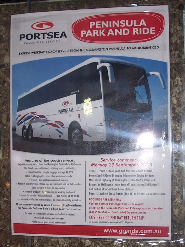
Grenda's is currently trialling a premium commuter coach service from the Mornington Peninsula to the CBD. The prebooked service completes a round trip, departing Rosebud West at 6:30am weekdays and Southern Cross Station at 5:30pm. A premium fare of $15 (one-way) or $25 (return) is payable. As a non-subsidised private service, the coach operates outside the integrated state-wide fare system.

Poster advertising the service (photo by Craig Halsall)

The posters above have been seen in route buses and at Frankston Station. This plus the wording indicate that the intent of the service is siphoning existing passengers from existing services as much as attracting new commuters from their cars. If successful this could be advantageous to the operator since their special fare means they keep all revenue. On the flip side the service is non-subsidised, so the number of passengers needed to pay is much higher than for a regular (subsidised) route.

About to leave Southern Cross

Last Friday afternoon Craig and I got on board to see how it was going. One other passenger boarded on Collins Street, but that was it. Before jumping to conclusions on its likely survival, let's look at the service in a little more detail:

The speed A major hold-up was the CBD portion, accounting for nearly half the 2-hour total travel time. While taking an indirect freeway route via Mitcham, travel time from then on was fast. Nevertheless had the bus called at Frankston Station it would have been about 30 minutes slower than an equivalent train trip from Southern Cross. However given that there is no waiting time and the express running compared to train+788, the coach wins for those near one of the stops.

The frequency No contest here. The coach has one round trip, so has no flexibility of arrivals and departures. In contrast express trains to Frankston run every 10-15 minutes with Bus 788 every 45 minutes, permitting better flexibilty of travel times.

The fare It's higher than the standard fare. Plus transferring passengers will need to buy a Metcard to board other buses, trains and trams in the CBD as it is not tied into the statewide fare system. However $15 for an 80-odd kilometre trip still represents fair value, so if the service fails the fare probably won't be the reason.

The profitability. Zero. The $45 collected would certainly not cover the fuel of the large coach, let alone Eastlink tolls, the driver's wage, any dead-running, vehicle maintenance or opportunity cost. I don't know the break even point, but even 20 passengers wouldn't be enough to make it pay. Even if it was subsidised as much as a regular local bus (say 25% farebox recovery) much higher patronage would still be required.

The patronage One (genuine) passenger per almost 100 kilometres is not good. Expressed in another way it's 0.01 boardings per kilometre or just 1% of that of even a moderately quiet local route (1 boarding per kilometre). Even if it was subject to public subsidy the service would almost certainly be withdrawn, alternative more frequent services already existing.

The future It is difficult to see one, whether it remains independent or becomes subject to public subsidy. Public subsidy would likely require incorporation into the statewide fare system and a social rationale for the service, which doesn't exist given alternatives. Ride it when you can!

Tuesday, May 27, 2008

Service costs and spreading the peak - 2

As well as fares and frequency, another way to spread the peak is to provide express services during shoulder peak. Generally expresses are even more 'peaky' than train frequency. This is good for inner-suburban passengers (as it gives inner suburban stations a broad peak of frequent services) but less favourable for outer suburban commuters who have increased travel times relative to if they travelled during the height of the peak.

The following times indicate the first and last peak direction express trains passing through Caulfield (or Camberwell). 'Express service' is defined as one not stopping at five or more stations*.

AM Peak

Belgrave/Lilydale: 5:46am - 10:20am
Cranbourne/Pakenham: 6:12am - 8:36am
Frankston: 7:43am - 8:47am

PM Peak

Belgrave/Lilydale: 3:40pm - 7:37pm
Cranbourne/Pakenham: 4:41pm - 6:06pm
Frankston: 5:16pm - 6:21pm

(*) Based on 30/9/07 timetables, which are out of date. Will be updated with new data.

The main limitation of the above spans is that they change according to where you draw the line on the number of stations the expresses miss. For example, there are many trains that express through three stations. This will broaden the span - to most of the day in the extreme case of the Frankston line where it becomes meaningless.

Because it's better to spread the peak and this requires both service and behavioural changes, I opted only to include the faster express trains. This is in line with passenger behaviour - passengers able to will prefer the faster expresses, even if the travel time saving is small. Shoulder travellers on some lines pay a penalty in reduced service frequencies and/or fewer expresses, and tackling this is helping to spread the peak and increase efficiency.

What do the above lists show? The Belgrave/Lilydale lines have wide peak express spans, with express services running well into the shoulders. The Frankston line has very narrow peak express windows (literally 'peak hour'), although it has many lesser expresses outside those times and during the day. Cranbourne/Pakenham has expresses opearating during most peak times. The most conspicuous gaps where there are no or slow expresses are on the Frankston line before 5pm and on both the Cranbourne/Pakenham and Frankston lines from about 8:30am. These early finishes do not encourage 9:30am starting, though if this was encouraged the after 6pm services also need attention.

The narrow express peaks on the Frankston line warrant further attention. Planning for it is complicated by the interplay with the other Caulfield group lines. Service priorities are elsewhere and nowhere is the competition fiercer but on the Caulfield group. The number of Frankston expresses appear to be held back by a need to provide a service to inner suburban stations (Malvern - Hawksburn) that cannot be satisfied by existing Carrum, Mordialloc, Cheltenham, Westall and Oakleigh local trains alone.

Current arrangements have the advantage of relieving the burden on the Cranbourne/Pakenham line (which has heavier patronage but less infrastructure). However Frankston is also a long line with its own distinct needs. These are a wider selection of expresses to serve areas beyond about Moorabbin and more frequent service closer in.

This makes the concept of a two-tiered service based on frequent local and express trains running over a longer span attractive with better use of the existing third track to Moorabbin. However it could also mean that some zone 1 stations (eg Glenhuntly or Carnegie) may lose express trains, and more services would miss the loop, running direct to Flinders Street.

To summarise, spreading the peak by making shoulder peak service more attractive is a viable way to improve capacity and network efficiency. While it can't cope with meeting long-term requirements, it's a worthwhile short and medium term strategy to relieve pressure on the network and has an exceptional return per dollar spent.

Wednesday, May 21, 2008

Service costs and spreading the peak - 1

What gives best 'bang for the buck' when it's decided to use service levels as a lever to boost patronage or change patronage patterns (eg spreading the peak)?

Whether you look at it from the customer side (better services) or the supply side (costs and resources), the answer is rather 'lumpy' and not linear.

As an example, adding an extra three trains per hour to a subway service that's already running every three minutes isn't going to make the service that much better, assuming the existing system is already reliable and is not overcrowded. On the other hand, using them to increase an hourly service to every fifteen minutes is a major boost and makes the service much more attractive.

On the supply side, the costs in boosting services escalate as follows:

Stage 1: Existing infrastructure sufficient, existing rolling stock sufficient, need to train/roster more drivers.

Stage 2: Existing infrastructure sufficient, need more rolling stock, need to train/roster more drivers.

Stage 3: Need more, infrastructure, need more rolling stock, need to train/roster more drivers.

Stage 1 is the fastest and cheapest, while Stages 2 and 3 are the dearest and take longest.

Additional peak capacity is likely to require Stage 2 or 3. In contrast, major improvements to off-peak services only require Stage 1. This explains why the marginal costs of increasing off-peak patronage is lower than increasing peak riders. If some of the latter can be induced to shift their travel times to shoulder peak periods, total patronage grows and the large fixed costs of rail are spread across more passengers, increasing efficiency.

Against this is a question as to transport's role in society. Should transport adapt itself to people's lifestyles, or should we expect people to change their living according to what suits the transport system? The former will obviously cost more than the latter, since more Stage 2 and 3 improvements will be needed to cater for a sharp peak. However public transport economics can't afford to impose itself too heavily on passengers, since more will find driving more attractive, train patronage will stagnate and modal share will fall.

To date the main measures that have been taken to spread the peak include:

1. Local bus improvements. Many routes now finish at 9pm instead of 7pm. This may lengthen the evening peak, although there is still a frequency penalty for those leaving work after about 6pm.

2. An 'early bird' ticket. A special ticket providing free travel for train travellers (only) who reach their destination by 7am. Intended to spread the morning peak.

3. Some increases in shoulder period train services.

The following graphs compare current service provision across the AM and PM peaks on several popular lines. For those not from Melbourne, the lines can roughly be described as follows: Belgrave/Lilydale: 3 tracks for better peak expresses, high service levels and low catchment population growth; Cranbourne/Pakenham: 2 tracks, moderate to high service levels and high catchment population growth; Frankston; 3 tracks for better peak expresses, moderate service levels and moderate catchment population growth. All are at least 40km long and have stations every 1 to 3 kilometres. Suburban services on the latter two lines also have to share with goods and/or country trains.

All trains that pass through the nominated points are counted; even when they do not stop. Using a moving time period (rather than fixed 30 minute blocks) would be better, but is not needed for broad comparisons.

Apart from the intensive services on the Belgrave/Lilydale line, the major distinguishing feature is its extended morning peak. This compares to the Dandenong line (especially) where service falls to off-peak levels by 9am. In this regard the Frankston line does better, though its frequency is less during the 'early bird' period.

During the evening, the broad peak on the Belgrave/Lilydale line is again apparent. Frankston again has the shortest peak, with the period of significantly enhanced service lasting for about two hours. Possibly due to its third track and relaxed capacity constraints the general pattern is that the Frankston line runs faster expresses (but fewer of them) than the Cranbourne/Pakenham lines, which has more stopping trains, but better frequency.

Of the lines surveyed, the Cranbourne/Pakenham lines have the least infrastructure, the most non-suburban trains to share with, the highest overall patronage and the greatest patronage growth. This causes its peak services to be under a degree of pressure unseen on the Belgrave/Lilydale line, as reflected in the reliability statistics. This makes it the most attractive candidate for peak spreading, particularly around 9am, 4pm and 7-9pm.

Sunday, March 30, 2008

Route 900 SmartBus - a video presentation

Here is a recording made during a trip on SmartBus Route 900 to Rowville earlier this afternoon. Stop facilities, information, interchanges and patronage are some of the topics mentioned.

For non-Melbourne readers, Route 900 is an east-west bus route through Melbourne's south-eastern suburbs. It runs every 15 minutes weekdays and every 30 minutes evenings/weekends between Caulfield Railway Station and Stud Park Shopping Centre in Rowville. Major trip generators served include Chadstone Shopping Centre, Oakleigh Station and Monash Univesity campuses at Caulfield and Clayton.

Route 900 patronage is high between Caulfield, Chadstone, Oakleigh and Monash Univesity. It is lower east of Monash University. However it provides a useful service to eastern areas and links with all other current SmartBus routes (700, 703, 888/9 & 901).

Thursday, June 28, 2007

Run it and they will come

No less than 23 people boarded the westbound 5:15pm Route 623 bus at Chadstone last Sunday. Route 623 runs between Glen Waverley and St Kilda via Chadstone Shopping Centre. Last Sunday was the first day of the new Sunday service; previously it (like most routes) ran six days per week and finished just after 6pm.

This success indicates the real demand for Sunday bus travel, a fact only recognised very recently. Indeed with an equivalent service, a route like 623 is the sort that could end up carrying more passengers on weekends than it does during the week.

Sunday, May 27, 2007

'Caught by suprise' or just sloppy sums?

A recent Age article contains a claim attributed to the Minister for transport that 'a rise in train patronage had caught the Government by surprise'.

'It has been over 18 per cent in the past two years, which is massive," she said. "We usually operate on the basis of 3 to 4 per cent increase since we have come to office.'

The government has also claimed a policy of achieving 20% modal share for public transport by 2020. Since modal share is currently around 10% it follows that a dramatic increase in patronage is needed to achieve the modal share aim. Assuming no population increase and no increase in motor vehicle trips per capita, a doubling would be necessary. With population growth and car usage per capita still increasing, the actual increase would need to be more - perhaps around 150%.

Let us assume that we have, in 2007, a city of 100 people. It makes 1000 motorised trips per annum per capita of which 100 by public transport (ie a 10% modal share). Doubling modal share would require a shift of 100 trips to public transport from some other motorised mode. So that makes 200 trips, assuming that there is no change in the volume of travel per capita.

Then there's population growth. Assuming 1.4% pa growth rate this would take us to 120 people by 2020. Perhaps 1.4% pa is a bit higher than the historical record, but note that the population is ageing and the number of people of driving age is increasing faster than the general growth rate.

Thus the total number of public transport trips would need to increase from 100 people x 100 trips (10 000) to 120 people x 200 trips (24 000) per annum to meet the target. That earlier 150% estimate is pretty close.

Compound percentages are tedious to calculate, but financial people do it every day and have developed handy calculators such as this. Luckily they are just as good for other uses such as passenger growth calculations.

For our purposes, we have an ending value of 24 000 and a starting value of 10 000. It's 13 years until 2020, so the number of periods is 13. This produces a required compound annual percentage growth of 6.97%. As it doesn't allow for driving growth, it understates the growth required, which in practice would be in the 7-8% pa region.

Of course this is an average across all modes. But given likely continued suburban development, one would expect that growth of trains and buses would need to be well above 7% while trams could grow slower (these generally only serving established inner suburbs and no major tram extensions planned).

To achieve 20%/2020 an average annual patronage growth of at least 7% is required. If the government banks on 3-4% growth then it can kiss the 20% by 2020 aim goodbye as the numbers don't stack up. Furthermore the annual growth requirements get more onerous and eventually almost impossible the later it's left.

Saturday, December 02, 2006

Rethinking the Loop

When the Melbourne Underground Railway Loop was designed, its major intended purpose was to serve a distributor function for CBD commuters. Before the Loop, commuters to the north and east of the CBD had to transfer to (possibly) an overcrowded and gridlocked tram from either Flinders or Spencer Street Station.

For such commuters it did not matter very much which direction loop services went, or indeed whether they reversed in the middle of the day.

However demographics and travel patterns have changed since the loop opened in the 1980s and it is appropriate to review its current function, potential, service patterns and passenger information. Such a review may find that while the loop benefits some trips, it poorly serves others. Furthermore, it is possible that demand for trips it serves poorly is growing faster than those it serves well.

The following have changed since the Loop fully opened in 1985:

* The rise of city living. The resident population has virtually doubled in the last 10 years and there has been an associated retail boom. The CBD is no longer just a place to commute to from the suburbs. The CBD population is growing by between 3000 and 5000 people per year, or at a rate twice the state average. Transport systems increasingly must serve within-CBD movement as well as suburb - CBD trips.

* The enlargement of the Melbourne CBD. The City Loop is no longer the natural boundary of the CBD, with growth bursting over the river to Southbank and westwards into the Docklands precinct. Within-CBD trips are becoming longer and trains will become faster than trams for more of them. Significantly, the closest railway stations to the new developments (Flinders Street and Southern Cross/Spencer Street) are also the oldest and those sometimes disadvantaged by the Loop.

* The revitalisation of regional rail and expected increased patronage. Services to fast-growing commuter-belt areas are based around Southern Cross Station, which currently lacks direct loop services at certain times of the day.

* The growth of air travel and specialist airport bus services. Current services (particularly to Melbourne Airport) are of high quality, but are let down by the limited accessibility of Southern Cross Station from some CBD locations at certain times.

* More diverse travel patterns, including more weekend and evening travel. Whether due to de-regulated shopping hours, labour market changes, CBD living, tourism or the influx of international students, this has increased the amount of movement, especially around the inner-city. Much of this demand could be met by a revised City Loop in conjunction with surface tram and bus systems.

The above points require a new way of thinking about the City Loop's function.

Its original rationale, that of a high-capacity distributor for CBD/M-F/9-5 workers commuting in from the suburbs, though still important, is declining in relative terms. In contrast, the Loop's current usefulness is limited for all five travel growth markets identified above.

To make the Loop relevant again, it needs to be seen and used as an inner-city metro system, offering faster CBD-area travel than is possible by tram. Of course the Loop still retains its traditional distributor and collector role for suburb-CBD trips, but the new emphasis could appeal to whole markets that are currently poorly served.

What would a modernised metro-style City Loop look like?

Generally, very similar to today. The tracks and stations are already there, and the services already run.

Just two things would be different; one substantive and the other cosmetic.

The substantive difference would be service patterns. The following three points are most important:

* Scrapping the 12:45pm weekday reversal so that loop services would run in the same direction all day long. Tourists and lunch-time travellers will no longer need to shun the loop as they do today.
* Standard loop directions seven days per week.
* A loop operating pattern that provides for direct no-transfer services between all CBD stations.

The cosmetic change is passenger information. As well as traditional line-based information (again only really suitable for beyond-CBD passengers), extra passenger information for CBD-area passengers would be established. Examples are shown below:

Image 1

Image 2

Image 3

Image 4

Note that the above platform numbers assume a weekend loop service pattern, with services stopping at Flagstaff.

Conclusion

Years of planning exclusively based on suburb to CBD commuter travel needs has left the City Loop poorly equipped to serve emerging passenger growth markets in and around the Melboune CBD. The midday reversal and differing service patterns have made full use of the City Loop impractical for many casual travellers.

A new-look Loop, based around existing services but easier to use and responsive to modern travel needs, has been proposed. It is hoped that train service revisions planned for next year will represent a step towards this aim.

Monday, October 16, 2006

Driver boosts patronage by 700%

Even though this area has an urban form conducive to walking, many homes without cars, a well-used tram service and and the highest journey-to-work train modal shares in Melbourne, almost no one takes the bus.

During the middle of the day you'll get a few elderly shoppers on board. Plus students before and after school. But that's about it. During the afternoon peak, while packed trains are spewing out passengers, it's common to see buses just metres away with 1 or 2 on board. And sometimes even 0 - in the middle of peak-hour.

I have often asked myself 'why was it so?'. I decided that it would be easy to treble patronage. So instead of 1 or 2 people on the bus, there could be 3 or 6. All you'd need is 5% of alighting train passengers to transfer, and this is simple as the bus route goes in the same direction as the main pedestrian flow.

But before we get onto that, I'll present a map to make it easier to explain.

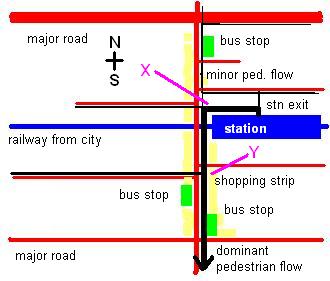
The red lines are the roads, the blue line is the station and the yellow denotes a shopping strip, the most active part of which is south of the railway. The green boxes are bus stops.

Most important are the black lines, which indicate pedestrian flows during the afternoon peak. The thicker the black line, the more popular is the route. As can be seen by the thickness, most people alighting the train walk south, through the most active part of the shopping strip.

That tallys with what one would expect; the area north of the major road is mainly low-density residential with a railway station on another line about 15 minutes walk away. In addition, the road's width and lack of crossing points presents somewhat of a barrier to pedestrians.

The area south of the line has no such constraints. Indeed it has some features conducive to high use of the local station, including a busy shopping strip, high-density housing, high student and rental populations and no other railway lines nearby. So it's no mystery why most users of the station live south rather than north of it.

The streets with the densest housing are up to 15 - 20 minutes walk due south of the station. It would seem logical that some of these people would take a 5 minute bus ride on the way home from the station, wouldn't it? But as noted before, almost no one does.

The map above provides the critical clue why this is so. Note the locations of the two south-bound bus stops. The one nearest the station is to the north. Despite the new route sign, the timetable case remains empty. But since this is away from the dominant southwards pedestrian flow, it would be seen by relatively few people who might wish to use it, so the timetable's omission may be less a sin than originally thought.

The other southbound stop is quite a distance from the railway station, five (maybe ten) minutes walk, near the southern end of the shopping strip. By that time people might have thought that since they're one half to one third the way home, they might as well keep walking and not catch the bus. Since the basic service frequency is 30 minutes, and assuming a random arrival, probability theory is on the side of the walker getting home quicker. And the passenger numbers on the bus are enough to indicate that most people instinctively know that anyway unless they can see a bus coming.

What about my trebling patronage claim - doesn't that sound a bit outlandish? It might, but first I'll tell you about the kind bus driver who did even better, getting a 700% patronage boost.

It was about 6:20pm. A down train had just stopped and dozens of passengers were squeezing their way out of a narrow station exit. As per the map above, most started heading south. A bus with one passenger on board happened to be stopped at the level crossing at point 'X' (see pink line). This was right near where alighting passengers were about to turn, and the driver opened the doors and let them board.

A bus that otherwise would have carried one now carried eight. And before the bus could go, the boomgates lowered again, and most likely more people were able to board. This 700% patronage increase was the product of no planning; all it needed were passengers in the right place, a bus in the right place and, most importantly of all, a nice driver.

Now the particular spot that the bus stopped was ideal for alighting passengers, but due to a side-street, there isn't enough room for a regular stop. However there is room at point 'Y'. This is still quite close to the station, central to the shopping strip and also convenient for city-bound trains. Most importantly it is in the main pedestrian traffic flow, so it will be visible to most people.

The chances are that some passers-by would check the timetable before deciding whether to continue walking or take the bus. This is particularly the case with properly-designed (composite) timetables, so that tired passengers can consult one list, not three. Even if it's fifteen minutes to the next bus, some might elect to do some shopping in the interim. Since they won't be half way home before they get to a bus stop, psychologically they would be more inclined to opt for the bus.

It so happens that point 'Y' is outside a Metcard outlet and already has a seat. As mentioned in a previous post, it would be a fine place for a bus stop. The stop north of the station can then be moved north-east around the corner to the main road, where it could also be used by other services including a SmartBus and a NightRider (which already stops there).

What are the lessons from all this?

* Alighting passengers will not risk walking time to back-track to a bus stop (especially when the walking distance home is less than 2 kilometres and bus times are unknown)

* Alighting passengers will board a bus going their way if it's waiting and outside the station exit

* Alighting passengers are likely to consider boarding a bus (ie checking the timetable) if it is (i) near the station and (ii) on the way home

* Even if the wait for the bus is longer than walking, some passengers may still choose the bus if they can use waiting time to shop

Conclusion: Putting bus stops on major pedestrian desire lines is likely to generate significant increased patronage. At certain times when buses are lightly used (eg peak hour for local trips) increases of several hundred percent are not unreasonable when backed by appropriate service planning and passenger information.

Tuesday, August 29, 2006

Public Transport Guidelines for Development: why they're needed

I briefly mentioned that the draft was available for comment a few days ago. Any doubt as to their importance was scotched yesterday afternoon when I rode bus Route 840. This route goes from Berwick to Berwick via half the known universe and takes an hour to do so.

On leaving Berwick Station I passed underdeveloped land near the station, brand new new housing estates, a few large shopping centres, some slightly older housing estates and vacant land.

There were a few swings and bumps (due to roundabouts) and circuitous running due to poor street layouts. Many school children were dropped off but few passengers were picked up. Even if the buses were more frequent (current off-peak service is hourly) travel would still have been indirect and excruciatingly slow.

Suburbs like Berwick and Narre Warren are why the guidelines are needed. They are full of neat houses, nice parks, views and even the odd lake. However traffic on surrounding roads is terrible and public transport even worse. With the way these subdivisions have been planned, with circuitous internal streets unsuited to direct bus routes, fences backing onto main roads creating poor passive surveillance for cyclists, and pedestrians considered second class it is hard to see how non-car transport modes can be effective and efficient, either now or in the future.

I hope these Guidelines will help the planning of future suburbs. Note that they're still in draft form and submissions close next Monday, so read it and put one in. I thought that there is more to it than just bus stops and roundabouts, and give a list of pointers in my submission (pdf 120k).

Russ over on Civil Pandemonium also has a few words to say.

To conclude, it's one thing for there to be a bus in a street near you. It's quite another for it to provide efficient and effective transport that people other than schoolkids and oldies will want to use. Planning suburbs for a choice of effective transport modes is the first step to attracting people to public transport. It's not the be all and all (factors such as service planning and integration are also crucial) but if done properly it would give new suburbs a good start that places such as Narre Warren and Berwick have been denied.

Sunday, August 27, 2006

Melbourne lagging on buses

The Public Transport Procurement Legislation Review Consultation prepared for Auckland (pdf 1.8MB) has some interesting comparisons between bus service levels, their change over time and patronage growth across major Australian and New Zealand cities.

The statistics (verifiable by consulting their timetables) show that Christchurch now has higher average bus service levels than just any other city in Australia or New Zealand. A concerted effort to redesign the nework and boost services was rewarded by higher patronage, with a growth of about 43% since 1990 (all of which occurred since 1999).

Of the Australian cities, Brisbane and Perth did best with increases of 35% and 14% respectively. The newly-integrated Translink fare system, high-quality BUZ services and better service co-ordination all contributed to Brisbane's performance.

Melbourne buses scored at or near the bottom on many measures, with a patronage growth of just 0.3% since 1990. Admittedly these stats exclude our large and popular tram system, which most of the other cities lack. However this also means that our buses disproportionately serve outer suburban growth areas, which should attract greater use through faster population growth. However you look at it, the statistics present solid evidence that there is room for Melbourne buses to do much better.