Showing posts with label service planning. Show all posts

Friday, December 30, 2011

Review - Human Transit: How Clearer Thinking about Public Transit can enrich our communities and our lives, by Jarrett Walker

An observation from last September’s Australasian Transport Research Forum conference was the abundance of academics versus the paucity of practitioners.

I define practitoners as those who plan and operate transport routes or closely work with those who do. They have their own work and don’t write books and attend conferences as much as academics and bureaucrats.

Consequently it was refreshing to find a book on public transport service planning by an experienced practitioner. The author, Jarrett Walker, is a service planner and consultant to transport agencies in the US, Canada, Australia and New Zealand. His work was already known to me through his blog at humantransit.org

Having read books by academics such as Mees, Newman and Kenworthy, I was particularly interested in the different perspective that a practitioner might bring.

Academics thrive on research, teaching and (sometimes) political advocacy. However the affordability, practicality and acceptance of their recommendations may not frequently be tested.

Whereas practitioners need to be more practical and less theoretical. They must often work within existing resources; something academics might find limiting. Consultants can be practitioners too but won’t get work if not seen as useful.

In Human Transit, Walker describes himself as a plumber.

We don’t expect plumbers to tell us how to run our cities and our lives; unlike (say) priests, politicians and talkback radio hosts. They may hold values but cannot choose them for their clients. But they might be able to advise on the consequences of particular decisions; for instance the cheap quick fix versus the dearer but enduring repair. And they might point out that any option chosen must respect basic laws, like water flowing from high to low, for the system to work effectively.

City planners and developers deal the hand with which transit planners must work. Some decisions, notably with respect to density, are controversial. Walker, more than Mees, sees density as conducive to higher patronage. However he adds, correctly in my view, that location and geometry are equally critical when designing neighbourhoods for direct and efficient transport routes. To Walker these factors are public transport’s equivalent of the plumber’s basic laws. If disobeyed an area may never be easily or efficiently served by good public transport.

Transport networks themselves can be optimised to favour patronage or coverage goals. Networks that optimise patronage generally have direct, fast, frequent but more widely spaced routes, whereas a coverage-oriented network sacrifices directness, speed and frequency for short walking distances. Walker insists that transport authorities set a resource allocation policy between ‘patronage’ and ‘coverage’ routes.

Only after such priorities, and thus available resources, are known can the service planner design the network.

The book is a mine of simple but often neglected insights that would make public transport better. All are applicable to Melbourne. For instance the trade-off between directness, frequency and legibility on the one hand, and requiring that people change for some trips. We’re used to road maps having different thicknesses for different types of road, from lane to freeway, so why not do the same with transit maps, highlighting our most frequent,and thus most usable routes? And, on busy roads, the contribution of the humble pedestrian crossing to improving access to bus stops and the impetus it provides to gradually increase an areas’s walkability (and thus transit access).

Human Transit does what its title suggests. It forces the reader, from layperson to transport planner, to sharpen their thoughts and ask the right questions. I highly recommend it.

Human Transit is published by Island Press and is available via the link below.

Saturday, December 10, 2011

The user time element in public transport service planning (Pt 2)

Can it be done?

Still think that substantial travel time reductions are impossible without building high-speed railways under each suburb?

The following examples show how significant travel time savings could be possible, largely with existing infrastructure.

Example 1: Inter-suburban bus trip

Consider a short bus trip where the bus runs every 40 minutes. This service level is typical for middle and outer suburban routes and even some major inner suburban routes (eg 246 on Sunday evenings).

The trip takes ten minutes, with five minutes allowed to reach and leave the stop at either end. That adds up to a best case 20 minutes travel time, if you arrive at the stop just as the bus arrives. The worst case, if a bus has just been missed, is 60 minutes. While the average, assuming random arrival is 40 minutes.

This comparison shows high variability, or +/- 20 minutes from the average. The 3:1 difference between maximum and minimum trip times is entirely due to the attempt to make a short trip by randomly arriving to catch a low frequency service.

Increasing frequency to 20 minutes reduces the average time to 30 minutes, or a 33% reduction. Variability is reduced to +/- 10 minutes, or 20 to 40 minutes. For a ten minute frequency the average drops to 25 minutes, or an average 37% time saving. Variability drops to +/- 5, or a ratio of maximum to minimum of 1.4:1.

The above example shows that frequency has a dramatic effect on random arrival end-to-end travel times. Higher frequency also cuts variability, or effectively increasing travel reliability. The minority willing to plan around timetables can enjoy the benefits today, without any frequency increase. That’s unless they depend on connections, which are discussed next.

Example 2: Bus + train trip

Consider a suburb about 20km from the CBD. Its local buses run every 30 minutes and the trains every 20 minutes. The passenger is 5 minutes walk away from the bus stop. The bus trip (via a meandering route) takes 15 minutes to a stop near the station. When passengers alight the bus they need to cross a busy road to the station, which has only one entrance at the far end of the platform (assume 5 min). After that the train takes 40 minutes to the city.

The best case travel time is 5 min (walk) + 0 min (wait for bus) + 15 min (bus travel) + 3 min (station access) + 0 min (wait for train) + 40 min (train travel). Or a total of 65 minutes for the 20km trip.

The worst case travel time is 5 min (walk) + 30 min (wait for bus) + 15 min (bus travel) + 5 min (station access – assuming 2 min traffic light cycle at crossing) + 20 min (wait for train) + 40 min (train travel). That’s a total of 115 minutes for the 20km trip.

There’s three things to note. Firstly the worst case represents an overall speed of just over 10km/h or about double walking speed. Secondly the variability is high – the worst case taking twice as long as the best case. And, in the worst case example, the passenger is in motion for barely half the time.

Now consider the same trip above, with the following modest service improvements:

· Bus frequency upgraded from 30 to 20 minutes, to provide a harmonised connection to each train, with a consistent 6 minute connection · Bus route made more direct, to reduce travel time from 15 to 10 minutes and fund the higher frequency, but with 5 minutes added walking time · Additional station platform entrance and zebra crossing installed (to reduce station access time from 5 to 2 minutes)

The best case travel time following these improvements is as follows: 10 min (walk) + 0 min (wait for bus) + (10 min bus travel) + 2 min (station access) + 4 min (wait for train) + 40 min (train travel). Or a total of 66 minutes for the 20km trip. The worst case following these improvements is as follows: 10 min (walk) + 20 min (wait for bus) + 10 min (bus travel) + 2 min (station access) + 4 min (wait for train) + 40 min (train travel). Or a total of 86 minutes for the 20km trip.

The difference is dramatic. The average travel time has fallen from 90 to 76 minutes, while the ‘worst case’ is nearly 30 minutes quicker. Variability also fell; from +/- 25 minutes of the mean to +/- 10 minutes. Better connectivity and higher bus frequency contributed most to the gain. However more direct bus routing and better pedestrian access also added smaller but no less cost-effective benefits.

Example 3: Bus + Bus trip

Finally we’ll examine a cross-suburban trip involving a change between two bus routes. This is typical for journey types in which public transport has a low modal share.

I’ll use similar assumptions to the first example. Eg 5 minute walk to and from the bus and 10 minute travel time in each bus. The first route runs every 60 minutes while the one being changed to is every 40 minutes.

The first leg involves 5 min (walk time) + 30 min (average wait) + 10 min (travel time), or a total of 45 minutes. The best case is 15 minutes, while worst case is 75 minutes. Or a variability of +/- 30 minutes.

The wait to the second bus will be anywhere between 0 and 40 minutes. Because the frequencies are unharmonised the best connections will recur every two hours. We’ll assume an average of half its frequency, or 20 minutes.

The second leg involves 20 min (average wait) + 10 min (travel time) + 5 min walk time, or a total of 35 minutes average. But it could range from 15 to 55 minutes, or a variability of +/- 20 min from the average.

The very shortest time that the overall trip can be made is 30 minutes, with the longest 130 minutes. The average time is 80 minutes. Because time savings and delays average out, the traveller is unlikely to experience the extreme shortest and longest trip times. But if they do, that’s a ratio of over 4:1, or a variation of +/- 50 minutes.

While people may tolerate a higher variability for a short trip (Eg a 10 minute trip taking 20 minutes), it is probably true that tolerance declines for longer trips (especially if routine). Hence the letters in the paper complaining about suburban trips that take an hour by public transport but only 20 minutes driving.

There’s a couple of things that can be done to reduce variability.

Firstly the passenger could forego flexibility and use a timetable. Instead of waiting an average of 30 minutes for the first bus, they wait an average 5 minutes. This reduced variability of +/- 20 minutes is solely due to the connection between the first and second bus, which is beyond the passenger’s control. Average travel time is also reduced – by 25 minutes, which is the difference between the planned wait and the random arrival wait (ie half the frequency of the first service).

There’s also the contribution of service planning, which unlike the first response, assumes no accommodation on the part of the passenger.

Suppose the frequency of the first service was upgraded from 60 to 40 minutes. The first benefit of this is to reduce the average wait, from 30 to 20 minutes. Variability contributed by the wait for the first service is thus reduced.

The second benefit is that it matches the frequency of the second service. Such matching does not guarantee good connections but does dramatically slash variability. Let’s look at the numbers.

The first leg involves 5 min (walk time) + 20 min (average wait) + 10 min (travel time), or a total of 35 minutes. The best case is 15 minutes, while worst case is 55 minutes. Or a variability of +/- 20 minutes.

The wait to the second bus will be anywhere between 0 and 40 minutes. Because the frequencies are now harmonised the connections will recur every 40 minutes. We’ll assume there’s been no special planning and the wait for the second service is half its frequency, or 20 minutes.

The second leg therefore involves 20 min (average wait) + 10 min (travel time) + 5 min walk time, or a total of 35 minutes. Because the first leg has been harmonised to it the wait for it is now constant, variability has been reduced to zero.

Add the two legs and we have an average of 70 minutes. That’s 10 minutes down on the first case of 80 minutes. But the real gain has been in reduced variability. At best it’s 50 minutes and at worst it takes 90 minutes. This is a variability of +/- 20 minutes – well down on the earlier +/- 50 minutes. Also the ratio of maximum to minimum journey time has fallen from over 4:1 to under 2:1. Although average travel times are still slower than many would like, the improvement made from adjusting one route from a non-harmonised 60 minutes to a harmonised 40 minutes cannot be underestimated.

Again, with the earlier example one can do better. If one sacrifices flexibility and uses a timetable to catch the first service, the average travel time falls by 15 minutes (70 to 55 minutes) and variability virtually eliminated. Secondly, if planners consider that the connection between the two services is sufficiently important to be worth adjusting timetables, the connection time could be reduced from the 20 minutes average assumed here to 10 minutes. This contributes another 10 minutes, meaning a total average trip time of 60 minutes for those who don’t use a timetable and a reliable 45 minutes for those who do.

Summary and Conclusion

I have demonstrated the effect of frequency on cutting journey time. It is at first dramatic, with a point of diminishing returns being reached as frequency rises to around ten minutes. Beyond that point, unless it needed for capacity or for very short trips, its impact drops.

Also discussed has been travel time variability. Public debate on this normally concerns train reliability, and this is especially important for those connecting to less frequent buses. However the examples demonstrate indicate it can be very high for bus trips, especially those involving random arrival and connections between non-harmonised services. Harmonised bus frequencies can greatly reduce variability and make public transport more useful for trips where it’s currently weakest.

The planning approach presented here focuses most on service frequency and its harmonisation. There is less attention to infrastructure and capacity.

The former is cheap and quick, while the latter is expensive and long-term.

Both have their place in a growing city. But introducing the latter without the former means that use of the latter is poorly utilised and public transport’s potential to fully contribute to the overall transport effort is unrealised.

The user time element in public transport service planning (Pt 1)

There’s been heavy discussion about the financial user cost of public transport, following the announcement of an 8.6 per cent fare rise from next month. This post is about another user cost; the longer time it sometimes takes relative to driving.

Amongst those with a choice, public transport attracts its highest share where it is time competitive with driving, notably work trips to the city. Where it’s uncompetitive passengers tend to be those with more time than money, typically due to low incomes and/or an inability to pay. This is the familiar skewed pattern of old and young in the off-peaks and city commuters during the peaks.

This is a long post, so is split into two parts. Part 1 discusses user financial costs, funding sources, trip time and trip time variability. Part 2 uses examples to illustrate the large gains possible from service and other improvements.

Two dimensions: time and money

One insight that comes from counting time as a cost is that it invites comparison with that other type of cost most commonly associated with public transport – fares. Fares are known and fixed whereas time value is less tangible but no less important.

Although lacking hard numbers, we can guess time value’s magnitude or draw inferences from surveys and modal share statistics. We know it varies with trip length, location and timing. Acceptance of slow trips and high costs varies but depends on the value placed on time and money respectively. Some rough plots of user time versus financial costs for various transport modes in Melbourne are on the graph below.

The ‘best’ is cheap and fast (bottom left) while the worst is dear and slow (top right). The other corners are occupied by fast expensive (top left) and slow cheap (bottom right). Overall user costs for each comprises dollar plus time costs, with this increasing from bottom left to top right.

Consensus that a particular mode represents good value is highest for those near the bottom left. Whereas top right is poor value and only worthwhile for those willing to bear the high overall cost. If they are not, they’ll change homes, jobs or schools to avoid it. The action is crucial; mere grumbling implies acceptance since bad transport may still be better than other choices available.

I take the view that most people are transport pragmatists, ie whichever available mode suits their time / cost value profile for a particular trip will be used. Most of the time the mode chosen (driving) is faster but dearer than public transport. This invites the question as to whether the overall user value of public transport would increase if it were faster, even if somewhat dearer.

Public transport’s place

Public transport’s detractors treat slowness as inherent but this is not necessarily so. Where transit is slow, this is due to decisions made on station spacing, route and timetable planning, street design, signal priority and allocation of road space between modes.

Skybus (also on the graph) is an example of fast public transport. Its fares are high relative to government-subsidised routes. But because it’s both fast and frequent its time costs are low. Add the two and you see that Skybus occupies a distinctive (and successful) position in the market, set apart from regular buses (with low fares but high time costs).

Is regular public transport’s position on the graph optimum?

The answer depends on what you want it to achieve.

What would happen if you changed either its user financial or time costs?

Making an already low-priced but infrequent bus service cheaper would not greatly reduce the overall user cost to the ‘average person’. This is because unless they value their time lowly, the time cost component probably outweighs the fare cost and slashing the latter won’t cut the total much.

However this conclusion ignores certain market segments. Fare cuts are more significant for those who value money more than time, ie the ‘captive passsenger’ end of the market. This segment tolerates the limited service and values the saving more than average so will probably use the service more, possibly even increasing revenue.

It’s a bit like arguments in favour of Reaganomics tax cuts; individuals pay less but incentive stimulates economic activity which increases overall tax take. Fare / patronage elasticity will likely be highest off-peak and weekends as there’s more discretionary trips made by a different passenger profile.

The above limited bus service isn’t attractive to car owners unless driving conditions are very poor. People on all but the lowest incomes may find the waiting not worth the saving. Passengers that a lowered fare attracts may have previously walked rather than driven. Cheaper buses might make individual travel more energy intensive, although public transport fuel efficiency (as measured by fuel use per passenger) improves with patronage (ie more passengers per litre).

Speeding up buses (achieved through directness, frequency and connectivity) but charging a higher fare should have a different effect. The better service may attract some who previously drove or got lifts. Existing passengers may use the improved, more capable service more. But a fare increase could mean that even though the service is better, price-sensitive passengers abandon it for their lower value discretionary trips.

Funding better transport

There’s at least three things that can be done.

* The first is to maximise effective service levels from current budgets. For example delete routes that duplicate others and use saved resources where more worthwhile. This requires a strong service planning culture, and for co-ordinating agencies to take a network view; both factors in which Melbourne has been weak. Like tidying an over-grown garden before selling your house, good service planning has high payoffs, due to this legacy. And participatory public engagement, including illustrating the service gains possible, should help build acceptance.

* Secondly there’s the possibility of differential off-peak pricing. This gives the price-sensitive a discount while preserving revenue from the less price sensitive. This segments the market and probably optimises patronage, though at expense to legibility. A difficulty here is if peak fares must rise disproportionately to retain overall revenue, and here we merge into the next point.

* The third are other measures to generate revenue. Possibilities include development of rail air space, parking taxes, hypothecated property levies or above-CPI fare increases.

All are politically difficult, especially if the fare increase has not followed tangible reliability and service improvements. Rises skewed toward peak period commuters (without whom capacity building infrastructure would not be needed) may be economically most rational, but send the wrong signals with regards modal choice if not accompanied by similar increases for driving (whether through fuel, parking or road space pricing).

This combined approach may be better transport policy but probably harder than fare hikes alone due to the larger numbers affected. While not impossible, it may require a trust in government that is lacking, particularly in states that propose then cancel major transport projects, such as New South Wales with its various metro plans.

Whereas people are willing to individually pay more for quicker travel (as witnessed by the popularity of driving versus public transport), sourcing such funds for collectively funded network improvements raises hackles. How do we break this deadlock?

Seeing improvements differently

It may be worth reviewing how we regard transport improvements.

Large transport plans may be centred on infrastructure. Its purpose is typically to relieve ‘bottlenecks’ caused by extrapolating present commuting patterns forward. Time costs may be used to justify it; studies may cite rising congestion costs and ‘lost productivity’. Infrastructure’s tangible nature invites us to draw lines on maps and build models to imagine a faster future.

Another way of thinking is to set a public transport journey time reduction target and use the best combination of infrastructure and services to achieve it. The bigger the target the higher the cost, but the more likely that public transport would win the modal share shifts envisaged in Melbourne 2030 (an increase from 9 to 20% or a patronage trebling).

A 20 to 50% cut in average public transport travel times may seem far-fetched. But considering how it could happen would sharpen our thinking about which improvements are really worthwhile. Plus it familiarises planners with the real source of delays, which passengers know but they may not.

Overall travel time and its variability

Rules for such analysis need to match where and when people live and travel. For example they must acknowledge that people live where they do and not at railway stations. They want to leave when they want, without checking a timetable. And the selection of trips used must represent travel made by all motorised modes, and not skewed towards public transport’s current profile. These rules are observed by (i) counting waiting and transfer times, (ii) assuming random arrival at the stop or station, and (iii) including a representative spread of trips (including cross-suburban, night and weekend travel, which together form a majority of all trips).

Adding the first two produces a more useful average travel time (random arrival end to end travel time) than ‘headline’ minimum in-vehicle travel times. The latter is often a dubious selling point for ‘fast rail’ projects. It’s a bit like quoting air fares without all the extras and surcharges; meaningless at best and misleading at worst.

Travel time variability also needs to be known. Which transit system is better? One where a particular trip takes anywhere between 10 and 40 minutes. Or one that at best is slower (eg 15 minutes) but at worst is faster (25 minutes). It’s no contest really; the latter’s lower variability means better reliability, especially for time-critical trips.

Average random arrival end-to-end travel time and travel time variability (for a representative sample of trips in the area) are the to key numbers planners need to pick the best from a number of route and timetable options.

Train planners may have to juggle with express running versus frequency. Service delivery is also critical; when passengers start having to catch an earlier train due to the risk of the one they want being cancelled, effective travel speeds can easily halve, especially when a connection from a bus is involved.

Tram planners have little scope for express running and frequency is generally already high. Their main problems are externally caused, especially when in mixed traffic. Although there are trade-offs between whether all services are run to the terminus or some terminate early to provide greater frequency and capacity in the busier inner core.

Bus planners have more flexibility. They must balance walking time, coverage, number of routes, use of transfers, directness and frequency. However, like trams, priority on the roads can speed travel and reduce variability. This is especially where bus priority operates at all times and not just when the bus is running late.

Part 2 will follow with examples

Saturday, December 03, 2011

The end of Melbourne's least legible bus route

Melbourne bus passengers will get less lost after the cessation of Melbourne's least legible bus route after end of service today.

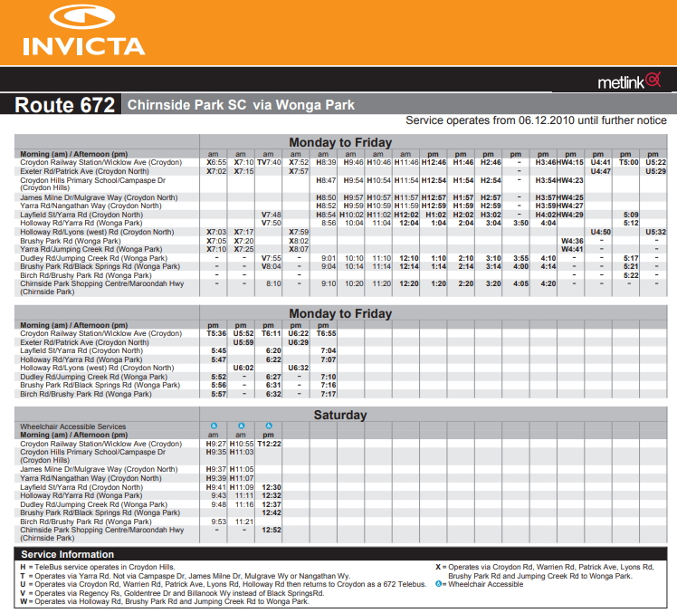
Route 672, in Melbourne's outer east, sometimes runs between Croydon Station, Wonga Park and Chirnside Park Shopping Centre. I say 'sometimes' because at certain times of the day almost each trip goes a different way.

672's proliferation of timetabled deviations meant that buses often missed stops, finished at unpredictable locations, went down other streets and even went on the opposite side of the road to what maps showed.

As attested by the number of footnotes, Route 672 had no standard pattern. Footnotes appear on timetables at stops. But if you're not up for a trip to Croydon, you'll be able to read them online for the next few days.

Current 672 timetable  (subsequent archived link)

The first thing to read is the route description. Note how the variations take up more space than the route route itself. If you're game, try to follow these on the map. Finally inspect the timetables themselves (either the pdfs under download route timetables or individual stop timetables). One direction has no less than nine footnotes and the other no less than six.


Compare it with Monday's timetable below.

672 timetable from 5 December 2011 (subsequent archived link

The description, map and timetable for the revised 672 are vastly simpler. Except for the Telebus deviate-on-demand service which remains, fine print footnotes have been almost eliminated. There are later finishes on weeknights and many more Saturday trips.

Other changes

The 672 isn't the only route that will be simplified on December 5. A good summary appears here.

Key cases where occasional deviations and extensions were removed include 691's Bayswater and Monash extensions (the latter now covered by other routes) and 664's Sunday deviation to Lilydale (a hangover from when 664 and 691 were about the only Sunday bus routes operating east of Stud Road). Other routes eg 671, 680 and 693 also lose occasional deviations or are straightened.

Span and frequency

As well as legibilty gains, there have also been span and frequency improvements.

The most common span improvements include one or two later weeknight trips and a fuller Saturday afternoon service. Frequencies have been made more regular on several routes. The largest changes include (i) a doubling of Route 693's off-peak service to 30 minutes, (ii) 664 becoming a 30 minute service along its full length (it was previously a split 20 / 40 minute service, unharmonised with trains every 30) and (iii) some weeknight frequency improvements between the pm peak period and last service around 9pm.

Overall the changes in the Invicta network reflect the biggest improvement since some routes in the area got minimum standards upgrades. They deliver substantial legibility gains without greatly changing the existing network. It's an example of a 'greater good' upgrade that should result in a net overall benefit.

Monday, September 05, 2011

Should transit follow people - or people follow transit?

While not the exact subject of the post, a recent Human Transit post contains a general quote that's worth reflecting on.

This, to me, fits into a much larger agenda of insisting that everyone who makes a location choice -- especially about where to live -- should be required to acknowledge the transit impacts of that choice. Today it's still common to encounter the other sequence, in which someone (a) signs a lease or deed of sale or development agreement and then (b) yells at the transit agency because the service isn't what they desire.

This is pertinent in any city where transport service quality varies.

Here in Melbourne there are roughly three service tiers correlating with inner (0-10km), middle (10 - 30) and outer (30 - 50km) suburbs. The first is dominated by trams, normally on a 10 to 20 minute frequency, although a few ex-tram bus routes also qualify. The second has trains and/or higher service buses (15 to 30 minute frequency). Then there's the outer suburbs with buses and sometimes trains (40 to 60 minute frequency). To this may be added an exurban and near regional zone, whose service varies from nil to hourly.

The above is a broad generalisation and exceptions apply. There exist inner and middle suburbs (Kensington Banks, parts of Port Melbourne, northern Reservoir, parts of Sunshine North) with limited span, frequency and coverage. In contrast some semi-rural areas (Warrandyte, Yarrambat) have almost inner-type service levels. And others (Woori Yallock, Cockatoo) have buses running as late as in a regular suburb.

These are not academic discussions as service planning decisions have human impacts. These are disproportionate if a service (even if temporary) is introduced, relied on by a few, and then discontinued.

Take Kinglake, for example. It's a semi-rural lifetyle dormitory area north of Melbourne. People move there to 'get away from it all'. They may be semi-retired or drive to work in Melbourne's northern suburbs or the CBD itself.

It had one suburban bus each weekday to the major suburban centre of Greensborough. The area was devastated by bushfires and the government introduced a frequent 7-day service to assist with relief recovery. Average patronage was not high and the added services were withdrawn. A residents' campaign called for services to be restored. The government responded, introducing a limited service, to start next week on a trial basis.

People in Kinglake (like those in Mornington Peninsula, Pearcedale, Warneet, Kangaroo Ground, Mt Martha or Eynesbury) pay taxes and expect government services in return (including public transport). Even an affluent car-owning population in these parts may request public transport on behalf of others, eg for their teenage children with part-time jobs or elderly parents.

Unfortunately dead-end routes to semi-rural areas are unlikely to be well patronised. They require high subsidies per passenger. If the aim is the 'greatest good for the greatest number' better uses for the resources are likely to be found elsewhere. If we temper this approach to acknowlege the 'tyranny of the majority' and provide a minimal 'safety net' service to sparse areas, the extremes of under-provision are avoided but at some opportunity cost (most notably in services foregone to lower income outer suburbs or to provide main road frequent service corridors).

Jarrett's quotation suggests we should have little sympathy for those who move to a poorly served area and complain about the service. One might also add the irony of affluent city folk seeking to 'get away from it all' in an exurban hideaway but then demanding city-type services (largely paid for by others).

Moving house is a major decision and it's not unfair to expect people research where they're moving to beforehand. Such expectation of personal responsibility should rise with incomes; those who earn more by definition have more housing location choices. Families, in particular, are used to making these types of decisions, especially in relation to childrens' schooling. Ditto for some older people, though a regular suburban house has more nearby services to 'age in place' than a high-maintenance semi-rural acreage, so the latter may require an earlier move out.

I should add an important qualification. Jarrett sees a world where bus service quality is based on objective criteria like pedestrian catchments, population density or a corridor's importance. If we planned like this services are likely to be more secure since there is a reasonable alignment between service provision and demand. And cases of gross over and under servicing (neither of which are sustainable long-term) would be fewer.

However in practice we know that service levels and network need do not necessarily match. I mentioned Warrandyte and Yan Yean, both of which receive more service than density or demand alone may justify. In Yan Yean's case though, the service is only as good as it is because it is on a major cross-suburban orbital route. Provided through passenger numbers were high this may be justified, with Yan Yean being a lucky but incidental beneficiary.

Should we be shifting some responsibility for public transport on the individual? Ie should people without cars live in a semi-rural area and expect urban-type public transport? Or should there be some obligation to consider transport in location choices?

I lean towards the latter, with two major reservations.

The first is that service levels are transparently determined and fairly reflect likely demand or need. That a route runs frequently only because it was an old tram, or that it does a special extension to a long-closed hospital would not be good service planning, for example.

Given the public subsidies involved, and the allied public interest, it could be useful to weigh up the merits of more widely distributing patronage data versus holding tight. Release would likely strengthen the hand of the service planner when pressing 'greater good' cases for service reform and educate the community about the trade-offs and opportunity costs involved. Such information would also be a useful antidote against those who may lobby to retain an indirect route deviation but never used it when it ran.

Secondly, there may be a need to provide coverage to some areas to 'complete the network' or 'fulfil social needs', even though these services may not be highly patronised. However their potential opportunity costs should be acknowledged by planners and shared with the public to better inform the decision made and increase acceptance of it.

For instance running an indirect route via a street with retirement homes in a low income area may be accepted (though ideally planning policies would only approve such developments near actual or likely bus routes). Whereas the strict '90% within 400 metres' coverage requirement could be relaxed in less needy or less dense areas (eg Brighton and Templestowe), especially where alternatives like trains and high-service buses are available to most within 800 metres.

Thursday, August 25, 2011

The armchair bus planner

He idly leafed through the Melway street directory as a sedentary diversion from gardening outside. Such an activity could have been done anytime since about 1980 when the directory started showing bus routes as well as streets.

The page turning stopped at Map 17. Straight streets, but bent bus routes. Almost as soon as the bus would have got up speed it was time to turn the corner, hand straps swinging from side to side.

This was Hadfield, built by the Housing Commission in the 1950s. Nine miles north of the Melbourne CBD and a mile from railways either side. Boundary Road betrays a former outgrown limit, while North, South, East and West Streets reassuringly prevent those in between from getting lost.

Less known than Pascoe Vale to the south or Glenroy to the west but still deserving capitals, Hadfield is a real suburb. As opposed to a mere locality like the nearby obscure lower-case Westbreen. The ‘50s were probably the golden age of the small lettered locality name. Like Bellfield, Pennydale, Coatesville or Coonans Hill. Built after the railway ceased being a necessity for a suburb but before children and housewives routinely motored beyond it.

Three of the area’s four bus routes (513, 527, 534) go to Coburg at the south-east of the map. Three (513, 534, 536) also run to Glenroy Station, back a page to Map 16. Glenroy roughly marks the limit of pre WWII development and forms the edge of the inner suburban fare zone. Two run to quiet Gowrie while none run to busy Broadmeadows, the area's main suburban centre just off the map.

The map showed that bent routes were typical – buses would typically head west, north and then west or east. A couple seemed unsure of themselves. 534 might as well join the communists. Once out of Coburg it sways wildly left, right, left, until deciding far left, to Glenroy, was its destiny. Route 536, slightly to the north, is so indecisive that, for good or evell, trips alternate between parallel streets.

536 veers off Map 17, with a small incursion into Map 6, to 17’s north-west. Map 6 is dominated by Broadmeadows. Shopping centre, library, town hall, schools, Centrelink, police and courts. One could almost live one’s entire life there, and some may have. Plus a major railway station and two orbital SmartBus routes, including the main route to the airport.

‘Broady’ has long had big things planned for it. It’s in successive government plans as a district centre, principal activity centre or suburban central business district. The idea is that people from surrounding suburbs would take jobs there rather than in Melbourne CBD, thus decongesting trains and shortening commutes.

To make the diagonal trip from Map 6 to Map 17, one may take Widford Road as this passes over the Metropolitan Ring Road. North of the Ring Road is a community centre and a shop or two. Bus Route 538 runs behind there via back streets, no doubt to the chagrin of Campbellfield commuters. Most homes in the area are near Widford Street. Hold that thought, for unlike chewing gum on a bus seat, it may come in use later.

Flicking across to Map 7, one sees the 538 paralleling the 902 along Camp Road. There’s only a barracks and a business park, so a single route every fifteen minutes, such as the 902 SmartBus, should suffice.

Ahead and to the left is the Campbellfield Shopping Centre. It’s got the beginnings of a transit oriented hub. Just fifteen kilometres due north of the CBD on its most important road, industrial or millitary land that could suit higher and better uses, an orbital SmartBus and a train that passes (but does not stop). Here the 538 runs north along Sydney Road, and then east, eventually terminating in Campbellfield’s Somerset Estate, most definitely not designed for transport other than the car.

Despite the neighbourhood being off the highway and not on the way to anywhere else, Route 538 is not alone in these parts; Route 531 between North Coburg and Upfield also goes there. Timetables for both are time-capsules; a reminder of how buses in Melbourne used to be. Route 538 runs every 40 minutes until 7pm weekdays and Saturday mornings, while the 531 is weekdays only, operating hourly until 8pm. Two limited service routes serving the same low-density residential streets. Reread that last sentence and hold that thought.

The armchair planner’s mind sped and his felt pen quivered, with blobs forming overleaf. A messy side-to-side red has been drawn, running east, then north, then east on Map 7, over the entire Route 538. Why keep it when it almost entirely overlaps other routes?

During a candid moment he professes a slight satisfaction in wielding the pen, not unlike a dentist after an extraction or a surgeon after cutting a cancer. Although, perhaps unlike the last two, pecuniary interest is not involved. This joy is not because the planner revels in denying people a bus. Rather it is due to the opportunity made; after the cull can come the creating (with some compensating).

It remains likely that some from Somerset will still wish to visit Broadmeadows, preferably via a direct means. Deleting 538, at first glance, appears to remove this option. However the 531, which we’re keeping, terminates at Upfield Station. As does 540, which runs to Broadmeadows.

Joining the two would restore this link, albeit via the slower north than the faster south. And pay homage to existing practice, footnoted in the timetable, of the 538 and 540 being linked. Loadings should be reasonably bidirectional – some will be travelling south to the tram and Coburg, while others will be heading north to Upfield station and Broadmeadows.

Then there is the matter of service levels. Would Somerset residents prefer two limited service routes or one full service route? The latter since no stops are being denied a service. So the resources from the deleted 538 could boost the 531, giving it new weekend and early evening service, much like the 540 that it could join.

The armchair planner is tantalised by these apparently easy gains. A simpler network, fewer routes, the same coverage and better operating hours. Why did someone not think of this before?

Such euphoria potentially precedes pricking by the practicalities.

Not immediately obvious is that Routes 531 and 538/540 are run by different companies. This may test the art of the possible in management where the dreamers are fewer or don’t make the decisions.

Neither was much thought given to route lengths and service frequencies; a forty minute service may neatly meet every second train but is inefficient if the route is 41 minutes long. Then there’s other questions like whether Route 540’s current twenty minute frequency would apply over the entire extended route, none of it or only the current portion.

Still these are minor things for the dreamer, who by now has turned back a map. For he did not forget that Widford’s fate was left hanging on Map 6. 538’s deletion makes it deserving of a service to compensate, but only if made an economical part of something bigger. Unlike some previous excursions, which left a trail of unsolved problems across the pages, fixing this pleasingly returns us to where we started on Map 17, with some Map 16 changes on the side. Such circles are usually bad for the routes themselves but are good for their planning.

So the dreaming resumes. Possibilities include improving access to Broadmeadows by breaking the Ring Road’s historical barrier on route planning. And could services be improved if buses could be sped up by running routes not requiring as many turns? Maybe more straight routes and fewer L and S shaped routes.

The armchair planner partly closes his eyes. This blurs the smaller streets. He tries to imagine the main roads of Map 17.

Clear north-south routes include West Street/Cumberland Rd, and East Street/Sussex Street. One or two others are ‘maybes’.

East-west routes include Hilton Street/Box Forest Road and Boundary Road. There are others but they may be in other route’s catchments. Successful bus routes must serve several markets, for instance local shoppers as well as train connections. Given existing off-peak train frequencies, it was sometimes considered acceptable to break the grid to feed the main centres. For instance Glenroy instead of Oak Park or Coburg instead of Pascoe Vale. A bit like now but straighter.

Like a spider starting a web, his first move was a straight drop down (more or less). From the twig up at Widford Street, the bus from Broadmeadows turns right at Daley, then Morley, West, Cumberland and then east to Coburg Station, via portions of Gaffney, O’Hea and/or Bell. Hence it serves catchments of Route 536 (Morley St), 534 (West St) and 513 (most of the rest) in a roughly north – south alignment.

This modified 513 has the makings of a very strong route; Major stops at Broadmeadows and Coburg, two medium sized shopping areas in between and high directness. Given that it ends in distant Greensborough or Eltham it’s rather long, but that’s a problem for another day and another map. Glenroy loses this route but there remain others and Broadmeadows ought to attract more passengers.

The other key north-south route is 527. It’s already quite direct (with a wobble to meet Tram 55) and serves Coburg and beyond to its south. In the north though it ends with a whimper, skirting a school, a cemetery and the sometimes as quiet Gowrie Station.

‘527 deserves better than Gowrie’, the armchair planer thought. If not Broadmeadows, at least Glenroy. The aptly named Middle Street might get it there via the West Street Shops and Glenroy Road to the station. However traffic calming measures and residents may not agree. Either South or Hilton Street may be alternatives, with the former sacrificing coverage and the latter directness. Again the route has become longer and remedial treatment may be required on another map.

Sussex Street (Route 534) is a third possible north-south corridor. It’s nearer midway between Cumberland St and the railway line, so ought to be better than the parallel Derby Street, just 300 metres away. However, unless dead people can be persuaded to ride buses, Sussex Street loses its catchment north of Boundary Road. And buses on Sussex miss the Melville Road tram. It may yet deserve a service but only from the fragments left after the rest of the network has been built.

From north to south the first east-west route is the alternating 536. It’s more frequent than the 538 but it still lacks evening, Sunday and public holiday service. While some of its western catchment would be served by the extended 513, its east still needs service. The 536 could be kept but straightened, with routing via Hilton Street being the lesser evil.

Some numbers enter the dreamer’s mind. Train frequency: 20 minutes. Bus 536 frequency: 30 minutes. Existing bus run time: 20 minutes. Buses needed if route run independently (which it isn’t): 2. But if straightening could reduce the bus run time, could the two run a 20 minute headway harmonised with trains? Or if there’s more demand elsewhere, pull one off and leave a 40 minute service, meeting every second train? The hard question here is whether those in North East Glenroy will accept a faster and better connected route in exchange for a longer walk to it.

The next big thick east-west line is Rhodes Parade/Pascoe Street/Boundary Road. Its west is seved by part of the 513. Its middle has no service, though there is one in nearby parallel South Street. Its east, near Merlynston Station, has the wavering 534 from Coburg (a relatively recent gain).

Given the first move was to straighten the 513, it’s only fair that the 534 get similar treatment. The grand swap commenced above can now be completed. 513, as discussed before, now up West St to Broadmeadows. Taking its place could be 534 routed west to Glenroy via Rhodes and Plumpton.

Dreamers are prone to thinking too much of what can (should?) be without sufficiently appreciating what’s there. An example was a fleeting thought to finish the modified 534 at Oak Park instead of Glenroy. However this was soon dropped. For part of the route (as 513) is within walking distance of Oak Park Station and the route’s shopper function is best met by keeping the Glenroy connection (Oak Park having few shops). The 534’s wavering section to Coburg is for now left alone but has been marked for later scrutiny.

It was getting late and way past bedtime. Washing up from breakfast remained. Lunch was a fridge visit. And tea had not been eaten.

But a wish to avoid a sleepless night would require that Map 17’s loose ends were at least listed if not solved. There is no loss so great as a forgotten idea. These night thoughts though are the craziest – radical, controversial and often half-baked. Who was it that said nothing good happens after 2am? Luckily none can be acted upon until daylight brings reason.

For example, could 536 have been extended from Gowrie to Fawkner shops on Jukes Road? Yes Fawkner gains but it’s a slow zig-zag across Sydney Road that would likely cost frequency.

And does Broadmeadows deserve a second major route from the south? It may even be an even stronger terminus than the Glenroy suggested for Route 527. If routed via Hilton St its East Street coverage would be restored and 536 could be moved north to nearer its current route.

Then there’s Pascoe Vale Station. Like Oak Park it has no bus to the east. Would a bus from it, via Gaffney Street, to Coburg work? Economy may dictate that this be a straighter redirected 534 from Coburg, with service withdrawn from parts near Merlynston. The Boundary Rd bus would need a new number (perhaps 537) and possibly a southward turn via Sussex and Shorts for coverage sake.

The armchair planner sees both pros and cons in these late bursts of radicalism. By this hour he has not the energy to seek more compelling evidence. Although his gut does see more winners than losers.

Legibility is certainly better. Two major routes north - south; Broadmeadows to Coburg. Three lesser routes east-west; linking stations on each side. Most stops remain in use and route kilometres is much the same as now.

Though the actual streets to use are not set in stone, the big picture network appears roughly sensible, with connectivity, bus running times and their efficient usage major caveats. In nutting these out the result of the dream is now subject to judgement, study, consultation and culling in the pursuit of a network that works.

Monday, July 18, 2011

New Route 601 commences service

Today marked the commencement of Route 601 - Melbourne's second high frequency university shuttle service. The service operates between Huntingdale Railway Station and Monash University Clayton.

While it parallels other routes (630, 630A & 900) along this busy corridor, 601 is a little different in that it is an express service that accepts prepurchased tickets only. Its 4 minute frequency is maintained until approximately 7pm, after which it drops to 12 minutes for the next couple of hours. It's one of Melbourne's shortest bus routes, with 4 - 7 minute transit times being observed.

Monash University is about 20km east of Melbourne, built on the (then) urban fringe between railway corridors in the 1960s. The campus was built around the car, with considerable space devoted to parking. The campus and surrounding business parks have grown rapidly, and the Monash precinct is one of Melbourne's key employment areas.

The campus has its own bus interchange and generates substantial patronage, most conspicuously seen in the corridor towards Huntingdale Station. It is overcrowding in this corridor that Route 601, with its four minute frequency, was set up to address.

Below are some pictures taken during the first morning's operation:

Poster advertising the new route at Huntingdale Station

The first service - 7am Huntingdale Station

Rear of first bus at Huntingdale

Bus about to depart Monash University Clayton

Service information at Monash University

Friday, July 08, 2011

Arrival variability and connection success

Connectivity is the biggest determinant of public transport travel time for most trips involving a transfer. It can make all the difference between an efficient journey that’s only twice as slow as driving and one that takes three or four times as long. Missed connections also add a variability to public transport travel time that is absent from most suburban walking, cycling or driving trips. Strengthening connectivity is one of the cheapest and best ways to improve public transport.

Train arrival and departure times are logged at railway signal boxes and switched in panels at stations. Arrival times at intermediate stations can be estimated from times recorded at the nearest signal box. Such data is key to planning connectivity based on actual rather than timetabled travel times, especially if recorded over several months or more.

A cumulative graph of train arrivals can show the proportion of trains that have arrived within a specified time relative to schedule. Punctuality varies by time of day so separate graphs could exist for each half hourly or hourly block at major stations on each line along with yearly or monthly summary graphs.

The punctuality curves below are estimates only. However we know that their basic shape is about right. Arrivals more than two minutes early are rare. The time at TT +5 for each line can be obtained from Track Record and compared to the 88% performance standard. And we know the other end tends towards 100% less cancellations (normally 1 – 2 per cent).

The blue line represents an above average performer (where 90% of trains arrive on time – say on the Burnley group) while the red is a below average line (where maybe 70% of trains arrive on time – eg the Caulfield group). Long-term data would provide more robust figures unaffected by individual incidents.

Implications for bus connectivity scheduling

There is always a trade-off between waiting times and robust connections when deciding how many minutes buses should be scheduled to leave after trains are scheduled to arrive. Effective service co-ordination tends to be hardest at stations where train reliability and bus frequency are both low – the exact circumstances that make it most important to try for.

The punctuality curves show the relationship between train reliability, the probability of a connection being successful and the connection time to allow. Such data, collected for each line, would be most useful to the bus service planner who is responsible for making the abovementioned trade-offs. It would quantify popular lore as to train reliability (the extremes of ‘always on time’ and ‘never on time’ are rarely correct) and provide a better basis for bus scheduling than published train timetables.

An 80% reliability (ie a missed train – bus connection one day per week for a commuter) requires the bus to depart at least three minutes after the train arrives on the more punctual blue line and perhaps seven minutes on the less punctual red line.

For 90% reliability (ie a missed connection once a fortnight) these allowances increase to five and ten minutes respectively. At 95% reliability (ie a monthly missed connection) buses need to leave at least seven and twelve minutes after the train arrives. For suburban trips, a twelve minute connection becomes significant relative to the total journey time and a disincentive to use buses, especially during inclement weather. It is also worse than the average wait for a bus operating every 20 minutes that has not been specially co-ordinated to meet trains.

Punctuality time variability

The graph illustrate the effect of train reliability on passengers catching buses. Low train punctuality probably hurts feeder bus patronage more than train patronage due to the former’s typically lower frequencies and greater consequences of a missed connection. And where buses are scheduled to achieve more robust connections (such as aiming for 95% success) this must be paid for by longer bus waiting times most days (when trains are on or near time).

It’s a bit like insurance – pay a little now to save yourself future longer waits. The May 2011 train timetable changes that added extra running time to the underperforming Caulfield group appear to have lowered variability and probably improved connection reliability with buses.

Access time variability

Train delays aren’t the only reason for missed connections. The graphs above neglect the time to exit the station and reach the bus stop. Ideally this is under a minute where the bus stop is right at the station. Otherwise access time increases to five minutes or more where platform exits are poorly placed and/or busy roads or railways need to be crossed.

The variability of walking time is equally critical when scheduling connecting buses. High variability of access times can combine with train delays to increase overall variability and thus the difficulty of scheduling connecting buses. A greater range of possible arrival times at the bus stop either means that more connections are missed (for a given connection time allowance) or connection time needs to be lengthened (to achieve a target connection success rate). The latter lengthens waits at times when trains do arrive on time and walking conditions are favourable.

Busy unsignalised roads, roundabouts, level crossings, long-cycle traffic lights all have high access time variability. Variability for the first two is infinite, mitigated only by luck or the risk the pedestrian is willing to take.

Once traffic volumes pass a certain level, traffic lights are beneficial because they limit variability (determined by their cycle – typically 90 to 120 seconds). Traffic islands reduce variability on unsignalised roads, and may also do so on signalised roads, provided that walk cycles are sufficient to cross all lanes in both directions in the one go. No such conditions apply to simple zebra crossings, which as the highest and best form of pedestrian access, reduce access time variability to almost zero.

Active transfer management

So far I have assumed fixed train and bus timetables, with the latter’s departures timed to connect. On paper this approach would work perfectly. However in practice train delays and access impediments increase bus stop arrival time variability and reduce the success rate of scheduled connections. The remedy suggested, that of lengthening the interval between train arrivals and bus departures, improves connection reliability but slows travel on those days when trains are running to time.

One possible solution could be to schedule a tighter connection time (say 5 minutes instead of 12) but routinely hold buses if trains are delayed. This provides the fastest journey time for passengers changing from train to bus while reducing the number of missed connections.

For passengers coming off the train this is the best of both worlds. If holding buses avoids one or two ‘near misses’ per week (and their consequent 20 – 40 minute waits) the gains are large and definitely worthwhile. Note though that some bus routes intersect several train lines and holding may not be possible at all stations. Reference to train punctuality curves and surveyed passenger needs should assist bus planners decide which interchanges justify enforced connections.

One shortcoming of holding buses for trains is that it introduces variability for those bus passengers who did not come off the train. Those changing to other buses may also be affected. And holding buses for late trains reduces the efficiency and robustness of the bus network as timetables may need padding to lessen knock-on delays.

For these reasons there is a limit to the time that buses ought to wait for late trains. A holding time limit of five minutes might be reasonable for regular suburban buses; more for long-distance or less frequent routes. A longer holding time is also justifiable for the last departure for the night on each route.

The difference possible is dramatic. Even a five minute holding limit can more than halve the number of missed connections. Using the less punctual red line as an example, switching from a regularly scheduled four minute connection to a four minute connection with a five minute permissible hold time increases the proportion of successful connections from 60 to 85 per cent. Or in commuter terms, a reduction of broken connections from eight to three per month (measuring homebound trips only). Even higher gains would be possible if combined with other efforts that lessen arrival variability (eg improved train punctality and better pedestrian access).

Communication and staffing

Bus drivers will sometimes wait for running passengers from the station, thus informally achieving some of the above. But it’s a bit hit and miss. And at busy stations they may not be clear whether the train arriving is the late arrival they should be waiting for or another service. Therefore bus drivers need real-time train arrival information and a clear holding policy (which should also be well-communicated to passengers).

An even more refined method of ‘active transfer management’ for larger interchanges dominated by a single operator is to provide a despatcher (especially during afternoon peak times such as 3 to 8pm). They could be an experienced bus company employees equipped with a microphone to inform drivers and passengers of any delays and where buses need to be held. Use could also be made of web and phone applications to provide alerts to passengers still at work, on the train or waiting at stops away from the interchange.

While the staffing overheads for (say) twenty major interchanges would need to be considered the likely gains in improved travel times would probably be a greater overall passenger benefit than other possible staffing initiatives such as a similar number of tram conductors or more staffed stations.

Tuesday, June 28, 2011

Are you a hankerer or a modernist?

I have a theory that there are two types of people around public transport in Melbourne: hankerers for the past and modernists.

Hankerers pine for an era when trains were government run, trams had conductors and buses were all run by family companies with a handful of routes (no doubt with different liveries). They write columns for The Age bemoaning the loss of tram conductors and how much better things were in the good old days. They exist in enthusisast groups or write on internet discussion boards. If employed in the industry they may occupy non-managerial positions like drivers, signallers and station staff. Some hankerers are even too young to remember the real past and live in an imagined past. Or they don’t remember the bad bits, eg the past lack of Sunday service or the sparse timetables of former branch lines (like Mornington which today receives buses every 20 minutes until 10pm seven days per week).

Hankerers may have an intense interest in a single mode and don’t always see the system as a network or accept different roles for different modes. For example they may advocate new orbital railway lines along routes where improved buses would deliver similar results for less. Neither are economic concepts such as social utility and opportunity cost their strong point. They may view modernists as bureaucrats and accountants. Like the future the past is a moving feast and there are no doubt hankerers who still vouch for the superiority of steam. Or parcel vans with conductors running between trackside factories that closed 40 years ago!

Modernists see themselves as rational and hankerers as deluded or merely backward. They dominate policy and management. Transit geeks with IT degrees seem to be modernists, as are many who’ve experienced systems overseas. Almost anything recently that has been done, from automated ticketing, station destaffing, rail franchising, unified signage and IT applications like SMS alerts, Tram Tracker and online journey planners have been modernist projects.

I should disclose that I lean towards the modernists, although not uncritically so. I laud reform like removing train guards or tram conductors if frequencies are doubled with the savings. Similarly deleting a quiet former munitions factory route plied by the ‘brown bus’ does not worry me if it frees resources for a parallel main route run at clockface frequencies harmonised with trains. I am more ambiguous about level crossing removals. They are expensive but may be a corollary to increased train throughput. Occasionally they are done well (Nunawading) but they mostly introduce urban blight (Huntingdale, Oakleigh, Albion or Sunshine) or an isolated platform waiting environment (Elsternwick or Boronia).

However I suspect that in being a modernist I form a minority. At least in this city, if the letters pages are anything to go by, vocal opinion favours the hankerer over the modernist.

Why is modernism in public transport a minority sentiment? There could be several reasons. Even if you’re under thirty you may still remember tram conductors and staffed smaller stations, provided you grew up here. Then there’s the track record. Service reliability and ticketing issues have sullied the standing of modernist projects like rail franchising and three successive new ticketing systems. The linking of scratch and Metcard ticketing with reduced staffing in the 1990s only added fuel to the hankerer’s ire. In contrast later gains such as Sunday buses, text alert services and extended concession ticket eligibility, seem to have (perhaps unfairly) been less influential in the public mind.

Go over to Perth and it’s a different story. No one hankers for the public transport of thirty to fifty years ago. Instead the popular memory is of the old diesel trains and how electrification and expansion transformed its rails from the nation’s worst to the nation’s best. And beyond the rails, the buses are more logical, legible and connected than they used to be, while the dark shed-like interchanges they served are nearly all gone. Perhaps except for senior citizens, who can still recall trams and trolleys, public transport’s past in Perth was indeed the ‘bad old days’.

An objective comparison reveals aspects of Perth’s public transport less developed than Melbourne’s. For instance stations with customer service (as opposed to security) staff are rare. Ditto for NightRider buses. Perth’s ticket vending machines do less than ours and the versatile daily tickets we take for granted are unavailable in Perth. People there still complain but don’t hanker for the past. Modernism’s hold in Perth is such that old concepts like returning trams are presented in modern terms, for example the ‘knowledge arc’ light rail proposal.

Why do we need modernism if we want better public transport? The main reason is its mindset and willingness to try something new. One old idea that no one uses public transport on a Sunday. Sunday train and tram frequencies doubled, buses gained Sunday service while fares were reduced. Patronage boomed. Similar success stories can be told about cross-suburban SmartBus routes and the NightRider services that were doubled. And again for our bus reviews where implementation improved connectivity and legibility.

More recently we are starting to rethink train operating patterns. Some may lose their expresses or be forced to change trains. Hankerers may be over-represented in opposition. However we cannot afford to turn our back on the ‘greater good’ capacity, reliability and frequency gains that timetable and operating pattern changes may entail.

The same also goes for buses. It was recently related to me how transport consultant Jarrett Walker gives people a certain amount of string to form an ideal bus network at public consultation sessions. The string could either form a network of many infrequent routes or a smaller number of direct, frequent services. This sort of engagement exposes the trade-offs needed and encourages flexibility amongst those who may previously vehemently oppose changes to ‘their’ route.

Good service planners seek to break the stalemate between limited resources and the ability to provide service improvements by reappraising the existing network’s efficiency. If hankerers are too strong (or are perceived as such) service changes will not happen, even where benefits outweight the costs. Managers will be too timid to innovate. ‘No change’ will be the path of least resistance that minimises political pressure. Long term, not changing comes at a cost; eg routes and timetables lagging modern travel needs, as ocurred on much of the Melbourne bus network during the 1990s.

Healthy modernism can be a powerful defence against inertia. Here its contribution is to ensure that public transport is planned in the public interest, patronage is maximised and the best possible network operates for the resources available. While preserving the best of the past is laudable, on no account should it degenerate into an unthinking hankering that stymies worthwhile (but sometimes risky) progress.

Monday, June 27, 2011

Counting the good things

I was reading some Transperth bus service change notices and couldn't help thinking that these were almost like textbook examples of good service planning that should simplify the network (and hopefully increases patronage and efficiency).

Below are some examples, taken from the notices:

City Beach and inner northern suburbs

Western suburbs

* Wider spans of peak frequencies
* Co-scheduling two routes to provide an even 30 minute service on Sundays
* Replacing special evening/weekend only routes with the same routes running 7 days per week (something that Melbourne has already almost completely achieved)
* Some routes to become 100% low floor
* Rationalising routes to remove duplication of another service (the frequent CAT route)

Inner north

* Changes similar to above
* Renumbering a historic route number (to be in same number block as others in the area since the Joondalup line opened)
* Small service upgrades to provide an even 30 minute frequency
* Increase in one route to a clockface frequency (from 80 to 60 min) while a quieter route is downgraded from 90 to 120 min
* Truncating a route but providing a more intensive service on the remaining busier portion
* Removing an infrequent occasional deviation
* Adding new timing points

North metropolitan region

The theme is continued for the north metropolitan area. There are however some route changes which are explained with alternatives given where necessary. Also notable was a reply to requests for a bus interchange at Greenwood station - basically saying that the station wasn't designed to accommodate a bus interchange and many parking spots would need to be removed if one was to be fitted. While not being familiar with the station, the logic did not appear to stack up; unless buses were very lightly loaded, they would likely carry more people to the station than a dozen or two cars that occupy spaces for eight hours or more per day.

Overall though Transperth service change notices are excellent reading and give an interesting insight into the decisions that service planners make to improve the network.

Wednesday, May 25, 2011

Tuesday, May 10, 2011

First weekday of new train timetable

Some of the sights from around the network, filmed yesterday.

Monday, April 11, 2011

What should a good CBD periphery transport system look like? Both Chris Loader/Charting Transport and Alan Davies/Melbourne Urbanist have picked up on the fact that as soon as you get beyond a City Loop railway station the modal share for public transport halves.

This blog takes the view that while there exist ardent revheads, greenies, transit geeks and the lycra set, the majority of the population are pragmatists in their transport choices. Especially for habitual and often time-critical trips such as the journey to work.

So why isn't transit so attractive when you get much outside the Hoddle grid?

A play with the Metlink journey planner gives some answers.

Let's compare comparative travel times between similar distance middle-suburban stations and various CBD fringe workplaces. For arrival at a start time of 8:30am, the following results were had:

Laverton - Melbourne Town Hall: 33 min
Laverton - Melbourne University (Parkville): 40 min
Laverton - Epworth Hospital (Richmond): 49 min
Laverton - Alfred Hospital: 51 min
Laverton - South Melbourne Market: 45 min
Laverton - Citylink Business Park (Port Melbourne): 52 min
Laverton - Waterfront City (Docklands): 54 min

Greensborough - Melbourne Town Hall: 38 min
Greensborough - Melbourne University (Parkville): 60 min
Greensborough - Epworth Hospital (Richmond): 42 min
Greensborough - Alfred Hospital: 60 min
Greensborough - South Melbourne Market: 61 min
Greensborough - Citylink Business Park (Port Melbourne): 65 min
Greensborough - Waterfront City (Docklands): 67 min

Mitcham - Melbourne Town Hall: 40 min
Mitcham - Melbourne University (Parkville): 50 min
Mitcham - Epworth Hospital (Richmond): 43 min
Mitcham - Alfred Hospital: 47 min
Mitcham - South Melbourne Market: 52 min
Mitcham - Citylink Business Park (Port Melbourne): 50 min
Mitcham - Waterfront City (Docklands): 60 min

Cheltenham - Melbourne Town Hall: 32 min
Cheltenham - Melbourne University (Parkville): 50 min
Cheltenham - Epworth Hospital (Richmond): 43 min
Cheltenham - Alfred Hospital: 39 min
Cheltenham - South Melbourne Market: 53 min
Cheltenham - Citylink Business Park (Port Melbourne): 50 min
Cheltenham - Waterfront City (Docklands): 62 min

In every single case a trip to the CBD was faster than to a CBD fringe location.

This is even where the destination was on the same side of town as the origin (eg Cheltenham - Alfred Hospital). It could be for this type of trip that driving would be relatively more competitive than existing public transport services, and so command a higher modal share (people are pragmatic, remember). There may even be a self-reinforcing pattern; if people can't afford to buy a home in the inner suburbs near work they may choose an outer suburb on the same side of town as their work (if not always the same train line).

City fringe destinations vary in the amount of time they add compared to within Hoddle's grid.

Waterfront City is the least accessible by fast public transport - from any direction - despite its frequent trams. Compared to the CBD, travelling to it can add 20 to 30 minutes to travel time each way. For a commuter that's 40 to 60 minutes per day, or an extra week added to annual holidays. Not suprisingly its public transport modal share is just 22%, compared to double or triple that a little to the east.

Why are the variations in travel time so great?

We have an extensive suburban rail system that has metro-style operating hours but commuter-type frequencies on its fringes. We have trams, but unlike some compact European cities we don't have a dense metro in the job-dense 2-5km core (see maps by Neil Freeman) that allows for fast local travel. Instead for the 'last mile' we rely on slow surface modes, notably trams and buses, often without their own right of way.

Also the fixed rail we do have is planned and run as a suburban - CBD distributor rather than doubling as a (small) inner city metro that with its spare capacity could take pressure off trams for longer trips.

The City Loop's weekday noon reversal introduces unwelcome complexity, discourages casual travellers and prevents direct access between some city stations at certain times. Quite different from the consistency and legibility of a real metro.

For many years the possibility of getting a direct train from South Yarra to Footscray (for example) was scotched by the philosophy that everything should run via the Loop and the primacy of the CBD as a destination. The May 2011 timetable will introduce some welcome improvements for such cross-town trips, provided dwell times at CBD stations are kept down. Especially important as Flinders Street and Southern Cross are the nearest stations to Melbourne's fastest growing areas at Southbank and Docklands.

The May 2011 timetable will increase the number of trains that will run from Flinders Street through to Southern Cross. This ties in well with an important bus rerouting from last year, namely the restructuring of Port Melbourne routes (235/237/238) to operate via Southern Cross Station. This restored a rail-bus connection that vanished when the tram superstop in Flinders Street was built and buses were forced away from Flinders Street Station. Peak frequency of the Port Melbourne buses is high but further work would lift their legibility and profile.

Route 401, between North Melbourne and Mebourne University, is an example of a 'bridging the gap' frequent service that has become well accepted by those commuting from the western suburbs to Melbourne University. The trip plan above for Laverton include the 401 as its bus leg as it proved the fastest travel option. Other opportunities for 401-style service could include Melbourne University to Clifton Hill or South Yarra to Port Melbourne, although bus priority would assist in providing worthwhile savings in travel time and efficient vehicle utilisation.

It seems to me that the CBD fringe is an area ripe for future patronage growth. Unlike the CBD, where public transport modal share is near saturation, there is significant room here to grow. But this can only come about if it can get the pragmatists on board. To achieve it a fresh look at how the CBD fringe and the close job-rich inner suburbs can be better served may achieve some surprising patronage results, as demonstrated by the success of Route 401.

Friday, April 01, 2011

Trains to swap sides in bold rail-bus plan

A bold plan to close up to half the Frankston line's railway stations and swap the lines that trains use is said be the first priority of Melbourne's proposed public transport authority.

Instead of trains running on the left track towards the city, as they do now, they will run on the right track. Up to half the stations on the line could be closed, with buses providing a service from a nearby major station. The track reversal aligns train platforms and bus doors, allowing easy cross-platform transfer to these new train replacement services.

It is understood that the Frankston line has been chosen to trial the plan. It was selected due to its large number of quiet stations, the presence of parallel roads on both sides of the line in some places and the line's long journey times (just 35km/h under the proposed May 2011 train timetable).

A transport insider understood to be backing the plan said cutting the number of stations would reduce the number of Siemens train speed restrictions on the line, speed travel and improve reliability. Also attractive is that fewer stations means fewer protective services officers will be needed to staff all stations at night.

The faster trip could slash travel time between Frankston and the city to 40 minutes and save several trains during the off-peak which could go to provide a ten minute interpeak service to Dandenong.

Most infrastructure is already in place, with the main outstanding work required being to turn signals 180 degrees around to reflect the reverse line running. The project is being fast tracked for commencement on 1 April, 2012.

Monday, March 28, 2011

A look at Metro's May 2011 timetables

The fomerly arcane world of train timetabling has assumed greater profile in the last few years. Decades-old operating patterns, often a legacy of years of negative or slow passenger growth, have been challenged as patronage rebounded and reached record highs. The timetable has become key to how more passengers can be reliably carried on existing infrastructure. And, unlike the 2004 – 2008 period, where patronage growth outstripped service provision, the delivery of new trains is allowing significant weekday service growth for the first time in years.

The construction of rail infrastructure lagged roads in the early 2000s. Rail's pace picked up in the late 2000s, with even larger projects, such as the Regional Rail Link and Melbourne Metro, featuring in government transport plans. Though critical to how this infrastructure would be used and integration between modes, timetables and service planning had a much lower profile. The main exceptions were both outside metropolitan rail; the Regional Fast Rail service improvements and various bus service upgrades.

The highest-profile championing of the importance of timetables and service levels has come not from government, the Department of Transport nor any of its transport plans, but from Metro’s Andrew Lezala, who advocates a ten minute base train frequency and fewer stopping patterns. Higher frequency improves connectivity with other modes and encourages a spontaneous metro-style ‘turn up and go’ method of travel. Fewer stopping patterns increase legibility and reduce the complexity of trip planning; if a desired pattern runs every ten minutes instead of every thirty there’s no gain from trying other ways to get there. Also demand isn’t artificially peaked by a few infrequent super-express services, making loading more consistent and easier to manage.

It is towards this style of network that May’s timetables should be judged. In many respects it's an interim work. Weekday times only are changed, though some lines gain 6-car trains on weekends.

Some loose ends are tidied and Lezala's 'ten minute network' has spread to two lines, creating a cross-city group between Newport and Frankston. There is also a major boost to weeknight service on four lines, with their evening frequency aligning with trams but disaligning with SmartBus and trains on other lines.

In other areas new loose ends are created. Services from May are less legible, less clockface and less metronomic than our current timetable on a couple of lines. In some cases this may be a trade-off against a higher good on a nearby busier line. Or it may represent a partial implementation of a future bolder service concept.

Metro's Destination Better website explains and reveals the new timetables. It might be worth referring to these while you read the summary and commentary on the changes below.

(tables below derived from Metro material and examination of timtables - notes in blue represent service increases)

Northern group

The northern group, and especially the lines through Newport, have had the most radical change. The process of seperating Altona and Werribee trains has continued, with the former being swapped with Williamstowns to operate as a shuttle during the off-peak.

Williamstown trains now pair with Werribee trains to form an even ten minute service between Newport, Southern Cross Station and Flinders Street. These then continue to Frankston, creating a new 'cross-city' group that avoids the City Loop. Hence it will now be possible to board at Caulfield or South Yarra and have direct trains to Footscray and Newport every ten minutes without negotiating the intricacies of the Loop.

The most controversial aspect of the new timetable will be in the west.

Werribee's off-peak timetable will drop from 6 trains per hour (not evenly spaced) to 3 trains per hour (evenly spaced). This represents a frequency cut. Although it can also be said that the current timetable's higher frequency was largely wasted because the intervals between trains are uneven, there are no major mid-line trip generators to generate off-peak shopper patronage, and the alternating stopping patterns offered poor legibility and varying travel times.

As a trade-off however Werribee does receive significant peak and evening service increases. Express trains will increase from approximately every 20 minutes to every 10-12 minutes. And evening headways will shorten from 30 to 20 minutes until approximately 10pm.

Some controversy is likely to come from residents of Altona, and, to a lesser extent, Williamstown. Their even and metronomic 20 minute peak service frequency will be downgraded to the forgettable 22 minutes; stated to be the cost of delivering the boosted service to the busier Werribee, Hoppers Crossing and Laverton stations. On the bright side, Altonians should be able to get a seat on the trains that do run as they will start at Laverton and not be full of passengers from Werribee and Hoppers Crossing.

Off-peak travel from Altona to beyond Laverton and Newport will require a change of trains as the Altona service will be a shuttle between Newport and Laverton (swapped with Williamstown). In addition a trip to a loop station will require a further change at either Southern Cross or North Melbourne as off-peak trains will run direct. In the evenings Altona trains will continue to run from the city, and like other lines through Newport will have their frequency increased to 20 minutely until about 10pm.

Clifton Hill group

no change

Caulfield group

Most of the Caulfield group has its biggest changes during the afternoon peak period and evening.

Frankston's off-peak trains currently alternate between the City Loop and Flinders Street. The result is that the even 10 minute service until the city fringe is diluted by the variations in the city. The May timetable through-routes all off-peak trains to Werribee or Williamstown via Flinders Street, Southern Cross, North Melbourne, Footscray and Newport. This improves consistency and provides a new cross-city corridor with services every ten minutes. Something to watch is timekeeping; the Frankston line is Melbourne's least reliable and passengers in the west will be hoping that through-linking will not delay their services.

For many years the Burnley group has had a much wider peak service window than the Caulfield group, and particuarly the Frankston line. This blog had a comparison showing that while peak express services on the Burnley group ran for over three hours, peak hour according to Frankston line timetables was just that (5 to 6pm). The May timetable dramatically changes that - it has Frankston peak expresses running between 4 and 7pm, at approximately 20 minute intervals. This makes fuller use of the third track to Moorabbin, which before recent peak service improvements was poorly utilised.

The Cranbourne and Pakenham lines also receive timetable changes. Like Frankston the pm peak is extended. Also notable is the upgrade from a 30 to a 20 minute evening service frequency on both lines. This follows a previous upgrade that saw services beyond Dandenong improve from 60 to 30 minutes. A quirk is that weeknight trains will now run twice as frequently as weekend daytime trains.

Sandringham, which was the first, and for many years the only, line on the network to have 20 minute evening frequencies also gains from the May timetable. Here there's an increased peak frequency and a couple of early morning trains starting from Middle Brighton. Early evening service frequencies will also increase from 20 to 15 minutes.

Burnley group

This group, historically Melbourne's busiest and best serviced, will also have substantial timetable changes.

Most interesting is the post morning peak period. While its am expresses have always continued after those on the other lines have ceased, this new timetable extends them until noon. Belgrave and Lilydale off-peak trains will remain at 30 minute frequencies but will run express to the city. Trains from Blackburn will provide a 15 minute service to the quieter stations. This arrangement, to run until approximately noon, is unusual since it provides substantial express running outside peak periods and could be a test of a possible future expanded two-tier service.

Both Belgrave and Lilydale are long lines - not dissimilar to Frankston. However their approach to service planning in this timetable is very different. Whereas Frankston has a turn-up-and-go ten minute stopping all stations service, Belgrave and Lilydale will offer a timetable-critical 30 minute service with significant express running. In addition the non-major stations from Ringwood in will remain with a 15 minute service.

Hence these lines will offer an interesting contrast of high frequency/stop all stations versus low frequency/express running in outer suburbs (my personal prejudice favours the former because of the improvements to end-to-end travel speeds possible with better bus connections that higher train frequency facilitates).

Peak services on the Burnley group will also be shaken up. Alamein and Blackburn trains will run via the City Loop (instead of direct to Flinders St) in the morning. The latter provides consistency with the after-morning peak Blackburns. Glen Waverley am peaks will be removed from the loop, with transfer at Richmond suggested. However, as tends to be the pattern for other lines converted to more direct running, their passengers have been rewarded with some frequency increases.

Conclusion

The new timetable will increase the number of services on three of the (current) four railway groups. More passengers are likely to gain than lose. The most memorable innovations introduced are likely to be the cross-city through-routing, the expansion of the ten minute network and the boost to early evening services (which partially restores some of the 1978 service cuts, made when patronage was half today's and still falling).